 |

Angular Material Select<mat-select> is a form control used for selecting a value from a set of options. It is same as the original <select> element. We will discuss more about the selections in Material Design Imagination. To add selection options, add <mat-select> elements to <mat-select>. Angular content supports the use of <mat-form-field> inside the native <select> element. Add the matNativeControl attribute to the <select> element to use a parent selection inside <mat-form-field>. app.component.html app.component.ts Output: 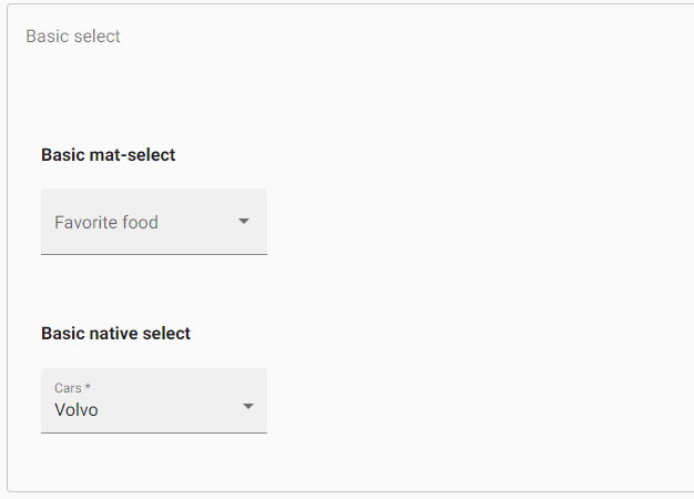
Getting and setting the select valueThe <mat-select> supports 2-way binding to the value property without the need for Angular forms. app.component.html app.component.ts Output: 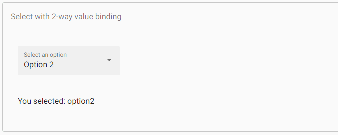
Both <mat-select> and <select> support Formsmodule (NgModel) and ReactiveFormsModule (FormControl, FormGroup, etc.). app.component.html app.component.ts Output: 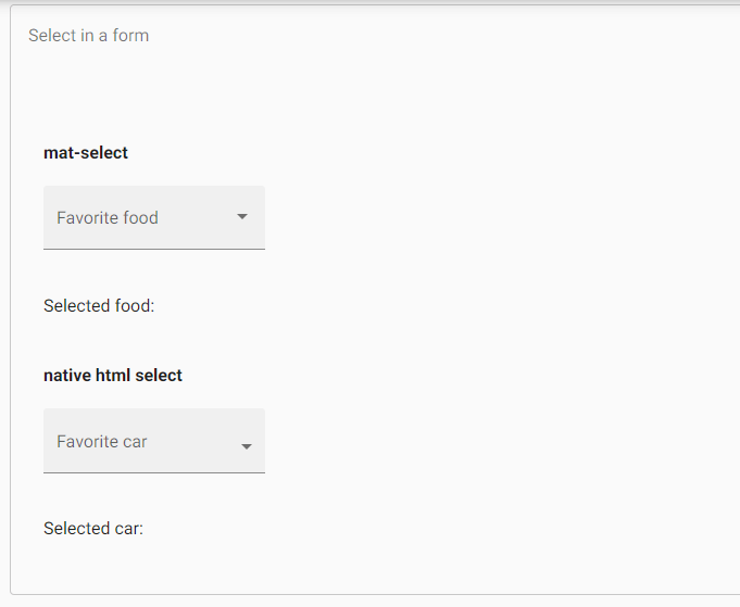
Form field FeaturesThere are a number of <mat-form-field> features that are used with both <select> and <mat-select>. It includes error messages, prefixes, hint text and suffixes. app.component.html app.component.ts Output: 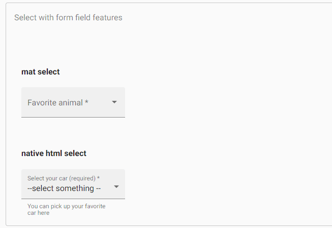
To set a static placeholderThe placeholder is shown when the <mat-form-field> label is floating or the <mat-select> label is empty. It is used to give the user an additional indication about the value of their selection. The placeholder specifies by setting the placeholder attribute on the <mat-select> element. In some cases, that <mat-form-field> uses a placeholder as a label. Disabling the select or individual optionsWe can disable the entire selection or individual options in a selection by using the Disable property on the <select> or <mat-select> and the <option> or <mat-option> elements. app.component.html app.component.ts Output: 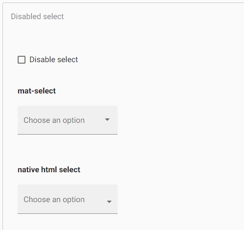
Creating groups of optionsThe <mat-optgroup> element is used to group common options under a subheading. The group name will set by using the label property of <mat-optgroup>. Like individual <mat-options> elements, the whole <mat-Optgroup> can be disabled or enabled by setting the Disable property. app.component.html app.component.ts Output: 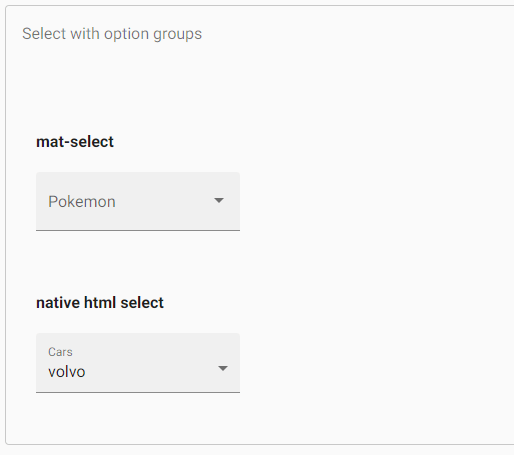
Multiple SelectionsThe <mat-select> defaults to single-select mode but can be configured to allow different classes by setting other properties. When using <mat-select> in multiple selection mode, its value will be a sorted list of all selected values instead of a single value. app.component.html app.component.ts Output: 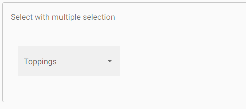
Customizing the trigger labelIf you have to display a custom trigger label inside a <mat-select>, you can use <mat-select-trigger> element. Disabling the ripple effectWhen the user clicks on <mat-option> then the ripple animation is shown. It could disable by the disableRipple property on <mat-select>. app.component.html app.component.ts Output: 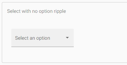
Adding custom styles to the dropdown panelTo styling the dropdown panel, app.component.html app.component.ts app.component.css Output: 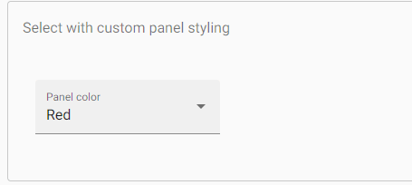
Changing when error messages are shownThe <mat-form-field> allows us to associate error messages with the <select> or <mat-select>. By default, error messages are came when the control is invalid or the user has interacted with the element. If we want to override the behavior, we can use the errorStateMatcher property <mat-select>. The property takes an instance of the ErrorStateMatcher object app.component.html app.component.ts Output: 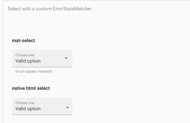
A global error condition matching can be specified by setting the ErrorStateMatcher provider. It applies to all inputs. ShowOnDirtyErrorStateMatcher is available to show globally available input errors when the input is invalid. Keyboard interactionDOWN_ARROW: It focuses on the next option UP_ARROW: It focuses on the previous option ENTER or SPACE: It selects on the focused item AccessibilityThe <mat-select> component has "combobox", the dropdown panel has "listbox" and options inside select panel have "option". The native <select> offers the best accessibility, and screen-readers support it. TroubleshootingError: Cannot change multiple modes of select after initialization It occurs if we try to bind different properties on the dynamic value to <mat-select>. Error: Value is an array in multiple-selection mode It occurs when we assign a value other than null, undefined, or an array to the <mat-select multiple>. For example, mySelect.value = 'option1'.
Next TopicAngular Material Toolbar and ToolTip
|
 For Videos Join Our Youtube Channel: Join Now
Feedback
- Send your Feedback to [email protected]
Help Others, Please Share


