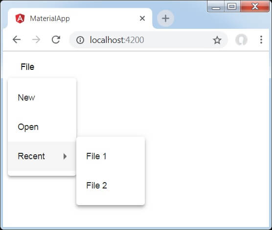
Angular Material Menu<mat-menu> is a temporary panel containing a list of options. It is used to create menus and engage with controls along with content design, styling, and animation capabilities. The <mat-menu> element itself does not represent anything. The menu is attached and opened by the application of matMenuTriggerFor directive: The menu exposes an API to open/close programmatically. Note that in this case, a matMenuTriggerFor directive is required to attach a menu to trigger the element in the DOM. IconsMenu displaying mat-icon elements before the menu item text. Customizing Menu PositionBy default, the menu will display (y-axis), after (x-axis), without overlapping its trigger. The position can be changed using the xPosition (before | after) and yPosition (up | down) attributes. Using the overlapTrigger attribute, the menu can be forced to overlap the trigger. Nested MenuThe content supports the ability of a matte-menu-item to open a sub-menu. To do this, we need to define our root menu and sub-menu, in addition to setting [matMenuTriggerFor] on the mat-menu-item that triggers the sub-menu: Lazy RenderingBy default, menu content will be initialized when the panel is closed. To postpone initialization the content can be provided as an N-template until the matmenucontent is open. Passing in Data to a MenuWhen using lazy rendering, additional reference data can be passed through the menu panel via matMenuTriggerData input. It allows a single menu instance to be provided with a different set of data, depending on the trigger that opens it: Keyboard interaction
AccessibilityMenu triggers and menu items without text or labels have given a meaningful label via aria-label and aria-labelledby. Example 1:app.component.html app.component.ts Output: 
Example 2:Modified module descriptor app.module.ts. Following is the content of the modified HTML host file app.component.html. Output: 
Explanation: We have created two menu using mat-menu and then bind them to buttons by using matMenuTriggerFor. MatMenuTriggerFor passed the menu identifier to attach the menu.
Next TopicAngular Material Menubar
|
 For Videos Join Our Youtube Channel: Join Now
Feedback
- Send your Feedback to [email protected]
Help Others, Please Share


