 |

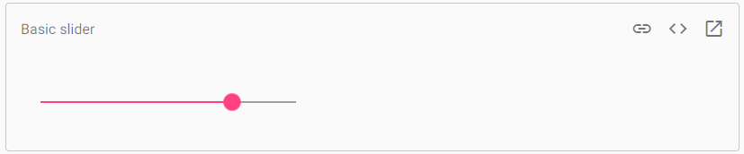
Angular Material SliderThe <mat-slider> is an Angular Directive used as the enhanced range selector with material styling and animation capabilities. The <mat-slider> allows the selection of a value from a range by mouse, touch or keyboard and it is similar to the <input type="range">. <mat-slider> tag is used when there is a need for a slider in the projects. Basic sliderSelecting a valueBy default, the slider has a minimum value of 0, a maximum value of 100, and a thumb move in increments of 1. OrientationThe orientation of sliders is horizontal with the minimum value on the left and the maximum value on the right. The vertical attribute is added to the slider to make it vertical with the minimum value and a maximum value at the top. An inverted feature is also available, specified to flip the axis that moves with the thumb. In the inverted vertical slider the minimum value is on the top and the maximum value is on the bottom. Thumb labelThe selected value of the slider is not visible to the user. But adding the value to the Thumb Lab attribute will be linked to the thumb. The Material Design Spec uses the Thumb lab attribute (with tickInterval = "1") only for sliders to display discrete values. Formatting the thumb label The value in the thumb label is same as the model's value. It is large to fit in the label at the end. If you have to control the displayed value, then use the DisplayWith input. Slider with custom thumb label formatting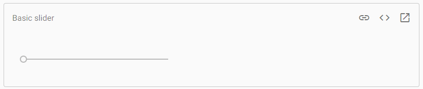
Sliders do not show tick marks on the thumb track. It is enabled by using the tick interval attribute. The value of tick interval is representing the number of steps between ticks. TickInterval select many steps such that there is 30px of space between ticks. The slider shows a tick at the beginning and end of the track. Keyboard interactionIt has the below keyboard bindings:
Example:app.module.ts app.component.html app.component.css app.component.ts Output: 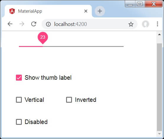
Explanation: We have created four checkboxes by using the mat-checkbox and bind them with NgModel with variables. It is used to customize the slider. Then, we have created the slider and showcased its attributes with variables in .ts file.
Next TopicAngular Material vs. Bootstrap
|
 For Videos Join Our Youtube Channel: Join Now
Feedback
- Send your Feedback to [email protected]
Help Others, Please Share


