 |

<apex: pageBlockButtons> Component in Visualforce PageThe <apex: pageBlockButtons> component is the most used component that acts as a set of buttons styled like standard Salesforce buttons. The <apex: pageBlockButtons> component is always used as a child component of the <apex: pageBlock> component. It is not necessary that the buttons are the direct children of the <apex: pageBlockButtons> component. Buttons that are positioned at any level within a <apex: pageBlockButton> component are styled appropriately. The HTML pass-through attributes are supported by this component using "html-" prefix. The <apex: pageBlockButtons> component has the following attributes on the Visualforce page: 1. dir The "dir" is a string-type attribute used to specify the direction in which the generated HTML component should be read. RTL and LTR are the possible values for this attribute. Syntax: 2. id The "id" is a string-type attribute, i.e., a unique identifier that allows this component to be referenced by other components on the page. Syntax: 3. lang The "lang" is a string-type attribute used to specify the base language for the generated HTML output. The "en" and "en-US" are the two possible values for this attribute. Syntax: 4. location The "location" is a string-type attribute used to specify the area of the page block where the buttons should be rendered. These are the possible values for this attribute:
The "both" is the default value for this attribute. Syntax: 5. onclick The "onclick" is another string-type attribute used to specify the JavaScript method invoked when the onclick event occurs or simply when the user clicks the page block buttons component. Syntax: 6. ondblclick The "ondblclick" is a string-type attribute used for specifying the JavaScript method invoked when the ondblclick event occurs or simply when the pageBlockButtons component is clicked twice. Syntax: 7. onkeydown The "onkeydown" is a string-type attribute used to specify the JavaScript method invoked when the onkeydown event occurs or simply when the user presses a keyboard key. Syntax: 8. onkeypress The "onkeypress" is a string-type attribute used for specifying the JavaScript method invoked when the onkeypress event occurs or simply when the user holds down or presses a keyboard key. Syntax: 9. onkeyup The "onkeyup" is a string-type attribute used for specifying the JavaScript method invoked when the onkeyup event occurs or simply when the user releases a keyboard key. Syntax: 10. onmousedown The "onmousedown" attribute is of type string used to invoke the JavaScript method when the onmousedown event occurs or simply when the user presses the mouse button. Syntax: 11. onmousemove The "onmousemove" is a string-type attribute used for specifying the JavaScript method invoked when the onmousemove event occurs or simply when the user moves the mouse pointer. Syntax: 12. onmouseout The "onmouseout" is a string-type attribute used for specifying the JavaScript method invoked when the onmouseout event occurs or simply when the user moves the mouse pointer away from the pageBlockButtons component. Syntax: 13. onmouseover The "onmouseover" attribute is of type string used to invoke the JavaScript method invoked when the onmouseover event occurs or simply when the user moves the pointer over the pageBlockButtons component. Syntax: 14. onmouseup The "onmouseup" is a string-type attribute used for specifying the JavaScript method invoked when the onmouseup event occurs or simply when the user releases the mouse button. Syntax: 15. rendered The "rendered" is a Boolean-type attribute used for specifying whether this component is rendered on the page. The boolean value true is set as a default value for this attribute. Syntax: 16. style The "style" is a string-type attribute used to specify the CSS that needs to be applied to it. Inline CSS is used as a value for this attribute. Syntax: 17. styleClass The "styleClass" is a string-type attribute used to specify the external CSS stylesheet that needs to be applied on it to display the page block buttons. Syntax: 18. title The "title" is a string-type attribute used to specify the text that needs to be displayed as a tooltip when the mouse hovers over this component Syntax: Let's take an example to understand how we can use this component on the Visualforce page: ApexPageBlockButtonsExample.vfp Output 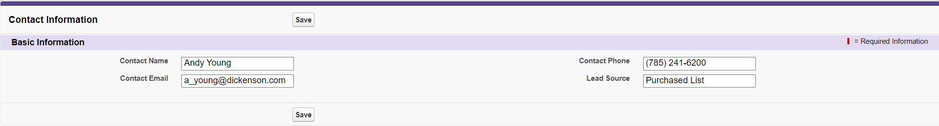
|
 For Videos Join Our Youtube Channel: Join Now
Feedback
- Send your Feedback to [email protected]
Help Others, Please Share


