 |

<apex: pageBlockTable> Component in Visualforce PageThe <apex: pageBlockTable> component is another most used component, i.e., a list of data displayed as a table within an <apex: pageBlock> or <apex: pageBlockSection> component. The <apex: pageBlockTable> is defined by iterating over a data set. The <apex: pageBlockTable> component displays information about one data item per row. The data set can contain up to 1000 items or 10000 items when the page is executed in read-only mode. We can specify more than one column component inside of the <apex: pageBlockTable> component to specify what information should be displayed for each data item. The HTML pass-through attributes are supported by this component using the "html-" prefix. The <apex: pageBlockTable> component has the following attributes: 1. align The "align" is a string-type attribute used to specify the position of the rendered HTML table for the page. These are the possible values for this attribute:
By default, its value is set to left. Syntax: 2. bgcolor The "bgcolor" is a string-type attribute that specifies the background color. However, this attribute is deprecated in Salesforce version 18.0. Syntax: 3. border The "border" is a string-type attribute used to specify the width of the frame around the rendered HTML table in pixels. Syntax: 4. captionClass The "captionClass" is a string-type attribute used to specify the style class for displaying the caption for the rendered HTML table. Syntax: 5. captionStyle The "captionStyle" is a string-type attribute used to specify the CSS style rule for displaying the caption for the rendered HTML table. Syntax: 6. cellpadding The "cellpadding" attribute is a string-type attribute used to define the amount of space between the border of each table cell and its contents. Syntax: 7. cellspacing The "cellspacing" attribute is a string-type attribute used to define the amount of space between the border of each table cell and the border of the other cells surrounding it. Its value can be in pixels or percentages. Syntax: 8. columnClasses The "columnClasses" attribute is a string-type attribute that defines one or more style classes as a comma-separated list associated with the table's columns. Syntax: 9. columns The "columns" is an integer-type attribute that defines the number of columns in this table. Syntax: 10. columnsWidth The "columnsWidth" is a string-type attribute that defines a comma-separated list of the widths applied to each table column. Values can be expressed as pixels Syntax: 11. dir The "dir" is a string-type attribute that defines the direction in which the generated HTML component should be read. RTL and LTR are the two possible values for this attribute. Syntax: 12. first The "first" is an integer-type attribute that indicates the first element in the iteration visibly rendered in the list. The index of the first element in the data set specified by the value attribute is 0. Syntax: 13. footerClass The "footerClass" is a string-type attribute that defines the style class used for displaying the footer for the rendered HTML table. The footer class will be applied when the footer facet is specified. Syntax: 14. frame The frame is a string-type attribute that defines the border drawn for this table. The "none", "above", "below", "hsides", "vsides", "lhs", "rhs", "box" and "border" are the possible values for this attribute. Syntax: 15. headerClass The "headerClass" is a string type attribute that defines the style class used for displaying the header for the rendered HTML table. The header class will be applied when the header facet is specified. Syntax: 16. id The "id" attribute is a string-type attribute that defines a unique identifier that allows this component to be referenced by other components on the page. Syntax: 17. lang The "lang" attribute is a string-type attribute that defines the base language for the generated HTML output. Syntax: 18. onclick The "onclick" attribute is a string type attribute used to invoke the JavaScript method when the onclick event occurs or when the user clicks the pageBlockTable. Syntax: 19. ondblclick The "ondblclick" attribute is a string type attribute used to invoke the JavaScript method when the ondblclick event occurs or when the user clicks the pageBlockTable twice. Syntax: 20. onkeydown The "onkeydown" attribute is a string-type attribute used to invoke the JavaScript method when the onkeydown event occurs or when the user presses a keyboard key. Syntax: 21. onkeypress The "onkeypress" attribute is a string type attribute used to invoke the JavaScript method when the onkeypress event occurs or when the user holds down or presses a keyboard key. Syntax: 22. onkeyup The "onkeyup" attribute is a string-type attribute used to invoke the JavaScript method when the onkeyup event occurs or when the user releases a keyboard key. Syntax: 23. onmousedown The "onmousedown" attribute is a string-type attribute used to invoke the JavaScript method when the onmousedown event occurs or when the user presses the mouse button. Syntax: 24. onmousemove The "onmousemove" attribute is a string-type attribute used to invoke the JavaScript method when the onmousemove event occurs or when the user moves the mouse pointer. Syntax: 25. onmouseout The "onmouseout" attribute is a string-type attribute used to invoke the JavaScript method when the onmouseout event occurs or when the user moves the mouse pointer away from the pageBlockTable. Syntax: 26. onmouseover The "onmouseover" attribute is a string-type attribute used to invoke the JavaScript method when the onmouseover event occurs or when the user moves the pointer over the data table. Syntax: 27. onmouseup The "onmouseup" attribute is a string-type attribute used to invoke the JavaScript method when the onmouseup event occurs or when the user releases the mouse button. Syntax: 28. onRowClick The "onRowClick" attribute is a string type attribute used to invoke the JavaScript method when the onRowClick event occurs or when the user clicks a row in the pageBlockTable. Syntax: 29. onRowDblClick The "onRowDblClick" attribute is a string type attribute used to invoke the JavaScript method when the onRowDblClick event occurs or when the user clicks a row in the pageBlockTable twice. Syntax: 30. onRowMouseDown The "onRowMouseDown" attribute is a string-type attribute used to invoke the JavaScript method when the onRowMouseDown event occurs or when the user clicks a mouse button in a row of the data table. Syntax: 31. onRowMouseMove The "onRowMouseMove" attribute is a string type attribute used to invoke the JavaScript method when the onRowMouseMove event occurs or when the user moves the mouse pointer over a row of the pageBlockTable. Syntax: 32. onRowMouseOut The "onRowMouseOut" attribute is a string type attribute used to invoke the JavaScript method when the onRowMouseOut event occurs or when the user moves the mouse pointer away from a row in the pageBlockTable. Syntax: 33. onRowMouseOver The "onRowMouseOver" attribute is a string type attribute used to invoke the JavaScript method when the onRowMouseMove event occurs or when the user moves the mouse pointer over a row in the pageBlockTable. Syntax: 34. onRowMouseUp The "onRowMouseUp" attribute is a string type attribute used to invoke the JavaScript method when the onRowMouseUp event occurs or when the user releases the mouse button over a row in the pageBlockTable. Syntax: 35. rendered The "rendered" attribute is a Boolean-type attribute used to specify whether this component is rendered on the page. By default, its value is set to true. Syntax: 36. rowClasses The "rowsClasses" attribute is a string-type attribute used for specifying one or more classes associated with the table's rows. Syntax: 37. rows The "rows" attribute is an integer-type attribute used for specifying the maximum number of items to display in the list. By default, its value is set to 0, resulting in all possible list items. Syntax: 38. rules The "rules" attribute is a string-type attribute used for specifying the borders drawn between cells in the table. The "none", "groups", "rows", "cols", and "all" are the possible values for this attribute, and by default, its value is set to "none". Syntax: 39. style The "style" is a string-type attribute that defines the inline CSS to apply the data list component. Syntax: 40. styleClass The "styleClass" is a string-type attribute used to define the CSS class to apply the data list component. Syntax: 41. summary The "summary" is a string-type attribute used to specify the summary of the table's purpose and structure for Section 508 compliance. Syntax: 42. title The "title" is a string-type attribute used to specify the text displayed when the user's mouse pointer hovers over this component. Syntax: 43. value The "value" is an Object type attribute that defines the data collection displayed in the list. Syntax: 44. var The "var" is a string-type attribute that defines the variable's name represented by one element in the collection of the data specified by the value attribute. Syntax: 45. width The "width" is a string-type attribute that defines the entire table's width, expressed as a relative percentage of the total amount of available horizontal space. Syntax: The <apex: pageBlockTable> component has the following three facets: 1. caption The components that appear in the caption for the table. 2. footer The components that appear in the footer row for the table. 3. header The components that appear in the header row for the table. Let's take an example to understand how we can use the <apex: pageBlockTable> component on the Visualforce page. ApexPageBlockTableExample.vfp ApexPageBlockTableController.apxc Output 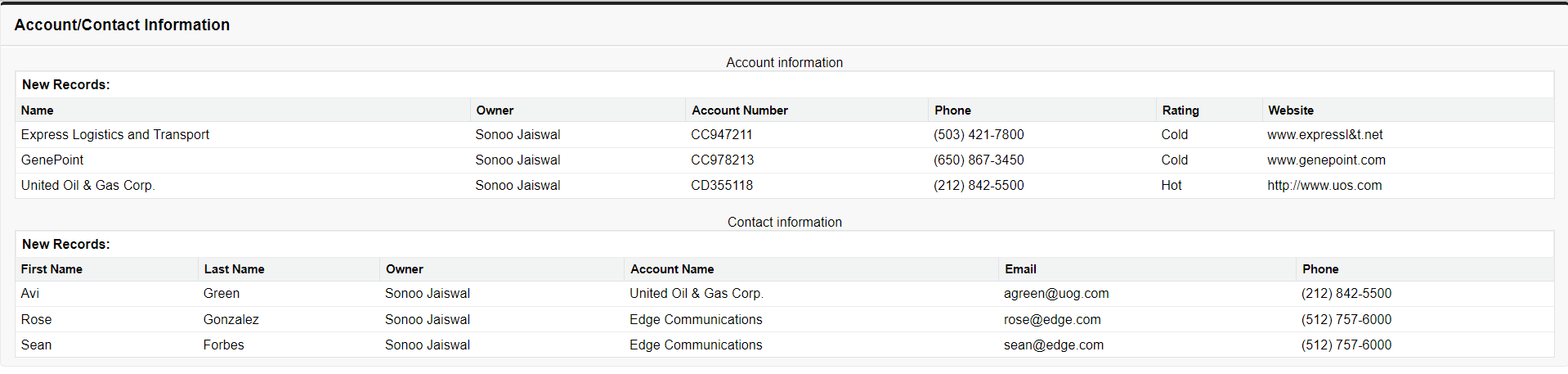
Next Topic#
|
 For Videos Join Our Youtube Channel: Join Now
Feedback
- Send your Feedback to [email protected]
Help Others, Please Share


