PrimeFaces SelectBooleanButton
The <p:selectBooleanButton> is used to create BooleanButton in JSF application. We can use it to get boolean input from the user. It provides a toggle button to interact with user.
SelectBooleanButton Attributes
The following table contains attributes for the InputTextarea component.
| Attribute |
Default value |
Return type |
Description |
| id |
null |
String |
It is an unique identifier of the component. |
| rendered |
true |
Boolean |
It returns boolean value to specify the rendering of the component. |
| binding |
null |
Object |
It is used to set an expression that maps to a server side
UIComponent instance in a backing bean.
|
| value |
null |
Object |
It holds value of the component referring to a List. |
| converter |
null |
Converter/String |
It is used to set an expression or a literal text that defines a converter
for the component.
|
| immediate |
false |
Boolean |
It is used to set boolean value. If value is true, process validations logic is executed at
apply request values phase for this component.
|
| required |
false |
Boolean |
It is used to make component as required. |
| requiredMessage |
null |
String |
It is used to set message to be displayed when required field validation
fails.
|
| onchange |
null |
String |
It is used to call a method on value change. |
| style |
null |
String |
It is used to set Inline style of the component. |
| onIcon |
null |
String |
It is used to set icon to display when button is selected. |
| offIcon |
null |
String |
It is used to set icon to display when button is unselected. |
| onfocus |
null |
String |
It executes when button receives focus. |
| onblur |
null |
String |
It executes when button loses focus. |
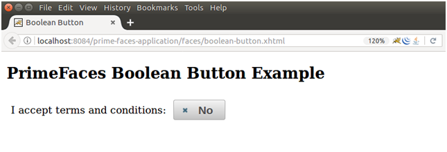
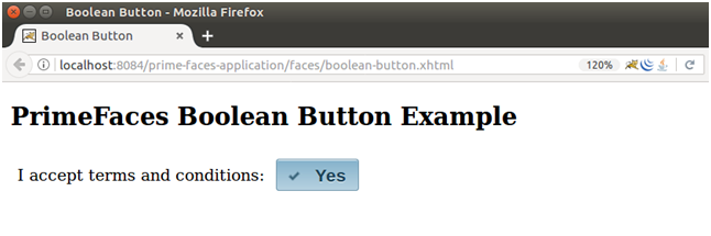
Example
Here, in the following example, we are implementing <p:selectBooleanButton> component. This example contains the following files.
JSF File
// boolean-button.xhtml
ManagedBean
// BooleanButton.java
Output:
It toggles to yes after clicking on the button.
| 

 For Videos Join Our Youtube Channel: Join Now


