PrimeFaces Calender
It is an input component which is used to select date. The <p:calendar> component is used to create a calendar in JSF application. It includes various features like: display modes, paging, localization, ajax selection etc.
Value of the calendar should be a java.util.Date.
Calendar Attributes
The following table contains attributes for the Calendar component.
| Attribute |
Default value |
Return type |
Description |
| id |
null |
String |
It is an unique identifier of the component. |
| rendered |
true |
Boolean |
It takes boolean value to specify the rendering of the
component.
|
| value |
null |
java.util.Date |
It is used to set value of the component. |
| converter |
null |
Converter/String |
It takes an expression or a literal text that defines a converter for the component. |
| required |
false |
Boolean |
It is used to make component as required. |
| mindate |
false |
Date or
String
|
It is used to set calendar's minimum visible date. |
| maxdate |
null |
Date or
String
|
It is used to set calendar's maximum visible date. |
| pages |
1 |
Integer |
It enables multiple page rendering. |
| mode |
popup |
String |
It is used to define how the calendar will be displayed. |
| pattern |
MM/dd/yyyy |
String |
It is used to set DateFormat pattern for localization. |
| timeZone |
null |
Time
Zone
|
It is used to specify
the timezone used for date conversion.
|
| showWeek |
false |
Boolean |
It is used to display the week number next to each week. |
| disabledWeekends |
false |
Boolean |
It disables weekend columns. |
| showOtherMonths |
false |
Boolean |
It displays days belonging to other months. |
| selectOtherMonths |
false |
Boolean |
It enables selection of days belonging to other
months.
|
| yearRange |
null |
String |
It is used to set year range. |
| timeOnly |
false |
Boolean |
It shows only timepicker without date. |
Skinning
The following table contains structural style classes.
| Style Class |
Applies |
| .ui-datepicker |
It is used for main container. |
| .ui-datepicker-header |
It is used for header container. |
| .ui-datepicker-prev |
It is used for previous month navigator. |
| .ui-datepicker-next |
It is used for next month navigator. |
| .ui-datepicker-title |
It is used for title. |
| .ui-datepicker-month |
It is used for month display. |
| .ui-datepicker-table |
It is used for date table. |
| .ui-datepicker-week-end |
This class is used for label of weekends. |
| .ui-datepicker-other-month |
Class for dates belonging to other months. |
| .ui-datepicker td |
It is used for each cell date. |
| .ui-datepicker-buttonpane |
This is button panel class. |
| .ui-datepicker-current |
This class is used for today button. |
| .ui-datepicker-close |
It is used to display close button. |
Example
Here, in the following example, we are implementing <p:calendar> component. This example contains the following files.
JSF File
// calendar.xhtml
ManagedBean
// Calendar.java
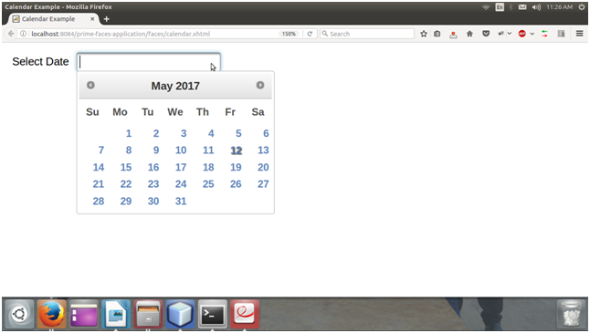
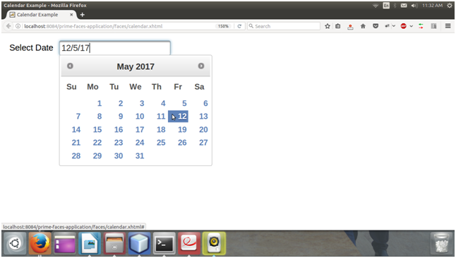
After running JSF file, it produces the following output.
Output:
It shows message, when we check it as giving below.
| 

 For Videos Join Our Youtube Channel: Join Now


