PrimeFaces SelectManyCheckbox
It is used to select multiple values from given options. It is useful when we want to take multiple user inputs from a collection. We can use <p:selectManyCheckbox> component to create SelectManyCheckbox in JSF application.
It has various attributes that are tabled below.
ManyButton Attributes
| Attribute |
Default value |
Return type |
Description |
| id |
null |
String |
It is an unique identifier of the component. |
| rendered |
true |
Boolean |
It is used to specify the rendering of the
component.
|
| value |
null |
obejct |
It is used to set value of the component. |
| required |
false |
Boolean |
It is used to mark component as required. |
| requiredMessage |
null |
String |
It is used to set message to be displayed when required field validation fails. |
| disabled |
false |
Boolean |
It is used to disable the component. |
| label |
null |
String |
It is used to set user presentable name. |
| layout |
lineDirection |
String |
It is used to set layout of the checkboxes. |
| columns |
0 |
Integer |
It is used to specify number of columns in grid layout. |
| onchange |
null |
String |
It is used to execute script on value change. |
| style |
null |
String |
It is used to set inline CSS of the component. |
| tabindex |
null |
String |
It is used to set position of the component in the tabbing order. |
Skinning
The following table contains structural style classes for SelectManyCheckbox.
| Style Class |
Applies |
| .ui-selectmanycheckbox |
It applies on the main container element. |
| .ui-chkbox |
It applies on the container of a checkbox. |
| .ui-chkbox-box |
It applies on container of checkbox icon. |
| .ui-chkbox-icon |
It applies on checkbox icon. |
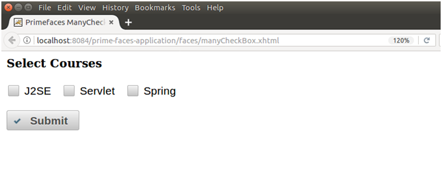
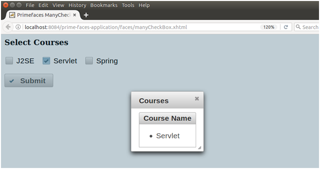
Example
Here, in the following example, we are implementing <p:selectManyCheckbox> component. This example contains the following files.
JSF File
// selectManyCheckbox.xhtml
ManagedBean
// ManyCheckBox.java
Output:
| 

 For Videos Join Our Youtube Channel: Join Now


