| |
Python Tutorial
Python OOPs
Python MySQL
Python MongoDB
Python SQLite
Python Questions
Plotly
Python Tkinter (GUI)
Python Web Blocker
Python MCQ
Related Tutorials
Python Programs

Joint Plot in PythonThe joint plot is a way of understanding the relationship between two variables and the distribution of individuals of each variable. The joint plot mainly consists of three separate plots in which, one of it was the middle figure that is used to see the relationship between x and y. So, this area will give the information about the joint distribution, while the remaining two areas will provide us with the marginal distribution for the x-axis and y-axis. Syntax Parameters
Example Earlier, we discussed a joint plot consisting of 3 separate plots. From those three, one of the plots displays the bivariate graph showing how the dependent variable (Y)is different from the independent variable (X). And the other plot is placed horizontally at the top of the bivariate graph, showing the distribution of the dependent variable (Y). Having univariate and bivariate plots together in one frame is also beneficial. It is because the univariate will mainly focus on one variable, describing, summarising and showing any patterns in our data. The bivariate will tell the relationship between two variables and represent the strength of their relationship. The function called joint plot() in the library called Seaborn will create the scatter plot by default with two histograms at the top and right margins of the graph. Let us create the dataset "tips" and pass the column data to the jointplot() function for our analysis. Creating Joint Plots using the Jointplot() FunctionOutput 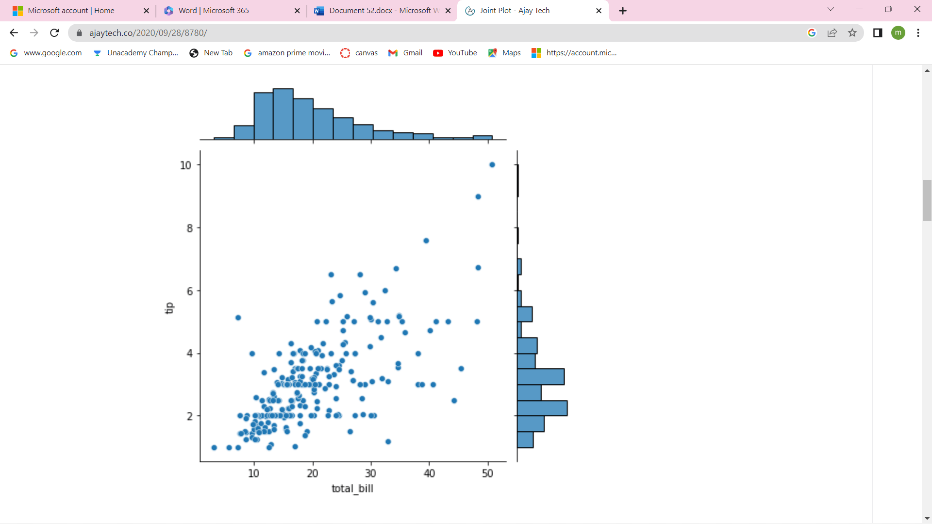
The above plot displays a scatterplot with two histograms at the margins of the graph. If we observe the scatterplot, there is a positive relationship between the columns 'total_bill' and 'tip' because if the values of one variable have increased, so does the other. The relationship's strength will appear moderate because the points are scattered in the graph. The marginal histograms are both right-skewed as most values are concentrated around the left side of the distribution, and the other right side is longer. The outliers denote the data points that lie at some distance from the rest of the data values, and in the graph, we can see the outlier in the scatterplot and in the histograms. We can also add color to the scatterplot with dimensions. Scatterplot with Color DimensionThe above plot shows the data points for smokers and non-smokers in different colors by setting the "hue" parameter to column "smoker". Regarding the marginal plots, instead of histograms, density plots are plotted on both margins showing the data distribution for the two levels of the hue variable differently. The Kernel Density Plots in a Joint PlotThe jointplot will create a scatterplot with two marginal histograms by default. If we require different plots, they are displayed on the main plot by setting the parameter 'kind' to 'scatter', 'kde', 'hex', etc. The parameter 'kind' will be set to 'kde' in the above function so that the joint plot will display a bivariate density curve on the main plot, and univariate density will curve on the margins. We also notice that the density curves for the two levels of the hue variable are plotted differently. Regression LineThe regression line or the line of best fit will give a visual presentation of the relationship of a dependent variable with one or many independent variables. The regression line is computed using mathematical equations, and by using this equation, we can predict the dependent variable for different variable values. Seaborn.jointplot() MethodSeaborn is a python data visualization library, and it is based on matplotlib. It will provide a high-level interface for drawing attractive and informative statistical graphics. Seaborn will help to solve the two major problems faced by matplotlib, and the issues are:
The seaborn will complement and extends matplotlib, and the learning curve is normal. If we know matplotlib, we can easily understand the concept of seaborn. seaborn.jointplot(): As we know, seaborn is a library that uses matplotlib, which is mainly used to plot graphs. It is used to visualize random distributions. Installation of SeabornIf we have installed Python and PIP on a system, install them using the below command. If we use Jupyter, then install Seaborn by using the below command. DistplotsDistplot means distribution plot, which will take input as an array; after that, it will plot a curve according to the distribution of points in the array. Import Matplotlib Import the object of the pyplot of the Matplotlib module in our code by using the following statement. Importing Seaborn We can import the seaborn module into our code using the statement below. Plotting a DistplotLet us take an example for plotting a Distplot. Output 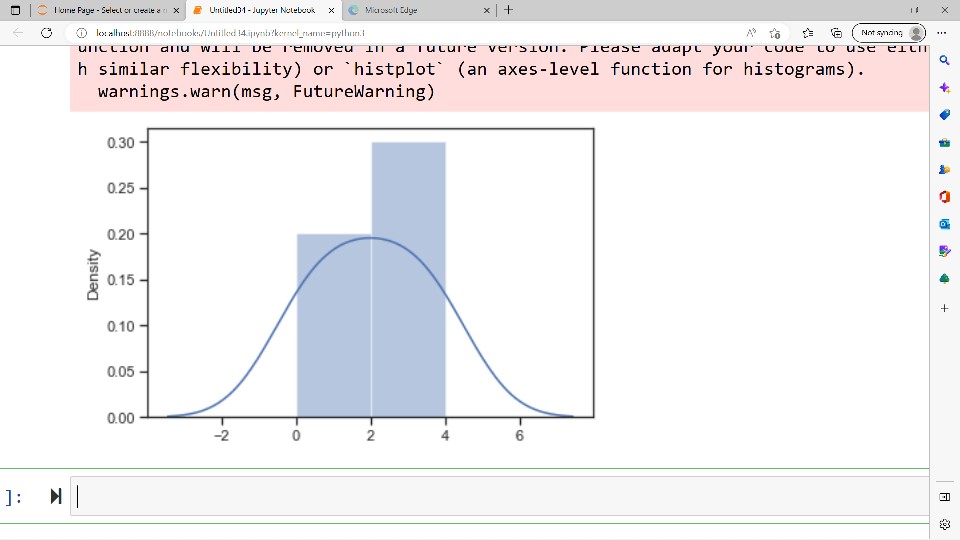
We can also plot a distplot without the histogram. Plotting a Distplot without the HistogramWe will discuss this by using an example. Output 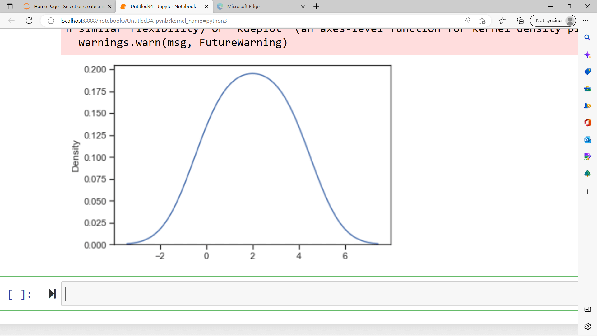
Different Categories of Plot in SeabornPlots are mainly used for examining the relationship between variables. These variables can be numerical or a category like a group, class, or division. A Seaborn will divide the plot into many categories, as shown below:
Installation of SeabornThere are two types of environments: Python and Anaconda environments. For Python environment: For anaconda environment: Dependencies
Some Basic Plots using SeabornDist plotThe seaborn dist plot is used for plotting the histogram and involving variations like kdeplot and rugplot. Program for dist plotOutput 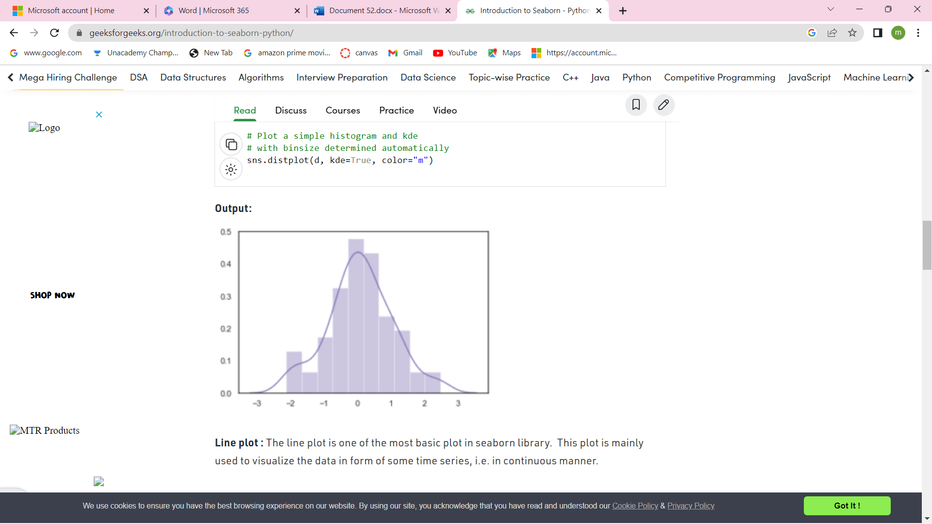
Line PlotThe line plot is the main and basic plot in the seaborn library. The line plot is mainly used for visualizing the data in the form of time series, that is, continuously. Program for Line plotOutput 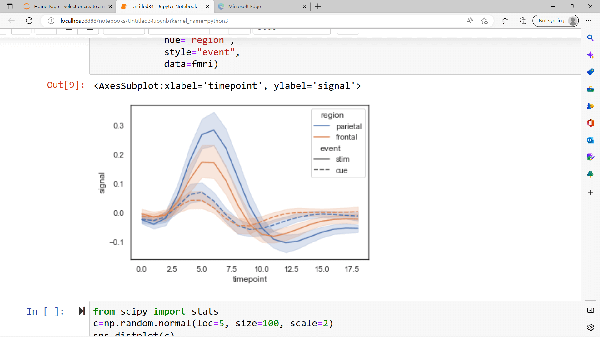
LmplotIt is the basic plot, and it will show the line representing a linear regression model with data points in 2D space, and x and y will be set as the horizontal and vertical axis, respectively. Program for LmplotOutput 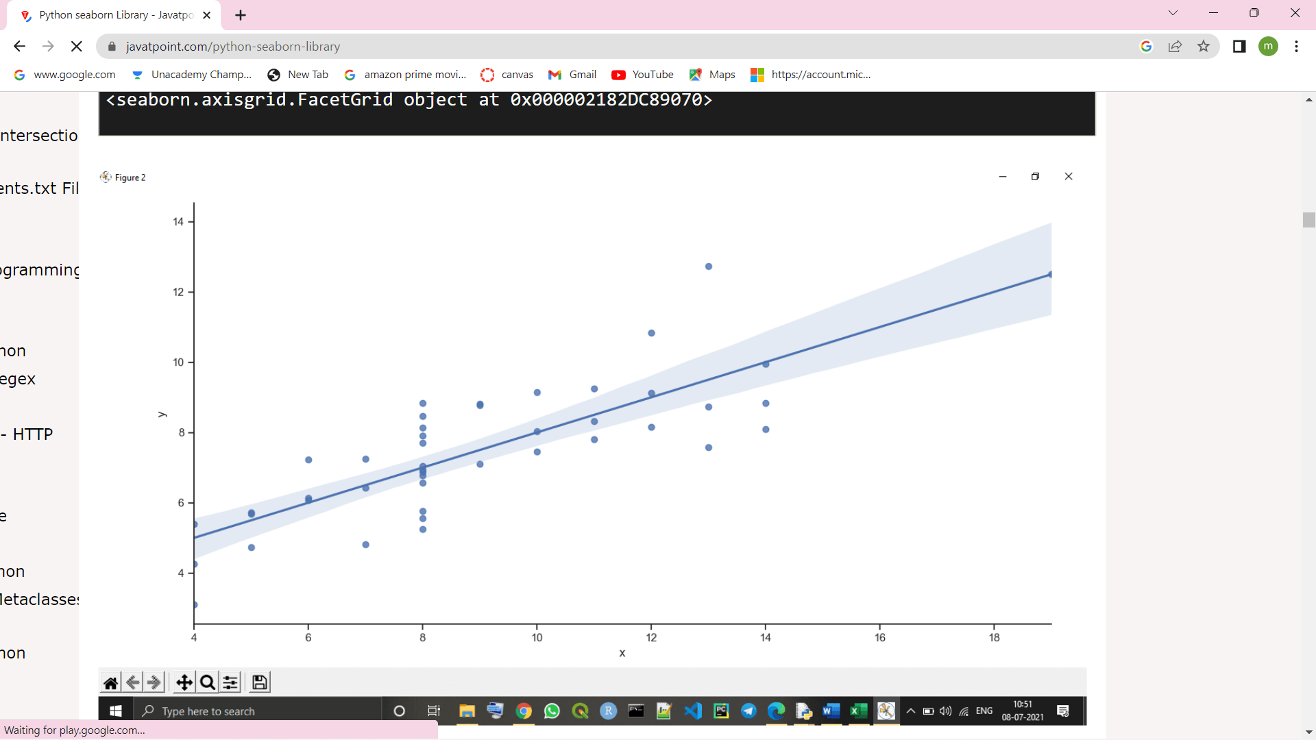
Features of SeabornSeaborn has been built on top of python's core visualization library, matplotlib. It is used to serve as a complement, but not a replacement. Let us see what the features associated with them are.
Next Topic"Not" Operator in Python
|
 For Videos Join Our Youtube Channel: Join Now
Feedback
- Send your Feedback to [email protected]
Help Others, Please Share


