| |
Python Tutorial
Python OOPs
Python MySQL
Python MongoDB
Python SQLite
Python Questions
Plotly
Python Tkinter (GUI)
Python Web Blocker
Python MCQ
Related Tutorials
Python Programs

Scatter() plot matplotlib in PythonMatplotlib is a Python library that lets you make deterministic, animated, and engaging visualizations. It is used to make plots in Python, such as bar charts, scatter plots, pie charts, histograms, line plots, 3-D plots, and many more. The matplotlib library contains the information about the scatter plot. matplotlib.pyplot.scatter()Scatter plots are utilized to see how different variables are related to each other. The dots on the plot shows how the variables are related. A scatter plot is made with the matplotlib library's scatter() method. People often use scatter plots to show the relationship between two or more variables and how a change in one affects the other. SyntaxHere's how to write code for the scatter() method: matplotlib.pyplot.scatter (x_axis_value, y_axis_value, s = None, c = None, vmin = None, vmax = None, marker = None, cmap = None, alpha = None, linewidths = None, edgecolors = None) The following are the syntax parameters for the scatter() method:
All of the parameters except x-axis data and y-axis data are optional, and their default value is None. ExamplesHere are many examples of scatter plots in matplotlib with different parameters. We can see the different types of scatter plots with size, color, and other functions. Example1: the following example shows a scatter plot using Python. We can see the plot values in the x and y-axis position. Output The following image shows a scatter plot with value in python. 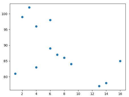
Example2: the following example shows a scatter plot using python. Here, we use the numpy package to compare two plots. Output The following image shows a scatter plot with value in python. 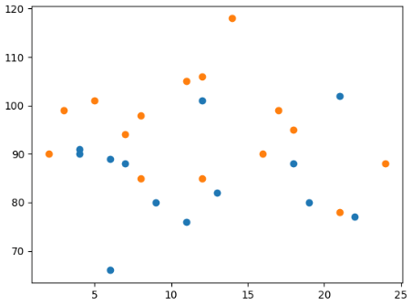
Example3: the following example shows a scatter plot using python. Here, again we used the numpy package to compare two plots with different colors. Output The following image shows a scatter plot with value in python. 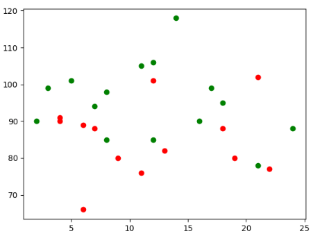
Example4: the following example shows a scatter plot using python. Here, we use a different color for each plotted value. We can use the "c" to assign a color variable. Output The following image shows a scatter plot with value in python. 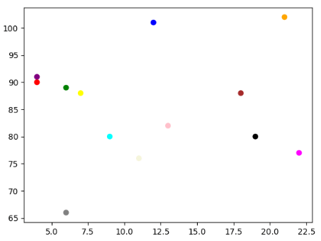
Example5: the following example shows a scatter plot using Python. Here, we use a different color for each plotted value. We can use the "c" and "cmap" to assign color variables and color bars, respectively. Output The following image shows a scatter plot with value in python. 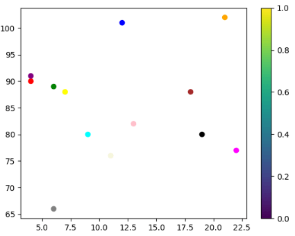
Example6: the following example shows a scatter plot using Python. Here, we can use different sizes of the plot value. Output The following image shows a scatter plot with value in python. 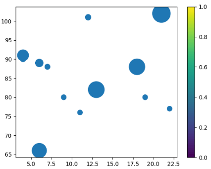
Example7: the following example shows a scatter plot using python. Here we use different sizes and opacity of the plot value. Output The following image shows a scatter plot with value in python. 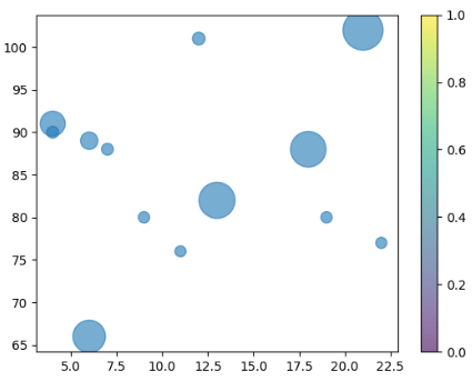
Example8: the following example shows a scatter plot using python. Here, we use a different color for each plotted value. We can use scatter plots with different colors, sizes, and opacity. Output The following image shows a scatter plot with value in python. 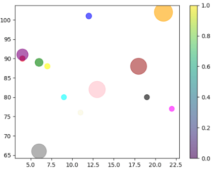
Example9: the following example shows a scatter plot using python. Here, we use a different color for each plotted value. We can use random scatter plots with different colors, sizes, and opacity. Output The following image shows a scatter plot with value in python. 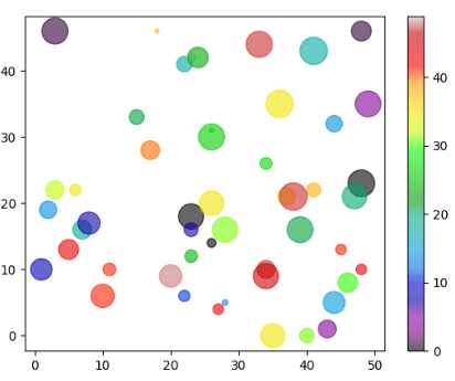
Example10: the following example shows a scatter plot using Python. Here, we use a different color for each plotted value. We can use scatter with different colors, sizes, edges, and line widths of the border. Output The following image shows a scatter plot with value in python. 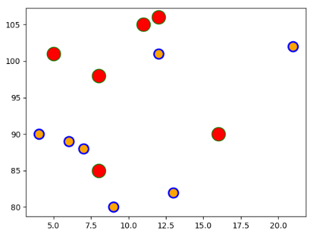
ConclusionThe matplotlib displays plot figures using Python language. The scatter function in python shows a different type of figures in the graph. The figure shows different sizes, and opacities in python.
Next TopicData Analysis Project Ideas in Python
|
 For Videos Join Our Youtube Channel: Join Now
Feedback
- Send your Feedback to [email protected]
Help Others, Please Share


