| |
Python Tutorial
Python OOPs
Python MySQL
Python MongoDB
Python SQLite
Python Questions
Plotly
Python Tkinter (GUI)
Python Web Blocker
Python MCQ
Related Tutorials
Python Programs

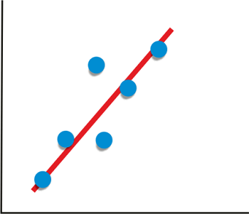
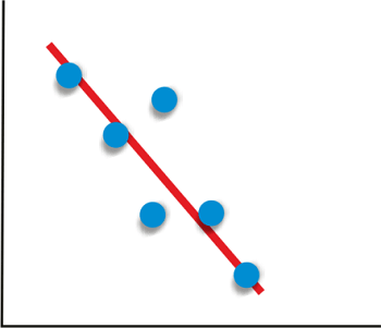
Plot Correlation Matrix in PythonGiven two variables, if the value of one variable is dependent on the value of the other variables, we say the variables are related. The measure of the relationship between two variables statistically is called "Correlation". Here the two variables dependent on each other are the price and Demand of a product. For a general example, whenever a product starts losing its Demand, the company decreases the price of the product because, with the price decrease, Demand rises. Given a vast amount of observed data, it is hard to determine how closely two variables are related. It is a major need for data science and data analysis. Statistical techniques are used to organize all the data to get the correlation view, and for that, graphs and other representations are made. This tutorial deals with how to plot the data and make a correlation matrix in Python. Between any two variables, three types of correlations can exist:
Given data about two variables, we can find the correlation between the two variables using Pandas: Output: 0.9793792286287205 0.9793792286287205
Now, given the data about the two variables, we can plot a graph showing the correlation we can achieve using the functions in the libraries mentioned above. If the libraries are not installed, we can install them using pip or conda manager.
Code:Output: 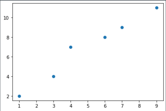
Functions used:
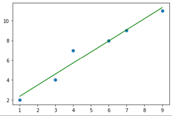
Customizing the Plot: We can add a title and labels to make the plot more understandable. For this, we can use the title () and label () functions: Output: 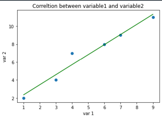
Functions used:
Data Frames from Sklearn Library:Sklearn is a machine learning library in Python. It has seven built sample datasets in it, which the programmer can use without the need to download any external file.
Dataset: sklearn. load_iris () Code: Output:
      Sepal length (cm)      sepal width (cm)   ...    petal width (cm)    relation
0           5.1                3.5              ...       0.2                0
1           4.9                3.0              ...       0.2                0
2           4.7                3.2              ...       0.2                0
3           4.6                3.1              ...       0.2                0
4           5.0                3.6              ...       0.2                0
..          ...                ...              ...       ...                ...
145         6.7                3.0              ...       2.3                2
146         6.3                2.5              ...       1.9                2
147         6.5                3.0              ...       2.0                2
148         6.2                3.4              ...       2.3                2
149         5.9                3.0              ...       1.8                2

[150 rows x 5 columns]
We created a data frame from pandas and included the iris data set. Out of the four features in the data set, we'll try to find the correlation between Sepal length and petal width:
Code: Output: The correlation number between Sepal length and Petal length: 0.8179411262715757
Correlation matrix: Code: Output: 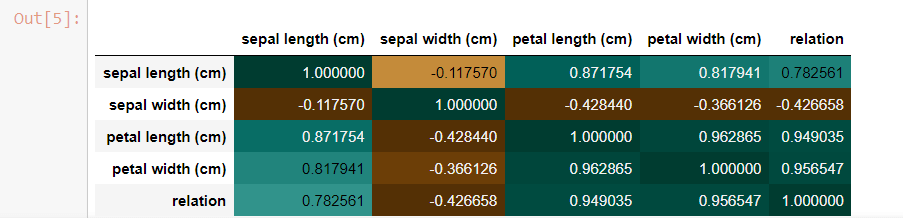
Correlation HeatMap: A HeatMap is another efficient way of plotting a correlation matrix. It shows the correlation of a pair of every two variables. It belongs to the Seaborn library. Code: Output: 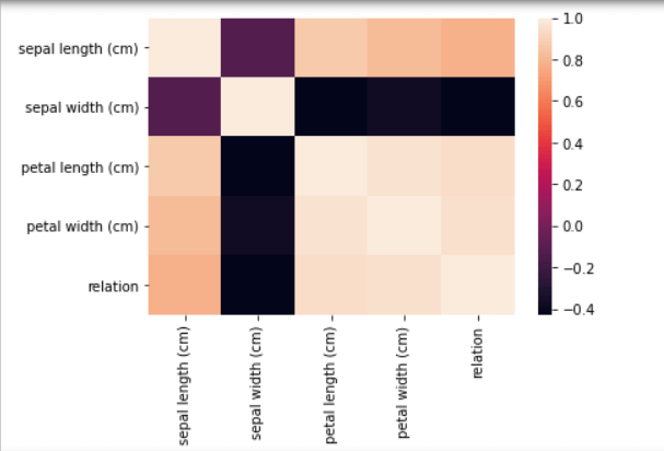
Understanding:
Customizing the heatmap: Using the pyplot module of the matplotlib library, we can add titles and labels on x and axes to the matrix, thus making it more understandable.
Code: Output: 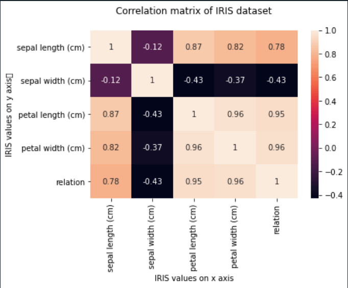
Conclusion:Correlation specifies the measure of relation/ dependence of one variable on another variable. It is simple to calculate using statistical techniques. But, when it comes to large amounts of data, it is hard to analyze the relation. Hence, we use correlation matrices in which the colours of the plots help the programmer differentiate and understand the correlation between the variables. This tutorial discusses how to analyze a correlated matrix using:
Next TopicEuclidian Distance using NumPy
|
 For Videos Join Our Youtube Channel: Join Now
Feedback
- Send your Feedback to [email protected]
Help Others, Please Share


