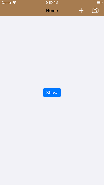
Navigation BarThe navigation bar is used in the association with the navigation controller that is displayed along the top of the screen. It is the instance of the UINavigationBar class that inherits UIView. The UINavigationBar object is a bar that is displayed along the top of the View Controller window that is embedded in the Navigation Controller. A Navigation Bar contains the navigation items typically bar button items that are used to navigate within the hierarchy of screens. A typical Navigation Bar contains a back button displayed at the left of the bar, a center View Controller title, and the optional right bar buttons. 
A Navigation bar is most commonly used in the association with the UINavigationController object. The navigation controller creates and manages the associated navigation bar. It also controls the content of the navigation bar using the attributes of the view controllers. The following steps are required to configure the appearance of the navigation bar associated with a navigation controller.
Using standalone Navigation BarWe can also use a navigation bar without using navigation control. To use a navigation bar, we must search for UINavigationBar in the object library and drag the result to our View Controller. The following steps are required to configure the appearance of UINavigationBar used stand alone in the interface.
Configuring NavigationBar AppearanceThe barStyle property of the UINavigationBar is used to configure the bar style. Generally, the navigation bar has two appearance styles: black or default. The black style makes the navigation bar with the black background and the white text. We can also set it to translucent to make it semitransparent. The following table illustrates interface builder attributes that are used to configure the navigation bar. Interface Builder AttributesCore Attributes
Title Attributes
Updating Navigation Bar ContentAs we have already discussed, the navigation bar contains the title of the topmost view controller on the navigation stack. Each time the navigation controller changes the topmost view controller, the content of the navigation bar also changes, including the title, and the bar button items. The navigation bar contains the content in three positions as Left, Center, and Right. The Bar Button Items are the instances of UIBarButtonItem class. The tintColor property of the UINavigationBar is used to change the tint color of the items in the navigation bar. We can also change the bar tint color by using barTintColor property of UINavigationBar. Left ItemThe Left item in the navigation bar provides the backward navigation to the previous view controller in the navigation stack. However, if the current topmost view controller contains a custom left bar button item, then it will be displayed. The leftBarButtonItem property of the View Controller's navigation item is used to set the custom left bar button item. If the top-level view controller doesn't contain the custom left bar button item, but the navigation item of the previous view controller has an object in its backBarButtonItem property, then the navigation controller displays that item. However, a default back button is always displayed in case no custom left bar button item is not set with the title of the previous view controller. Center ItemIf the top-level view controller doesn't contain any custom navigation bar title view, then a default bar title is displayed. However, a custom title view can be set using titleView property of the View Controller's navigation item. The title property of View Controller is displayed as the title for the navigation bar. However, the title property of the view controller's navigation item can be used to show a different item. Right ItemThe Right side of the navigation bar is optional, I.e., no default content is set for the right item if no custom right item is already set. To specify the custom Right bar button item, we use the rightBarButtonItem property. ExampleViewController.swift Output 
Next TopicNavigation Item
|
 For Videos Join Our Youtube Channel: Join Now
Feedback
- Send your Feedback to [email protected]
Help Others, Please Share


