TextField
It can be defined as an object which is used to display an editable text area in the interface. Textfields are used to get the text-based input from the user.
As we have discussed for the label, we can also customize the text field by giving attributes. There are scenarios where we might need to configure the keyboard as well, for example, to restrict the user from entering the numbers only. Textfield uses the target action mechanism and a delegate object to report changes made during editing.
The following steps are used to configure the text field.
- Search for the TextField in the object library and drag the result to the storyboard.
- Configure one or more targets and actions for the text field.
- Customize the keyboard-related attributes for the text field.
- Perform text field delegate object tasks to report the changes made while editing.
- The text field delegate method is called when the user changes the text field content.
- Validating the text entered by the user.
- Delegate method is called when the keyboard's return button is tapped.
- Create an outlet of the text field in the corresponding ViewController class.
Example
Here, we will create a form using text fields and labels. We will also apply some validations on the text field. If the validation fails, then an alert will be shown to the user; otherwise, a success message will be displayed to the user.
Interface builder
To create the interface for the project, we will use text fields for getting the data from the user, associated with the labels for showing the messages to the user.
We will not use Button in the application, as it is not covered yet in this tutorial; instead, we are using clickable labels to trigger the events.
Create the interface by searching for the appropriate objects in the object library and drag the result into the storyboard.
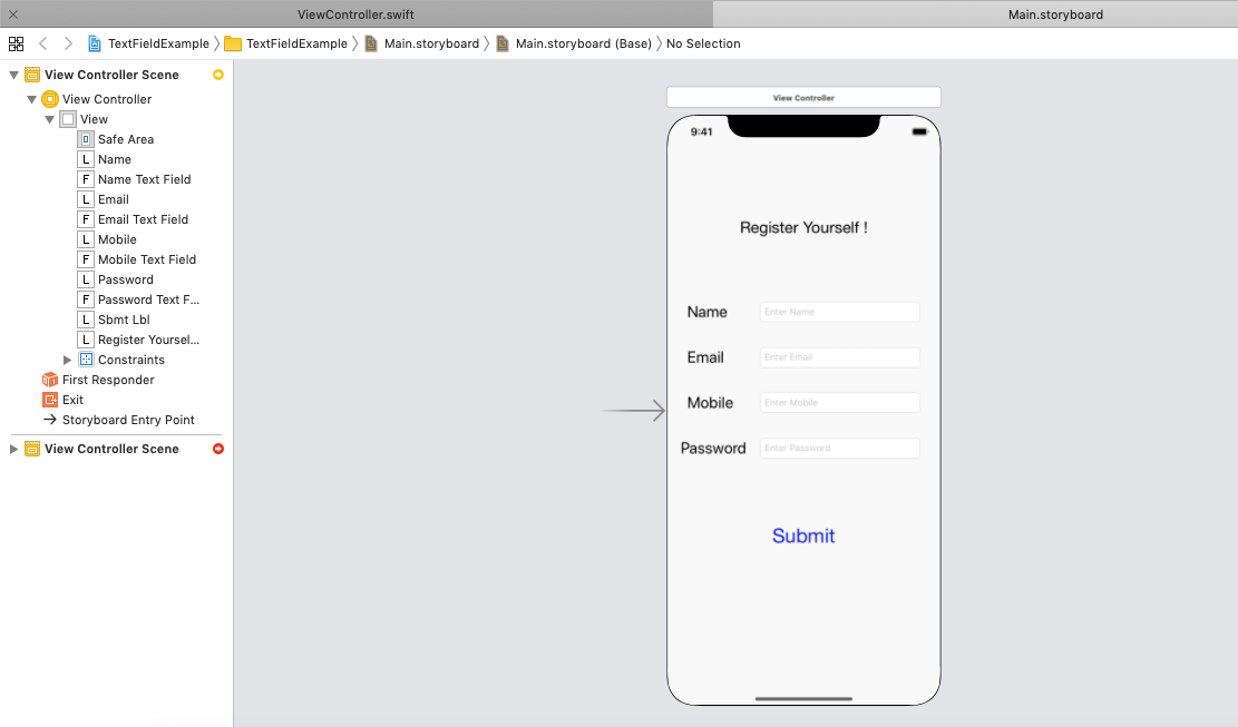
The following View is created in the project to get the information from the user.
How to show the success message on the successful registration?
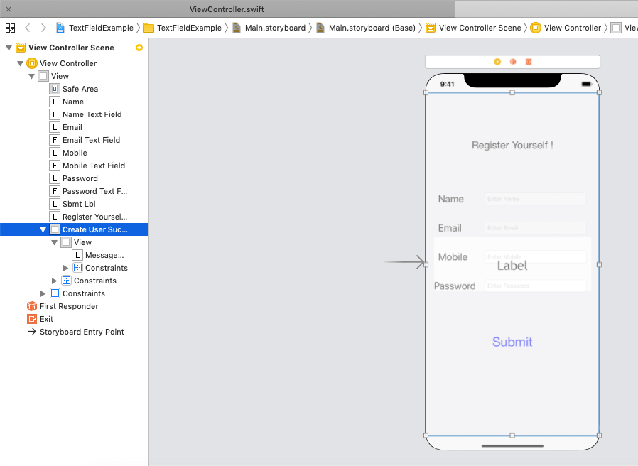
In iOS development, we generally create another screen on the successful completion of any task. However, in this example, we will create a UIView containing the success message on the same screen and keep it hidden until the validation succeeds in on the submit label tapped.
The interface after adding the createUserSuccessView is shown in the following image.
Outlets
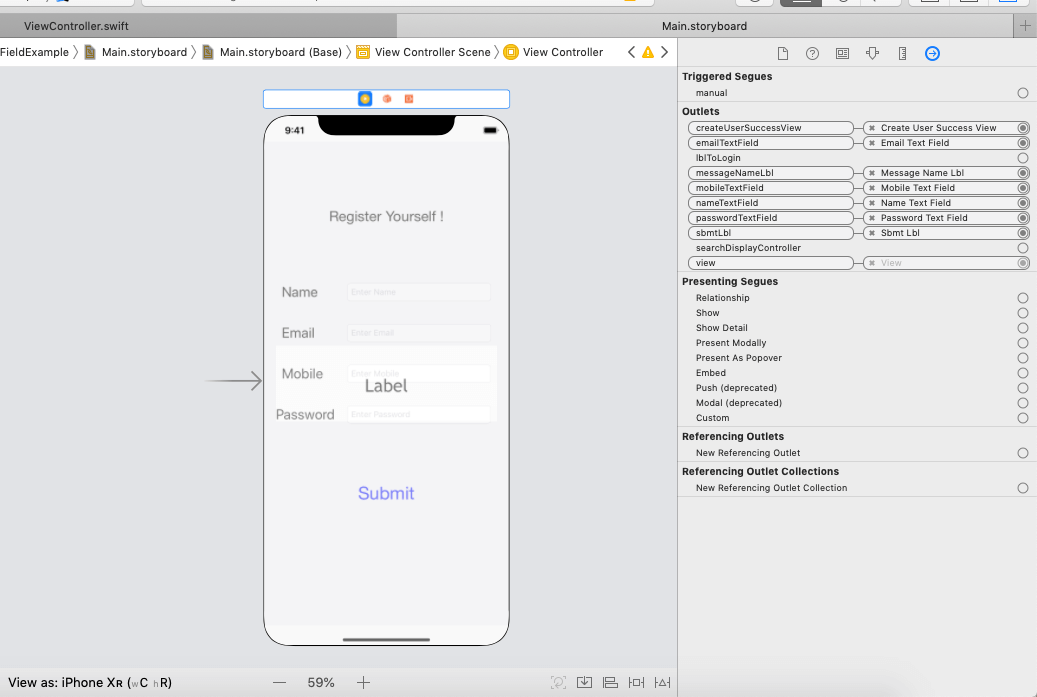
The outlets are created of the objects in the Associated View Controller class. All the connecting outlets can be shown in the connection inspector in XCode, as shown in the following image.
ViewController.swift
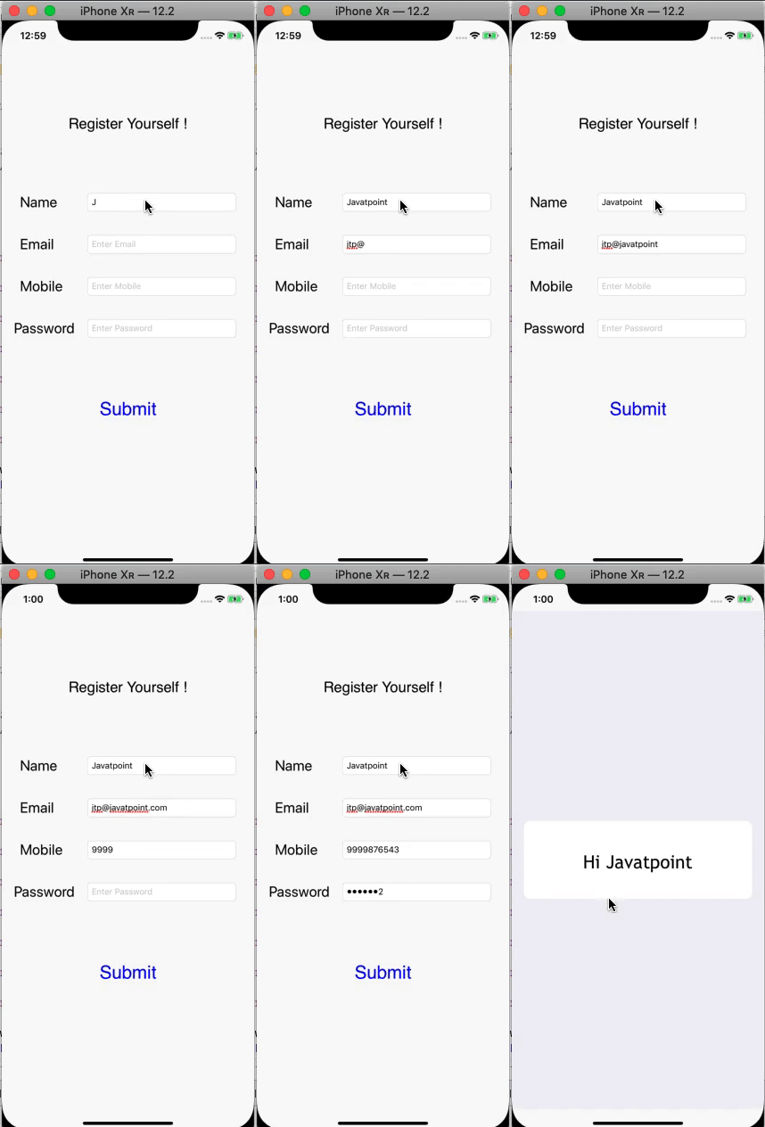
Output:
Configure the keyboard
The text field can become the first responder by calling the becomeFirstResponder() method on the text field outlet. When the text field becomes the first responder, the keyboard automatically becomes visible, and the keyboard input is bound to the text field. When the user taps onto the text field, the text field becomes the first responder, i.e., the keyboard becomes visible.
To dismiss the keyboard, the resignFirstResponder() method is called on the text field outlet. We may need to dismiss the keyboard in response to some specific interactions. The keyboard is automatically dismissed when the user presses the return key.
The editing state of the textfield is affected by the appearance and dismissal of the keyboard. When the user starts editing the textfield on the appearance of the keyboard, the textfield sends the appropriate notification to its delegate. The delegate methods are also notified when the editing begins and ends.
TextField Delegate Methods
| SN |
Method Signature |
Description |
| 1 |
func textFieldShouldBeginEditing(UITextField) -> Bool |
It asks the delegate if editing should begin the respective textfield. |
| 2 |
func textFieldDidBeginEditing(UITextField) |
It tells the delegate that the editing is started in the textfield. |
| 3 |
func textFieldShouldEndEditing(UITextField) -> Bool |
It asks the delegate to end the editing in the textfield. |
| 4 |
func textFieldDidEndEditing(UITextField, reason: UITextField.DidEndEditingReason) |
It tells the delegate that the editing has been stopped for the specified textfield. |
| 5 |
func textFieldDidEndEditing(UITextField) |
It is the overloaded methods which also does the same as the above. |
| 6 |
func textField(UITextField, shouldChangeCharactersIn: NSRange, replacementString: String) -> Bool |
It asks the delegate that if the text field's current content should be changed. |
| 7 |
func textFieldShouldClear(UITextField) -> Bool |
It asks the delegate if the text field's current content should be removed. |
Interface builder Attributes
TextField Attributes
| SN |
Attribute |
Description |
Property |
| 1 |
text |
It represents the current text the textfiled contains. It can be accessed by the text property of the textfield at runtime. |
text |
| 2 |
color |
It represents the color of the textfield text. This can be accessed by using the textColor property of the TextField. |
textColor |
| 3 |
font |
It represents the font of the text field's text. This can be accessed by using the font property of the textfield object. |
font |
| 4 |
alignment |
It represents the alignment of the text inside the editing area. |
textAlignment |
| 5 |
placeholder |
It represents the placeholder string of the textfield. When the textfield is empty, this string is displayed to guide the user. |
placeholder |
| 6 |
background |
It represents the background image to display when the textfield is enabled. The background image is displayed behind the textfield content. |
background |
| 7 |
disabled |
It represents the background image to display when the textfield is disabled. |
disabledBackground |
| 8 |
border style |
It represents the visual style of the textfield border. |
borderStyle |
| 9 |
clear button |
The clear button is an overlay view that can be tapped by the user to delete all the content of the textfield. This attribute can be used to set the appearance of the clear button within the textfield. |
clearButtonMode |
| 10 |
Min font size |
The minimum font size for the text field's text. When the Adjust to Fit option is enabled, the text field automatically varies the font size to ensure maximum legibility of the text. |
minFontSize |
Keyboard Attributes
| SN |
Attribute |
Description |
Property |
| 1 |
Capitalization |
This attribute applies the automatic capitalization style to the typed text within the text field. |
autocapitalizationType |
| 2 |
Correction |
This attribute is used to determine whether the auto-correction is enabled or not while typing. |
autocorrectionType |
| 3 |
Spell Checking |
It is used to determine whether the spelling checking enabled or not while typing. |
spellCheckingType |
| 4 |
Keyboard Type |
This property sets the type of the keyboard displayed while typing. |
keyboardType |
| 5 |
Appearance |
It is used to set the appearance of the textfield. It specifies a dark or light keyboard. |
keyboardAppearance |
| 6 |
Return Key |
It is used to set the type of the return key to display on the keyboard. |
returnKeyType |
| 


 For Videos Join Our Youtube Channel: Join Now


