Slider
A slider can be defined as a UIControl, which provides the contiguous range of values on a single scale to the user, out of which the user is prompted to select a single value. The user is supposed to move the thumb on the slider. The slider is connected with the action method, which is notified every time the user moves the thumb onto a slider. The value of the slider can be retrieved each time the action method is called.
The slider is declared as follows.
The following steps are used to add the sliders to the interface builder.
- Search for the slider in the object library and drag the result to the storyboard.
- Give the attributes to the slider like the range of the values represented by the slider, tint color, limit images, etc. from storyboard or programmatically.
- Define the logic that is to be executed when the value of the slider is changed every time in the action method of the slider.
- Set up auto-layout rules to govern the size and position of the sliders on different screen sizes.
Example
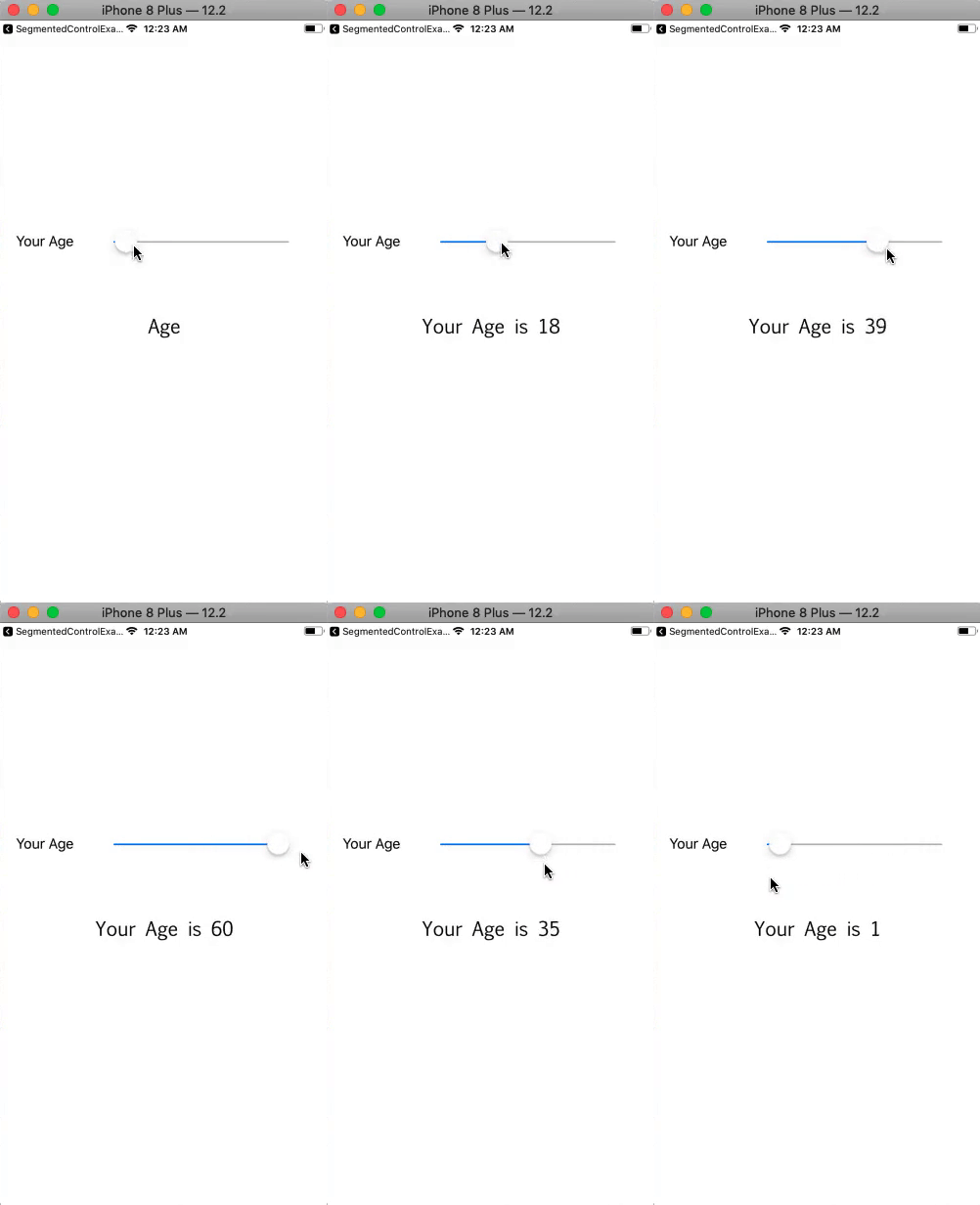
In this example, we will provide the slider to the user onto which a user can select among different values to choose his age.
Interface Builder
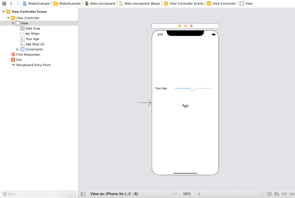
In this example, we have created a very simple storyboard, in which we have used the slider and the label to show the value of the current value of the slider. The following image shows the interface builder (storyboard) created in the project. The slider is connected to the action method, which is used to set the message label text according to the current slider value.

ViewController.swift
Output:

Interface Builder Attributes
Core Attributes
| SN |
Attribute |
Description |
| 1 |
Value (minimum/ maximum) |
It represents the float value, which is specified at the ends of the slider. The minimum value represents then leading end of the slider whereas the maximum represents then trailing end of the slider. |
| 2 |
Value (current) |
It represents the initial value of the slider, which is changed when the user interacts with the slider. It exists between the minimum and maximum values. This can be accessed at runtime by using value property on the slider object. |
Appearance attributes
| SN |
Attribute |
Description |
| 1 |
Min Image |
It represents the image specifies the leading end of the slider. This can be accessed by using minimumValueImage property at runtime. |
| 2 |
Max Image |
It represents the image specifies the trailing end of the slider. This can be accessed by using the maximumValueImage property at runtime. |
| 3 |
Min Track Tint |
It is the track tint color of the leading side of the slider. This can be accessed by using minimumTrackTintColor property at runtime. |
| 4 |
Max Track Tint |
It is the track tint color of the trailing side of the slider. This can be accessed by using the maximumTrackTintColor property at runtime. |
| 5 |
Thumb Tint |
It is the tint color of the slider's thumb. This can be accessed by using the thumbTintColor property at runtime. |
| 

 For Videos Join Our Youtube Channel: Join Now


