| |

HistogramA histogram chart is a chart that displays the shape of the distribution. A histogram looks like a bar chart but group values for a continuous measure into range. In the histogram, each bar represents the height of the number of values present in that range. To create a histogram, we need only one measure. It creates the additional bin field for the measure. For example, consider the data source such as Sample-Superstore, and if you to find the Quantities of sales for different Segment. For this, follow the below procedure step by step, such as: Step 1: Go to the worksheet. Step 2: Drag the measure Quantity into the columns shelf. 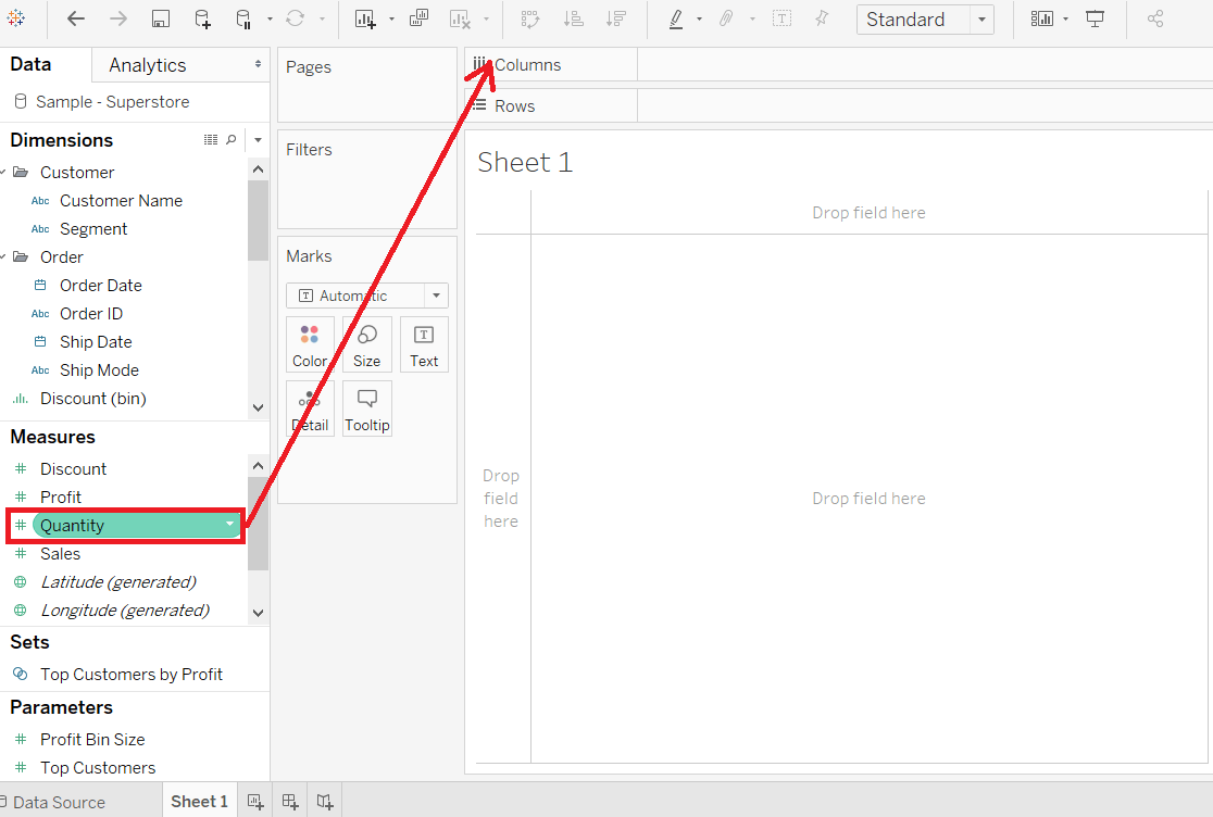
Step 3: Click on the "show me" toolbar and select the histogram chart icon, shown in the below screenshot. 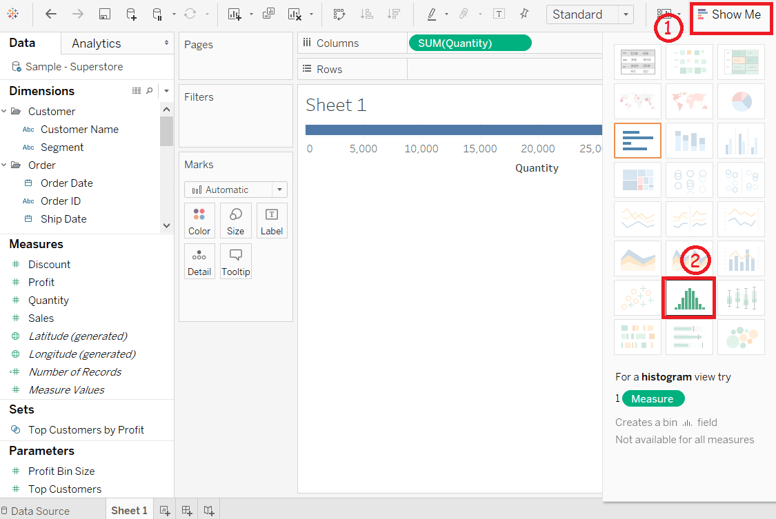
NOTE: The histogram chart is available in "show me" when the view contains only one measure and no dimensions.Step 4: After selecting the histogram chart as the chart type. Then,
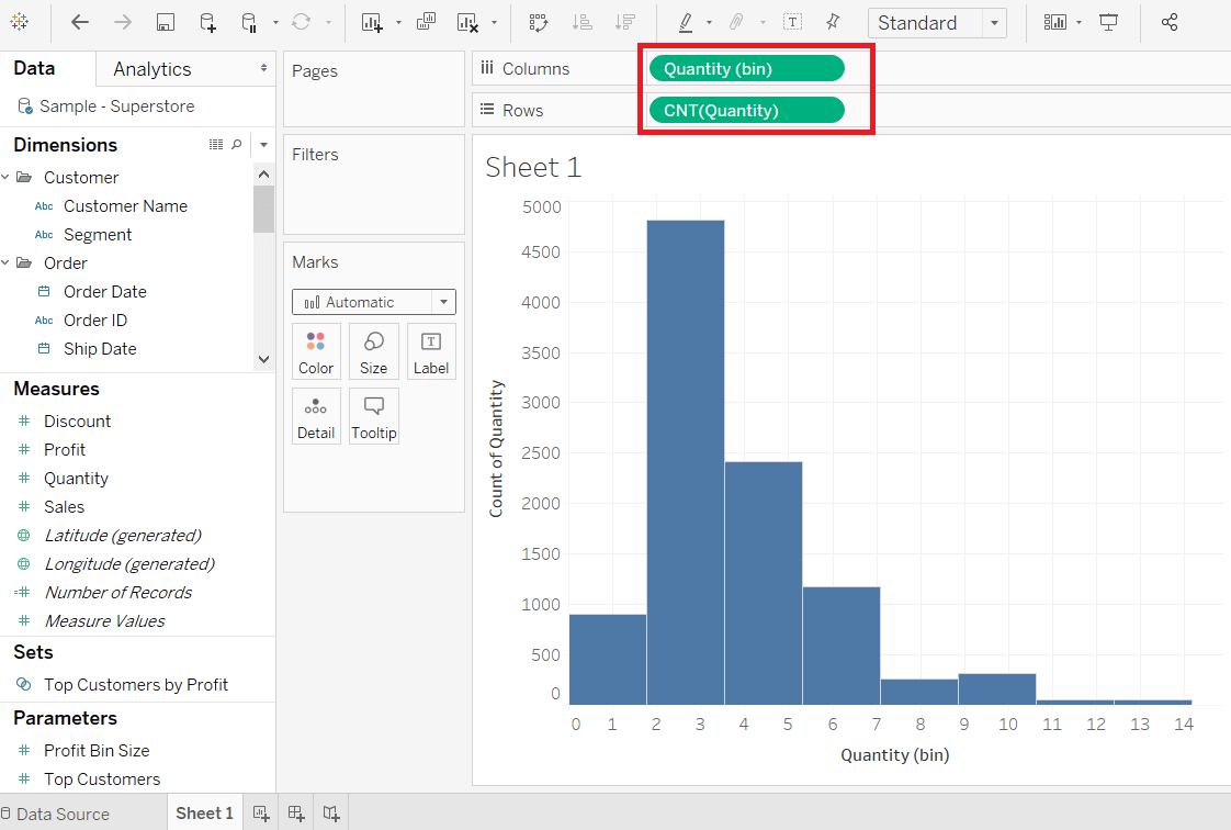
Step 5: Drag the dimension Segment and drop into the Color shelf under the Marks pane. 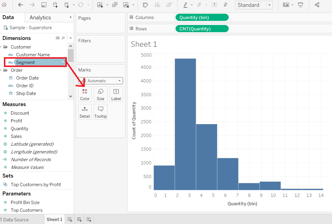
After adding the Segment field to Color shelf, you can see a relationship between the Segment field and the Quantity of item as per order is shown in the below screenshot. 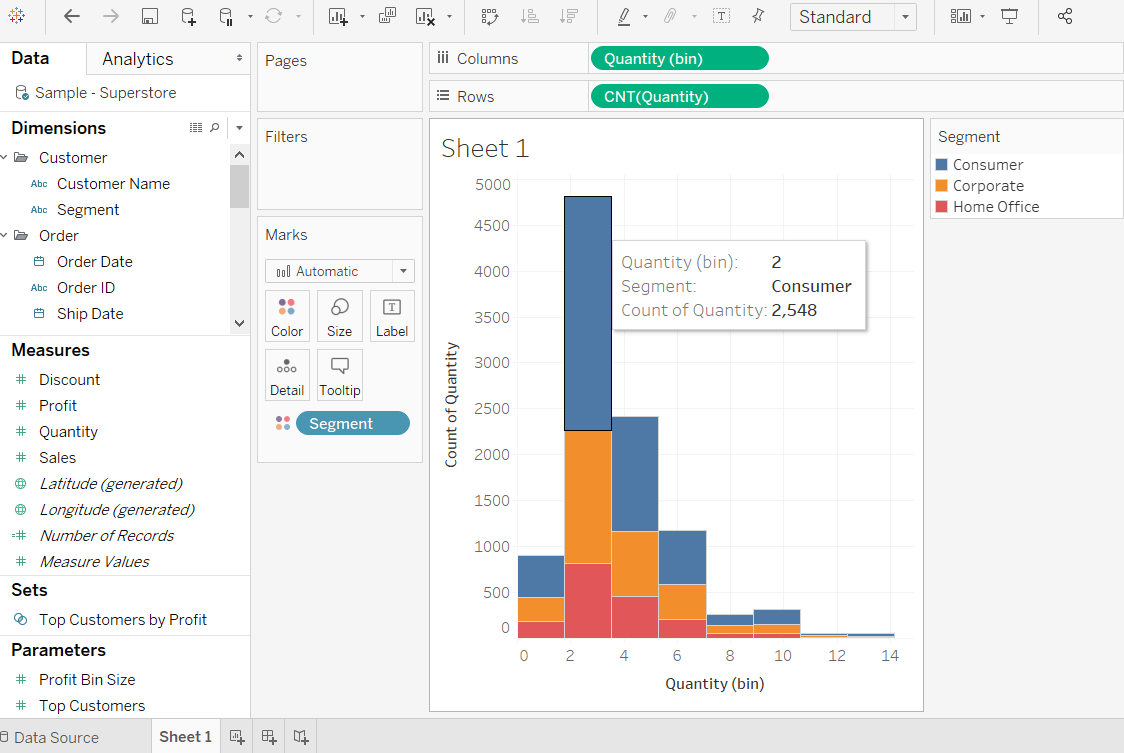
Step 6: Hold the Ctrl key in the keyboard and drag CNT(Quantity) field from the rows shelf Label shelf under the Marks pane. 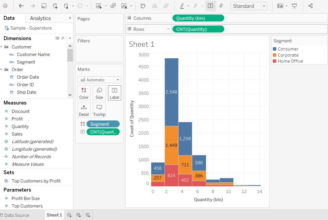
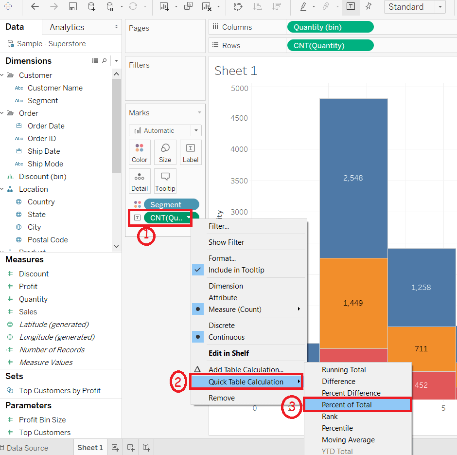
Step 7: Right-click on the CNT(Quantity) field in Marks pane. And
Now each colored section of each bar shows its percentage of total quantity shown in the following screenshot. 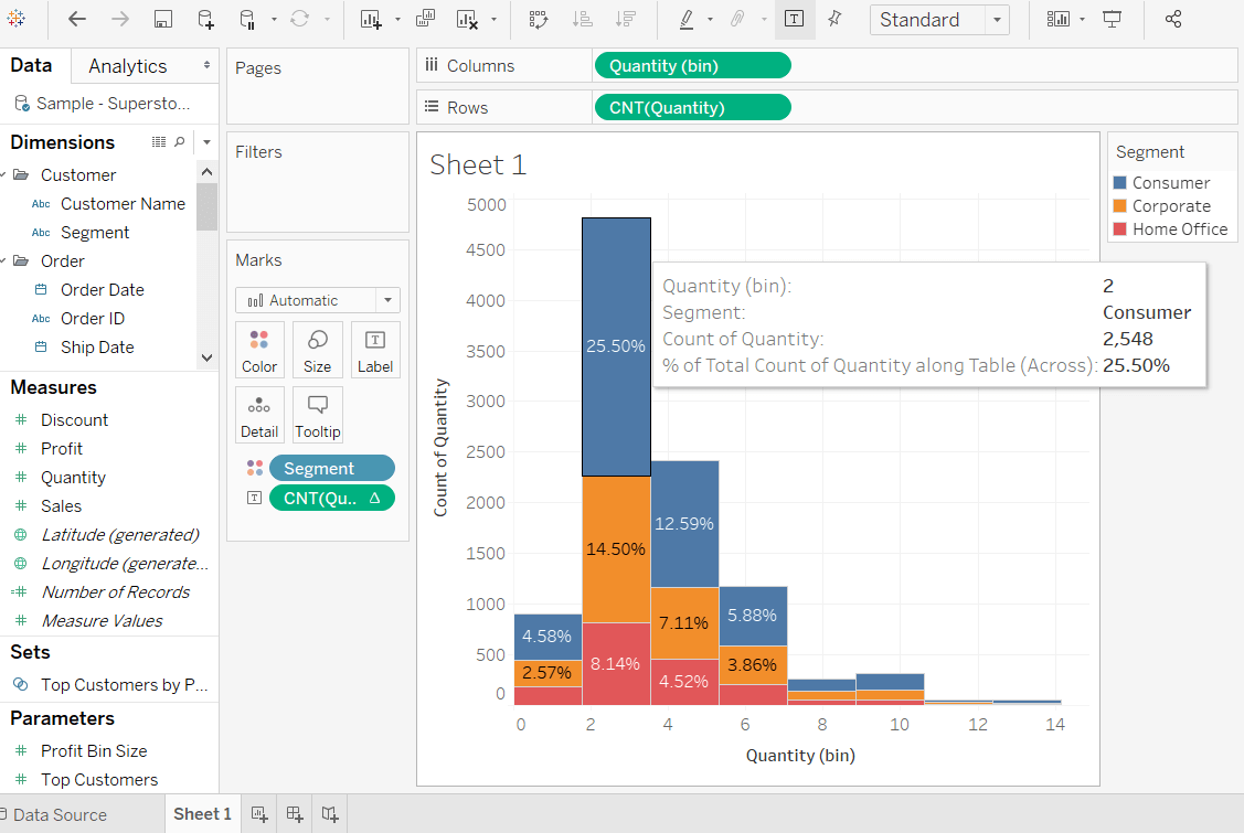
Next TopicTableau Vs. Power BI
|
 For Videos Join Our Youtube Channel: Join Now
Feedback
- Send your Feedback to [email protected]
Help Others, Please Share


