| |

Tableau Pie ChartThe pie chart shows the segment-wise data. It can show the contribution of measures over different members in a dimension. The angle of pie determines the measured value. Different colors can be assigned to pie to represent the members in a dimension. A pie chart represents the data in the form of the circle slice with different size and colors. These slices are labeled, and the numbers corresponding to each slice is also represented in the chart. You select the pie chart option from the "Show Me" pane to create a pie chart. For example, consider a data source such as sample-superstore and Choose one dimension and one measure to create a simple pie chart. Step1: Go to the worksheet. Step2: Drag the dimension Segment and drop into the Color and Label pane. Step3: Drag the measured Profit and drop into the Size pane. Step4: Choose the chart type from "Show Me" pane. The following chart will appear that shows the three segments in different colors with labels. 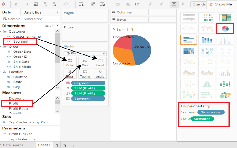
Drill Down Pie ChartYou can choose a dimension with the hierarchy or go deeper into the hierarchy. The chart changes reflect the level of the selected dimension. For example, consider a data source such as sample-superstore, then take the dimension Product, which has four more levels such as Category, Sub-Category, Manufacturer, and Product Name. Drag the measured Profit and drop it to the Labels pane. The following pie chart appears that shows the values for each slice. 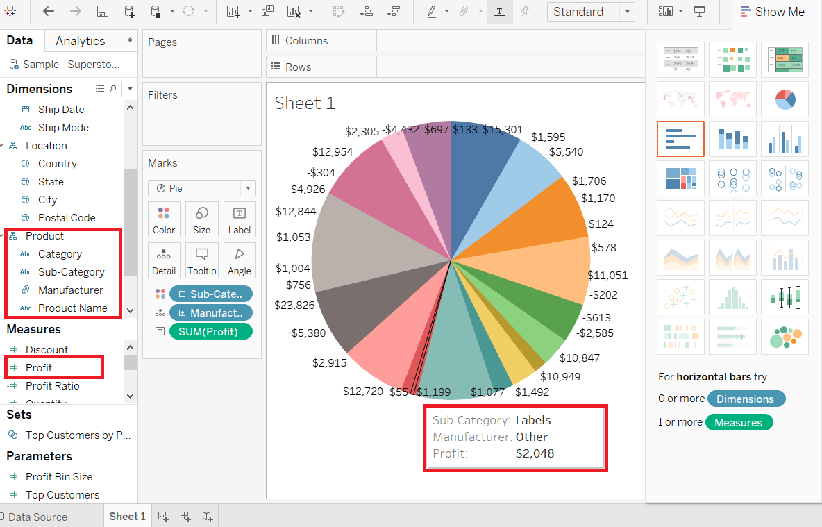
Here is one more level into this hierarchy, we get the manufacturer as the label shown in the below screenshot. 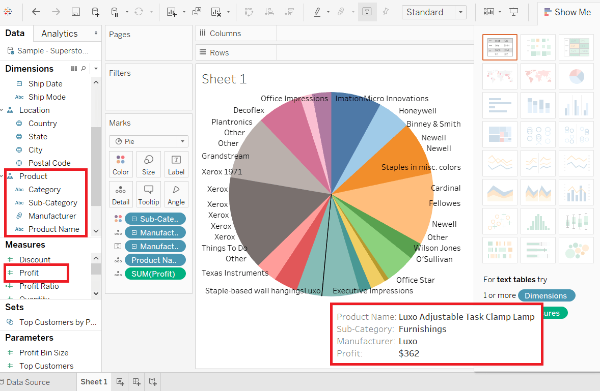
Next TopicTableau Bubble Chart
|
 For Videos Join Our Youtube Channel: Join Now
Feedback
- Send your Feedback to [email protected]
Help Others, Please Share


