| |

Tableau Scatter PlotThe scatter plot is used to visualize the relationship between the two measures. It is designed by adding measures in both x-axis and y-axis. This can show the trend or relationship between the measures selected. To create a scatter plot, you should have at least one measure in the rows shelf and one measure in the columns shelf. However, you can add the dimensions field to the scatter plot that plays a role of different color making for already existing points in the scatter graph. For example, consider the data source such as Sample-Superstore, if you want to find the variation of Sales field and Profit field as the two axes of the Cartesian plane is distributed according to their Sub-Category field. To create a scatter plot, there are the following steps, such as: Step 1: Drag the measure Sales and drop into the columns shelf. Step 2: Drag the measure Profit and drop into the rows shelf. 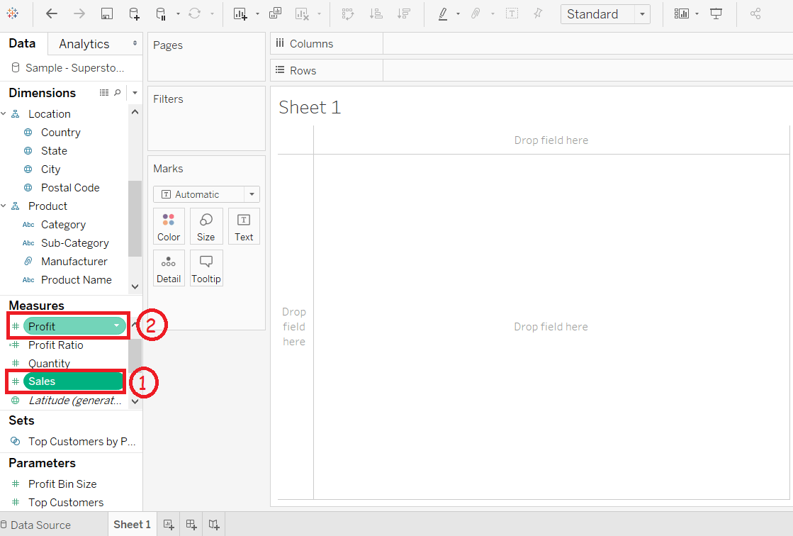
Step 3: Drag the dimension Sub-Category and drop into the Label shelf under the Marks pane. 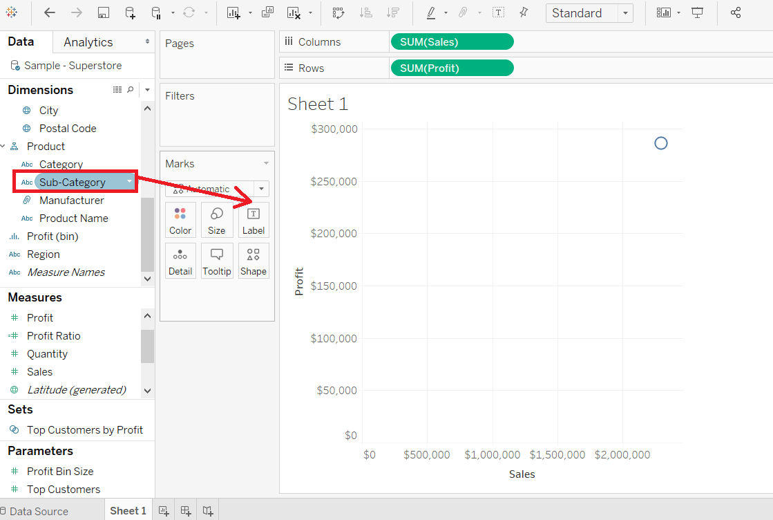
After that, it creates the scatter plot that shows how the Profit field and Sales field is distributed across the dimension Sub-Category of products. 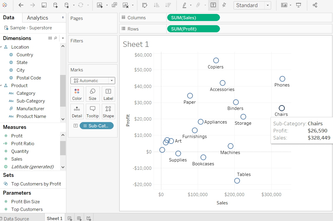
Step 4: You can also get the values color encoded after dragging the Sub-Category field into the Color Shelf. Below chart appears that show the scatter points with a different color for each point. 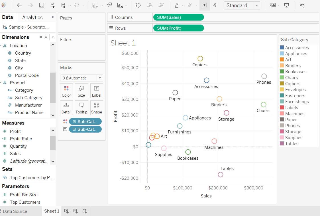
The same scatter plot can show different values when you choose a dimension with hierarchy. For example, expand the dimension Sub-Category to show the scatter plot values for the Manufacturers field. 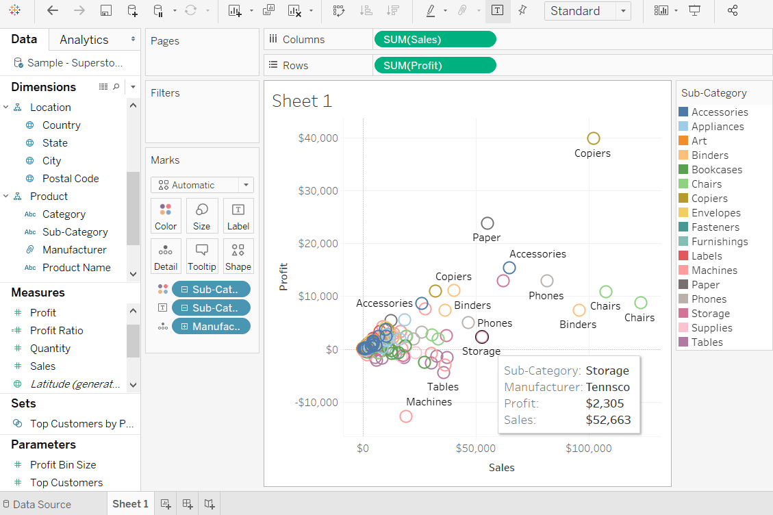
Next TopicHistogram
|
 For Videos Join Our Youtube Channel: Join Now
Feedback
- Send your Feedback to [email protected]
Help Others, Please Share


