| |

Tableau Pareto ChartA Pareto chart consists of two graphs, such as bar graph and line graph. The same measure is used to create the graph, but the measure values are handled differently. In Tableau, the purpose of using the Pareto Chart is to identify the contribution of members present in a field. For example, the data source such as Sample-Superstore, the measure Profit contributed by different dimension, i.e., Sub-Category of products which can be analyzed using the Pareto Chart. It shows the top members and their contribution. Here is the procedure to create a Pareto Chart as given below. Step 1: Go to the worksheet. 1) Drag the dimension Sub-Category into the columns shelf. 2) Drag the measure Profit into the rows shelf. 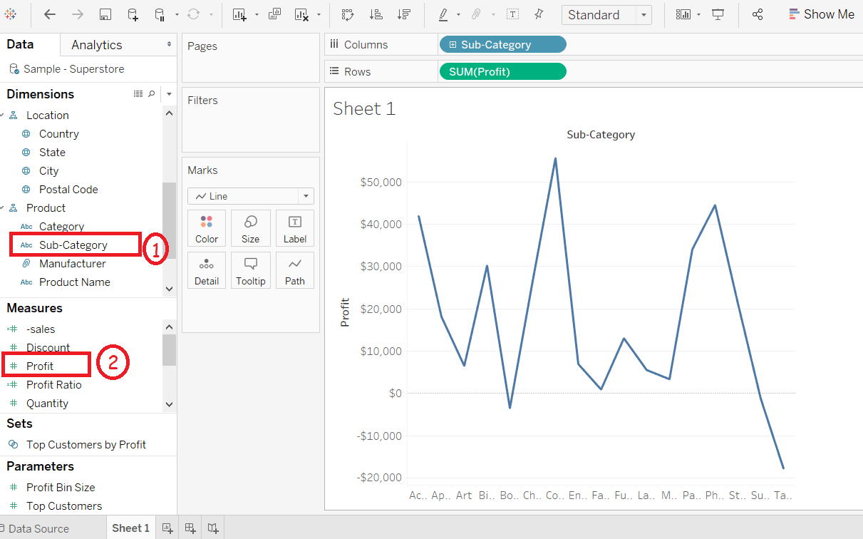
Step 2: Right-click on the Sub-Category field. Step 3: And select the "Sort" option from the list. 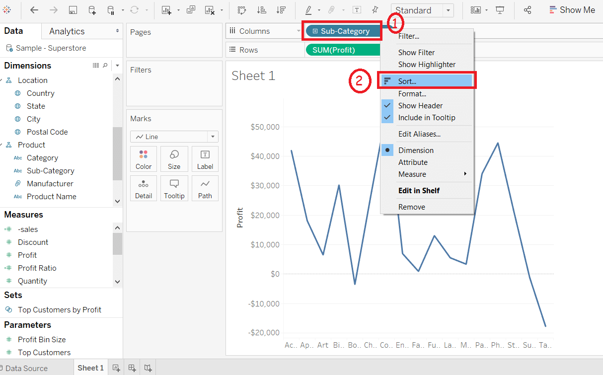
Step 4: It opens the sort window. 1) Click on the Descending option in sort order. 2) Select the Field Name option under sort section. 3) And select the Field Name as Profit and choose Sum as the aggregation function. 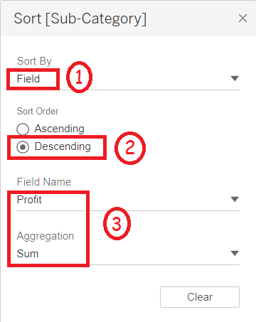
Step 5: Again, drag measure Profit into the rows shelf. Then, 1) Right-click on the newly added Profit field. 2) And select the Dual Axis option from the list. 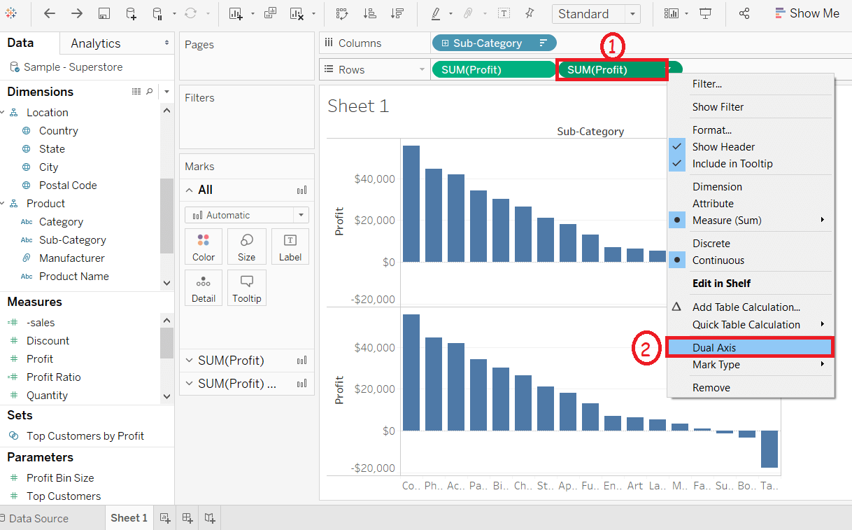
It merges the X-axes of both measures and converts the visualization shown in the below screenshot. 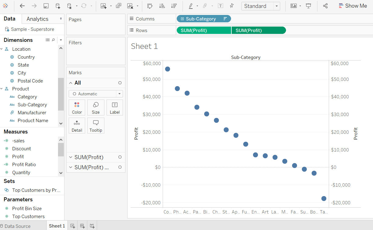
Step 6: Go to the Marks pane. And 1) Select the SUM(Profit) form the marks pane. 2) Click on the drop-down button. 3) And select the Bar chart from the list, as shown in the following screenshot. 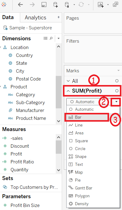
Step 7: Again, 1) Select the Sum(profit)(2) from the marks pane list. 2) Click on the drop-down button. 3) And select the line chart option from the list shown in the below screenshot. 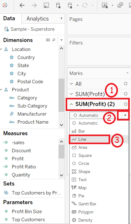
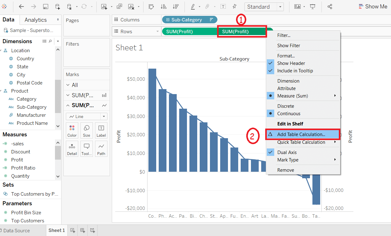
Step 8: Select the SUM(profit) on the right side of the rows shelf. 1) Right-click on the SUM(profit) field. 2) And select the Add Table Calculation from the list as shown in the below screenshot.
Step 9: It creates the "Table Calculation" window. 1) Select the Running Total option as "Calculation Type". 2) Choose Sum as the aggregation function. 3) Select Table(across) option as the "Compute Using". 4) Then click on the Add Secondary Calculation checkbox. 5) It expands further window as Secondary Calculation Type. 6) Select the Percent of Total option from the list. 7) Again select the Table(across) option as the "compute using". 8) Click on the Closing icon. 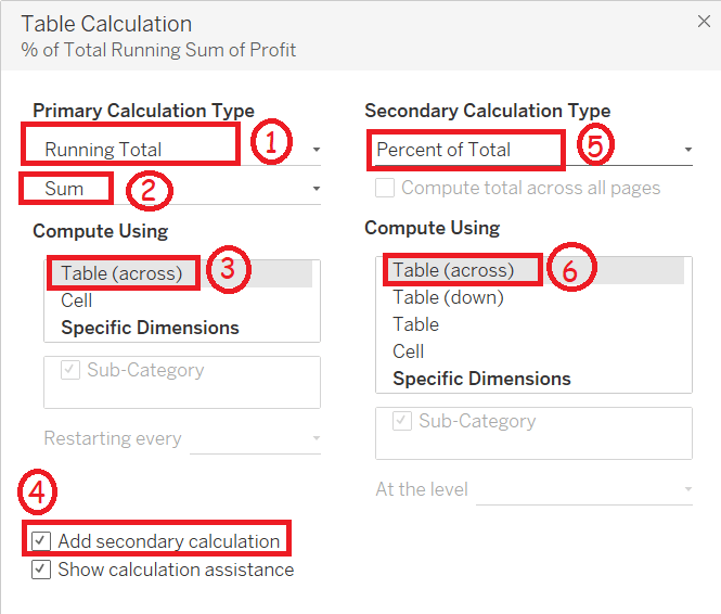
Step 10: Go to the Marks pane. And 1) Go to the SUM(profit)(2). 2) Click on the color icon in the marks pane. 3) Choose a color from the color options. 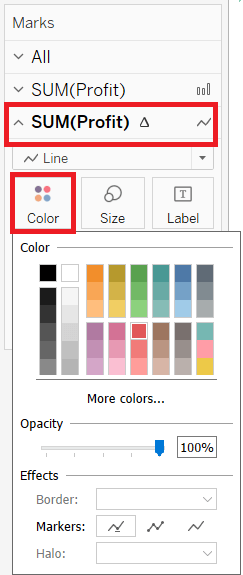
After choosing a color, you can see this color line in the graph, and this is the procedure to create a Pareto chart shown in the below screenshot. 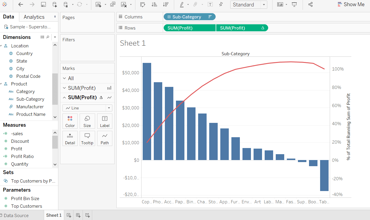
Next TopicTableau Dual Axis Chart
|
 For Videos Join Our Youtube Channel: Join Now
Feedback
- Send your Feedback to [email protected]
Help Others, Please Share


