| |

Dashboard in Microsoft ExcelFor the purpose of creating a dashboard in Microsoft Excel, we must need to create a pivot table by making use of the data set. And for every visual are required to have single pivot table. And then we can drag and place out the particular pivot table and can create a number of sheets as per our requirement. Furthermore, we can also create various others visuals by making use of the different chart types which are made available in the Chart section of the Insert menu tab, once we have created and named each Chart, after that we will be cutting them from the respective sheet and placing them in the sheet for the final Dashboard. What do we understand by Dashboard in Microsoft Excel?A dashboard in Microsoft Excel is primarily considered as the visual representation of the data, as it is basically a process in which we will be taking out all the efforts for the purpose of making our complex data look much easier to understand and could be managed through some visual techniques. Different Excel tools which can be used to create a dashboard are as follows:
And these are the various tools that can be effectively used to quickly create a dashboard and simplify the usually complex-looking data for a better understanding. What are the critical Metrics for the Dashboard in Microsoft Excel?The core of the Dashboard in Microsoft Excel primarily lies in the key metrics which are required for monitoring, and it is based on whether the Dashboard is for an organization on the whole or for the various departments like as:
Furthermore, the critical metrics for the respective Dashboard also depend upon the role as well as the functionality of the work.
And the main goal which is associated with the Dashboard is none other than to enable the data visualization for better decision-making, and the success of the various Dashboard offenly depends upon the metrics which were chosen for monitoring. What are the various benefits associated with the Dashboard?Dashboards in Microsoft Excel basically allow managers to monitor the contribution of the various departments in the different organizations, and also responsible for monitoring out the organization's overall performance, in that case, the specific Dashboard helps us to capture as well as report out the data points from each of the departments in the selected organizations, and thus providing the snapshot of the current performance and a comparison with the earlier performance in an effective manner. And the various benefits that are associated with the Dashboard in Microsoft Excel are as follows:
What are the different types of Dashboards which are available in Microsoft Excel?The different types of Dashboard which are available in Microsoft Excel are based on their utility as follows:
Strategic Dashboards We all know that the respective strategic dashboards primarily support managers at any level in an organization for the purpose of making decisions in an effective manner. And they also helpful in providing a snapshot of the given data, as well as displaying the health and opportunities of the business, focusing on the high-level measures of the performance and their forecasting efficiently:
Analytical Dashboards Now the Analytical dashboards basically include effective context, comparisons, as well as the history, and they focus on the various facets of data that are required for analysis of the data. The Analytical dashboards support effective interactions with the different data, such as drilling down into the underlying details and therefore it must an interactive nature. And the various examples of particular analytical dashboards primarily include the following ones:
Operational Dashboards And the operational dashboards are used for constant monitoring of the operations, as they are often designed differently as compared to the strategic Dashboard and also the analytical dashboards as well as focus on the effective monitoring of the various activities and events constantly changing. They might require attention and response at the moment they get notices respectively. And the operational dashboards effectively require live and up-to-date data which needs to be available at all times and they needs to be dynamic in nature. An example of an operation dashboard could be support-system dashboards which are required for the purpose of displaying the live data on the given service tickets that require an immediate action from the supervisor on high-priority tickets as well. Informational Dashboards The particular Informational dashboards are just used for the purpose of displaying the various figures, facts, and/or statistics, and they can be either dynamic or static with the live data but not interactive, respectively.
What are the various Dashboard Data and Formats available in Microsoft Excel?We all know that the respective data required for a dashboard depends primarily on its category, and the premise for the data is that it should be much relevant, must be error-free, and also up to date as well as life in action if they are required at any instance of the time by us. And the data can be collected from the various sources and in different formats which includes the following ones respectively:
And the outcome which is going to be displayed on a specific dashboard must be accurate, authentic, and apt in nature, which is very much important since the information on a given dashboard would lead to effective decisions-making, choosing best actions, and getting inferences. Thus, along with the data being displayed, the medium chosen to say is equally crucial as it should not give an erroneous impression in the data portrayal. Before building the Dashboard: what should we know?And we can quickly tell that we are about ready to start building our own dashboards respectively. However, before proceeding further, we must first lay the appropriate groundwork. And here are the few things which we want to do before getting started with a dashboard. 1. Import our data into Microsoft Excel To create a dashboard, our data must first exist in Microsoft Excel. If it is already there? Excellent?there is nothing more we need to do with this step as well: But if not? Then we all need to import it into an Excel workbook. And there are the different methods that can be opt with ranging complexities? depending on where our detailed data exists or not. So, our first job is to have effective research on how to import our data format. 2. Cleaning of our data While working with data within Microsoft Excel, each piece of information must live within its cell. If in case our existing spreadsheet is a bit of a jumbled mess, then it will take some time to get clean it up and ensure that things are organized into rows and columns. It is also wise to briefly analyze our data and ensure no glaring typos or errors jump out at us. Besides all this, an excellent time to search for any duplicate information which are required to be deleted because of the reason that each row of data must be unique to utilize the dashboard feature. Otherwise, we will be double counting. Do we want a quick way to search for the duplicates? We highlight our entire dataset and then click on the "Remove Duplicates" button. Important Tip: It is best to keep our original dataset somewhere else. That is why if we make an error, we can retrieve the data we started with. 3. Setting up our workbook Now for the purpose of creating a dashboard, we are going to need three separate sheets within our Excel workbook: Naming our first tab with something which we will readily recognize as "Data" or "Raw Data" And then, we will create a second tab which are labeled as "Chart Data," This is thetab in which we will be storing only those data which needs to be fed into the different charts for the Dashboard. And finally, we will be creating a tab labeled as "Dashboard," where our various charts will get appears. 4. Understanding our requirements as per our needs When we start familiarizing ourselves with the respective dashboards in Microsoft Excel, we will quickly realize that there are many options, that can be overwhelming?which is why it is much more important to get clear view our Dashboard creation. What are the essential features which are required to create the Dashboard in Microsoft Excel?Now we can easily create a dashboard in Microsoft Excel by just using the various features, which eventually help us to make data visualization prominent, which is considered as the main characteristic of any dashboard. And we can show data in the respective tables with the help of conditional formatting to highlight the good as well as the bad results, and we can summarize the data in charts as well as the PivotTables; we can add into active controls, and we can also define and manage KPIs and so on as well. And we will now get to know the most important Excel features that come into our hands when we are creating a dashboard effectively, as these features will help us to arrive at the dashboard elements that will simplify the various complex data and then provide the visual impact on the current status in real-time as well. Excel Tables And the most important component of any respective dashboard is the data, which can be from a single source or multiple sources. The particular selected data might be limited or span to several rows effectively. The Microsoft Excel tables are well suited for getting the data into the workbook which we want to create the Dashboard. And various methods can be used to import the data into the Excel sheet by just establishing connections to multiple sources. And this makes it possible to refresh the data in our particular workbook whenever the source data gets updated respectively. Sparklines We can use the Sparklines in our Microsoft Excel tables to show the trends over specific intervals of time. Besides all this, the respective Sparklines are the mini charts that can be efficiently placed in a single cell, and we can also use charts such as Column charts, line charts, or win-loss charts to depict the trends based on our data as well. Conditional Formatting Now the particular conditional formatting is basically considered to be a big asset which can also be used for the purpose of highlighting out the data in the given tables. And we can also define the rules by which we can vary color scales, data bars, as well as the icon sets. One can also either make use of the Microsoft Excel-defined rules or create our own rules that are based on the applicability to our data. Excel Charts Microsoft Excel charts are the most widely used data visualization components for the various dashboards, and much more, we can quickly get the audience view for the data patterns, comparisons, and trends in data sets of any size, strikingly adding color and styles, Besides all this, Microsoft Excel has various built-in heart types such as line, bar, column, scatter, bubble, pie and radar if we make use of the Microsoft Excel version 2013. Excel Camera And once when we are creating out the respective charts, then, in that case, we are required to place them in our Dashboard, and if we wish to make our Dashboard looks much dynamic in nature, so with the data getting refreshed each time the source data will also bring various changes, and we would like to provide an interface in between of the charts in our Dashboard and the data at the backend as well, and this could be achieved with the help of Camera feature present in the Microsoft Excel. Excel PivotTables When we have large sets of data, and we are like to summarize the results dynamically, showing the various facets of the analysis results, then in that case the Excel PivotTables come in handy to be included in our Dashboard. And we can make use of either the Excel tables or the more robust data tables in the data model for the purpose of create the PivotTables. The main differences between the two approaches are as follows:
How can one easily create a Dashboard in Microsoft Excel?Now in this we will be seeing how one can easily create the Dashboard in Microsoft Excel with some examples for the better understanding. # Example 1: Creation of a Dashboard by making use of the Data Let us assume that we have sales data, which primarily gets spread across the months for the past few years, 2017 and 2018. After that, we are required to create a dashboard by making use of this data as well. 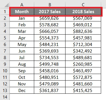
Now on moving further we will be adding out the Data Bars for this data and can easily see the comparison across the sales for the past two years. And for that, we will be following out the below-mentioned steps: Step 1:Firstly we are required to cut out the column which is named 2017 Sales and then pasting it before the Month column so that we can have a comparative view on both the sides of the Month column. We will having a 2017 Sales on the left-hand side, and on the right-hand side, we will be having 2018 Sales data. 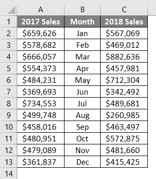
Step 2:Now in this step, we will be selecting out all the cells given in the respective column A, and then will move to the Conditional Formatting dropdown under the Home tab and will click on the Data Bars navigation option. And there, we will see a series of options for the data bars. Out of all those, we will be then selecting More Rules and click on them. 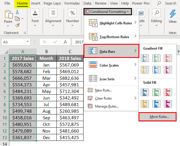
Step 3:A "New Formatting Rule" window will pop up on our screen as soon as we click on More Rules. We can now define out the various new rules for data bars or can edit the ones which have been already created. 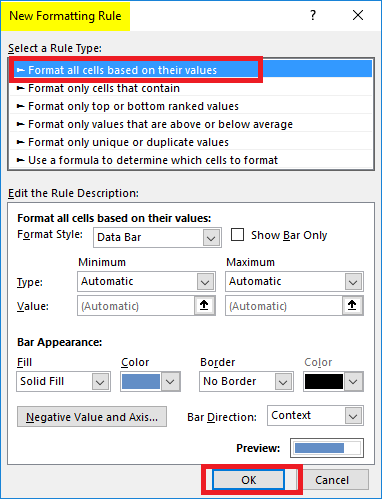
Step 4: Just after that, we can see the available rules, from which we will be choose the one with the name "Format all cells based on their values" as a rule. And under Edit the Rule Description, we will be changing out the minimum as well as maximum values and also the bar colors present under Bar Appearance. 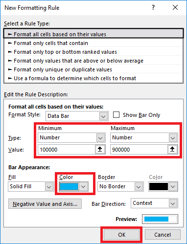
Step 5:Now just under Bar Direction, we will be then changing out the direction to Right-to-Left and press on the OK option as well. 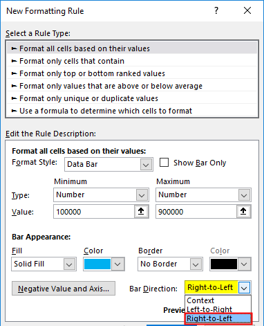
After that, we will be able to see data bars which are added for 2017 Sales, as depicted below. 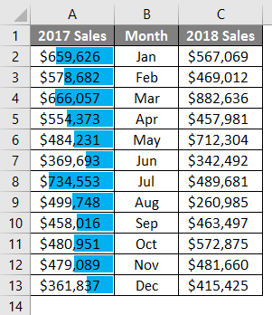
Step 6:In this step, we will do the same for 2018 by just changing the Bar Direction from Left-to-Right. After that, we are going to make use of the Microsoft Excel Camera tool that can be used for the purpose of adding the snap of this Chart which is present just under the dashboard tab efficiently. 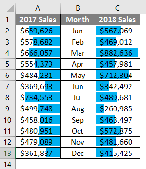
And the camera tool can be easily activated by just clicking on File - Options - Quick Access Toolbar - and choose a command from a tab -select All Commands - Camera option- Add and click on the OK option. Once enabled/added on the main ribbon, we can see a Camera button at the Quick Access Menu bar respectively. 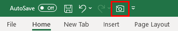
Step 7: After that, we will be selecting out the data across cells ranging from A1 to C13 in the Data tab from Excel and will click on the Camera button to take a screenshot of this chosen data. 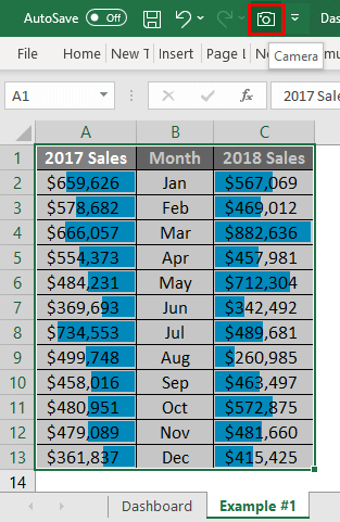
Paste it under the Dashboard tab as well. 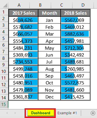
# Example 2: By making use of Pivot Table in Microsoft Excel Dashboard 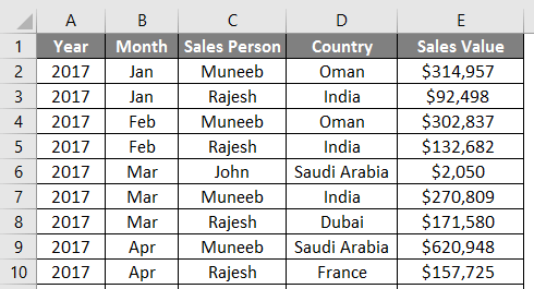
Now let us use the Pivot Table as an example for the Dashboard. So now in this particular example, we will see how one easily adds the pivot charts as well as the slicers in the selected Dashboard. 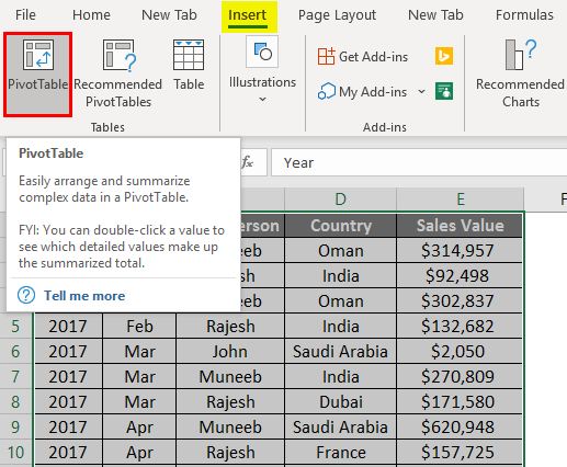
Step 1: We are required to select out all the data that is ranging from cell A1to E93 and then will click on the Insert tab. After that, we will be choosing the PivotTable option from the list of choices available to insert as it will be opening upthe Create PivotTable window; in that we will be selecting the New Worksheet for the generation of the Pivot table, and click on the OK button. 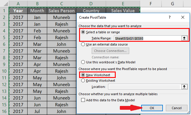
Step 2: Now in this step, we will be then molding out the pivot as per our requirements. And then, we will add the Sales Person in rows, Country names in columns, as well as the Sales Value just under the values section. 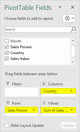
Now after that, we will be adding the pivot chart under our Dashboard by making use of this pivot table as a data source respectively. Step 3:We will be then clicking on the Analyze tab which are present on the Excel ribbon, and will click on the PivotChart option, under the Tools section, to get the insights of the chart options that needs to be get added. 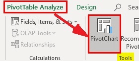
Step 4:And when we click on the PivotChart option, we will be able to be get encountered with a series of chart options which are available just under a new window Insert Chart. And now, we will click on the Bar button, present inside the Insert Chart option, and will select the 3-D Stacked Bar option to have a stacked bar chart 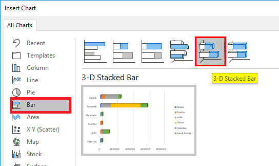
And the best thing about the pivot charts is that we can apply the filters to the different column values and then model them in real-time. Step 5: In this step, we will be selecting the Chart area and then will click on the Camera button to capture it efficiently. 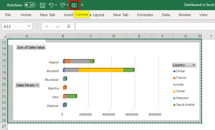
What essential things need to be remembered about the Dashboard in Microsoft Excel?The various essential things that need to be remembered by an individual while working with the Dashboard in Microsoft Excel are as follows:
|
 For Videos Join Our Youtube Channel: Join Now
Feedback
- Send your Feedback to [email protected]
Help Others, Please Share


