| |

Excel Pareto chartA Pareto chart is also known as a Pareto diagram. It is a statistical chart that is based on the Pareto principle and represents the major cause/problem in an order. Pareto chart is a kind of histogram that contains both vertical and horizontal bars. Or you can say that the Pareto chart is a combination of bar chart and line graph. Using the Pareto chart, you can perform Pareto analysis. It is an advanced type of chart of MS Excel that is not generally used, but sometimes you need it. You can find this chart under the Histogram category chart. This chapter will show you to create and use the Pareto chart. In this chapter, we will cover various points related to the Pareto chart and as well as examples. These are -
Remember one thing that the Pareto chart is available in Excel 2016 and later versions. If you do not have 2016 or later versions, you can do the same process by combining the column chart and line graph. Pareto chart = Column chart + Line graph Types of Pareto chartThere are two types of Pareto charts in Excel -
Static Pareto chartA static Pareto chart is a simple chart to represent the entire data. There is no option exist that allows the users to see the data corresponding to particular values. You can create a Pareto chart to analyze the data and find out the problem. Dynamic Pareto chartDynamic Pareto chart is a chart in which users can adjust the values and see the result for real-time updates. In dynamic chart, the Excel users can see data corresponding to a particular value. We will define the several ways and types of Pareto chart through different examples. When to use the Pareto chart?Pareto chart can be considered as a powerful decision making and problem analyzing/solving tool. It can be used in various cases, such as -
In the below examples, you will learn how you can use the Pareto chart and how it is helpful to analyze the data and find the issue, if any. How Pareto chart helps to analyze the issue?A Pareto chart is a graphical way to represent the data in a visual manner. It helps the users to find the issue by arranging them in an order. It helps to resolve the biggest issue first and then all other issues one by one. Following are three important points through which you will understand how this chart will help the users to analyze the issue and resolve it.
What is Pareto analysis?You can understand the Pareto analysis as that - it states that 80% of problem is caused due to 20% of factors. You can also consider it as that by working on 20% of factors (that are the reason of problem), you can solve 80% of the problem. That is why this method is famous as 80/20 rule. Create a simple Pareto chartWe will take an example in which we will create a basic Pareto chart. With the help of this chart, we will get an overview of the chart that why and how it is used in MS Excel. Following is the data for creating the Pareto chart. 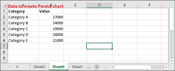
Step 1: Select the given data as usually you select one text column and one number column. 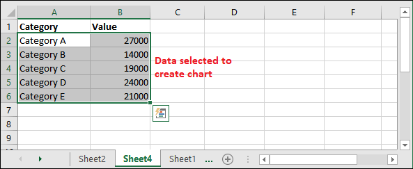
Step 2: Go to the Insert tab and click the Insert Statistic chart dropdown button under the charts group. Insert > Insert Statistic chart 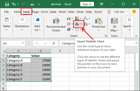
Step 3: Now, select the Pareto chart under the Histogram chart category and insert it into your Excel sheet. 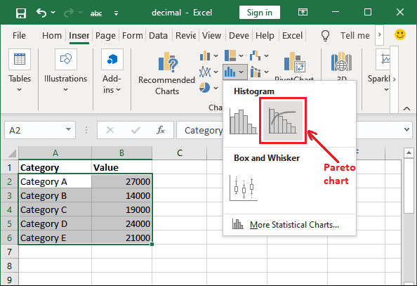
Tip: You can also go for Insert > Recommended chart > All Charts to create the Pareto chart.Step 4: The Pareto chart is inserted into the Excel sheet. The chart automatically puts the text column corresponding to the number values column as a label. 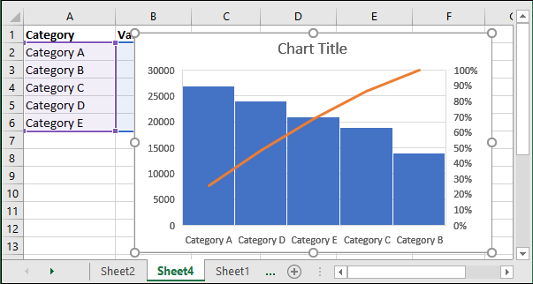
Here, you can see that categories are shuffled in increasing order of values. Set the chart Title Charts come with default title, i.e., Chart Title. Excel allows the users to provide the new chart title wherever they want. Step 5: Click on the chart title to edit it and provide a new title according to the data. 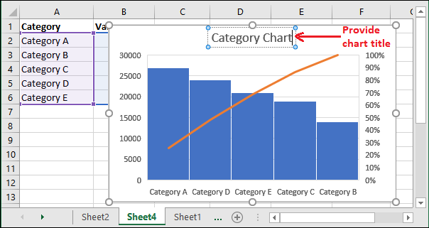
This chart is automatically set the values according to the data. You do not need to put effort to set the chart label and categories as other charts. Display the exact values on bars You can make your Pareto chart more informative by using its related options. Till now, you have seen the value through bar, but they are not showing the exact value. Step 6: Double-click on the inserted chart that will enable some options in the right window of Excel. Here, click the Chart Options dropdown button and select Series Data Label from the list. 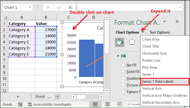
Step 7: Select the Label Options here. 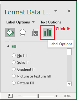
Step 8: Here, expand the Label Options and then mark the Value checkbox. It will add the exact values to each bar in the bar. 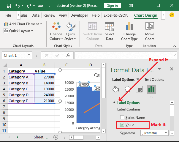
Step 9: See that each bar is now showing exact value through each bar along with visual representation. 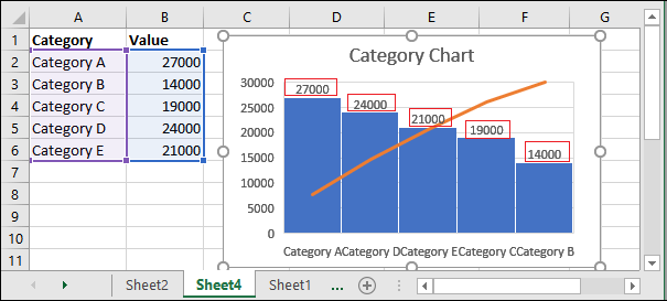
This chart is now more informative and defining each parameter of the Excel data. Modify the value The vertical bars change their length automatically if you modify the value inside Excel data. So, we will modify the value of Category C from 19000 to 25500 in its corresponding cell. Step 10: We have changed the value corresponding to the category C cell so that the bar is also changed. 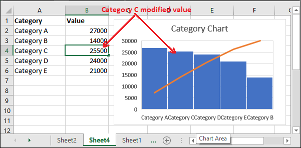
If you notice, you will see that when the Category C value was 19000, its respective bar was at second place from the right in the Pareto chart. But when the value changed to 25500, the Category C bar moved to fourth place from the right. Delete the value In case if you delete any of the category values, then its respective vertical bar will also be deleted from the chart. Step 11: See that - this time, we have removed the Category E value inside excel data. Hence, its respective bar inside the chart is also deleted. 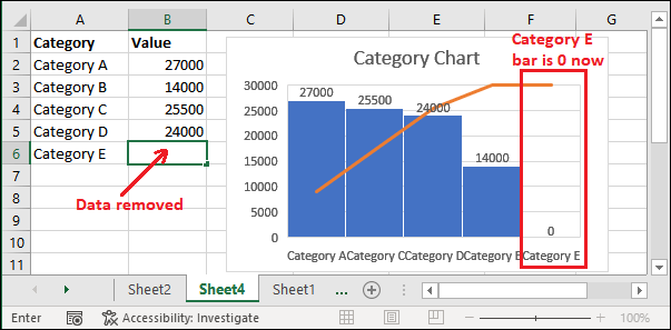
In that way, you can work with the Pareto chart for Excel data. Create Static Pareto chart to analyze the complaintsLet's take a real scenario for which we will create a Pareto chart to analyze the data. Scenario An e-commerce company like amazon is less popular even after too many years. So, the company CEO wants to find out the reason behind it that why users are not visiting their website and using it. He has done a survey and took the customers feedback for not using the product. He has collected all this data in an Excel sheet, which is as follows - Feedback for e-commerce data 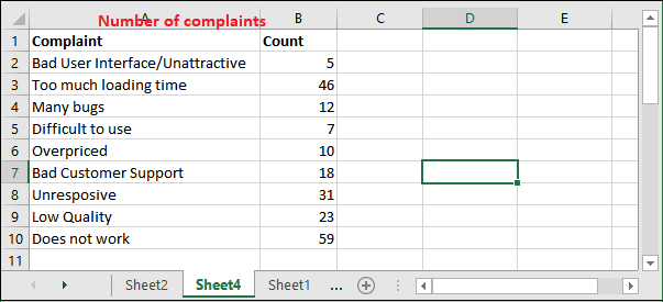
You can easily analyze and find out the biggest problem inside the small set of data by just seeing the excel data. When the data is too large, it is good to create a Pareto chart and then resolve the issue. Step 1: Select the given data and navigate to the Insert tab, where you will get the Insert Statistic chart dropdown button and Recommended Charts under the Charts group. 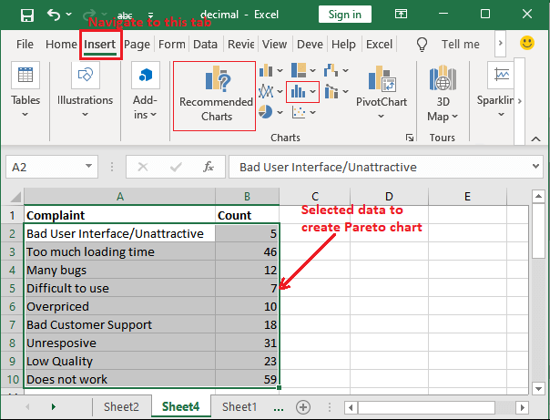
Recommended Charts and Insert Statistics Chart both contains the option to insert a Pareto chart. This time we will go for Recommended Charts option. Step 2: Click the Recommended Charts button here. 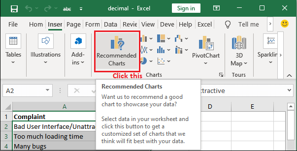
Step 3: An Insert Chart panel will open where you move to the All Charts tab. 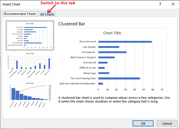
Step 4: On the left sidebar, select the Histogram to open its related options. You will get two charts here, i.e., Histogram and Pareto. 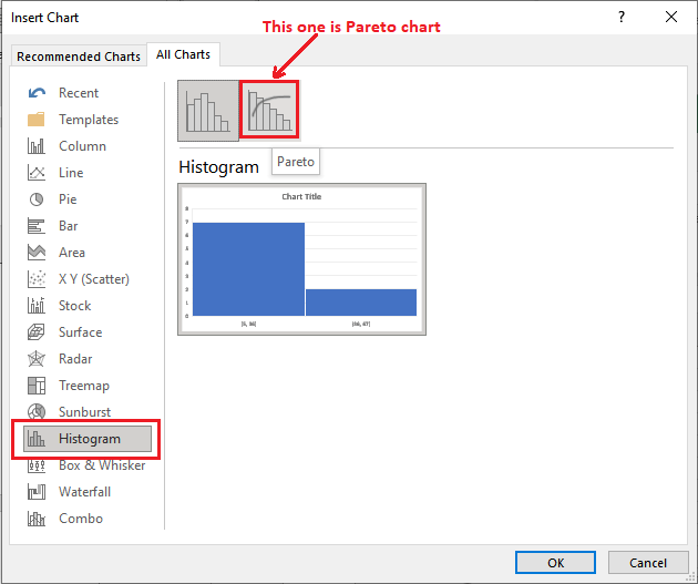
Step 5: Select the Pareto Chart and click OK. You can also see that how the Pareto chart looks. 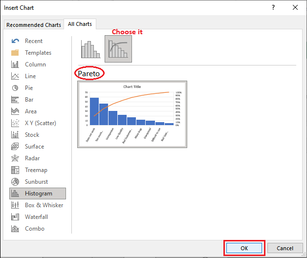
Step 6: The selected chart is inserted into the Excel sheet. 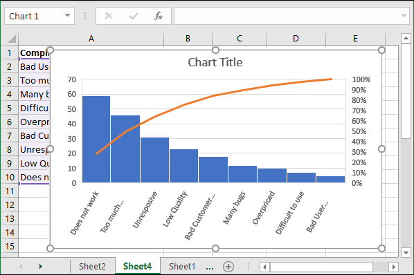
Here, you can see that the data is shuffled to show the greatest problem at first and the lowest problem at last so that the user can find and resolve the biggest problem first. Step 7: Click on the chart title to edit it and provide a new title according to the data for which you are designing the chart. 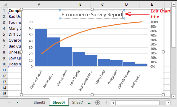
Tip: The Pareto chart sets almost all chart data automatically. It is a self-explanatory chart that does not require setting up too many things explicitly.Display the exact values for each bar Currently, you are seeing the bars in decreasing order for a number of problems. We will make this chart more informative by adding the exact value for each bar in this chart. Step 8: Double-click on the inserted chart and click the + sign (called Chart Elements) near the chart that has been appeared on selecting the inserted chart. 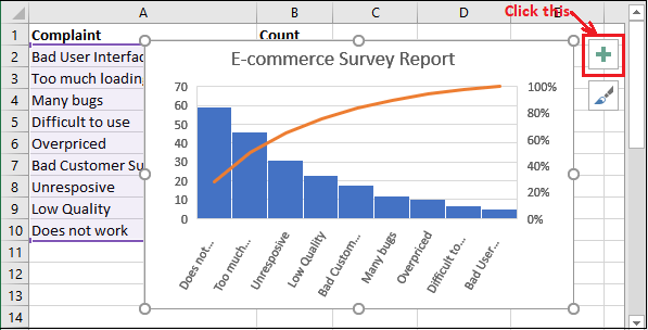
Step 9: Mark the Data Labels checkbox that is enabled by clicking the Chart Elements (+) option. 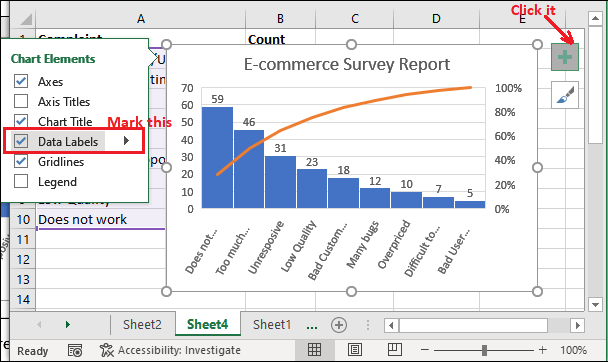
Step 10: See that each bar now has the exact value for each problem through the bar. 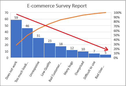
This chart is now more informative and defining each parameter of the Excel data. Analyze the chart data Now, it's time to analyze the inserted chart data because the user must know how to analyze the data. We have a complete chart now. So, try to understand it and find the problems through visual representation. We have this chart for the specified problem -
ProblemYou can find out by seeing the chart that the biggest reason why the customers are not using the specified e-commerce website. Biggest issue of not using the website: Website does not work fine Lowest reason of not using the website: It has a bad user interface SolutionNow, the company CEO know the main cause of not using his e-commerce website. He can now order their software team to update the website interface, processing, and all the technical issue. So, it becomes attractive, responsive, and fast loading time. In this way, the Pareto chart helps the users to find the problem in less time and resolve the issues. Analyze the problem using column chart and line graphPareto chart is only available in Excel 2016 and later versions. So, if you are using an earlier version of MS Excel, you will not find the Pareto chart in it. But you can do the same process by combining the column chart and line graph, which is equal to the Pareto chart. We will use the same e-commerce complaints data as used in the above example. So, you can compare both charts and see they are same. This data is not arranged in order yet. Firstly, arrange the complaints data in descending order to move forward in the way of creating the chart. Step 1: To do this, first go to the cell whose column data you want to sort and then click the Sort & Filter button inside the Home tab. 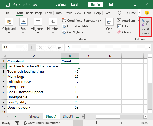
Step 2: Click the Sort Z to A to sort the number of complaints data in descending order. 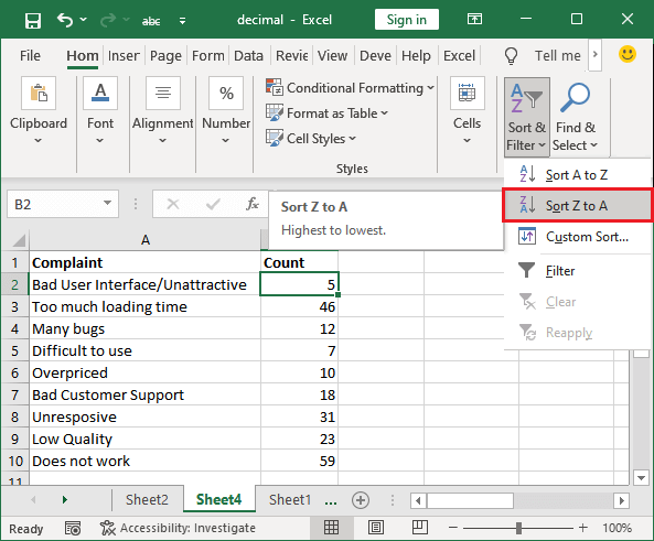
Step 3: Create a new column and name it as Cumulative Count. Now, place the first value manually same as the highest count for the number of complaints. 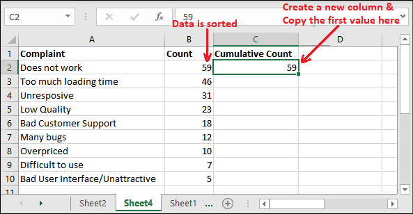
Step 4: Next, write the following formula in C3 cell to calculate the cumulative count. =(C2+B3) 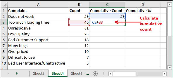
Step 5: Hit the enter key and see the calculated value. Now, select the cell C3 cell (calculated value) and drag down the cumulative percentage formula below. 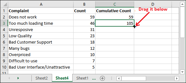
"Cumulative impact is an effect that is being caused due to defect happening over a long period of time." Step 6: See that cumulative % values are calculated for all complaints. 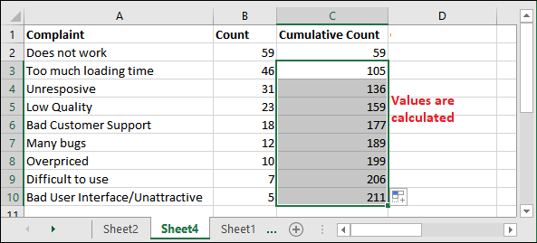
Step 7: Create one more column named it Cumulative % and then write the given formula in the first cell (D2 cell) to calculate the cumulative percentage. =(C2/$C$10)*100 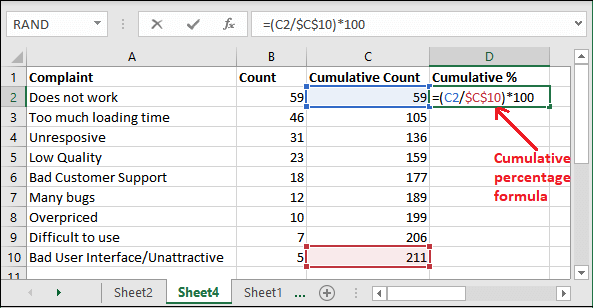
Step 8: Hit the Enter key and get the calculated cumulative percentage for the "Does not work" complaint. 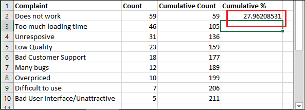
Step 9: Now, select the cell D2 cell and drag the cumulative percentage formula below down. 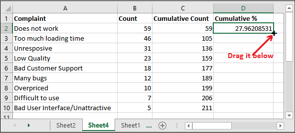
Step 10: Look at all the calculated cumulative values in the below screenshot. 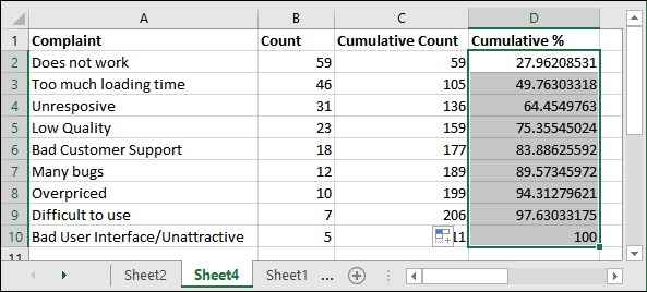
Now, we have all the needed data to a create chart like Pareto. Step 11: Now, select columns A, B, and D by holding the Ctrl key. 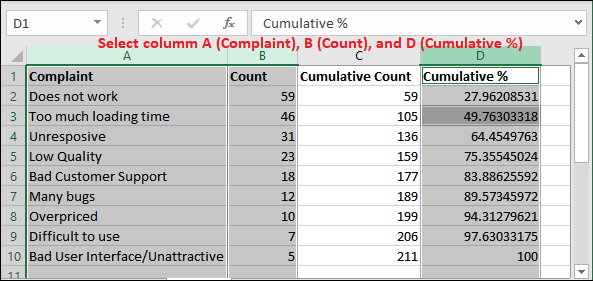
Step 12: Go to the Insert tab and click the column chart and select the clustered chart. Insert > Column Chart > Clustered Chart 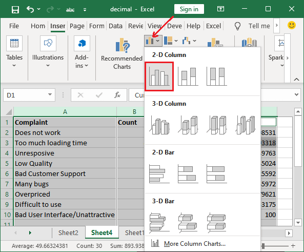
Step 13: A 2D column chart has been inserted into the Excel sheet. 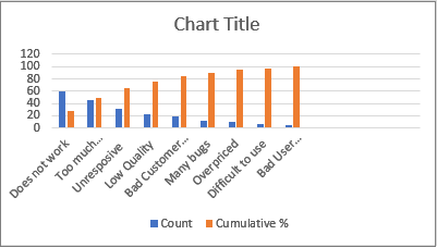
Step 14: On this chart, select the orange bars and right-click on one of them and click the Change Series Chart Type in this list. 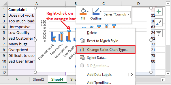
Step 15: A panel will open where click the corresponding dropdown button to the Cumulative % and select Line with Marker. 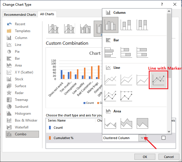
Step 16: Now, mark the Cumulative % checkbox and click OK to save all the changes done here. 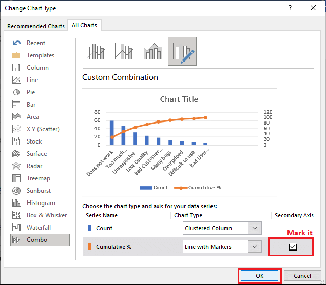
Step 17: See that your chart looks like the Pareto chart and represents the same data as the Pareto chart. 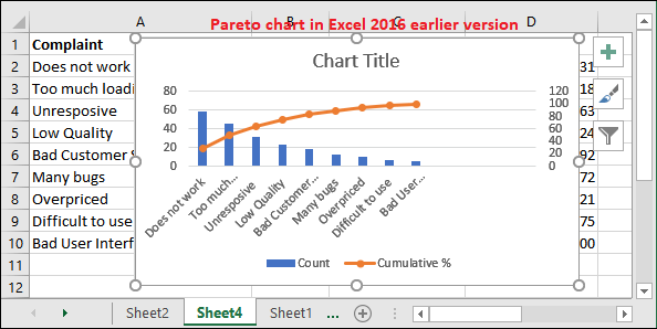
You can now set the chart title and do the same thing as the Pareto chart. No need to be worried about using an earlier version of Excel. You can create a Pareto chart in them, but the process is lengthy and time taking. Advantage of using Pareto chartPareto chart has some advantages over other Excel chart, which are as follows -
Next TopicColumn Chart
|
 For Videos Join Our Youtube Channel: Join Now
Feedback
- Send your Feedback to [email protected]
Help Others, Please Share


