| |

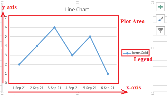
Line Chart ExcelMS Excel is one of the popular spreadsheet software with a wide range of powerful features. It also allows various ways to present data. We can represent or display our data in graphical formats using different worksheet objects, such as charts, images, shapes, etc. Line Charts are one of the great ways to represent our spreadsheet data in different analytical fields. In this article, we discuss the line chart and creating a simple line chart with the help of step-by-step instructions and relevant screenshots. What is a Line Chart in Excel?By definition, "a line chart is a simple but powerful graphical object used to display a series of data points linked through straight lines, highlighting the significant changes over time." Line charts are also termed as the Line Graph, Line Plot, Run Chart and Curve Chart. These charts are mainly used in science, analysis, and statistics to display the trends over a specified period. These charts are considered convenient as they display the supplied data and the respective trends very accurately. Line charts use data points in the form of markers because they typically link straight lines. Components of Line ChartLike the other essential charts, line charts also include the components like the X-axis, Y-axis, Legend, and Plot area:
Types of Line ChartsThe following are the essential types of line charts in Excel:
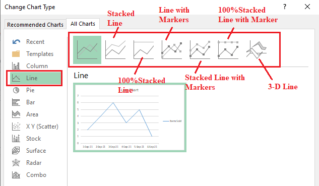
Stacked LineStacked line charts help to display different sets of points that have been connected using a single line. The lines drawn in this type of chart do not overlap. This is because the plotted lines are cumulative at each point. Furthermore, stacked line charts do not represent both positive and negative values simultaneously. 100%Stacked Line100%stacked line charts are identical to the stacked line charts. It is a typical type of line chart where the plotted lines don't overlap and remain cumulative at each point. Additionally, the plotted lines depend upon the supplied data set. The y-axis always represents the data in percentage (%) in 100%stacked line charts. Line with MarkersAs the name suggests, these line charts have simple lines plotted as per the supplied data. However, the data points are highlighted using markers. The markers may vary depending on the configurations. They can be circles, triangles, squares, or any other shape, marking the plotted data. Stacked Line with MarkersThe stacked line chart represents various sets of points linked through a line, and when the corresponding data points are highlighted with markets, they are called stacked lines with markers. 100%Stacked Line with MarkersThese types of line charts are almost similar to the 1005stacked line charts. However, unlike the 100%stacked line charts, the data sets are highlighted with markers in the 100%stacked line with markers charts. 3-D LineThe 3-D line charts are used to display data more clearly with 3-D visual effects. These types of charts are good to display various information all at once on the plot area. Features of Line ChartsThe following are some essential features of the line chart in Excel:
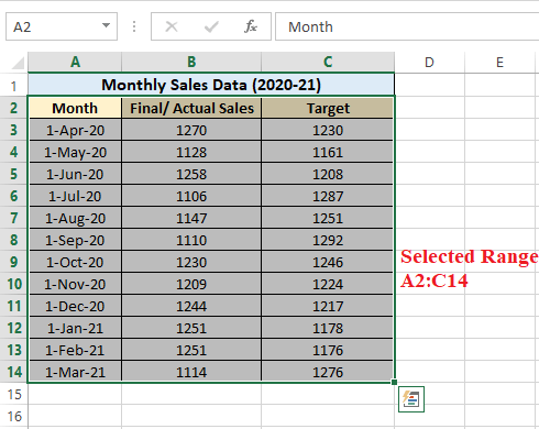
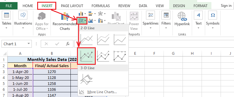
How to create a Line Chart?Creating a line chart is as simple as plotting any other chart type. We can include many lines and multiple data points for each category. However, it is always recommended to keep it as minimal as possible. Because of the several lines on the plot area, it becomes complex to understand the results when lines overlap. Let us understand the step by step process of creating a line chart with the help of an example:
Customizing a Line ChartAlthough Excel default chart styles and formatting are good, we can make custom customizations as desired. The simplest method to quickly change the style of the inserted line charts is to use built-n chart styles. Once we have inserted a line chart, we can navigate the Design tab and access a wide range of available chart styles. We can see a preview of each style by hovering the mouse over them. 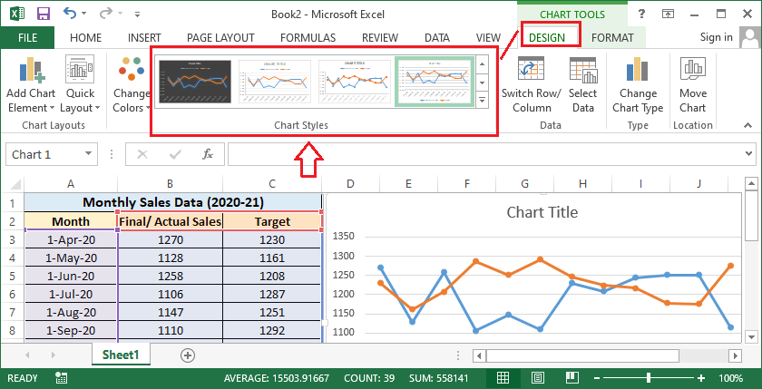
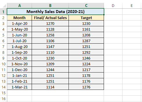
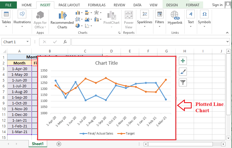
Apart from the existing chart styles, we can customize almost everything manually, including various chart elements. Some essential customizations are as follows: Adding a Line Chart TitleWhen we insert a line chart in our sheet, the chart title is also inserted. It is usually located on the top area of the chart with the text 'Chart Title'. However, we can edit the text and enter the desired title. For this, we need to click on the graph object 'Chart Title' and then type the title suitable for the supplied chart data. In our example line chart, we have entered the title 'Monthly Sales Data (2020-21)', as shown below: 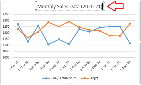
Adding AnnotationsAdding annotations in a line chart can help in making the graphic presentation more meaningful. It can draw a little focus on any specific part of the information about the inserted chart. To insert an annotation within the chart, we need first to select the specific chart and then click on the Insert tab on the ribbon. Next, we must select the option Text Box from the shortcuts under the Insert tab. 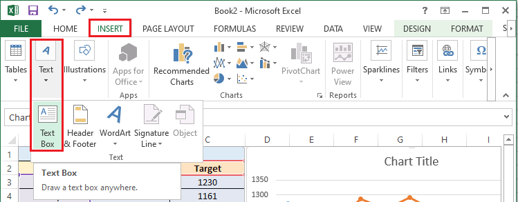
After clicking on the Text Box icon, we need to click on the area within the chart where we wish to insert an annotation. It will enable a text box in the specific area, and we can type the desired annotation using the keyboard. 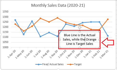
Adjusting Legend PositionWe can change the position of the legend according to our requirements. For this, we must right-cling on the existing legend and select the option 'Format Legend' from the list. 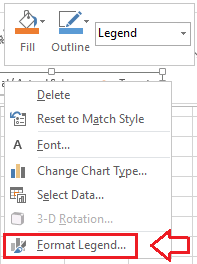
It will display formatting options for the legend position. We can mark the radio button of the desired position, and the legend will be moved to that location to the plot area. 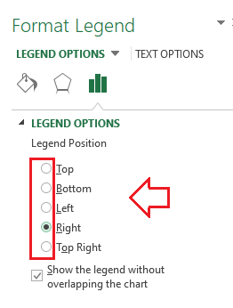
After we select the option 'Right', the legend is moved to the right side of the chart, as shown below: 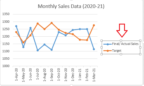
Scaling/ Changing Chart AxesWhen we insert a chart in Excel, it automatically inserts random axis values nearest the data supplied. However, we may sometimes need to start our axis at some certain value. For this, we can format the axis accordingly. To format the chart axis, we need to select the corresponding axis and right-click on it to access additional menu options. Next, we need to click on the option 'Format Axis' from the list. 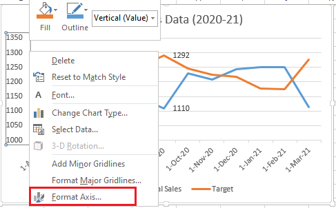
The above option will display formatting preferences for the selected axis where we can set or configure minimum and maximum values for the axis, as shown below: 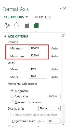
We set the min axis value to zero in our example data, and the axis now starts at 0 instead of 1000, as shown below: 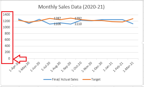
The chart axis should be changed carefully to simplify the overall presentation of the data points and the chart. Formatting Lines in a ChartWe can change the default formatting of the lines in the chart. To change the appearance of the lines in a chart, we need to select a specific line and right-click on it to access menu options. Next, we need to select the option 'Format Data Series'. 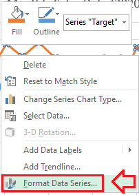
Next, we need to select the 'Line' tab (as shown in the below image). After that, we will see the variety of formatting options to modify the appearance of the selected line. It looks like this: 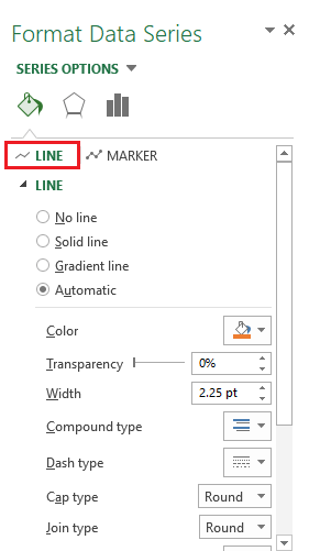
Using the options in the above image, we can use line formatting options to change line colour, transparency, line style, width, etc. Adding/ Modifying MarkersWhen we go to the Chart section of the line chart, we see different types of line charts. Some line charts have markers by default, and we insert any of them to get the chart with markers quickly. However, if we insert a simple line chart, we can add markers manually on data points. To insert markets in a line chart, we must select a specific line and right-click on it. Next, we need to select the option 'Format Data Series'. 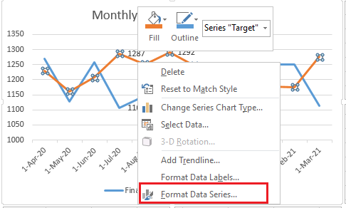
After clicking the option to format the data series, Excel displays some advanced formatting options for the selected line. We need to click on the 'Marker' tab and select 'Automatic' to get the default markers or 'Built-in' to get the customized markers. 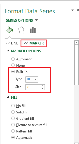
We can scroll down and access more formatting options for markers. In the below image, we have inserted customized markers in our example: 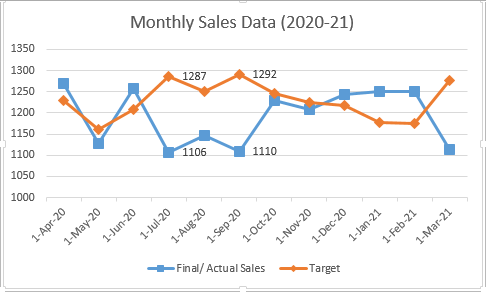
Adding and Formatting Data LabelsAdding the data labels can be helpful to get accurate information for the effective values in a line chart. We can add the data labels on each marker of a line. For this, we need to click and select the specific line or the marker and right-click on it to access additional options. Next, we must select the option 'Add Data Label' from the list. 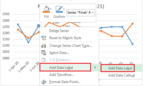
We need to perform this process for each marker separately to add data labels on few markers. Besides, we can select the entire line to add labels on all markers at once. Once the data points are added in a line chart, we do not need to assume or read the data points values from the x-axis or y-axis, depending on the chart style. However, adding data labels on all markers is not recommended when the chart has several lines on the plot area. Once we have added data labels on few markers in our example data, it looks like this: 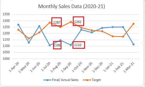
Using the data labels, we have highlighted the two highest sales of the target sales and the two lowest sales of the actual sales data. Moving the Line ChartMoving a chart within the same sheet and to another sheet in the same spreadsheet is also possible. It helps to separate the visual representation of supplied data from the text data recorded in cells. If we want to move or reallocate the inserted chart in the same sheet, we can click on a chart's blank area and drag it to the desired place. If we want to move a chart to another or a new sheet, we must first select a specific chart. Next, we need to navigate to the ribbon and select the Move Chart option under the Desig tab. 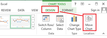
As soon as we click the Move Chart option, Excel launches a corresponding dialogue box, as shown in the following image: 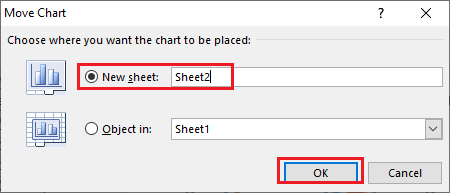
Here, we must select the option 'New Sheet' and then select the desired sheet or enter a name in the box. The selected chart will be moved to a selected sheet instantly. 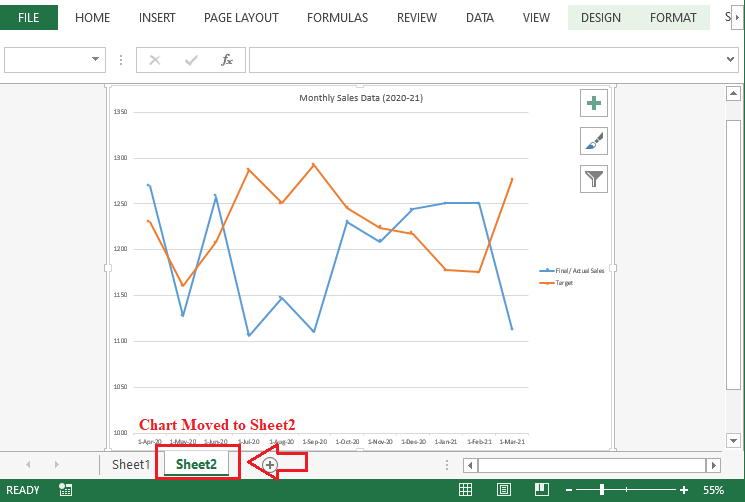
Apart from this, if we want to use the chart in other programs such as MS Word or PowerPoint, we can click on the specific chart, copy/ cut it and paste it into the corresponding program. Adding Chart ElementsWhen we insert a chart in an Excel sheet, some essential chart elements are added by default. Furthermore, Excel also allows users to insert more elements if required. To insert chart elements, we must click on the Plus Icon (+) on chart tools from the right side of the chart and select the desired element from the list. 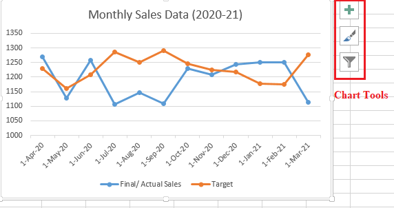
We can enable or disable the chart elements by marking/ unmarking the checkboxes in the list. Additionally, we can access more features of the specific chart elements by clicking the arrow icon next to the element name. 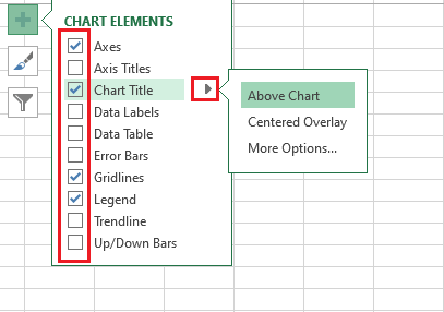
Changing a Line Chart TypeExcel also allows us to change the inserted chart to another chart type instantly without performing the entire process of chart insertion. We can insert any of the desired line charts or other charts. To change a line chart type that we have inserted, we need to select the specific chart and click on the Design tab. Next, we need to click the shortcut 'Change Chart Type' from under the Design tab. 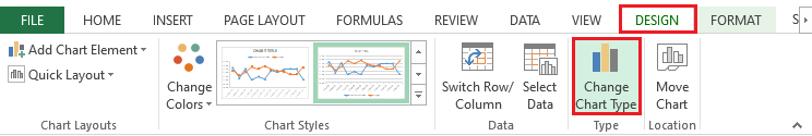
After clicking the 'Change Chart Type' shortcut, Excel displays the dialogue box with all the chart types. It looks like this: 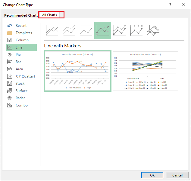
In the above image, we must click the Line Chart option and select the specific Line Chart we wish to insert. Once the desired chart is selected, we must click the OK button. This will replace the previous line chart, and we will get a new type of line chart. In our example, we have replaced the inserted 'Line chart with markers' with the simple 'Line Chart' in the 2-D section. 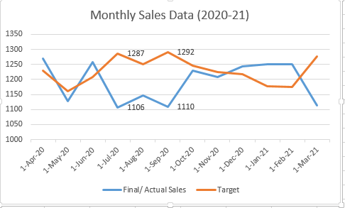
The chart type has been changed in the above image, and thus the markers have been removed. Saving a Line Chart as PictureUnfortunately, Excel does not provide any direct way to save the inserted Excel chart as an image or picture. However, there are some alternative methods. One of the easiest ways is to copy the chart from Excel and paste it into an image processing program like MS Paint. After pasting the image in MS Paint, we can save it in any popular image/picture format, like PNG, JPEG, BMP, etc.
Next TopicExcel RAND() function
|
 For Videos Join Our Youtube Channel: Join Now
Feedback
- Send your Feedback to [email protected]
Help Others, Please Share


