 Home
Home CSS
CSS HTML
HTML XHTML
XHTML JavaScript
 Bootstrap
 jQuery
 PHP
PHP XML
XML JSON
JSON Python
 C++
C++ Java
Java C#
C# SQL
SQL Interview Q
Background Blur in CSSIntroductionWe can create background blur images, which makes the web page beautiful to the user. We can achieve this with the help of the backdrop-filter property. In this article, we are going to learn about how to blur the background image in the webpage and what is the method to achieve this. How to Make a Background Blur in CSS?Before knowing about the backdrop-filter property, let's understand the way to make the background image blur. If we add the background blur image, then it will increase the appearance of the web page. If we provide an element with a background blur image, then the user can easily identify the element among all the elements. There are some CSS filter properties by which we can create the blur effect. We can also use the background blur image in the creation of Photoshop filters on the web. These are also applied to graphics, backgrounds, and borders. With the help of the blur function of the filter, which creates the Gaussian blur to the source image. We have to set the value of the radius, which is similar to the value of standard deviation to the Gaussian function or a number of pixel values on the screen blend into each other. If we don't provide any parameter, then it will set the default value, which is zero. Syntax:Example:Output 
Explanation: In the above code, we have created the background blur image in which the .blurry-background class represents the container with the blurry background effect. The ::before pseudo-element is used to create the overlay with the blurred background image. The filter: blur() property is responsible for the blurring effect, and you can adjust the value (e.g., 2px) to control the amount of blur. The actual content is placed within the .content div, which is given a higher z-index to ensure it appears above the blurred background. What is Backdrop-Filter?In CSS, the backdrop filter is a property by which we can apply filters like grayscale, contrast, blur, etc., in our background or backdrop element. This effect is applied to only a particular element, not to the whole web page. This property also provides some graphical effects, such as blurring or color shifting behind the element. We can also see the reflection of opacity in that particular region. Let us understand this by taking an example. Example:Output 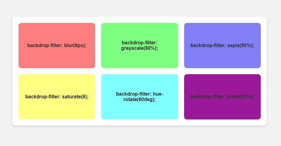
Explanation: In the above code, we add the styling to the <body> element to centre the container on the page and provide a background color. Then we also Styled the .container element with a grid layout, padding, rounded corners, a background color, a backdrop filter, and a subtle box shadow.. then we also Styled each .content element with a background color, rounded corners, and centred text. After this, we just Adjusted the backdrop-filter property values for each .content element to apply different filter effects. Then, we Added more spacing between the .content elements using the gap property in the grid layout. Example 2:Output 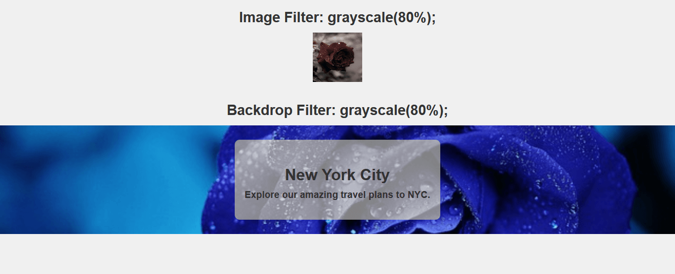
A Simple ExampleThere is a need for a target element for the implementation of the backdrop filter property. After applying the filter property, all effects are applied to the targeted element. Let's take another example to understand this. Code: Output 
Explanation: In the above code, we have created a .card class, which represents the container for the card design. It uses the backdrop-filter: blur(10px) property to create a blur effect on the background. Then, we have also created .card-image, which represents the image area at the top of the card. The .card-content class provides padding for the content inside the card. Styling for the title and description of the card is provided by the .card-title and .card-description classes. Filtered Backgrounds without backdrop-filterWe can also create the background blur image without the help of backdrop property. Let's understand this by taking an example. Example:Output 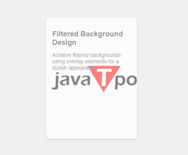
Explanation: In the above code, we have created a .card class, which represents the container for the card design, with the background image set using the background-image property. There is a .overlay class, which creates a semi-transparent overlay that sits on top of the background image. You can adjust the opacity and color to achieve the desired effect. Syntax for Backdrop Filter PropertyThere are so many properties for backdrop filter property. Let us understand this one by one. Here, <filter-function> represents the graphical function that is used to change the appearance of the web page. Properties of the Backdrop FilterLet's discuss the properties of the backdrop filter with some examples.
With the help of these properties, we can provide the overlay blur property to the background image. We can apply the blur effect to the box or any other element. It creates a Gaussian blur to your content. The help of blur radius determines the blueness of the background image. Syntax: Example: Output 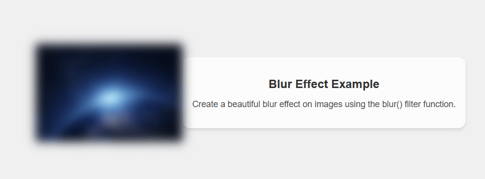
Explanation: Here, The .blurred-image class creates a container with a background image that is being blurred using the blur() filter function. You can adjust the 10px value to control the intensity of the blur.
With the help of this property, we can apply a linear multiplier to the various input images. We can also appear in the background image with more or less brightness. We can also change the intensity of brightness by changing the value of brightness value to below 100 for less intensity and above 100 for more intensity. Syntax: We can implement this property with the help of the syntax below. Example: Output 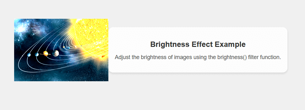
Explanation: In the above code, we have created a .brightened-image class, which creates a container with a background image, and the brightness() filter function is applied to adjust the brightness of the image. We can also adjust the 1.9 value to control the level of brightness. After this, we also created the .content class, which provides a background with a slight overlay and rounded corners for displaying the content.
With the help of this property, we can adjust the contrast for the input image. We can also change the intensity of contrast by changing the value of brightness value to below 100 for less intensity and above 100 for more intensity. Syntax: We can implement this property with the help of the syntax below. Example: Output 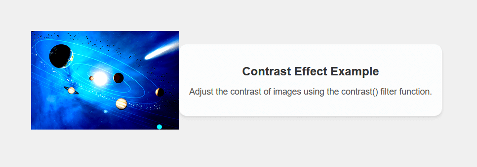
Explanation: In the above code, we have created the .contrasted-image class, which creates a container with a background image, and the contrast() filter function is applied to adjust the contrast of the image. We can also adjust the 1.8 value to control the level of contrast. Then, we also created the .content class, which provides a background with a slight overlay and rounded corners for displaying the content.
With the help of this property, we can modify the hue of the content. It totally depends on the color, which is surrounded by the circle of the color. We can also choose the angle at which the hue will be rotated. If we provide a similar angle value, then it displays all the cold colors, and if we provide a larger angle, then it displays warm colors in the hue. Syntax: We can implement this property with the help of the syntax below. Example: Output 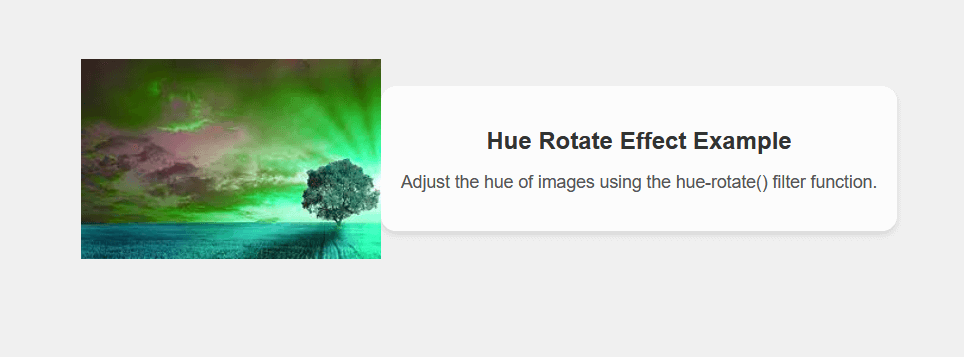
Explanation: In the above code, we have created the .hue-rotated-image class, which creates a container with a background image, and the hue-rotate() filter function is applied to adjust the hue of the image. We can also adjust the 90deg value to control the amount of hue rotation. We have also created the .content class, which provides a background with a slight overlay and rounded corners for displaying the content.
With the help of this function, we can change the effect of saturation of our content. If we change the saturation value to below 100%, then it will desaturate the content, and if values are over 100%, increase its saturation. Syntax: We can implement this property with the help of the syntax below. Example: Output 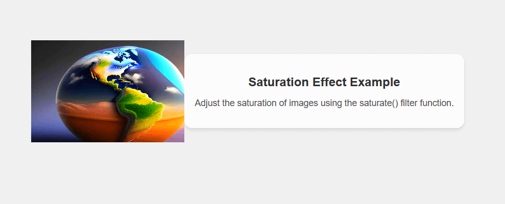
Explanation: In the above code, we have created the .saturated-image class, which creates a container with a background image, and the saturate() filter function is applied to adjust the saturation of the image. We can also adjust the 150% value to control the level of saturation. Then, we have to create the .content class, which provides a background with a slight overlay and rounded corners for displaying the content.
With the help of this function, we can make our web page grayscale. If we reduce the value of the grayscale below 100%, then the grayscale effect will be reduced. If we increase the value of the grayscale above 100 %, then it will display the complete grayscale of our content. The initial value of the grayscale is 0. Syntax: We can implement this property with the help of the syntax below. Example: Output 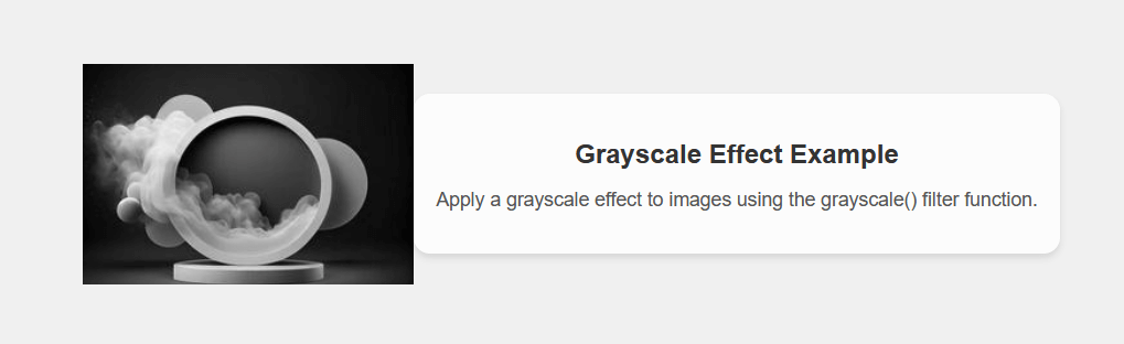
Explanation: In the above code, we have created the .grayscale-image class, which creates a container with a background image, and the grayscale() filter function is applied to apply the grayscale effect. We can also adjust the 100% value to control the level of grayscale.
With the help of this function, we can reverse the color of the element. We can also change the value of the invert function. If we set the value to below 100%, then it will reduce the effect on the element. If we set the value as above 100%, then the effect will be affected completely. If we apply the backdrop invert(), then the webpage will look completely like a black body. Syntax: We can implement this property with the help of the syntax below. Example: Output 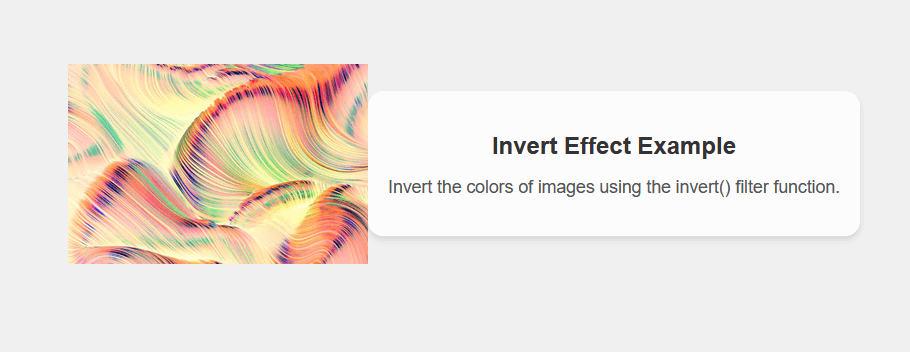
Explanation: In the above code, we have created the .inverted-image class, which creates a container with a background image, and the invert() filter function is applied to invert the colors of the image. We can also adjust the 100% value to control the level of inversion. We have also created the .content class, which provides a background with a slight overlay and rounded corners for displaying the content.
With the help of this function, we can convert the input image to sepia. The sepia means it makes the image more warm, i.e., more yellow or more brown. We can also set the value for sepia. If we set the value to below 100%, then it will reduce the effect on the element. If we set the value as above 100%, then the effect will be affected completely. The default value for sepia is 0. Syntax: We can implement this property with the help of the syntax below. Example: Output 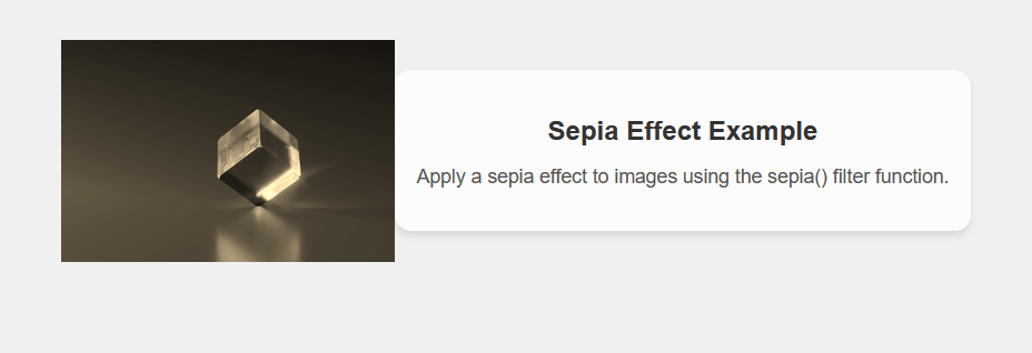
Explanation: In the above code, we have created the .sepia-image class, which creates a container with a background image, and the sepia() filter function is applied to apply the sepia effect. We can also adjust the 100% value to control the level of the sepia effect. We have also created the .content class, which provides a background with a slight overlay and rounded corners for displaying the content.
With the help of this function, we can create a shadow image for the given element. A drop shadow is the compressed version of the alpha mask from the input image that has been particularly offset and blurred. It is similar to the box-shadow property. With the help of the filter property, we can increase the speed of the hardware. Syntax: We can implement this property with the help of the syntax below. drop-shadow(offset-x offset-y blur-radius color) Example: Output 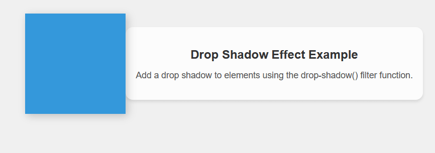
Explanation: In the above code, we have created the .element-with-shadow class, which creates a square element with a blue background color. The filter property applies the drop-shadow() filter function to add a drop shadow. We can also adjust the 4px 4px 8px rgba(0, 0, 0, 0.2) value to control the shadow's offset, blur radius, and color. We have also created a .content class, which provides a background with a slight overlay and rounded corners for displaying the content.
With the help of this property, we can provide transparency to the image. If we set the value to below 100%, then it will reduce the effect on the element. If we set the value as above 100%, then the effect will be affected completely. Syntax: We can implement this property with the help of the syntax below. Example: Output 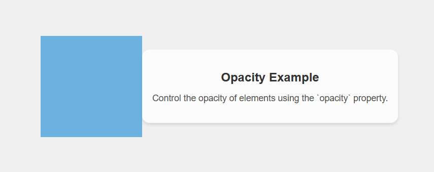
Explanation: In the above example, we have created the .opaque-element class, which creates a square element with a blue background color. The opacity property is set to 0.7, which means the element will be 70% opaque. Then, we created the .content class, which provides a background with a slight overlay and rounded corners for displaying the content.
With the help of this property, we can take the address of the file in the form of XML. The XML file defines the SVG filter and many anchor tags for a particular filter element. Syntax: We can implement this property with the help of the syntax below. Example: Output 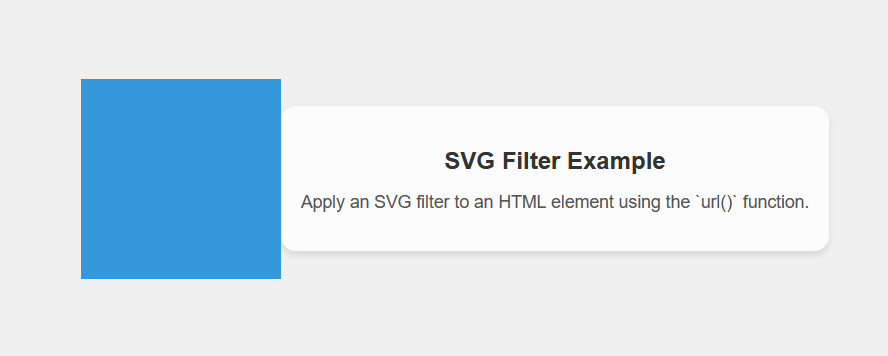
Explanation: In the above code, we have created the .filtered-element class, which creates a square element with a blue background color. The filter property uses the url(#custom-filter) syntax to reference an SVG filter with the ID custom-filter. Then, we also created an SVG element Inside the HTML document, which is defined in line with the filter effect. In this case, it applies a Gaussian blur with a standard deviation of 5 to the element. Adding Multiple FiltersWe can also apply background filter property in the different parts of the image. Also, we can apply different filter properties to the backdrop of the element. All the value for the filter property is valid for the value of the backdrop property. We can take advantage of the hardware support because the browser engine supports those filter operations. Example:Output 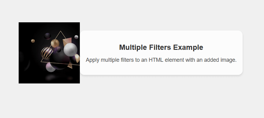
Explanation: In the above code, we have created the .filtered-element class, which creates a square element with a blue background color. The filter property applies multiple filter functions, including grayscale(50%), brightness(80%), and contrast(120%). These filters are applied in the order they appear in the list. The grayscale(50%) filter reduces the color intensity to 50%, creating a grayscale effect. The brightness(80%) filter increases the brightness of the element to 80%. The contrast(120%) filter increases the contrast of the element to 120%.
Next TopicCSS Background Image Opacity
|
 For Videos Join Our Youtube Channel: Join Now
Feedback
- Send your Feedback to [email protected]
Help Others, Please Share


