CSS Inline Block
What is CSS Inline?
A value for the display property in CSS called inline specifies how an element will be rendered within the flow of other content on a web page. An element is an inline-level element if it has the display value of inline.
What is CSS Inline Block?
Cascading Style Sheets (CSS)'s display property has a value of CSS inline-block. It is used to manage the positioning and display of elements on a web page.
The following characteristics of both inline and block elements are combined when an element is set to have the display value of inline-block:
- Inline: Inline elements only take up as much space as is required and are displayed on the same line as the surrounding content. The inline elements span, a, and strong are some examples. They do not insert their line breaks before or after.
- Block: In CSS, block elements begin on a new line and occupy the entire available width. Before and after line breaks are made by them. Block elements include div, p, and
An element is handled as an inline-level element with an inline-block. Still, it acts more like a block-level element in terms of positioning and interacting with other elements. It respects line-height and vertical-alignment properties, allows you to add margins and padding, and can adjust its width and height.
Why do We Use CSS Inline Block?
When you want the advantages of both inline and block elements, CSS inline-block is used. It provides a flexible way to control layout and presentation on a web page. Here are some reasons to use inline-block:
- Inline Flow with Block Control: Elements with inline-block display are treated as inline-level elements, so they flow within the surrounding content like text. Inline Flow with Block Control. To control their size and spacing more precisely, they can be given width, height, margins, padding, and border properties, unlike conventional inline elements.
- Horizontal Arrangement: Inline-block works well for arranging elements horizontally. For example, you can use it to create button groups or navigation menus with adjacent items.
- Responsive Design: With an inline-block, you can create flexible layouts that change according to the size of the screen. You can create components that gracefully reorganize themselves on smaller screens by carefully managing the dimensions and spacing of your elements.
- Text and elements: Text and other elements are both permitted in inline-block elements. When combining text content with additional styling or interactive elements, like buttons or icons, this is helpful.
- Centering Elements: The inline-block property can be used to center elements horizontally within a container. You can achieve centering without using more complicated methods by setting the container's text alignment to center and giving its children an inline-block display.
- Vertical Alignment: The vertical-align property can be used to align inline-block elements vertically. When you want to align elements with various font sizes on the same line, this is especially useful.
- Margins and Spacing: Inline-block elements respect margins, which gives you more control over how far apart they are from one another than traditional inline elements do.
- Combining Layouts: To create a particular layout, you may want to combine inline-block, block, and other display values in some circumstances. You have detailed control over the appearance of your content thanks to this flexibility.
Inline block combines both the advantages of inline and block elements, so it can provide a compromise that is efficient and adaptable for a variety of layouts and designs. It's an effective tool for designing web interfaces that are both aesthetically pleasing and useful.
Example
Let's take an example to understand the CSS inline block:
HTML:
CSS:
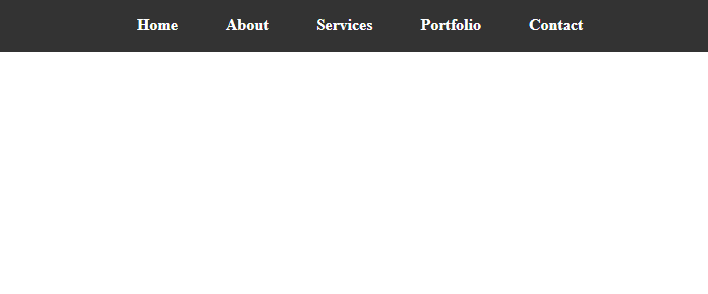
In this example, the navigation items were created as a straightforward horizontal menu using inline-block. Each navigation item is a nav-item class anchor (a>) element. The navigation menu and its items have received some fundamental styling, such as background colors, padding, margins, and hover effects.
Each item in the navigation menu is displayed inline and in the center of the navigation menu container when the HTML file is opened in a web browser. We can design the horizontal layout using the inline-block display while still having complete control over spacing and styling.
Output:
How does CSS Inline Block Work?
The display property value inline-block in CSS combines the advantages of both inline and block elements. It offers a flexible method of managing the arrangement and display of elements on a web page. This is how inline-block functions:
- Inline level behavior: Elements with inline-block display behave as if they are elements at the inline level. They appear on the same line as adjacent text and other inline elements, flowing within the text content of their parent container. Block-level elements, on the other hand, begin on a new line and create breaks before and after.
- Block-Level Control: Inline-block elements can be given properties that are typically reserved for block-level elements despite their inline behavior. With the help of this, we can adjust the margins, padding, border width, and height. So, it gives us the same control over the element size and spacing as you would have with block-level elements.
- Flexible Layout: Inline-block elements are perfect for designing flexible and responsive layouts because they combine inline flow with block-level control. The ability to control the size and placement of elements allows for the creation of horizontal arrangements of those elements.
- Text and Other Elements Can Be Mixed: Inline-block elements can include both text and other elements. This implies that you can combine text content with other graphical elements like buttons, icons, or images.
- Vertical and Horizontal Alignment: Inline-block elements can be vertically aligned within the line that contains them by using the vertical-align property. When aligning elements with various font sizes or images with surrounding text, this is especially helpful.
- No line breaks: Inline-block elements, like inline elements, do not produce line breaks before or after themselves, allowing them to flow freely within a line of text.
- Spacing and Margin: Margins and spacing are respected by inline-block elements but not by traditional inline elements. This means that using margin properties, you can establish a consistent spacing between elements.
- Mixed Layouts: To meet particular design requirements, you can combine inline-block, block, and other display values within the same layout. This adaptability gives you precise control over the appearance of your layout.
Limitation of CSS Inline Block
There are some limitations of CSS inline block. Some are as follows:
- Whitespace and Line Breaks: Using inline-block can cause unintentional gaps or spacing between elements if your HTML markup contains whitespace. Inline elements respect whitespace characters like spaces, tabs, and line breaks, so this is what happens. To avoid this, you frequently need to manually modify your HTML layout or employ tricks like making the parent container's font size zero.
- Challenges with Vertical Alignment: While vertical-align is used to align inline-block elements vertically, it can occasionally take time to get precise vertical alignment, especially when working with elements of various heights or fonts. Unexpected outcomes could result from this.
- Baseline Alignment: By default, inline-block elements are positioned in line with their baselines. When aligning elements with varying font sizes or content, this may lead to irregularities. Additional adjustments might be necessary to achieve constant vertical alignment.
- Inherent white space: Due to their alignment with the baseline of text content, inline-level elements, including inline-block elements, occasionally have a small inherent space beneath them. The layout and spacing may be affected, and while it may be possible to mitigate the effects, doing so can be laborious.
- Complex Layouts: Using inline-block alone may be difficult and produce difficult-to-manage code for complex layouts that call for precise control over dimensions and spacing, grids, or intricate positioning. Alternative layout strategies like Flexbox or CSS Grid may provide better solutions in these circumstances.
- Limited Flexibility: Inline-block provides a good blend of inline and block behaviors, but it may only be suitable for some layout scenarios. To create the desired design, you may need more specialized layout tools.
- Inconsistencies between different browsers: Some older browsers may handle inline-block elements differently, which could result in inconsistent layouts. However, as browser compatibility has increased over time, these problems have become less frequent.
In conclusion, inline-block is a flexible tool for making specific kinds of layouts and designs. Still, it has some drawbacks, particularly when it comes to precise control, intricate layouts, and responsive designs. Knowing these restrictions will enable you to decide when to use inline-block and when to look into alternative layout options.
|
 Home
Home CSS
CSS HTML
HTML XHTML
XHTML JavaScript
 Bootstrap
 jQuery
 PHP
PHP XML
XML JSON
JSON Python
 C++
C++ Java
Java C#
C# SQL
SQL Interview Q
 For Videos Join Our Youtube Channel: Join Now


