 Home
Home CSS
CSS HTML
HTML XHTML
XHTML JavaScript
 Bootstrap
 jQuery
 PHP
PHP XML
XML JSON
JSON Python
 C++
C++ Java
Java C#
C# SQL
SQL Interview Q
CSS Before and AfterWhy Use Animations?We can add some animation to our web page because it will create a micro-interaction between the user and the web page. It will also attract the user attraction. But if we design a well-defined animation, then it will also attract the user to the content of the web page. What is CSS Pseudo-Element?With the help of the pseudo-element, we can add some decorative content to the web page. There are so many pseudo elements available in the CSS. These are ::before, ::after, ::placeholder, ::first-letter, and more. But in this article, we are going to learn about only ::before and ::after. ::Before Pseudo-ElementWith the help of this pseudo-element, we can insert some content before the element. It is also the first child for the selected element. Syntax: Example: Output 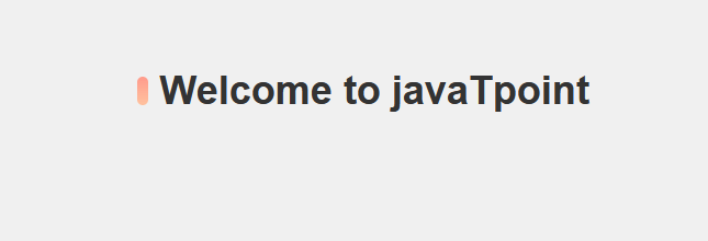
Explanation: In the above code, we have created a vertical bar on the left side of the heading with the help of the before pseudo-element. Here, we have used the position property value as the absolute value. ::After Pseudo-ElementWith the help of this pseudo-element, we can insert some content after the element. It is also the first child for the selected element. Syntax: Example: Output 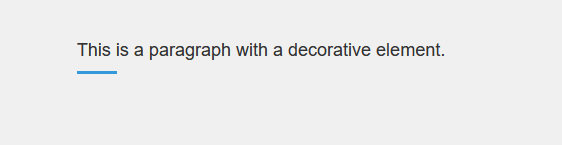
Explanation: In the above code, we have created a horizontal bar after the paragraph with the help of the pseudo-element. Here, we have used the display property as a block. What is the Difference between Pseudo-Elements and Pseudo-Classes?Sometimes, it creates confusion between the pseudo-element and pseudo-class. Because of their name, they look similar, but actually, they are different. A pseudo-element is a type of keyword that is used by merging with the selector and providing the style property to the specific element. For example, if we use ::first-letter, then it is used to provide the style property to the first letter of the paragraph or the word. The pseudo-element must start with the double column. Let us understand this by taking an example. Example 1:Output 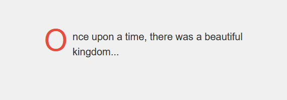
Explanation: In the above code, we have used the pseudo-element first letter, which is used to provide some style property to the first element of the paragraph. In the case of a pseudo-class, it is a keyword that is used to merge with the selector and used to target the state of the element. All the pseudo-classes must start with a single column. Example 2:Output 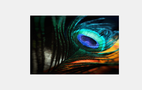
Explanation: In this example, the hover pseudo-class is used to apply a smooth scaling transition effect to an image when the mouse is hovered over it. The image starts at its original size and scales up by 10% when hovered. This creates an elegant and subtle animation that adds a touch of interactivity to the design. There are so many pseudo-classes available in CSS, which is used to target all the element. These are as follows.
Animating with Pseudo-ElementsWe can create an animating webpage with the help of a pseudo-element. To create an animating CSS, we have to take the help of the following things.
With the help of this property, we can scale, skew, rotate, and move the element. We can do this with the help of the transform function, i.e., rotate() and scale().
With the help of this property, we can define the animation by the transition of the element from one state to another state.
With the help of this property, we can define the position of an element in a document. We can set the position of the pseudo-element as relative, which is very common.
With the help of this property, we can set the Z-order of the position element. According to the value of the Z-index, all the elements are overlapped with each other. The element that has a larger z-index value will overlap the element that has a lower z-index value. A look at CSS Transform and TransitionWe basically use the CSS transform property, which is used to translate (move), rotate, scale, and skew to the element of the webpage. Let us understand this by taking an example. Example:Output 
If we hover over the element, then the below output will be displayed. 
Positioning with Relative and Absolute PropertiesThere are so many CSS properties available that are used to control the flow and position of the element. Let's discuss relative and absolute position properties.
We can control the position of the elements to the normal flow of the document with the help of the relative position property. Let us understand this by taking an example. Example: Output 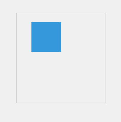
Explanation: In the above code, we have implemented the position: relative; property is used to position the .box element relative to its normal position inside the .container element. The .box element is shifted 30 pixels down (top: 30px;) and 50 pixels to the right (left: 50px;)
With the help of the absolute position property, the targeted element gets pulled from the normal document flow, and there is no space created in the page layout. And all the positions of the element relative to the closest-positioned ancestor. Let us understand this by taking an example. Example: Output 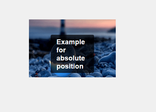
Explanation: In the above code, we have used the position property as absolute. The position: absolute; property is used to position the .overlay-text element over the .image-container absolutely. The text is centered both horizontally and vertically using the top, left, and transform properties. A semi-transparent background color with padding and border-radius is applied to create an elegant overlay effect that contrasts nicely with the image. Controlling the Stacking Order of Elements using Z-IndexWe can create a web page in which all the elements are in stack order on top of each other. The element that has the highest stack order then it will always appear on the top of the stack. Let us understand this by taking an example. Example:Output 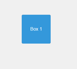
Explanation: In the above code, we have used the Z-index property, which controls the stack order of three boxes. The higher the z-index, the closer the element is to the viewer, creating a sense of depth. The position: absolute; property is used to position the boxes within the container. This arrangement results in a visually layered effect where the blue box is on top, followed by the red box, and then the green box, despite their order in the HTML. Creating an Animated Button using CSS Pseudo-ElementsLet's create an animated button using CSS pseudo-elements. Example:Output 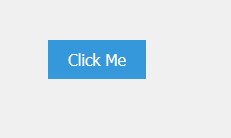
Explanation: In the above code, we have created ::before and ::after pseudo-elements are used to create horizontal lines that will animate when the button is hovered over. These lines start from the left and right sides of the button and extend to the center with a smooth transition. The z-index: -1; property ensures that the lines are positioned behind the button's content. When you hover over the button, the lines animate to fill the button's width, creating a sleek and subtle animation that adds an elegant touch to the button's appearance.
Next TopicCSS Inline Block
|
 For Videos Join Our Youtube Channel: Join Now
Feedback
- Send your Feedback to [email protected]
Help Others, Please Share


