 Home
Home CSS
CSS HTML
HTML XHTML
XHTML JavaScript
 Bootstrap
 jQuery
 PHP
PHP XML
XML JSON
JSON Python
 C++
C++ Java
Java C#
C# SQL
SQL Interview Q
CSS TrianglesHow can a Triangle be Made in CSS?Triangles are a fundamental geometric form that may be used in various web design projects. Triangles may be made in CSS by employing a few straightforward methods. This tutorial will discover two methods for making triangles in CSS.
More "fix and tricks" are needed for certain forms than others. When using CSS to create shapes, width, height, top, right, left, border, bottom, transform, and pseudo-elements like before and after are frequently combined. Additionally, more recent CSS features like shape-outside and clip-path may be used to build shapes. CSS Shapes: The Simple MethodWe've always been able to make simple shapes like squares, circles, and triangles using standard CSS attributes by employing a few methods. Now, let's examine a couple of them. In this tutorial, we'll discover how to make a triangle using CSS attributes. Typically, using CSS to make a triangle is not possible directly. The triangles are made by adding a single div to the HTML section for each triangle. Making a box with no width or height is the idea. The border's width determines the exact height and breadth of the triangle. For instance, an up-arrowed triangle's left and right edges are translucent, whereas the bottom border is colored. We must maintain the color of the top, right, and left borders to create triangles with bottom-arrowed, left-arrowed, and right-arrowed edges. The main role of used property:
Triangles are Made by BordersUsing the border property in CSS is the simplest approach to making a triangle. We can easily make a simple triangle form by generating a rectangle element and then utilizing the border attribute to generate the sloping edges of the triangle. Here is an illustration of how to use borders to form an equilateral triangle: Output: 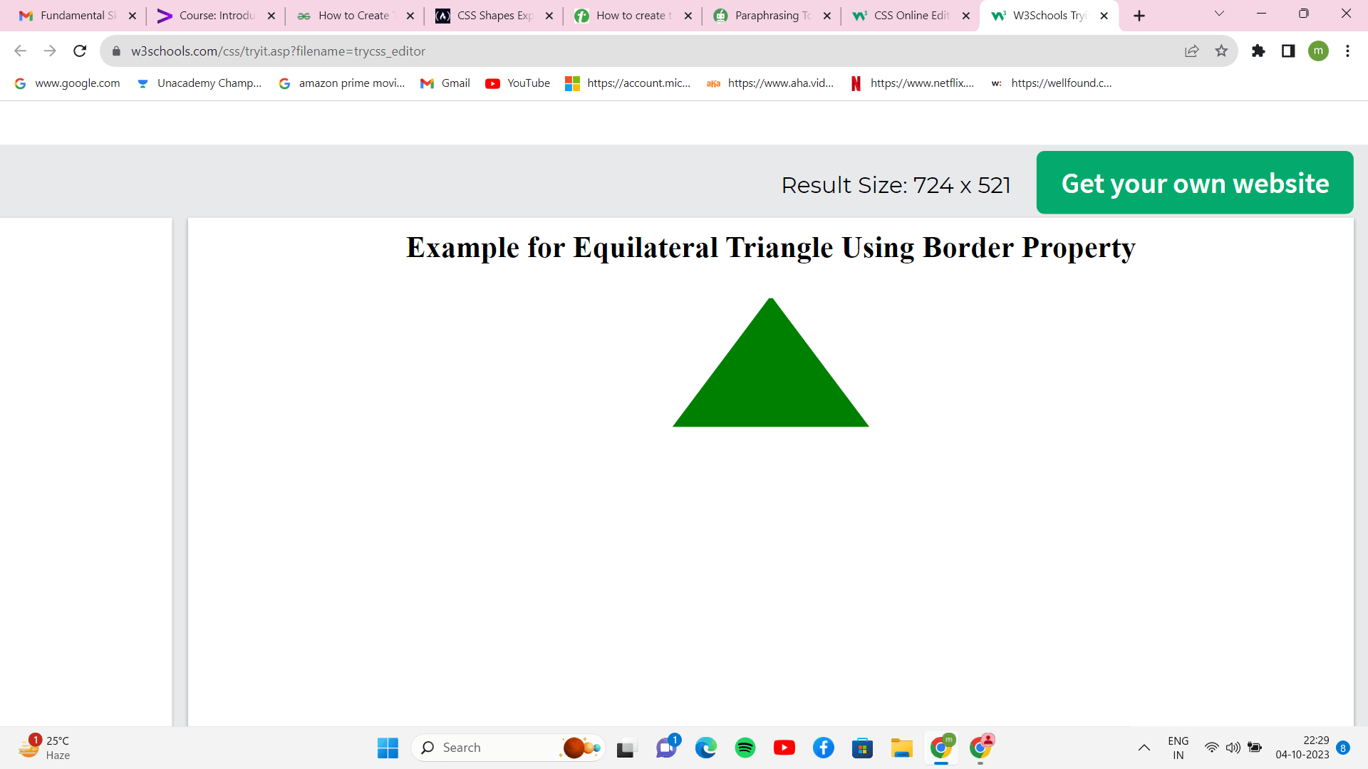
Since we will be utilizing the border property to build the triangle in the example above, we create a div with the class of .main and set the width and height of the element to 2. The triangle's base is created by setting the border-bottom property, and the triangle's sloping edges are created by setting the border-left and border-right values. We make a diagonal edge that slopes toward the element's centre by making the left and right borders translucent. Making Triangles using Clip PathUsing the clip-path feature in CSS, we can also make triangles. Using this attribute, we can build a unique clipping path for an element, which we can utilize to generate various shapes, such as triangles. Output: 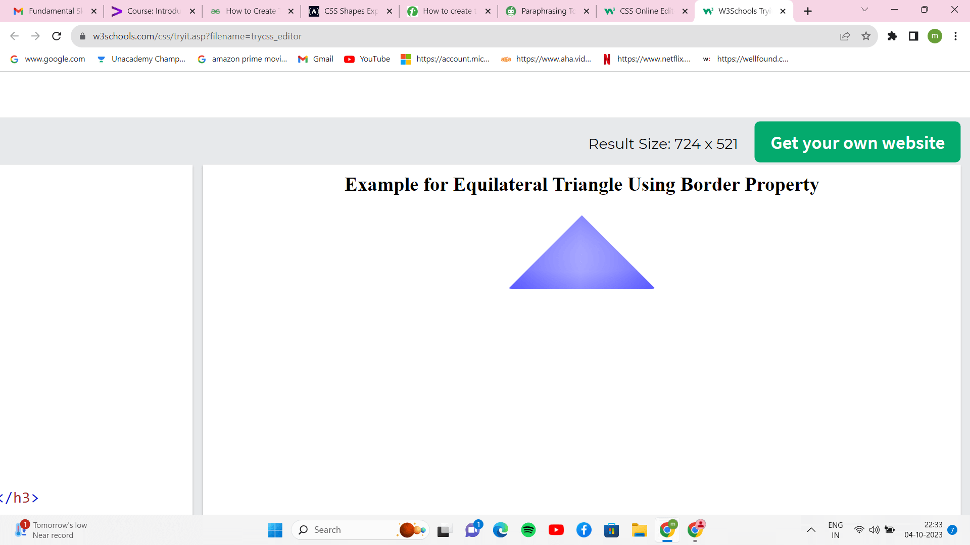
Since the triangle will be created using border and clip-path attributes, we create a div with the class of .main and set the width and height of the element to 0. The sloping edge is created by setting the border-radius property, and the rectangular element is then clipped into a triangular form by setting the coordinates of the three vertices using the clip-path property. The x and y coordinates of a list of points, each with a comma separating them, are sent as inputs to the polygon function.
Next TopicDropDown Menus in CSS
|
 For Videos Join Our Youtube Channel: Join Now
Feedback
- Send your Feedback to [email protected]
Help Others, Please Share


