 Home
Home CSS
CSS HTML
HTML XHTML
XHTML JavaScript
 Bootstrap
 jQuery
 PHP
PHP XML
XML JSON
JSON Python
 C++
C++ Java
Java C#
C# SQL
SQL Interview Q
CSS Animation keyframesIn today's world, you hardly have any opportunity to be heard or noticed a second time in the virtual world, where the canvas of creativity is never complete. As a web designer/developer, you sell out designing artistically attractive and fun sites. Using CSS animation keyframes can make this possible for you. Such magical code can invigorate static websites, catching the viewer's mind in play. Welcome to this post! Here, I will tell you about CSS animation keyframes - their role and ways of working. In addition, I'll provide you with helpful examples so you can learn how to create dazzling web animation. Understanding CSS AnimationsIn web design, CSS is essential in the layouts and visual styling of web pages. Despite being mostly a static design tool, CSS allows you to incorporate dynamic and interactive features in your online design through animations. You can use CSS animations to manipulate visual properties of HTML elements like color, size, position, and transparency to achieve attractive transitions and effects. CSS Animations are based on the concept of keyframes. These are points that characterize a specific instance of an animation sequence. A particular state specifies the animation aspect of an element. The author can specify the start and end keyframes, allowing the transition from one state to another without jerks. CSS Animation Keyframes are essential. This implies that they help select how the intermediate animation steps are ordered and what each component will look like at each stage. Essentially, in the form of a sequence of instructions, it is possible to make certain changes concerning different parts of HTML on the web page. CSS Animation KeyframesCSS Animation Keyframe Defined by Rule @keyframes. The essential components of a keyframe animation are as follows: The animation CSS @keyframes rule. For instance, an animation-name which can be changed. Percentages are the keyframes for the different animation phases specified. For instance, 0% represents start, 50% is half-point or middle, and 100% indicates end. The attribute describes how one element should look at every point of the animation as its percentage blocks are presented one after another with their corresponding CSS values. For example, let's look at one of these cases in reality. In this sample, we have introduced a fadeIn keyframe instance. At first, the animation is invisible with 0% opacity, whereas finally, it gets 100% opacity, making the animation's full-fledged visible. This animation gradually introduces an element into view. Applying CSS Keyframe AnimationsTo add an HTML element's keyframe animation, use the animation property. Here is a simple illustration: In the following line, the fadeIn animation is applied to an HTML element with the class 'my-element' using the 'ease-in/ease-out' timing algorithm for a 2-second animation, which creates a smooth acceleration and deceleration effect. Sample example: Output: 
Real-World Use CasesThey are useful in various ways, ranging from small hover effects to complex page transitions. Here are a few actual instances:
Ideal TechniquesConsider the following recommended practices to get the most out of CSS animation keyframes:
Using Keyframes for Advanced CSS AnimationNow that you have gotten the basics of CSS animation keyframes, it's time to move forward and improve your animation abilities. In this article, I will teach you some complex ways and examples to help create more sophisticated and gorgeous web animations to enrich your web applications further. This advanced keyframe method allows developers and designers of any level, whether or not they are experienced in CSS animation development, to breathe life into their web pages. 1. Combining several animations: The strength of CSS animations is their ability to connect several consecutive keyframe animations. Such can be fascinating as well as amazing. When you enter multiple animations, separate each animation name with a comma for the animation property. The "fadeIn" effect initially fades the element before "moveUp" is applied after a one-second pause. This chaining of animations allows complex motion and transformation sequences to appear. 2. Direction for Animation: By default, animation animates to the right, but the animation direction can be configured differently. The two most common options of parameter animation-direction are "normal" (default) and "alternate." The alternative parameter causes the animation to change sense after each second and gives an impression that the image moves back and forth like the sound of ping pong. The animation has a 2-second movement to the left, then it plays the reverse of the animation and has a back-and-forth move. 3. Animation Fill Modes Utilized: The animation fill modes dictate how an element should be styled before and after the animation. Forward means that the final keyframe styles are used after the completion of the animation, while backwards means that the first keyframe styles take place before the start of the animation. In this image, the element slides into position with a "forwards" fill mode until the animation ends. 4. Delays in Animation: Keyframe animations could also be delayed using the animation-delay attribute. Animation can be synchronized on a website, or you can add a delay to build anticipation. The "rotate" animation starts working one second after the element emerges for the first time, providing an illusion of delaying spinning. 5. Customizable Timing Options: The use of the easing-in and out timing function is common. However, you can create your timing algorithms using the cubic-bezier function to determine the timing of each keyframe. With this, one can adjust each animation step's speed and speed-up parameters. We have created a unique way of using the cubic bezier function to create an animation curve. With this curve, you can trace the rate of change within the animation and recognize its visual appearance. 6. 3D transformation: CSS animation allows for more than just 2D transformation. Use 3D transformations to give your animations depth and reality. For example, you can rotate a layer along its x, your z-axis to produce appealing 3D effects. The "rotate3D" animation uses both rotateX and rotateY to create a smooth 3D rotation effect on two axes. Example using all the above concepts: Output: 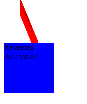
ConclusionWith advanced CSS animation keyframes, you can create wonderful web animations with unlimited possibilities. With these capabilities, you can improve your web design and development skills, such as chaining animations, controlling animation direction, using fill modes, applying delays, and creating custom timing functions. Ensure that your investigation of these advanced techniques focuses on finding this equilibrium between originality and usability. The user experience should be focused on simple animations. You must test on multiple platforms to ensure users have smooth, consistent interactions while using different browsers and other devices. These highly advanced CSS animation keyframe techniques will enable you to design beautiful and engaging web pages that will stick in the minds of your users. Therefore, let your imagination fly, experiment with those techniques, and develop engaging web pages.
Next TopicCSS Blur
|
 For Videos Join Our Youtube Channel: Join Now
Feedback
- Send your Feedback to [email protected]
Help Others, Please Share


