 Home
Home CSS
CSS HTML
HTML XHTML
XHTML JavaScript
 Bootstrap
 jQuery
 PHP
PHP XML
XML JSON
JSON Python
 C++
C++ Java
Java C#
C# SQL
SQL Interview Q
CSS border-radius propertyIntroductionCSS (Cascading Style Sheets) is a powerful tool for styling and designing web pages. One of the most versatile properties in CSS is the border radius, which allows you to create beautifully rounded corners on elements. In this article, we will explore the border-radius property and learn how to use it effectively to enhance the visual appeal of your web designs. What is Border Radius in CSS?The border-radius property in CSS enables you to define rounded corners for various elements, including divs, buttons, images, and more. By specifying a value for border-radius, you can give elements a softer and more approachable appearance, moving away from sharp edges and harsh angles. Syntax: The syntax for the border-radius property is as follows: The value can be specified in various ways, allowing for different degrees of roundness. You can define a single value, which applies the same radius to all corners, or separate values for each corner, giving you more control over the element's shape. How to Apply Border Radius to Elements?Let's look at how to apply the border-radius property to different elements: Applying Rounded Corners to a DivTo apply rounded corners to an <div> element, you can use the border-radius property in your CSS code: This code will give all <div> elements a uniform border radius of 10 pixels, creating a slightly rounded appearance. Output: 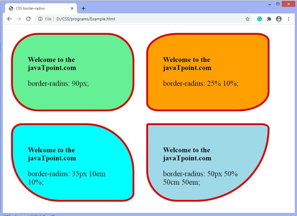
Setting Different Radii for Each CornerSuppose you want to have different radii for each corner of an element. In that case, you can use the border-radius property with four values, representing the top-left, top-right, bottom-right, and bottom-left corners, respectively: Output: 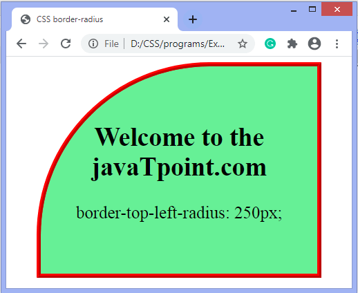
In the example above, the top-left corner will have a radius of 10 pixels, the top-right corner will have a radius of 20 pixels, the bottom-right corner will have a radius of 15 pixels, and the bottom-left corner will have a radius of 5 pixels. Creating Circular ElementsTo create a perfect circle, you can set the border-radius property to a value equal to half the element's width or height: In the code snippet above, a <div> element with the class "circle" will be rendered as a circular shape with a width and height of 100 pixels. Output: 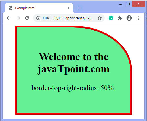
Additional Properties of Border RadiusCSS offers additional properties that can be combined with border-radius to achieve more advanced effects:
These properties allow you to set specific border radii for each corner individually. For example: Output: 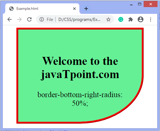
In addition to the border-radius property, box-shadow is another CSS property that can enhance the appearance of your rounded elements. By adding shadows to your elements, you can create a sense of depth and dimension, making them stand out and adding visual interest. Syntax: The syntax for the box-shadow property is as follows:
Applying Box Shadows to Rounded ElementsLet's see how we can combine the border-radius property with box-shadow to create visually appealing rounded elements with depth: Output: 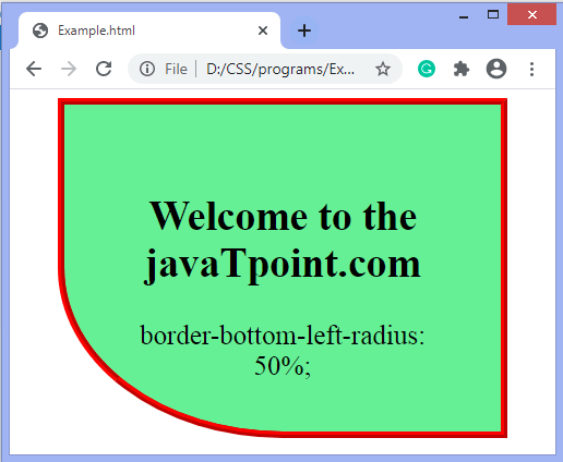
In the code above, we set a uniform border radius of 10 pixels for all corners of the <div> element. Then, we add a box shadow with a horizontal offset of 0, a vertical offset of 0, a blur radius of 10 pixels, and a color with an opacity of 0.2. The result is a soft shadow that adds a subtle depth effect to the rounded element. Creating Inset ShadowsYou can also create an inset shadow effect to give the impression that the element is pressed or embedded into the page. To achieve this, you can use the inset keyword: Output: 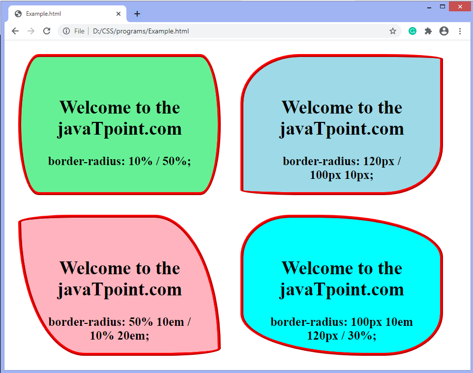
In the code snippet above, we add the inset keyword before the horizontal offset in the box-shadow property. This creates an inset shadow that appears inside the element's borders. Multiple ShadowsThe box-shadow property also allows you to apply multiple shadows to an element. Each shadow can have its values, allowing for complex and creative effects. Here's an example: Output: 
We apply two box shadows to this code snippet's <div> element. The first shadow has a blur radius of 10 pixels, and the second shadow has a blur radius of 20 pixels. You can achieve various combinations and create unique effects by adjusting the values, colors, and opacity. ConclusionThe border-radius property in CSS is a versatile and powerful tool for creating visually appealing and modern web designs. By adding rounded corners to elements, you can soften the look and feel of your interface, making it more welcoming and aesthetically pleasing. Whether you want to create subtle roundness or design perfectly circular elements, the border-radius property provides you with the flexibility to achieve your desired results. Remember to experiment with different values and combinations to find the right balance for your design. Play around with individual corner radii or apply uniform roundness to create a cohesive look across your elements. By utilizing the border-radius property effectively, you can elevate the visual appeal of your web pages, making them more engaging and user-friendly. Embrace the power of rounded corners and unlock new possibilities for your CSS designs. |
 For Videos Join Our Youtube Channel: Join Now
Feedback
- Send your Feedback to [email protected]
Help Others, Please Share


