 Home
Home CSS
CSS HTML
HTML XHTML
XHTML JavaScript
 Bootstrap
 jQuery
 PHP
PHP XML
XML JSON
JSON Python
 C++
C++ Java
Java C#
C# SQL
SQL Interview Q
Responsive CSSIntroductionNowadays, most visitors open the website on their phone. But the website was created in the past, so we could only open part of the website on a mobile phone. We have to zoom in to read or visit proposals on the website. But presently, all the websites created are user-friendly, and users can easily read them. It also increases the number of visitors to the website. In this article, we will learn about CSS's responsiveness and how to achieve this. What is CSS Responsive Web Design?In CSS, making a responsive webpage means that it is a method used to design and code the webpage to respond to all types of screen sizes. It also provides the best viewing express for the user, and it does not depend on the screen size of the mobile; it can fit any size of the mobile phone. 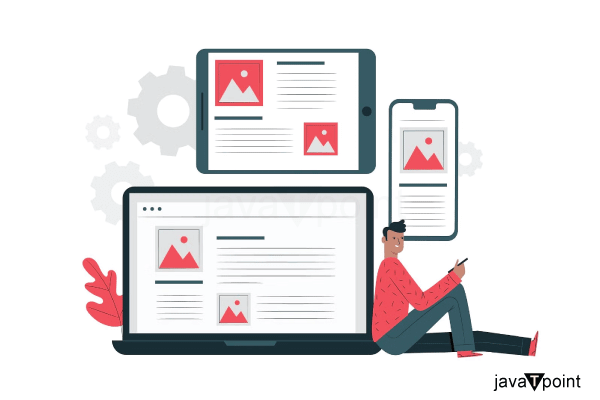
Why is Responsive Design So Important?Creating a responsive webpage is very important. These are as follows. 1. Device-Independent Rendering It is the main important advantage of creating a responsive webpage. Nowadays, we use so many types of devices with different screen sizes. Also, there is no uniform standard of size, shape, or display parameters across devices. At this point, responsive design comes into work. After creating the responsive webpage, it makes the devices optimal in the particular environment. 2. Usage Experience We can increase the user experience by creating a responsive webpage. It is also a key factor that increases the number of web page visitors. If the user finds it very difficult to navigate the webpage, then the user never returns to the website again. We can increase the user experience on the web page by creating a responsive web page. Key principles and techniques of CSS Responsive Web Design There are some Key principles and techniques of CSS Responsive Web Design. These are as follows.
A Mobile-First Approach to Responsive Web DesignThe meaning of the mobile-first approach is to design the first website for the mobile, and then we have to create the desktop version of the web page. There is a variety of reasons which is used to create an effective website.
Setting the ViewportWe have to write the viewport tag inside the meta tag. It is used to optimize the variety of the devices. Syntax: Example 1: Output 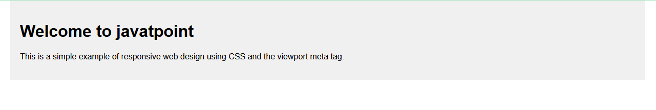
Explanation: In the above example, there is a meta tag named "viewport," which ensures that the webpage should ensure that it adjusts its width to match the device's screen width. It also defines the responsive container with a maximum width of 1200px and centers it on the page. Responsive ImagesIn responsive images, the image is scaled to fit the size of that fit the screen size. When there is a need to create a responsive image, we have to implement some technique that allows them to scale, resize, or even change based on the characteristics of the user's device. How to Make Image Responsive?We can create a responsive image with the help of some techniques. They are as follows. 1. By using the Width PropertyWe can create a responsive image with the help of the width property. Example: Output 
Explanation: In the above example, there is a class named ".image-container," which provides the implementation maximum width of the container to 100%, also ensuring that the container adjusts to the width of its parent element. Also, we have set the height property as auto and the width property as width: 100%. 2. Using the Max-Width PropertyWe can create a responsive webpage with the help of the max-width property. The main advantage of using the max-width property is that we can not enlarge the image more than its original size. Example: Output 
Explanation: In the above example, we have created an image in the center position with a maximum width of 800px and a light gray background. Then we have to center the img container, which has a maximum width of 100%. Then, we have to provide the height property as auto. Then, we have to provide the display property as a block. Then, we have to set the margin as 0 auto. 3. Responsive Text SizeWhen there is a need to create the text size as responsive text, we have to ensure that the content should be legible and user-friendly for different devices. Let's see this with the help of the below code. Example: Output 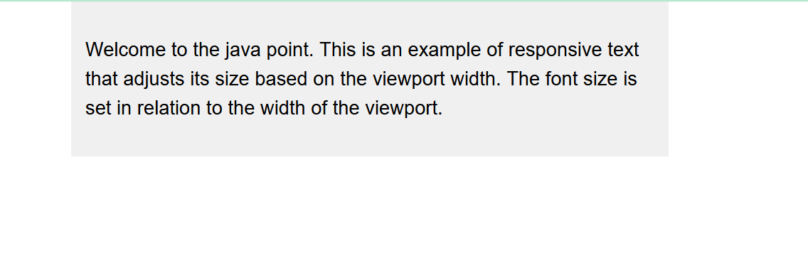
Explanation: In the above example, we have created text in the center position of the webpage, which has a width of 800px. It has the background of a light gray color. We have set the font side of the web page in the format of a "vw" unit. Then, we have to set the line height property, which increases the web page's readability. Then, we have to set the margin property as 0 auto. What is a Media Query?It is a technique present in CSS used to apply different types of styles to the webpage. It is also the main fundamental part of creating a responsive web page. We can also create the design and layout of the webpage, which is used in creating the web page. We can use media query with the help of @media, which specifies the condition for creating the web page. Syntax: To create the media query, we have to follow the syntax below. Example: Output 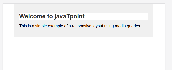
Explanation In the above code, we have a default large screen with a font size of 24px, a text color of #333, and a background color of #fff for the h1 element. Also, we have to define the media query as the @media (max-width: 600px). When we change the screen size to 600px, we get to change the font size, color, and background color.
Next TopicCustom Scrollbar CSS
|
 For Videos Join Our Youtube Channel: Join Now
Feedback
- Send your Feedback to [email protected]
Help Others, Please Share


