 Home
Home CSS
CSS HTML
HTML XHTML
XHTML JavaScript
 Bootstrap
 jQuery
 PHP
PHP XML
XML JSON
JSON Python
 C++
C++ Java
Java C#
C# SQL
SQL Interview Q
CSS Placeholder ColorIn the CSS pseudo-element, the placeholder selector is used to customize the placeholder text by altering the text color and style. The ::first-line pseudo-element is the only relevant CSS property subset that may be used in a rule with the selector ::placeholder. The placeholder text is a transparent or light grey color for most browsers by default. Syntax:In the CSS pseudo-element, the placeholder selector creates the placeholder text by altering the text color and enabling the text's style to be modified. The placeholder (inside the input tag) is grey in most browsers. Non-standard ::placeholder selectors, which implement the color property in that particular selector, can be used to modify the color of this placeholder. This selection differs between browsers. For example, Google Chrome, Mozilla Firefox, and Opera. The examples will help us grasp the notion of::placeholder selector and its implementation. ExamplesExample 1: In this example, the ::placeholder selector is used to change the text color and the background color of the placeholder text. Output: 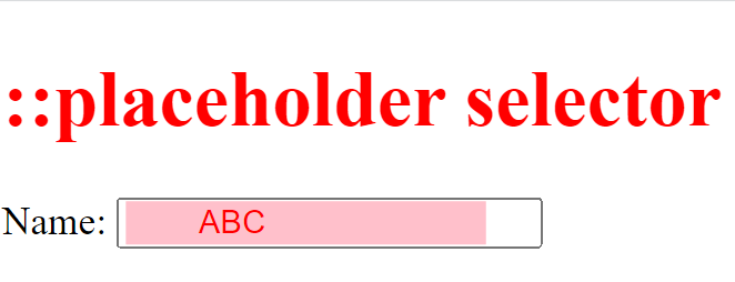
Example 2: This example shows how to use the ::placeholder selector to create placeholder text with an attribute that indicates the hint that describes the intended value of an input field. Output: 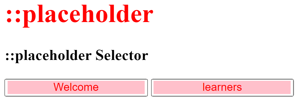
Example 3: This code demonstrates the usage of ::placeholder selectors in several browsers. Output: Output using Chrome 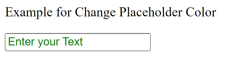
Output using Microsoft Edge 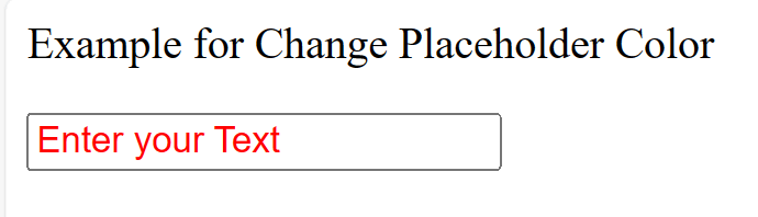
NOTE: Internet Explorer no longer supports the placeholder selection.Example 4: In the email attribute of the input element, this code provides a placeholder selector. Placeholder selectors may be used for any attribute of the input element (text, tel, password, and so on) to emphasize color changes in any of the attributes. Output: Output using Chrome 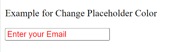
Output using Microsoft Edge 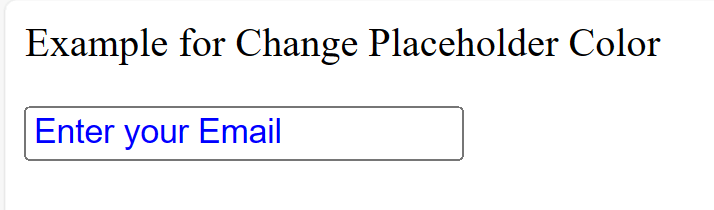
Output using Internet Explorer 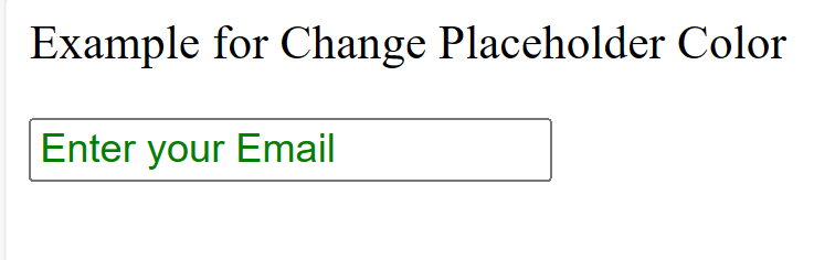
UsabilityPlaceholder text with sufficient color contrast may be interpreted as entered input. Placeholder text will also disappear when a person enters content into an element. Both circumstances can interfere with successful form completion, especially for people with cognitive concerns. An alternate approach to providing placeholder information is to include it outside the input in close visual proximity and then use an aria described to programmatically associate it with its hint. With this implementation, the hint content is available even if the information is entered into the input field, and the input appears free of preexisting input when the page is loaded. Most screen reading technology will use aria-described to read the hint. This approach allows the input to appear clear of previous input when the page loads and the hint content is accessible even if data is placed into the input field. After the input's label text is stated, most screen reading technologies employ aria-described to read the hint. The screen reader user can mute it if the additional information is superfluous. High Contrast Mode for Windows Placeholder text produced in Windows High Contrast Mode will have the same style as text content input by the user. Some users may find it challenging to distinguish between information that has been entered and placeholder text as a result. LabelsThe <label> element is not replaced with placeholders. Helpful technology like screen readers cannot comprehend <input> elements unless a label has been programmatically attached with an input using a combination of the for and id properties.
Next TopicCSS Triangles
|
 For Videos Join Our Youtube Channel: Join Now
Feedback
- Send your Feedback to [email protected]
Help Others, Please Share


