 Home
Home CSS
CSS HTML
HTML XHTML
XHTML JavaScript
 Bootstrap
 jQuery
 PHP
PHP XML
XML JSON
JSON Python
 C++
C++ Java
Java C#
C# SQL
SQL Interview Q
CSS Navigation BarWhat is a CSS Navigation Bar?In CSS, a navigation bar is, also known as a navbar used in an interface to provide navigation links or menus to various selectors or page users in website design. Users can easily navigate a website's content using it as a visual guide. With the help of a navigation bar, we can improve the presentation and styling of a web page, and it also includes the design, colors, fonts, and spacing described using CSS. A CSS navigation bar is developed and styled using CSS properties and rules to produce a particular appearance and functionality. Characteristics of CSS Navigation BarSome characteristics of the navigation bar are as follows:
With the help of a CSS navigation bar, we can enhance the user experience and make it simple for visitors to navigate a website's content, so it is a crucial part of web design. ExampleLet's take a simple example of how we can create a horizontal navigation bar using CSS: Output: 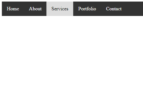
Five links are being created in this example's horizontal navigation bar: "Home," "About," "Services," "Portfolio," and "Contact." We've used fundamental CSS properties to style the navigation bar, links, and hover effects. Your preferred design can be reflected in the colors, fonts, padding, and other styles. Limitation of CSS Navigation BarThere are some limitations of the CSS navigation bar, and some are as follows:
Despite these drawbacks, the versatility and widespread use of CSS navigation bars in web design persists. However, they might need to be supplemented with JavaScript and other technologies for more sophisticated features and a seamless user experience. Horizontal Navigation BarThe horizontal navigation bar is the horizontal list of links, which is generally on the top of the page. Let's see how to create a horizontal navigation bar by using an example. ExampleIn this example, we are adding the overflow: hidden property that prevents the li elements from going outside of the list, display: block property displays the links as the block elements and makes the entire link area clickable. We are also adding the float: left property, which uses float for getting the block elements to slide them next to each other. If we want the full-width background color then we have to add the background-color property to <ul> rather than the <a> element. Border dividersWe can add the border between the links in the navigation bar by using the border-right property. The following example explains it more clearly. Example Fixed Navigation barsWhen we scrolls the page, fixed navigation bars stay at the bottom or top of the page. See an example of the same. Example Test it NowSticky NavbarThe position: sticky; property is used to position the element based on the scroll position of the user. This CSS property allows the elements to stick when the scroll reaches to a certain point. Depending upon the scroll position, a sticky element toggles in between fixed and relative property. Example Test it NowDropdown NavbarFollowing example explain how to create a dropdown menu inside a navigation bar. Example Test it NowVertical Navigation barIn this example, we are going to see how to build a vertical navigation bar. Example Test it NowWe can align the links to the center and add borders between them. See an example of the same. Example In this example, we are adding the text-align: center; property to <li> and <a> to center the links and border property to <ul> to add the border. We will also add the border-bottom property to all <li> elements. Test it NowFull-height fixed Vertical NavbarWe can also create the fixed full-height side navigation bar by using the properties height: 100%; and postion: fixed; Example Test it Now
Next TopicCSS overlay
|
 For Videos Join Our Youtube Channel: Join Now
Feedback
- Send your Feedback to [email protected]
Help Others, Please Share


