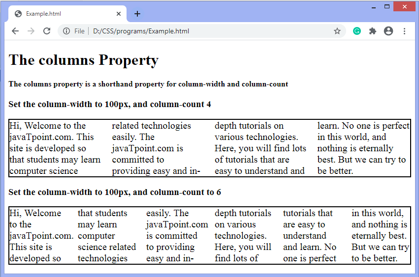
CSS columnsThe columns property in CSS sets the number and width of columns in a single declaration. It is a shorthand property that can take several values at a time. It is used to set both column-count and column-width properties at the same time. Both of these properties are used to control how many columns will appear. The column-count property is used to set the number of columns, whereas the column-width property specifies the width of the columns. Together using column-count and column-width properties creates a multi-column layout that breaks automatically into a single column at narrow browser widths without using the media queries. It is not always helpful to use both of them because it can restrict the responsiveness and flexibility of the layout. If the column-count and width don't fit in the element's width, then the browser reduces the column count automatically to fit the specified column widths. SyntaxValuesThe property values are tabulated as follows with their description.
If any of the value is omitted, then by default, the browser assumes the corresponding value to auto. ExampleIn this example, we are defining two <div> elements, including text. For the first div element, the minimum width is 100px, and the maximum no. of columns can be four. Whereas for the second div element, the minimum width is 100px, and the maximum no. of columns can be six. Output Test it Now
Next TopicCSS pointer-events property
|
 For Videos Join Our Youtube Channel: Join Now
Feedback
- Send your Feedback to [email protected]
Help Others, Please Share


