 Home
Home CSS
CSS HTML
HTML XHTML
XHTML JavaScript
 Bootstrap
 jQuery
 PHP
PHP XML
XML JSON
JSON Python
 C++
C++ Java
Java C#
C# SQL
SQL Interview Q
Grid Template Columns CSSA potent tool for developing complex and adaptable web layouts is CSS Grid Layout. The ability to specify columns and rows in a grid container is one of CSS Grids primary capabilities. The grid-template-columns property which enables us to specify the columns of a grid will be the main topic of this essay. What is Grid-Template-Columns?Grid template columns is a CSS property that defines the number and size of the columns in a grid container. It's used in conjunction with the grid template rows property thus it defines the rows of the grid. Together hence these properties allow for precise control over the layout of content within a grid. Code: Output: 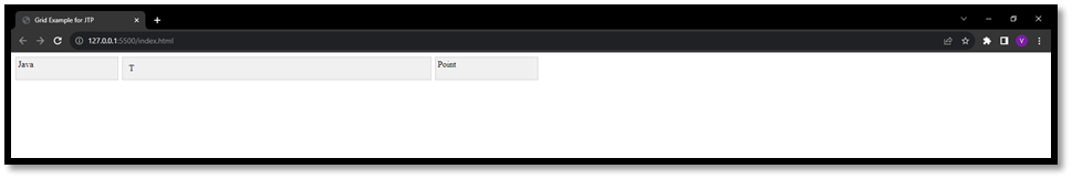
Advantages of using Grid-Template-Columns in CSS1. Accurate Layout Control: Grid container layout may be precisely controlled by grid template columns. A significant degree of customisation is possible since you may select the size and number of columns with different units. 2. Responsiveness: It enables the creation of responsive layouts. By using relative units like fr or percentages you can create grids that adapt to different screen sizes and content amounts. 3. Modularity in Design: A flexible approach to design is made possible by mixing several units inside the same declaration. This implies that you may design grids with both fixed and adjustable column widths. 4. Automatic Sizing: The "auto" parameter enables the browser to choose the column size based on the content of the column. In particular processing dynamic or changing content benefits from this. 5. Improved Readability: It is easier to figure out and maintain the layout code when grid template columns are used. The column structure is precisely defined and making it simpler for other developers to learn and adapt. Disadvantages of using Grid-Template-Columns in CSS1. Limited Browser Support: While CSS Grid is well supported by modern browsers and it may not be completely supported by some older browsers. For some scenarios it is necessary to use fallbacks or different layout techniques. 2. Learning Curve: For individuals who are new to web development and understanding and mastering CSS Grid which includes grid template columns may take some time. It necessitates acquiring new vocabulary and syntax. 3. Potential Complexity: The mix of rows, columns and gaps can result in extensive CSS code for layouts. Especially for big project management and troubleshooting this may be difficult. 4. Not Always Suitable for Simple Layouts: A more direct method may be more effective for simple layouts that don't need a grid framework. 5. Limited Control over Older Versions: If you need to develop fallback layouts or utilise other ways to accommodate outdated browsers without Grid support for your project the complexity of your codebase may increase. 6. Debugging Challenges: Debugging complicated grid layouts can be difficult. It might take some effort to find and fix problems with the size or location of grid components. Applications1. Creating Multi-Column Layouts: You may define a grid with several columns using the grid template columns. This is helpful when designing layouts in the style of magazines or any other layout in which content has to be arranged into many columns. 2. Building Forms: Form components can be organised using the grid template columns. The readability and usefulness of forms can be improved for instance by designing input fields with a two-column style for labels. 3. Navigation Menus: It is frequently used to make navigation menus. A grid with numerous columns each containing a menu item can be defined. The menu items are much simpler to align and design. 4. Image Galleries: In order to construct picture galleries with uniform space between the photographs and grid template columns may be employed. For a consistent and professionally acceptable layout and you may define the width of each column. 5. Dashboard Layouts: For developing dashboards where multiple widgets and components need to be organised in a systematic way and grid layouts are perfect. The required flexibility and control are provided by grid template columns. 6. Masonry Layouts: It may be used to construct layouts in the masonry style where elements are organised in columns of variable heights that results in an interesting and beautiful design. 7. Responsive Card Layouts: Card based layouts frequently employ grid template columns. You may adjust the positioning and size of the cards by specifying the columns by ensuring that they adapt carefully to various screen widths. 8. Responsive Grid-Based Forms: When designing forms that require multiple fields in a row, grid-template-columns is valuable. It allows for easy alignment and spacing of form elements. ConclusionThe grid-template-columns property in CSS Grid Layout is a fundamental tool for creating versatile and responsive layouts. By understanding how to use different units and combining them, you can create complex grid structures that adapt to various screen sizes and content types. Experimenting with different combinations of units and values will give you a deep understanding of how to harness the full power of CSS Grid in your web projects.
Next TopicLess CSS
|
 For Videos Join Our Youtube Channel: Join Now
Feedback
- Send your Feedback to [email protected]
Help Others, Please Share


