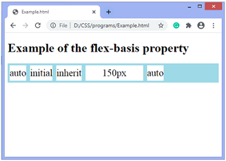
CSS flex-basis propertyThis CSS property specifies the initial size of the flex item. It only works on the flex-items, so if the container's item is not a flex-item, the flex-basis property will not affect the corresponding item. Generally, this CSS property is used with the other flex properties that are flex-shrink and flex-grow and usually defined by the flex shorthand to ensure that all values are set. SyntaxValuesauto: It is the default value. This value sets the item's width equal to the value of its width property, if defined. But if the width property is not specified for the flex-item, it sets the width according to the content. width: This value is defined using relative or absolute units. It defines the initial length of the flex-item. It does not allow negative values. initial: It sets the property to its default value. inherit: It inherits the property from its parent element. Now, let's understand this property by using some examples. ExampleIn this example, there is a container with five flex-items. Here, we set the different values of the items, such as the auto, initial, inherit, and 150px. We are not defining the width property, so the values like auto, initial, and inherit set the width based on the content, but there is an item with the flex-basis: 150px; so the corresponding item's width will be 150px. Test it NowOutput 
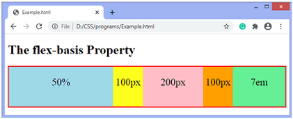
ExampleIt is another example of flex-basis property. Test it NowOutput 
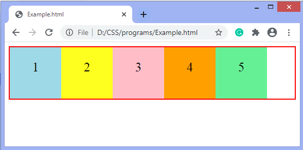
Let's see how to define the flex-basis property using the flex shorthand property. ExampleIn this example, we set the flex-basis property by using the shorthand flex property. The flex property is shorthand for flex-grow, flex-shrink, and flex-basis. Here, we define the 100px value to the flex-basis, and the other two are specified by 0. Test it NowOutput 
Next TopicCSS flex-grow property
|
 For Videos Join Our Youtube Channel: Join Now
Feedback
- Send your Feedback to [email protected]
Help Others, Please Share


