CSS Position Fixed
Cascading Style Sheets (CSS) is the language used to style the visual presentation of web pages. It allows developers to control layout, colours, fonts, and other design elements. One powerful property in CSS is position, which enables precise control over the positioning of elements on a webpage. Among the various position values, position fixed is a crucial tool for creating user interfaces with elements that remain in a fixed position relative to the viewport.
What is Position: fixed?
Position fixed is a CSS property that allows you to position an element relative to the viewport, which means it will stay in the same place even if the page is scrolled. This makes it particularly useful for creating headers, footers, sidebars, or any other element you want to remain visible regardless of how far a user has scrolled down the page.
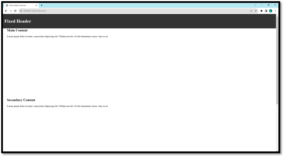
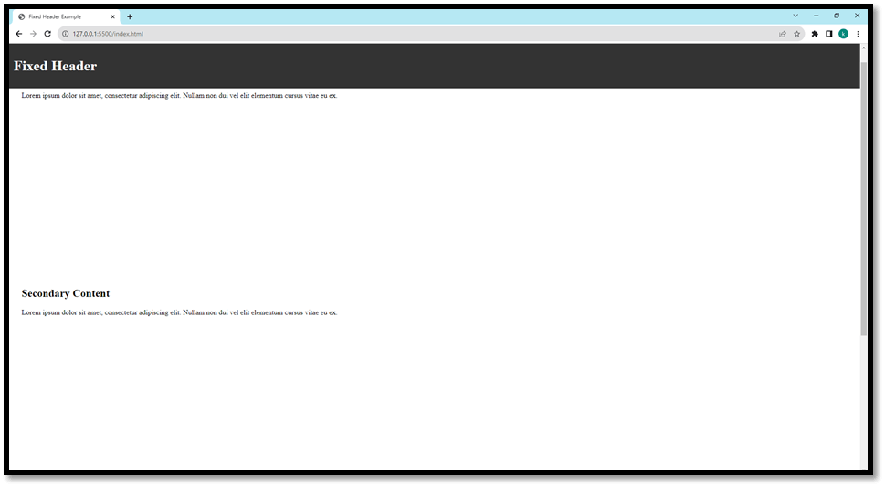
Here's a basic example:
Code:
Output:


Common Use Cases
- Navigation Bars: A fixed navigation bar at the top of a webpage provides easy access to important links regardless of how far a user has scrolled down.
- Sticky Sidebars: A sidebar that sticks to the side of the page as the user scrolls down is a common pattern for website layouts, especially in blogs or content-heavy websites.
- Modals and Pop-ups: Modals and pop-ups are often implemented using position fixed to ensure they remain in view, regardless of the user's scroll position.
- Headers and Footers: Headers and footers that remain visible even when a user scrolls through a lengthy page are often implemented using fixed positioning.
Advantages of Position-fixed
- Persistent Visibility: Elements with position fixed remain in the same position relative to the viewport, regardless of scrolling. This is especially useful for navigation bars, headers, and other UI elements that need to stay visible.
- Improved User Experience: Fixed elements enhance user experience by providing easy access to important information or navigation options without the need to scroll back to the top of the page.
- Effective for Long Content: This is particularly beneficial for long web pages where users might need to navigate to different content sections without losing sight of the navigation or important information.
- Sticky Headers and Footers: Fixed positioning is commonly used to create headers and footers that remain visible as users scroll through content, providing consistent branding and navigation.
- Modal Pop-ups: It's commonly used for creating modal windows, alerts, and pop-ups that need to stay in view until the user interacts with them.
Disadvantages of Position fixed
- Overlap Issues: If not implemented carefully, fixed elements can overlap with other content on the page. This can be problematic, especially on smaller screens or with complex layouts.
- Accessibility Concerns: Fixed elements can potentially interfere with screen readers and other assistive technologies. It's crucial to ensure that fixed elements do not obstruct the page's accessibility.
- Mobile Responsiveness Challenges: Fixed elements might not work as expected on all screen sizes and can sometimes cause issues on mobile devices. Responsive design considerations are necessary.
- Potential Clutter: Overusing fixed elements can lead to a cluttered user interface, which can overwhelm users. It's important to balance fixed elements and the overall design.
Conclusion
Position fixed is a powerful CSS property that allows you to create user interfaces with elements that remain in a fixed position relative to the viewport. It is commonly used for headers, footers, navigation bars, modals, and other UI components. Understanding how to use position fixed effectively can enhance the user experience and create more dynamic and interactive web pages.
|


 For Videos Join Our Youtube Channel: Join Now


