 Home
Home CSS
CSS HTML
HTML XHTML
XHTML JavaScript
 Bootstrap
 jQuery
 PHP
PHP XML
XML JSON
JSON Python
 C++
C++ Java
Java C#
C# SQL
SQL Interview Q
CSS Grayscale()The grayscale filter in CSS lets you essentially turn an element's colors into gradations of grey, giving it a grayscale or black-and-white appearance. It's a visual effect that turns an element into shades of grey by removing its color information. This filter is a component of the CSS filter property, which offers several effects for manipulating images and colors. The grayscale() function in CSS is an inbuilt function that is used to apply a filter to the image to set the grayscale of the image. A number between 0 and 1 indicates no grayscale (the original colors are kept), and 1 indicates complete grayscale (the colors are totally erased, leaving just shades of grey). These are the values used for the grayscale filter. Intermediate values between 0 and 1 represent grayscale intensity. Syntax:The grayscale filter is applied using the filter property in CSS.The value is a number between 0 (no grayscale) and 1 (full grayscale). This value can also be given in the form of a percentage, i.e., from 0% to 100%. Here's an example of using the grayscale filter in CSS: In the example above, the grayscale filter is applied to an element with the class grayscale-element, and the value is set to 0.5, making the element appear in a grayscale format. The filter property in the above example is useful in CSS. The grayscale( ) is one of the functions available for use in the filter property. The filter property in CSS provides graphical effects like blurring, adjusting brightness, or modifying color channels. Demonstration of Grayscale( ) FunctionBelow is a simple example of how you can use the grayscale() filter in HTML and CSS to apply a grayscale effect to an image: index.html The HTML file defines a basic webpage structure. It includes a viewport meta tag for responsiveness and links to an external stylesheet (styles.css). style.css The CSS file provides styling for the webpage. Output: 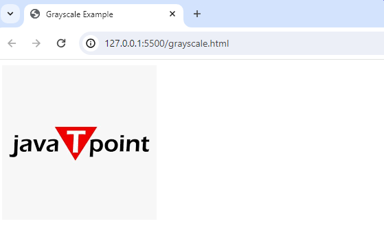
Explanation: In this example:
ConclusionThe CSS grayscale filter and the grayscale() function are useful tools for turning colors into various shades of grey and creating a grayscale or black-and-white visual impression. The syntax for the grayscale filter is straightforward, using the filter: grayscale(value); format where the value ranges from 0 to 1, indicating the degree of grayscale intensity. It may be used to alter color and picture presentations on web pages and is a component of the larger CSS filter property. The `filter: grayscale(value);} format is used in an easy-to-understand syntax for the grayscale filter. When desaturation or monochromatic representations are needed, this visual modification might be helpful. With the help of the programmable intensity parameter, developers may tailor the grayscale effect to their style. Web developers may improve the visual appeal of their websites and create visually appealing presentations by implementing the grayscale filter.
Next TopicCSS Make Div Scrollable
|
 For Videos Join Our Youtube Channel: Join Now
Feedback
- Send your Feedback to [email protected]
Help Others, Please Share


