| |

Matlab ColorMapIntroductionA colormap in MATLAB is a matrix that maps scalar data values to colors. Each row of the colormap matrix corresponds to a color, and the columns represent the red, green, and blue (RGB) components of that color. When visualizing data, MATLAB linearly maps scalar values to the indices of the colormap matrix, thereby assigning a color to each value. Types of ColormapsSequential ColormapsSequential colormaps are commonly used for representing ordered data, where values range from low to high. These colormaps feature a smooth progression of colors, allowing for easy interpretation of trends and variations in the data. Here's a more detailed look at some examples: Parul: 'Parula' is a default colormap introduced in MATLAB R2014b. It is perceptually uniform, meaning it maintains consistent perceptual differences between colors across the entire range. Example: Output: 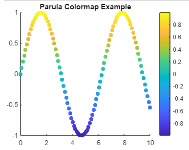
Jet: 'Jet' is a classic colormap in MATLAB, but it's important to note that it's not recommended for scientific visualization due to its non-uniform perceptual properties, particularly in grayscale. Example: Output: 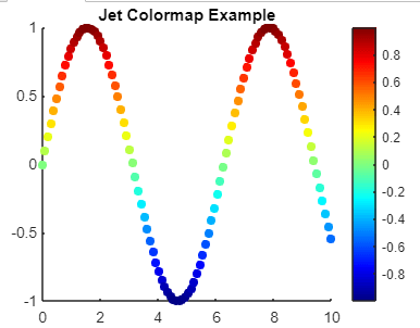
Hot: 'Hot' is a colormap that transitions from black to red, yellow, and white. It is often used to represent temperature-related data, where black corresponds to low temperatures and white corresponds to high temperatures. Example: Output: 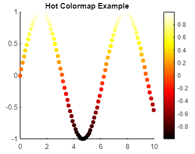
Viridis: 'Viridis' is one of the colormaps introduced in MATLAB as part of the "perceptually uniform" colormap series. It is designed to be perceptually uniform across all types of color vision deficiencies. Example: Output: 
Diverging ColormapsDiverging colormaps are ideal for highlighting positive and negative deviations from a central reference point. These colormaps typically use two distinct colors that diverge from a neutral midpoint. Let's delve into some examples: Coolwarm: 'Coolwarm' transitions smoothly from blue (negative values) to white (midpoint) and then to red (positive values). Example: Output: 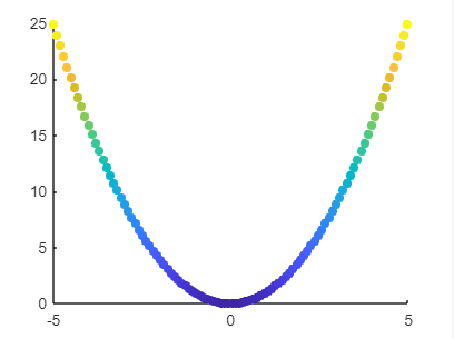
Bwr (Blue-White-Red): 'Bwr' colormap consists of blue for negative values, white for zero, and red for positive values. It provides a clear visual representation of deviations from a central reference point, with blue and red indicating negative and positive deviations, respectively. Example: Output: 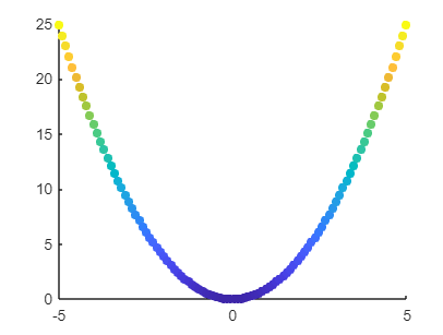
Cyclic ColormapsCyclic colormaps are suitable for data that wrap around at the extremes, such as angles or periodic data. These colormaps seamlessly transition from high to low values without any perceptible discontinuity. Here are a couple of examples: Hsv: 'Hsv' colormap represents colors in the hue-saturation-value color space. It smoothly transitions through all hues of the color wheel, making it suitable for cyclic data. Example: Output: 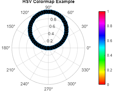
Twilight: 'Twilight' is another cyclic colormap that smoothly transitions through various hues, providing a visually appealing representation of cyclic data. It can be customized to adjust the brightness and saturation levels according to the specific requirements of the visualization. Example: Output: 
Qualitative ColormapsQualitative colormaps represent categorical or discrete data, and distinct colors are needed to differentiate between categories. Some examples include: Lines: The 'Lines' colormap consists of a set of distinct colors suitable for representing different categories or groups in a plot. Each color is easily distinguishable from the others, making it ideal for qualitative data visualization. Example: Output: 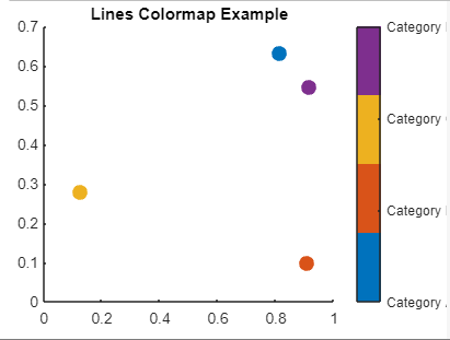
Prism: 'Prism' colormap offers a range of vibrant and distinct colors, making it suitable for visualizing categorical data with multiple groups or categories. It provides a visually appealing representation without sacrificing clarity. Example: Output: 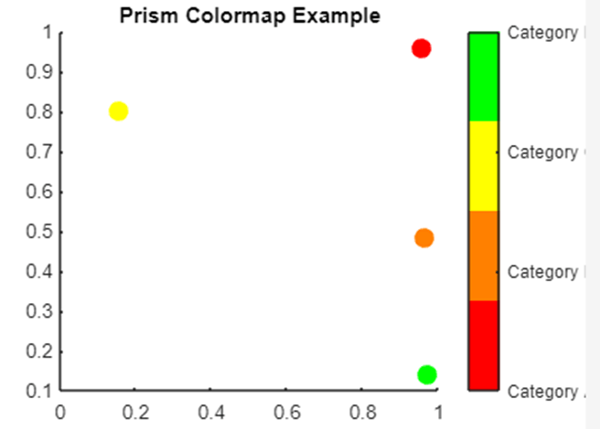
Flag: Flag' colormap consists of bold and contrasting colors, making it suitable for highlighting categorical distinctions in a plot. It is particularly useful when visualizing data with a small number of distinct categories. Example: Output: 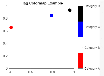
Customizing ColormapsMATLAB provides various options for customizing colormaps to suit specific visualization needs. Changing Colormap LengthYou can adjust the number of colors in a colormap using the colormap function. By default, MATLAB colormaps have a length of 64, but you can specify a different length to achieve smoother or more detailed color transitions. For example: Reversing ColormapsTo reverse the order of colors in a colormap, you can use the flip-up function. This can be useful for altering the direction of color transitions in your visualization. For example: Creating Custom ColormapsMATLAB allows you to create custom colormaps tailored to your specific requirements. You can define a colormap as a matrix specifying the RGB values of each color. For example: You can also use tools like rgbplot and colorGradient to assist in creating custom colormaps. Using Colorbar to Interpret ColormapWhen visualizing data with a colormap, it's essential to include a colorbar alongside the plot. This allows viewers to interpret the mapping of colors to data values. You can customize the colorbar to display relevant ticks, labels, and units to provide additional context to the visualization. For example: Applying Colormaps to Specific PlotsYou can apply different colormaps to specific plots within the same figure or across different figures. This flexibility allows you to optimize the visual representation of each plot based on its data characteristics. For example: Implementation:Output: 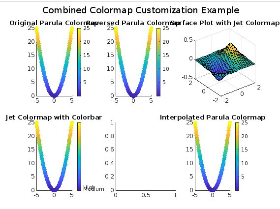
Explanation: The above MATLAB program demonstrates various colormap customization options through a series of scatter plots, surface plots, and colorbars. Here's a simple and short explanation of what each part of the program does: Creating Sample Data: Generates sample data (x and y) for visualization purposes. Customizing Colormaps:
Creating a Figure: Initializes a new figure for plotting. Plotting with Different Colormaps:
Adjusting Layout and Display:
Each subplot demonstrates a different aspect of colormap customization, such as changing colormap length, reversing colormaps, defining custom colormaps, adding colorbars, applying colormaps to specific plots, and interpolating colors. The program provides a visual representation of how these colormap customization options affect the appearance of the plots. Best Practices for Colormap UsageChoose Appropriate Colormaps:
Consider Color Vision Deficiencies:
Maintain Consistency:
Document Colormap Choices:
Consider Cultural Differences:
Seek Feedback:
Colormaps are indispensable tools for visualizing data in MATLAB. By understanding the types of colormaps available, customizing them effectively, and following best practices for colormap usage, you can create clear and informative visualizations that enhance the understanding of your data. Experiment with different colormaps and settings to find the most suitable representation for your specific visualization tasks.
Next TopicMatlab fft()
|
 For Videos Join Our Youtube Channel: Join Now
Feedback
- Send your Feedback to [email protected]
Help Others, Please Share


