| |

What is GraphIn mathematics, a graph is a visual representation or diagram that arranges facts or values. The relationships between two or more items are commonly represented by the points on a graph. Graphs are one of the subjects covered in discrete mathematics. In discrete mathematics, notably in graph theory, a graph is a structure resembling a set of objects in which some object pairs are conceptually "connected." Vertices, also known as nodes or points in mathematics, are the abstractions of objects, and edges are the connections between related pairs of vertices (also called a link or lines). In a diagrammatic representation of a graph, the vertices are typically represented by a collection of dots or circles, while the edges are typically represented by a set of lines or curves. 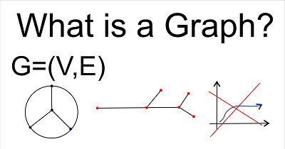
A triangular graph consisting of three vertices and three edges. A graph is the pair G = (V, E), where V is a collection of vertices (plural: vertices), and E is a set of paired vertices with edges as its components. Undirected and simple graphs distinguish them from directed graphs and multigraphs (sometimes links or lines). A multigraph is a generalization that enables several edges to share the same endpoints. Graphs are a common method for displaying the relationships between data. A graph accomplishes the goal of conveying information that is too complex or extensive to state in the text while taking up less space adequately. However, use graphs only for what we can express clearly in a sentence. Additionally, avoid repeating the information from the text because doing so defeats the purpose of utilizing a graph. We should utilize a graph if the data exhibits clear trends or demonstrates relationships between variables. A graph is not the appropriate visual representation when the data lack any discernible trend in the evidence. Graph a visual depiction of statistical information or a relationship between variables that serves a purpose. Here, for instance, we can plot a graph showing the type (Delivery time) and quantity of school supplies used by pupils in a class (Count) based on the data provided below. 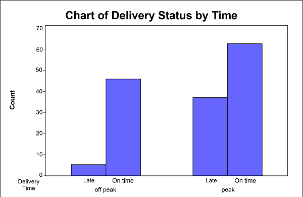
Each supply is first counted, and the data is then shown in a table with specific colours in a logical order. Graphs serve a predictive purpose because they can display broad trends in the quantitative behaviour of data. However, as approximations, they may need to be more precise and occasionally deceptive. Directed and Undirected edgesBoth directed and undirected edges are possible. For instance, if the edges between two individuals are handshakes, then the graph is undirected since any individual A can only shake hands with individual B if B also shakes hands with A. The graph is directed, however, if an edge from person A to person B indicates that A owes money to B because borrowing money is not always returned. J. Sylvester in 1878 (what he called a chemical-graphical image). J. used the term "graph" for the first time in his context. Edges and LoopsThe edges that connect a vertex to itself are known as loops and are occasionally permitted in graphs. The definition needs to be modified to define edges as multisets of two vertices rather than sets to support loops. Such generalised graphs are referred to as graphs with loops or simply as graphs. The edges must also be finite because the set of vertices V is typically assumed to be finite. Although occasionally considered, infinite graphs are typically seen as a specific type of binary relation because most findings on finite graphs are binary. The endpoints of an edge are the vertices x and y of an edge x, y. The edge is described as the incident on x and y and as joining x and y. A vertex may not be linked to any other vertex if it belongs to no edge. The infinite case is not covered by graphs, or it calls for a completely different proof. A graph's order is determined by its vertex count, or |V|. A graph's |E| number of edges measures its size. A graph that contains no vertices is said to be empty (and thus an empty set of edges). However, the size is |V| + |E| in other situations, such as when defining the computational complexity of algorithms (otherwise, a non-empty graph could have a size of 0). The number of edges that are incident to a vertex determines its degree or valency; for graphs with loops, an edge is counted twice for each loop. The highest degree of each vertex in a graph of order n is n 1 (or n). The greatest number of edges is n (n 1)/2 (or n (n + 1)/2 if loops are permitted), while the minimum number of edges is n (n 1)/1 (or n (n + 1)/1 if loops are allowed). 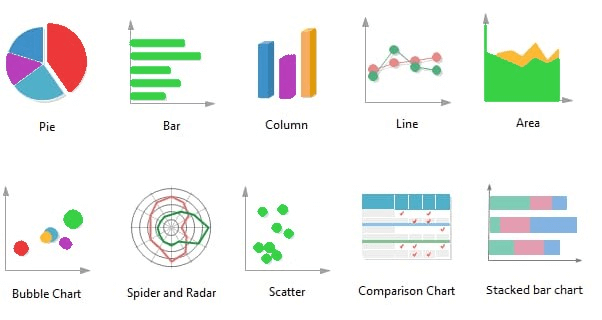
The adjacency relation is symmetric, defined by a graph's edges on its vertices. In more detail, two vertices, x and y, are close together if x, y is an edge. The adjacency matrix A, an n square matrix that specifies the number of links from vertex I to vertex j, may fully describe a graph. Hence for a simple graph, Aij must be either 0, which denotes disconnection, or 1, which denotes connection. Aii also must be zero. MultigraphsGraphs with self-loops will be characterised by some or all Aii being equal to a positive integer and multigraphs (with many edges connecting vertices) by some or all Aij being equal to a positive integer. Most graphs include two axes: a horizontal axis representing a set of independent variables and a vertical axis representing a set of dependent variables. A broken-line graph, in which time is typically the independent variable, is the most typical type of graph. Data points are plotted on such a grid to roughly represent a curve of seasonal swings in sales trends and then connected with line segments. It's okay to connect data points in a straight line. Instead, as is frequently the case in experimental physics or chemistry, we may group them around a median line or curve. We can use a bar graph to display the relationships between discrete numerical quantities when the independent variable is not explicitly temporal. For instance, we may use parallel columns or bars to show the relative population sizes of various countries. Each bar would have a length proportional to the population of the nation it was meant to represent. As a result, a demographer could quickly determine that China's population is roughly 30% larger than its closest competitor, India. The same data can be expressed using a circular graph as a part-to-whole relationship. When a circle is broken into sectors, the size or angle of each sector directly relates to the proportion of the entire circle that the sector makes up. The most typical use of this type of graph, also known as a pie chart, is to display how items are broken down in a budget. We would depict similar relative population proportions in this graph as in the bar graph, but it would also show that China is home to about one-fourth of the world's population. Analytical GraphsAnalytical graphs are used to map functions of two variables onto a Cartesian coordinate system, which consists of a horizontal x-axis, also known as the abscissa, and a vertical y-axis, known as the ordinate. In this sense, a graph gathers every point (x, y) that fulfils a particular function. The zero point represents where each axis intersects with a real number line. Linear, or first-degree, equations are the simplest to graph, and the simplest of these is y = x. This equation's graph is a straight line that cuts through the bottom left and top right quadrants at a 45� angle to the origin. The most frequent shapes on graphs of second-degree equations include parabolas, hyperbolas, circles, and ellipses. On a logarithmic grid, where a point on an axis represents the variable's logarithm rather than the actual variable, we occasionally show this and other nonlinear functions. CoordinatesIn some circumstances, polar coordinates (q.v.) offer a more suitable graphic system in which points on a circular plane are located using a sequence of concentric circles connected by straight lines through their shared origin. By adding a third variable to the corresponding algebraic or trigonometric functions, polar and cartesian coordinates can be stretched to represent three dimensions. When three axes are present, solid bodies are represented by an isometric graph in the first case, and a graph represents curved surfaces with spherical coordinates in the second. The author must adhere to some fundamental principles even though numerous computer applications can build a graph. A graph must be easily legible and understandable as a basic need. The type of graph itself, in addition to the font size and symbols, determines this. Each graph needs to have a detailed and understandable legend. A graph may include a figure number, and a caption (not a title), depending on the format. X and Y AxisCreate a graph where the horizontal axis is the independent variable and the ordinate, or the Y axis is the dependent variable. The independent variable is represented by the axis (abscissa, X-axis). 
A data field, axes and scales, symbols, and a caption are always required for a graph. The plotting symbols must be clear, readable, and strongly contrast the background and foreground figures. Compared to open circles and open squares combined, open and closed circles offer the best contrast and are more useful. Similar to how the paper's title is expressed, each para should be as informative as possible about what the graph tells the reader. Still, it should not give a summary or interpretation of the findings or specifics of the experiment. The data type to be shown must be considered when selecting the appropriate graph type. Use bar graphs if only the dependent variable is numerical, line diagrams or scattergrams if both the independent and dependent variables are numerical, and pie charts or bar graphs for proportions if both the dependent and independent variables are numerical. ScattergramA scattergram shows the relationship between two variables when determining if their values vary consistently, such as when contrasting the concentration levels of two different proteins. One continuous variable, like time, temperature, or pressure, is represented by a line graph's X values, the only distinction between a line graph and a scattergram. It plots a set of related data to show how Y changes as a function of X. Line graphs are similar to the survival plots of time-to-event outcomes used in Kaplan-Meier studies. The Y-axis shows the percentage of people who avoid or experience a particular event over time as a proportion or percentage. A bar graph can have either horizontal or vertical columns. The value rises when the bars lengths do as well. A particular kind of bar graph that resembles a column graph is the histogram, also known as a frequency distribution graph. The columns are lined up perfectly with one another. It displays the information acquired from measuring a continuous variable. Individual data points are categorised into groups called classes to depict the frequency of data within each class. The column's area is utilized to determine the frequency. These graphs are frequently used, for instance, to determine whether a variable has a normal distribution, such as the distribution of protein levels among a community of people. These can show how a measured category combined with a measured variable is distributed. A pie chart displays data categories or groups concerning the entire data set. The pie represents all the data, with each slice or segment representing a different class or group within the overall picture. Significant variations should be visible in each slice. Generally speaking, the range of categories should be between 3 to 10. A box plot could be vertical or horizontal. The distances between the box's various components show how dispersed the data are and whether they are distributed symmetrically or asymmetrically. The minimum, lower quartile, median, and a maximum of one or more box-and-variables are displayed using this technique as a statistical summary. It might also provide the data that stand out. Common Mistakes Include the Following:
The author cannot determine the values between the age groups that lie on the line when a continuous line is formed between discrete data points, such as average patient measurements. Displaying average values from each age group in each bar chart column could be more effective than displaying individual data. When an extremely large range needs to be covered but cannot be realistically shown with a continuous scale, a discontinuity in the scale and the data field should be indicated using paired diagonal lines (-/-).
Next TopicHow Many Zeros in One Billion
|
 For Videos Join Our Youtube Channel: Join Now
Feedback
- Send your Feedback to [email protected]
Help Others, Please Share


