Data Visualization in Machine Learning

Data visualization is a crucial aspect of machine learning that enables analysts to understand and make sense of data patterns, relationships, and trends. Through data visualization, insights and patterns in data can be easily interpreted and communicated to a wider audience, making it a critical component of machine learning. In this article, we will discuss the significance of data visualization in machine learning, its various types, and how it is used in the field.
Significance of Data Visualization in Machine Learning

Data visualization helps machine learning analysts to better understand and analyze complex data sets by presenting them in an easily understandable format. Data visualization is an essential step in data preparation and analysis as it helps to identify outliers, trends, and patterns in the data that may be missed by other forms of analysis.
With the increasing availability of big data, it has become more important than ever to use data visualization techniques to explore and understand the data. Machine learning algorithms work best when they have high-quality and clean data, and data visualization can help to identify and remove any inconsistencies or anomalies in the data.
Types of Data Visualization Approaches
Machine learning may make use of a wide variety of data visualization approaches. That include:
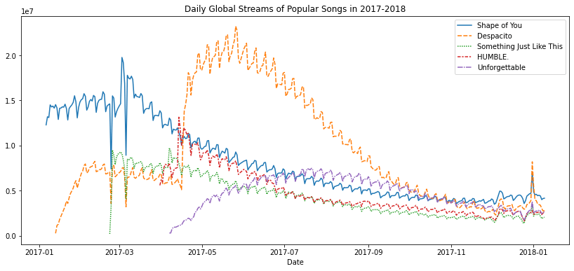
- Line Charts: In a line chart, each data point is represented by a point on the graph, and these points are connected by a line. We may find patterns and trends in the data across time by using line charts. Time-series data is frequently displayed using line charts.
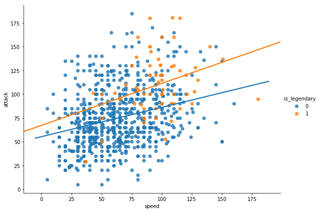
- Scatter Plots: A quick and efficient method of displaying the relationship between two variables is to use scatter plots. With one variable plotted on the x-axis and the other variable drawn on the y-axis, each data point in a scatter plot is represented by a point on the graph. We may use scatter plots to visualize data to find patterns, clusters, and outliers.
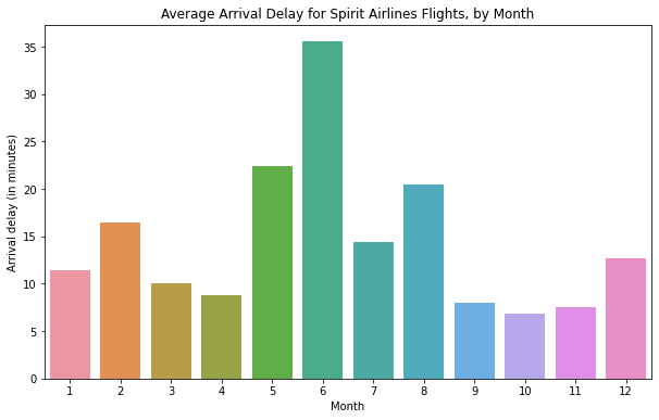
- Bar Charts: Bar charts are a common way of displaying categorical data. In a bar chart, each category is represented by a bar, with the height of the bar indicating the frequency or proportion of that category in the data. Bar graphs are useful for comparing several categories and seeing patterns over time.
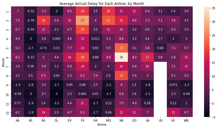
- Heat Maps: Heat maps are a type of graphical representation that displays data in a matrix format. The value of the data point that each matrix cell represents determines its hue. Heatmaps are often used to visualize the correlation between variables or to identify patterns in time-series data.
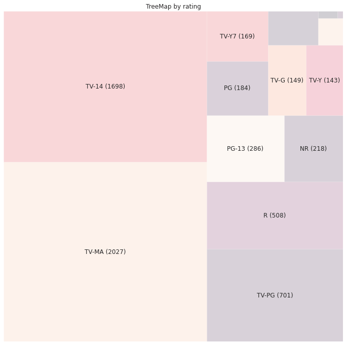
- Tree Maps: Tree maps are used to display hierarchical data in a compact format and are useful in showing the relationship between different levels of a hierarchy.
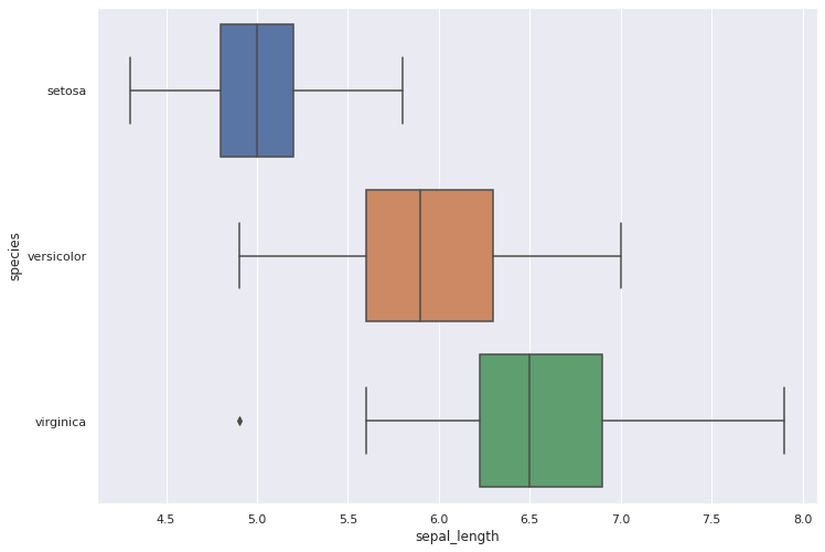
- Box Plots: Box plots are a graphical representation of the distribution of a set of data. In a box plot, the median is shown by a line inside the box, while the center box depicts the range of the data. The whiskers extend from the box to the highest and lowest values in the data, excluding outliers. Box plots can help us to identify the spread and skewness of the data.
Uses of Data Visualization in Machine Learning
Data visualization has several uses in machine learning. It can be used to:
- Identify trends and patterns in data: It may be challenging to spot trends and patterns in data using conventional approaches, but data visualization tools may be utilized to do so.
- Communicate insights to stakeholders: Data visualization can be used to communicate insights to stakeholders in a format that is easily understandable and can help to support decision-making processes.
- Monitor machine learning models: Data visualization can be used to monitor machine learning models in real time and to identify any issues or anomalies in the data.
- Improve data quality: Data visualization can be used to identify outliers and inconsistencies in the data and to improve data quality by removing them.
Challenges in Data Visualization

While data visualization is a powerful tool for machine learning, there are several challenges that must be addressed. The following list of critical challenges is provided.
- Choosing the Right Visualization: One of the biggest challenges in data visualization is selecting the appropriate visualization technique to represent the data effectively. There are numerous visualization techniques available, and selecting the right one requires an understanding of the data and the message that needs to be conveyed.
- Data Quality: Data visualization requires high-quality data. Inaccurate, incomplete, or inconsistent data can lead to misleading or incorrect visualizations. When displaying the data, it is crucial to make sure it is accurate, consistent, and comprehensive.
- Data Overload: Another challenge in data visualization is handling large and complex datasets. When dealing with large amounts of data, it can be difficult to find meaningful insights, and visualizations can quickly become cluttered and difficult to read.
- Over-Emphasis on Aesthetics: While aesthetics are important, overemphasizing the visual appeal of the visualization at the expense of accuracy and clarity can be problematic. Data visualizations should prioritize the accuracy and effectiveness of the message over aesthetics.
- Audience Understanding: Another challenge in data visualization is ensuring that the target audience can interpret and understand the visualizations. Visualizations should be designed with the audience in mind and should be clear and concise.
- Technical Expertise: Creating effective data visualizations often requires technical expertise in programming and statistical analysis. Data analysts and data scientists need to be familiar with programming languages, visualization tools, and statistical concepts to create effective visualizations.
Conclusion
In conclusion, data visualization is an essential tool for machine learning analysts to analyze and understand complex data sets. By using data visualization techniques, analysts can identify trends, patterns, and anomalies in the data and communicate these insights to stakeholders in a format that is easily understandable. With the increasing availability of big data, data visualization will continue to be an important part of the machine learning process, helping analysts to develop more accurate and reliable machine learning models.
|

 For Videos Join Our Youtube Channel: Join Now


