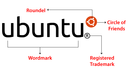
Ubuntu LogoUbuntu means "a humanist and ethic philosophy concentrating on the relations and allegiances of the people with each other". The Ubuntu logo can be described as the graphical illustration of three people holding their arms out and making a circle. The logo of the Ubuntu system captures the reliable and precise brand qualities in a straightforward wordmark and symbol. It is composed of a wordmark (custom-designed font) and carefully spaced using the 'Circle of Friends' (re-drawn) placed in a roundel. The consistent application of the Ubuntu logo is necessary for making the identity of a united brand. A master logo can be supplied as artwork and must never be changed, re-created, or distorted in any way. Important: The word "Ubuntu" and related logos are trademarks registered. To understand the concept of the Ubuntu logo, it's necessary to know what the logo name itself specifies. The Linux OS gets its name after the humanist or ethic Ubuntu philosophy which contains its roots in South Africa. The playful and bright visual Ubuntu identity was recreated only once since the time of the release of the software in 2004. The modernized and refined emblem repeats the actual ones displaying the value of traditions, roots, and reflecting the ability of the brand for growing and evolving.
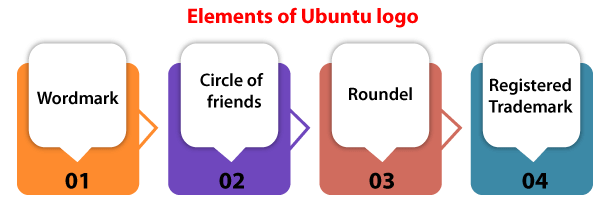
Elements of LogoThere are several elements of the Ubuntu logo available. These elements are listed and explained below: 

WordmarkThe logotype has been established with our custom-designed and unique font. All the letters are carefully spaced for maximum legibility and a correct feel.
Circle of FriendsThe Ubuntu logo is a crafted graphic sign that illustrates reliability, precision, collaboration, and freedom. The Ubuntu logo is composed of the Ubuntu symbol and Ubuntu wordmark. This system is known as the "Circle of Friends". It is carefully positioned and re-drawn inside a roundel for added clarity and precision. The symbol must always occur as white over a flat background of orange color whenever possible.
RoundelFor the design, i.e., Circle of Friends, the roundel (circular holding device) is used for added clarity and precision. Registered TrademarkThe word "Ubuntu" and related logos are trademarks registered. If using the logo of Ubuntu, we must include the registered trademark symbol, unless the location or size of the reference or logo will make it detrimental or impossible to feel and look. In such a case, we must recognize the logo as the Canonical TM by specifying in an obvious and appropriate place "Ubuntu is the registered trademark of the Canonical Ltd.". Selecting the Right Version of LogoThere are some alternative versions of Ubuntu are available. These are listed and explained below:
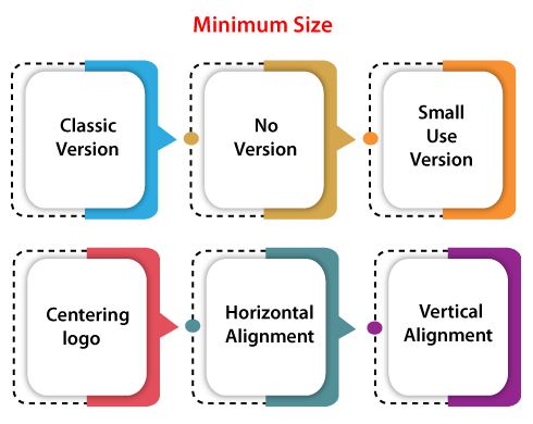
Specifying the exclusion zoneThe logo of Ubuntu should always include a clear space surrounding it and it should also be free from other elements. To specify this area, we need to measure the roundel's height and apply half of this measurement for creating a clear space's boundary around the logo. The CoF (Circle of Friends) must always include a clear area around it and be free from other elements if used on their own. To specify this area, we need to measure the roundel's height and apply a quarter of this measurement for creating a clear space's boundary around the logo. Minimum Size
Incorrect UseIt is paramount to the identity of the Ubuntu brand to ensure the correct use of the logo. By following some guidelines on how to apply them we will understand the concept for building a united and powerful identity for the Ubuntu brand. These guidelines are discussed as follows:
Ubuntu Stacked LogoThe stacked release of the logo has been developed for remarkable circumstances (for example, hardware stickers). The consistent application of the Ubuntu logo is necessary for making the identity of the Ubuntu brand. A master logo can be supplied as artwork and must never be changed, re-created, or distorted in any way. Describing the Stacked logo's exclusion zoneThe logo of stacked Ubuntu should always contain a clear space around it and it should also be free from other elements. To describe this area, we need to measure the roundel's height and apply a quarter of this measurement for creating a clear space boundary surrounding the logo. Minimum Size
Making brand extensionsThe logo must always be applied in a landscape style when making brand extensions using exclusion zone info, i.e., 'half X'. The extension's cap height is equivalent to the 'u' height within the brandmark.
Next TopicUbuntu MATE
|
 For Videos Join Our Youtube Channel: Join Now
Feedback
- Send your Feedback to [email protected]
Help Others, Please Share


