| |
Python Tutorial
Python OOPs
Python MySQL
Python MongoDB
Python SQLite
Python Questions
Plotly
Python Tkinter (GUI)
Python Web Blocker
Python MCQ
Related Tutorials
Python Programs

How to Create India Data Maps With Python and MatplotlibIntroductionData visualization's ability to simplify and improve the availability of complex information is frequently crucial. In today's data-centric world, making customized maps is one very effective way to communicate data. Python and the Matplotlib library can work together to create a potent tool for data visualization linked to India. For a long time, maps have been successfully used to visualize data and identify spatial trends. Code Output: 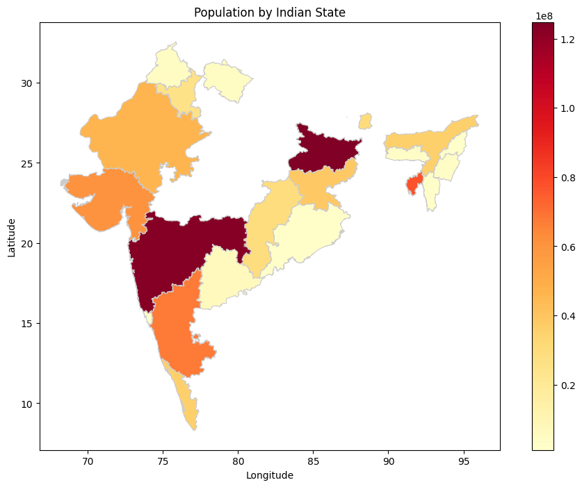
Step 1: Setup Your Environment
Step 2: Gather Geospatial Data
Step 3: Load data and import libraries
Step 4: Load Data Points
Step 5: Create a Basic Map
Step 6: Plot Data Points
Step 7: Customize Your Map
Step 8: Geographic Projections
Step 9: Display or Export Your Map
Step 10: Additional Research and Improvement
Preparation of Data
Customizing a map
Geographic Projections
ConclusionThis tutorial will teach you how to create data maps of India using the robust Matplotlib package and the flexible Python programming language. In our modern, information-centric culture, the value of data visualization cannot be emphasized, and the capacity to present data in a spatial context is of utmost importance. We have used a logical, step-by-step approach throughout this tutorial to ensure that both new and seasoned Python users can generate educational and aesthetically pleasing maps customized to their data needs. From installing the Python environment to integrating geographic data and customizing map elements, we have thoroughly covered every procedure step. The ideas mentioned here are valid regardless of the sort of data you desire to visualize, be it demographic patterns, economic differences, or any other geographical information. Python and Matplotlib provide the tools to turn unstructured data into engaging visual stories. You now possess a useful skill set that enables you to make informed judgements and share insights using India data maps. You'll be able to create appealing visualizations that aid in better comprehension and decision-making in various sectors, from research and academics to business and public policy, with continuing practice and exploration. Utilize the strength of Python and Matplotlib, and let your data paint a picture of the geography of India. |
 For Videos Join Our Youtube Channel: Join Now
Feedback
- Send your Feedback to [email protected]
Help Others, Please Share


