Python Tutorial
Python OOPs
Python MySQL
Python MongoDB
Python SQLite
Python Questions
Plotly
Python Tkinter (GUI)
Python Web Blocker
Python MCQ
Related Tutorials
Python Programs
Python Libraries for Data VisualizationPython programming language has different types of libraries for all kind of projects. Likewise, python has various libraries for visualization of Data, so that user can understand the dataset in very detailed way and analyze it properly. Each library of visualization has its own specification. Using the particular libraries for specific task helps the user to complete the task in more easy and accurate way. Some liberates work better than the others. In this article we will discuss pros and cons of the libraries to understand which library would be better for data visualization. The Libraries for Data Visualization in Python programming are given below:
MatplotlibMatplotlib is a Library used for plotting graphs in the Python programming language. It is used plot 2 - dimensional arrays. Matplotlib is built on NumPy arrays. It is designed to work with the border SciPy stack. It was developed by John Hunter in 2002. The benefit of visualization is that user can have visual access to large amounts of the dataset. Matplotlib is a library which is consists of various plots such as histogram, bar, line, scatter, etc. Matplotlib comes with a huge variety of plots. Plots are helpful for understanding patterns, trends and for making correlations. It has instruments for reasoning about quantitative information. As matplotlib was the very first library of data visualization in python, many other libraries are developed on top of it or designed to work parallel to it for the analysis of the dataset. Output: 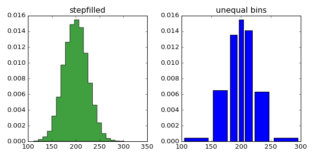
SeabornSeaborn is a library of Python programming basically used for making statistical graphics of the dataset. This library is built on top of the Matplotlib library. It is also integrated closely with Pandas, which is used for the data structure of Datasets. Seaborn is very helpful to explore and understand data in a better way. It provides a high level of a crossing point for sketching attractive and informative algebraic graphics. Let's understand the following example. Example - Output: 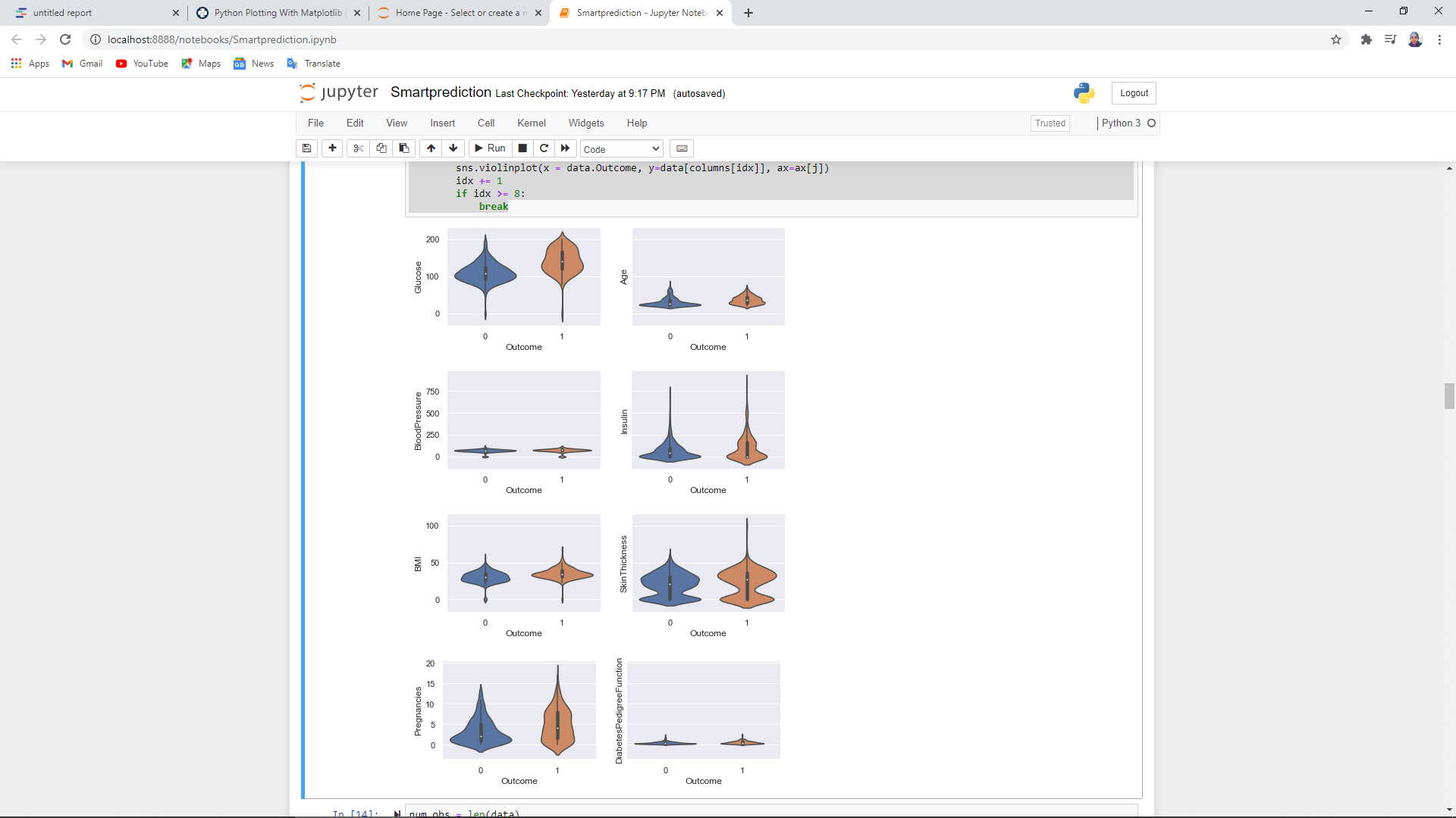
GgplotThe ggplot is a Python operation of the grammar for graphics. It is based on ggplot2, which is an R programming language plotting system. It has a different operating process than matplotlib, as it lets the user to layer components for creating a complete plot. The user can start layering from the axis, add points, then a line, afterward a trendline and so on. Ggplot is not designed to develop a high level of customized graphics. It has a simpler method of plotting with a lack of complexity. It is integrated with Pandas. Therefore, it's best to store data in a data frame while using ggplot. Example - 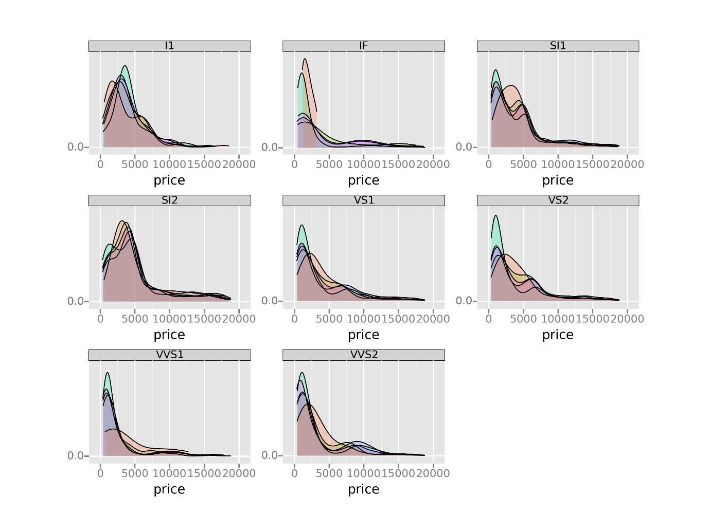
BokehBoken is a library of Python which is also based on the grammar of graphics, just like the ggplot. It is just inherent to Python language only. This library cannot be used in the R programming language. This library has the ability to build interactive, web-ready plots, which are the outputs of JSON objects, interactive web applications or HTML documents. This library of python language also allows streaming and real-time data. There are three interfaces with different levels of control to put up different user types in the Bokeh library. The highest level of control is used to create charts rapidly. This library includes different methods of generating and plotting standard charts such as bar plots, histograms and box plots. The lowest level focuses on developers and software engineers. This level has no pre - set defaults, and users have to define each element of the chart or plot. The middle level of control has the specifications same as the Matplotlib library. This level allows the users to control the basic development of blocks of every chart and plot. Let's understand the following example. Example - 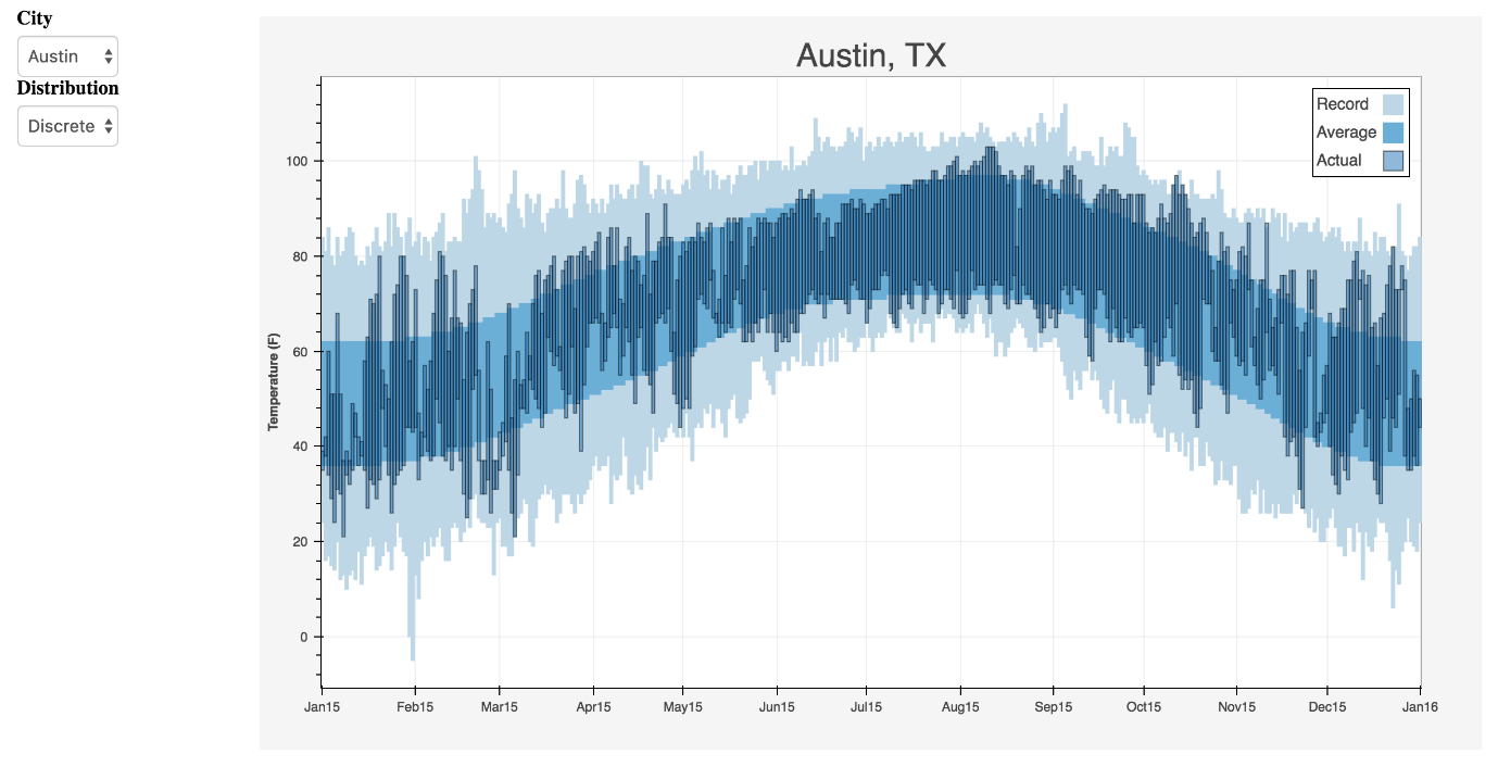
pygalPygal is a library of Python programming language which is also used for data visualization. This library also develops interactive plots, just like Bokeh and Plotly libraries. The interactive plots developed using the pygal library can be rooted inside the web browser. This library has the ability to provide the output chats of data as SVGs. SVGs work well with smaller datasets. So if the users are using a large data set and trying to create charts with a large number of data points, charts will have problems in execution and will become slow. In the pygal library, it is easy to draw an attractive chart in just a few code lines because it has methods for all different chart types, and it also has built-in styles. Example - Output: 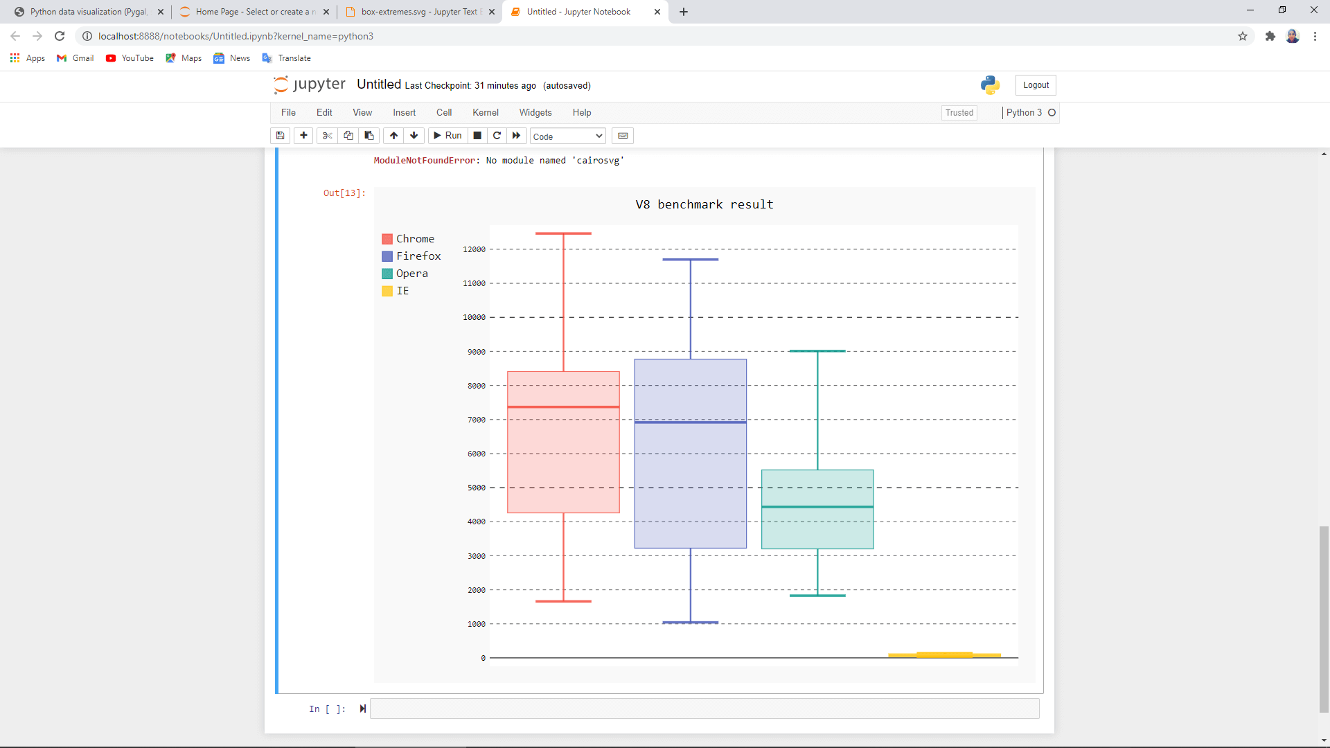
PlotlyPlotly is a library used for data visualization. It is also an open platform where users can visualize and analyse the data online. This library is used for developing interactive plots and charts. It is an open - source plotting library that allows nearly about 40 unique chart and plot types, covering a huge range of algebraic, economical, geographical 3 -Dimensional and scientific user cases. This library is used to draw chats and plots like dendrograms, 3 - Dimensional charts and contour plots. Plotly library of python is developed on the top of Plotly JavaScript library. Example - Output: 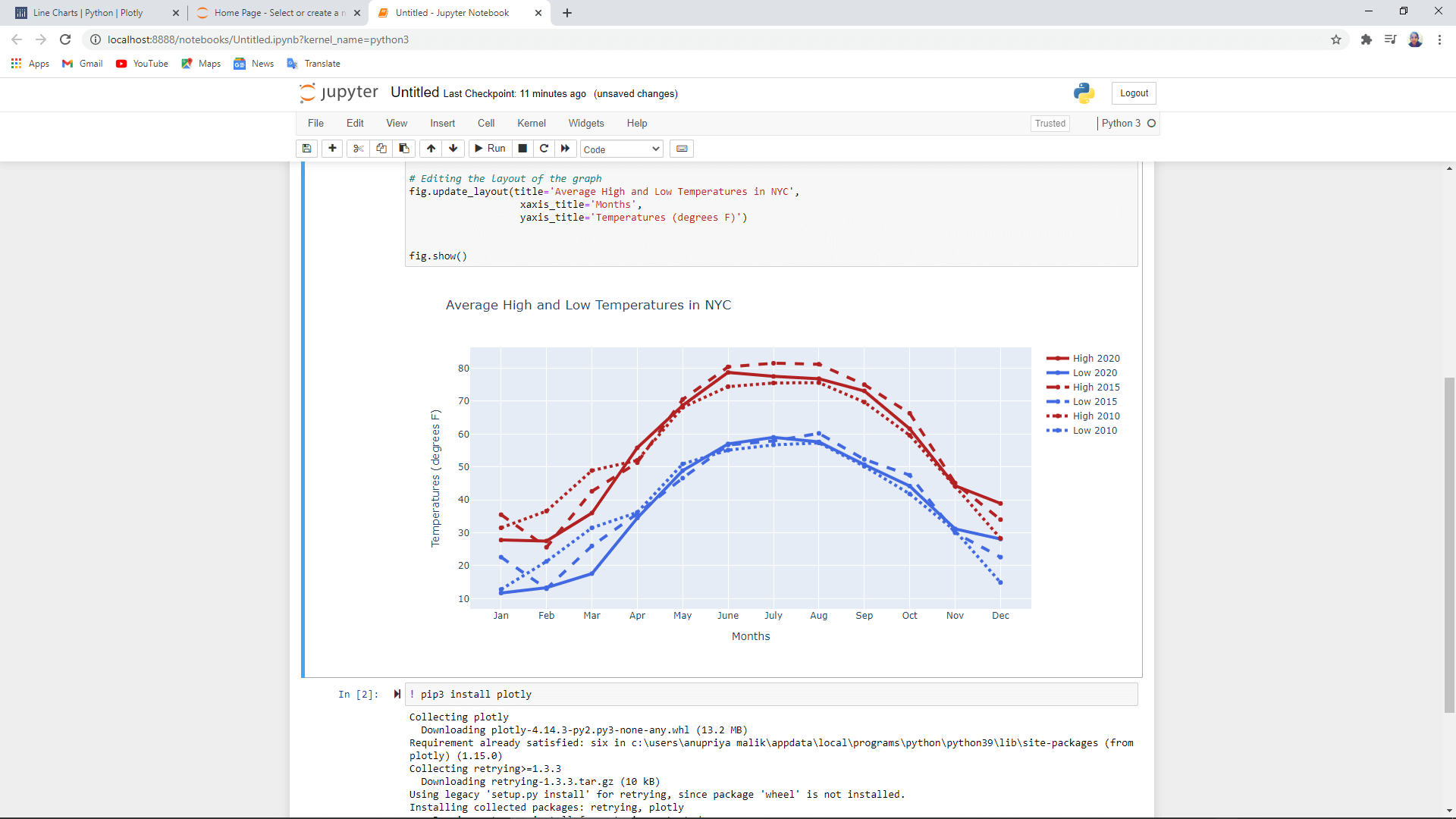
GeoplotlibGeoplotlib is a library of Python language which allows the user to develop maps and plot geographical data. It is a library of the toolbox that are used to draw different types of maps such as heatmaps, dot - density maps and choropleths. To use the geoplotlib library user needs to download Pyglet, which is an interface of an object-oriented programming language. Geoplotlib library plot the points of maps on OpenStreetMap tiles. It also has the feature of zooming and panning the map so that users can see more specifically. This library automatically handles the entire dataset loading, the projection of the map, and downloads the tiles of the map. It has graphics rending from OpenGL. Example - Output: 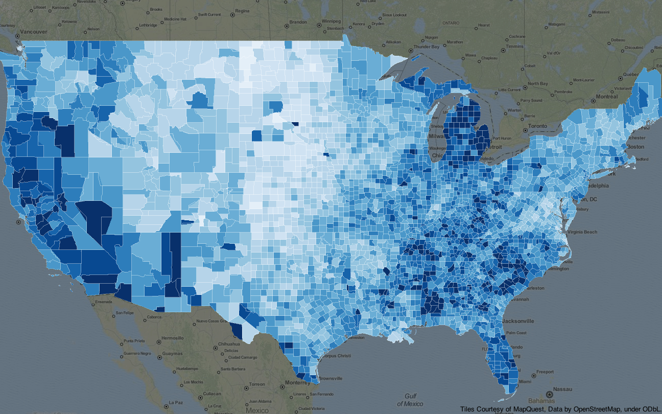
GleamGleam is used for data visualization in the Python programming language. It is inspired by the Shiny package of R programming language. This library is used to visualize and analyse the data of interactive web applications which use Python scripts only. So, users do not need to learn any other programming language like JavaScript, HTML or CSS. Gleam can work with any data visualization library of python programming language. Using gleam, users need to develop the basic plot, and they can build different fields on its top and later on can filter and sort the data easily. Example - Output: 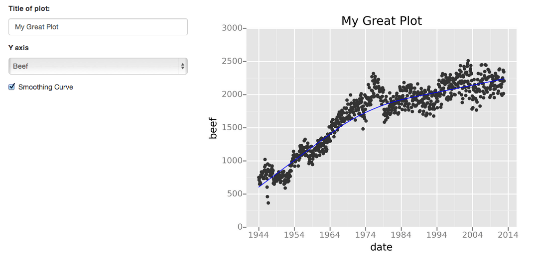
MissingnoMissingno is a library of the Python programming language used to deal with the dataset having missing values or messy values. This library provides a small toolset that is easy - to - use and flexible with missing data visualizations. It has utilities that help the user to get a rapidly visual summary of the completeness dataset. The user can use the filter and sort the dataset based on the completeness or spot the correlations using heatmap or dendrograms. Example - Output: 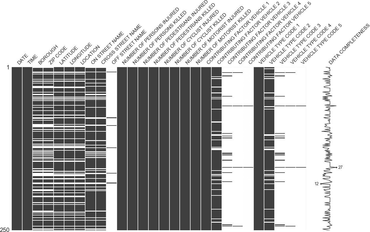
LeatherLeather is a Python programming language library used to create charts for those who need charts immediately and do not care whether the chart is perfect. This library works with every type of data set. This library creates the output chats of data as SVGs so that the users can measure the charts with the best quality. The leather library is a new library, and still, some of its documentations are in progress. The charts created using this library are basic but of good quality, which is roughly made. Example - 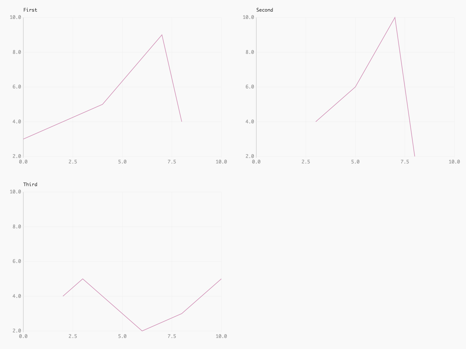
FoliumFolium is a library that makes ivery easy to visualize and analyse the data on an interactive leaflet map. This library has various built - in tilesets from different platforms like OpenStreetMaps, Stamen and Mapbox. Folium library is easy to draw maps with markers. However, other libraries of python language are also capable of creating maps like Altair, boken and Plotly. Folium library uses OpenStreetMap, which gives a feel of Google map and a few code lines. This library also made it easy to add possible locations of other users by using markers. Folium library also has various plugins that can be seen on the map, including a plugin to Altair. Example - 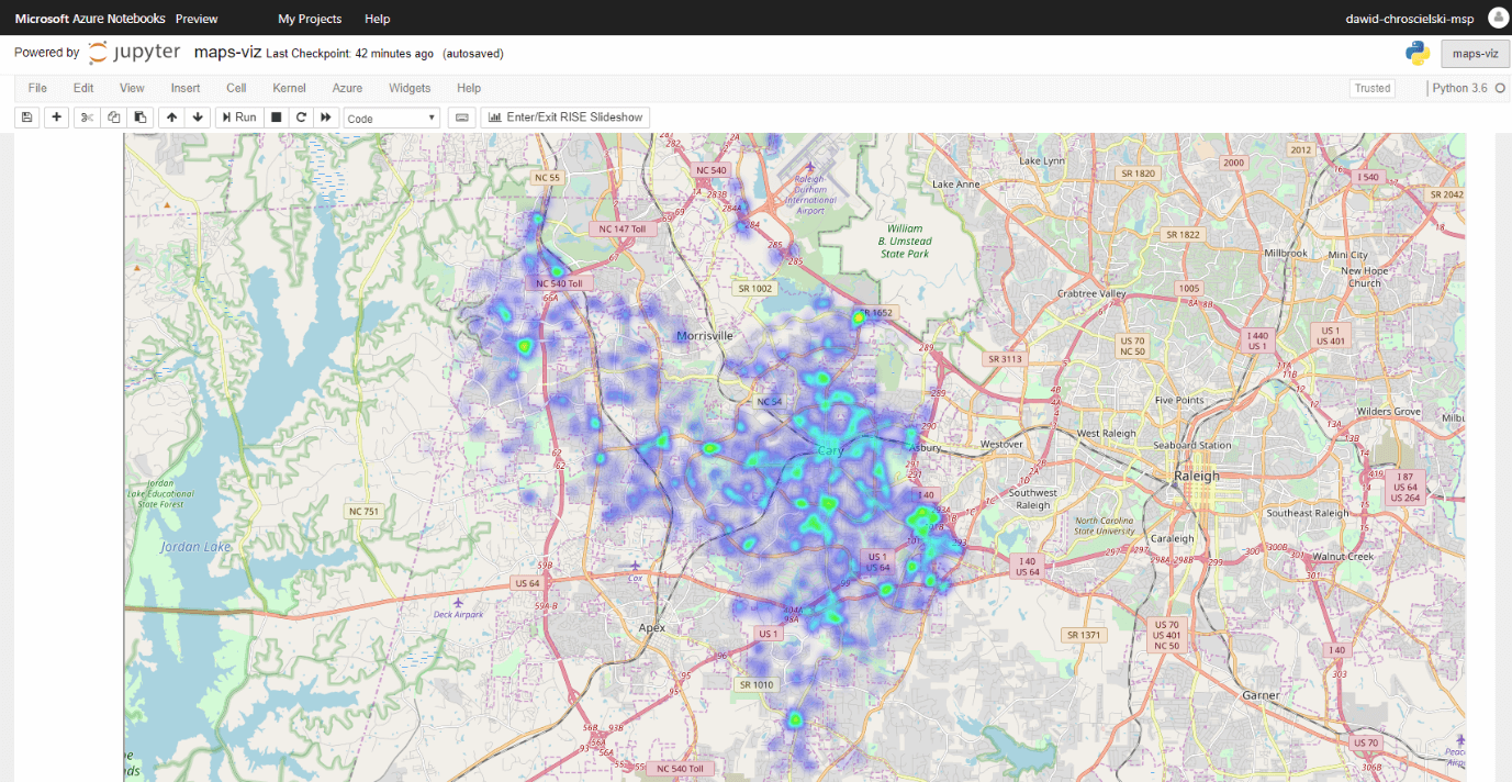
SummaryThis article has discussed different types of Python libraries used for data visualization and analysis in more specific and detailed ways. We have also discussed each library's different use and purpose and their unique features, like which library is used for what kind of plotting and creating charts and how we can manage to get more accurate and fast output visualization of our data set.
Next TopicHow to call a function in Python
|
 For Videos Join Our Youtube Channel: Join Now
Feedback
- Send your Feedback to [email protected]
Help Others, Please Share


