| |

Plotly with Pandas and CufflinksA Python module called plotly is used to create graphs, particularly interactive graphs. It can draw many different graphs and charts, including histograms, boxplots, spreadplots, and barplots. It is mostly employed in financial analysis and data analysis. An interactive visualisation library is called plotly. To immediately produce graphs and charts out of dataframes, cufflink integrates plotly with pandas. The term "choropleth" refers to the geographic plotting of the USA. Maps of the earth and many other things are plotted using choropleths. Let's use plotly and cufflinks to create various plot kinds, like as boxplots, spreadplots, etc. Command to install plotly: Command to install cufflink: Code #1: Show dataframeProgram: The following program will be: OUTPUT: The Output for the following program will be:
      Category  Values
0       A              32
1       B              43
2       C               50
Code #2: Normal PlotOUTPUT: The Output for the following program will be: 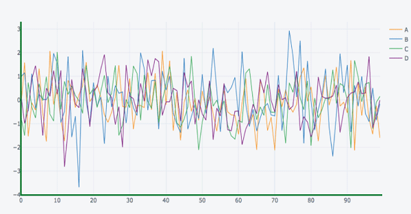
Pandas is a very well-liked Python data analysis toolkit. Additionally, it supports its own plot functions. Pandas plots do not, however, offer interactive visualisation. Thankfully, Pandas dataframe objects can be used to create plotly's interactive and dynamic displays. We begin by creating a Dataframe out of straightforward list objects. The x and y characteristics of graph object traces are represented as data values in the dataframe columns. Using the name and marks columns, we will create a bar trace in this instance. 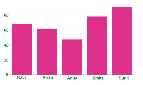
It can be used directly with Pandas dataframes by using another package called Cufflinks. Install the cufflinks package using your preferred package manager, such as pip, if it is not already installed. To set up cufflinks for offline use, import it first along with other libraries like Pandas and numpy. Now, you may display different types of plots directly using Pandas dataframes rather than using the trace and figure objects from the graph_objs module as we previously did. df.iplot(kind = 'bar', x = 'name', y = 'marks') Pandas dataframes from databasesData from many kinds of databases can be used to populate the dataframe rather than Python lists. We can use the read_csv() method from the Pandas library to retrieve data from a CSV file. To set up cufflinks for offline use, import it first along with other libraries like Pandas and numpy. An interactive visualisation library is called plotly. To immediately produce graphs and charts out of dataframes, cufflink integrates plotly with pandas. The term "choropleth" refers to the geographic plotting of the USA. Maps of the earth and many other things are plotted using choropleths. Data Visualization in PythonUsually, only these two libraries-matplotlib and seaborn-are covered in class. These libraries include tools that allow us to create many different types of plots, including line charts, pie charts, bar plots, box plots, and many more. I had the exact same thought when I first learned about plotly and cufflinks. What is plotlib?An open-source charting package that offers the capability of interactive plotting is called Plotly. A number of programming languages, including Python, R, MATLAB, Arduino, and REST, are supported by the library. Another Python module called Cufflink links plotly with pandas so that charts can be easily created on data frames. In essence, it functions like a plugin. With plotly, we can also create animations and interactive graphs on geographical, scientific, statistical, and financial data. DatasetBefore going for the implementation of plotly, we first need to apprehend our dataset and operations that may be carried out to do information visualization the usage of various charts. We have taken the tata cars shares charge dataset of 6 years duration(2016-2021) from yahoo finance. The dataset has 7 columns that consist of the date, near charge, open fee, high, low, adj close, and volume. Then we've got added two columns i.E. Year and month inside the dataset in an effort to assist in plotting the charts. The following code is written under: Program:The following program will be: OUTPUT: The Output for the following program will be: 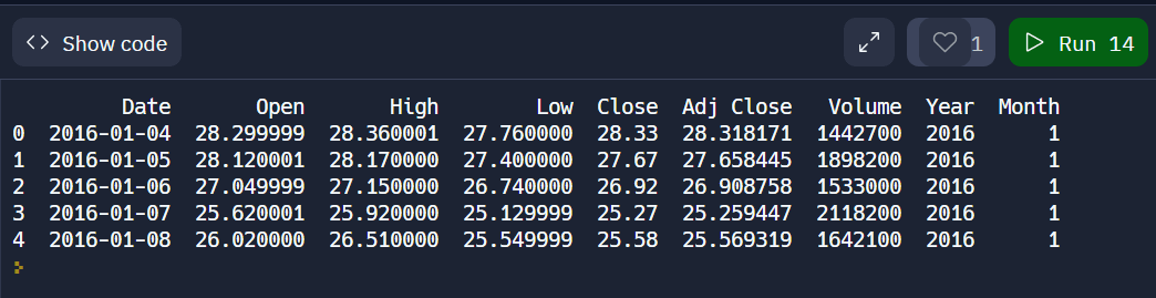
Basic Charts1. Line ChartAs we can see from the example above, Plotly offers a variety of choices for modifying the visualisation. Ten buttons with different functions may be found in the plot's upper right corner. Bar Plot 2. Bubble ChartNowadays, Pandas is the library that most data scientists use to work with structured datasets (tables) (loading, modifying, etc.). It offers very practical data visualisation functionality in addition to data management and manipulation capabilities. By executing the plot() method on the dataframe, it allowed for the immediate creation of charts. By calling "plot()" with the appropriate arguments, we can quickly construct charts such as scatter plots, bar charts, line charts, and more with only one line of code. Behind the scenes, the pandas data visualisation employs the matplotlib package. Because every plot produced by matplotlib is static, any charts produced using the pandas dataframe's '.plot()' API will also be static. But we live in an interactive age. In the modern world, almost everything is interactive (charts, apps, dashboards, etc.). Plotly, Bokeh, Holoviews, Bqplot, Altair, and other data visualisation packages in Python may produce interactive charts. If interactive charts can be produced directly from the Pandas dataframe, that can be very useful. We were surprised to see that a Python package called "cufflinks" was created with this objective in mind. With just one line of code, it enabled us to create interactive charts based on the Plotly platform. How Can This Tutorial Help You?This tutorial includes instructions on using the Python module "cufflinks" to build interactive data visualisations. On top of Plotly, another data visualisation library, Cufflinks is constructed. Cufflinks' primary goal is to make data visualisation easier by offering the same API as the pandas dataframe function "plot()" while creating interactive charts using Plotly. It offers two methods with the same "plot()" API as Pandas. "iplot()": This function offers many arguments that are nearly identical to those of plot(), making it simpler for someone who is familiar with plot() to get acclimated to it. Do You Want to Know All "iplot()" Function Parameters? To learn about all the arguments that the "iplot()" function accepts, use the help(df.iplot) command in Jupyter Notebook or IPython shell. Because it is a generic function to make many charts, it contains a lot of arguments. "figure()": The only difference between it and iplot() is that it produces a Plotly Figure object, which we can further customise if we are familiar with Plotly. In this tutorial, we'll mainly focus on using Cufflinks' 'iplot()' method to create a variety of interactive Plotly charts from a pandas dataframe. All datasets are initially loaded as pandas dataframes. In addition to just plotting charts, we have also described a number of theming and styling options to enhance the visual appeal (look & feel) of the charts. However, Python users who lack front-end engineering abilities may struggle with interactive visualisation because many libraries, such D3, chart.js, call for a knowledge of javascript. That Plotly and Cufflinks come in helpful in this situation. Plotly is a charting framework that is built on top of d3.js and can be used directly with Pandas dataframes thanks to another package called Cufflinks. We'll demonstrate how to use interactive Plotly graphs with Pandas dataframes in this brief introduction. We'll use the well-known Titanic dataset to keep it simpleand Jupyter Notebook, both of which were installed using Python 3.6.4 from Anaconda Distribution. Plotly VersionPlotly was at version 3.3.0, and Cufflinks was at version 0.14.5. Plotly may be installed with the commands below in Anaconda Prompt (or Terminal if you're using OS X or Ubuntu).
Loading LibrariesWe will first load the libraries for Pandas, Plotly, and Cufflinks. We will use offline mode in this topic because it is sufficient for using Jupyter Notebook. Loading DatasetYou can immediately get the Titanic dataset from the kaggle link, as we specified that we will be using it. Only the train.csv file will be used. HistogramTo examine the feature distributions, in this case the "Age" feature, histograms can be employed. With the (dataframe["columnname"]) syntax, we just select a column, and then add the.iplot function. The following example shows how to specify the bin size, theme, title, and axis names. With the "help(df.iplot)" command, you may view all the arguments for the iplot parameter. For instance, we'll display the ages of both male and female travellers in the same plot. HeatmapHeatmaps have many applications, but as an illustration, we'll look at the association between the dataset's attributes. BoxplotFor immediately determining skewness, outliers, or quartile ranges in data, boxplots are highly useful. The distribution of "Fare" for each class aboard the Titanic will now be displayed using a boxplot. Scatter PlotsThe main purpose of scatter plots is to examine the relationship between two quantitative variables. To visualise the "Fare" and "Age" variables, we shall utilise scatter plots. "Categories" enables us to display the variables for a chosen feature (in this case, the passengers' sex) in various colours. Just a brief reminder: the "categories" option needs to be a column of the float64 or string type. Bubble ChartWe may see several variable relationships simultaneously using bubble charts.. Additionally, we may specify the "text" parameter for the hover text column. Bar GraphAdditionally, they can be utilised stacked to demonstrate various varied effects. To display the number of survivors by sex, we shall create a bar graph. Plotly & CufflinksInteractive charting is made possible via the open-source and browser-based graphing library Plotly. Another package that ties the Pandas data frame to Plotly is called Cufflinks, which enables users to produce visualisations straight from Pandas. For simple plotting, the library combines the strength of Plotly with the adaptability of Pandas. Hands-On VisualisationThose who are familiar with Pandas charting may find this to be very straightforward because all we have to do is import a few libraries and rename the Pandas plot function to iplot, which stands for interactive plot. Let's examine a few instances. Importing necessary libraries You might want to remain with Jupyter Notebook for iplots because of its excellent support. Importing The DatasetThink about a little collection of random numbers. Plotly offers a variety of choices for modifying the visualisation. Ten buttons with various functions can be seen in the top right corner of the created plot. We have a button to download the plot as a png image, toggle buttons to change the mouse hover modes, a zoom in and zoom out button, the zoom mode and pan mode. The option to export the graph to Plotly's web gallery is located in the image's bottom right corner. How to create line plots?The plot can be enlarged and reduced in size. To see the values, move your cursor over the plot. To view a specific plot of the columns, click on the column names in the legend. On the right side of the plot, you can see the various plot-related options. The snippet is given below: How to create scatter plots?By specifying the 'kind' as scatter and invoking the 'iplot' method, the interactive scatter plot is produced. The scatter plot's x and y values can also be mentioned in accordance with how it was created. Plotly connects all of the points by default using lines. Therefore, refer to the "mode" as "markers" to see the data points without the links. How to create bar plots?By specifying 'bar' as the value for the 'kind' option, this plot can be produced. The values of the x and y axes are also provided. On the bar plot, several functions can be called, such as count() and sum(). How to create box plots?Box plot is created by adding the 'box' value to the 'kind' argument. When the mouse is placed over the plot, the quartiles, median, minimum, and maximum values are displayed. Choose what to display by clicking on the column names in the legend. How to create surface plots?It will build a surface plot by identifying "surface" as the "kind." It may be turned around to be seen from various perspectives. The 'colorscale' option can be used to modify the colour scheme as well. Several colours have acronyms, including red (rd), blue (bu), and yellow (yl). How to create histograms?By designating the 'kind' as 'hist', histograms can be created for a specific column of the dataset. Te bins might also be mentioned together with this. The histograms for each column will overlap if the 'hist' command is used on an entire dataframe. By clicking on the legends, you can choose which columns to display. How to create spread plots?For the chosen columns, the line plot is displayed. Additionally, a spread plot that is constructed in opposition to one another is displayed. This is typically employed for stock data analysis. This plot is made possible by the'spread' keyword being passed to the 'kind' parameter. How to create bubble plots?The scatter plot and this layout are comparable. The only difference is that the marker's size will now vary based on a parameter. To make this plot, the word "kind" is used to refer to the bubble. Like in a scatter plot, the x and y axis values are passed. By adding the column name to the'size' option, it is also possible to describe the marker's size dependent on another column. To represent GDP, a plot of this type is utilised. How to create scatter matrix plot?The pair plot from the Seaborn Library is comparable to this plan. Off the dataset, the'scatter_matrix' method is called. The columns must have numbers in order for the scatter matrix to be constructed. You can make stunning, interactive, and shareable visualisations using Plotly, a flexible and interactive data visualisation framework for Python. With just a few lines of code and the help of the popular data manipulation package Pandas and the Cufflinks extension for Pandas, you can produce effective data visualisations. What is plotly?A popular open-source Python toolkit for creating interactive data visualisations is Plotly. Scattered plots, line charts, bar charts, pie charts, and other chart styles are supported. The user experience can be improved by adding interactive elements like zooming, panning, and hover tooltips to Plotly visualisations, which are very configurable. How do cufflinks work?A library called Cufflinks serves as a connector between Pandas and Plotly. It enables you to quickly and simply generate Plotly visualisations from Pandas DataFrames. Making interactive plots is made easier with Cufflinks, making it accessible to those who are unfamiliar with Plotly's complexities. Creating the EnvironmentIf you haven't previously, you should install these libraries before using Plotly, Pandas, and Cufflinks. Using pip, you can install them: Once installed, you can import these libraries into your Python script or Jupyter Notebook: Loading Data with PandasStart by loading your data into a Pandas DataFrame. Pandas supports various data formats, including CSV, Excel, and SQL databases. Here's an example of loading a CSV file: Creating Basic Plotly VisualizationsYou can create basic Plotly visualizations directly from a Pandas DataFrame using Cufflinks. Here's an example of creating a simple line chart: Replace 'column_name' with the column you want to plot. The iplot method generates an interactive Plotly chart that you can customize further. Creating Interactive Scatter PlotsPlotly is known for its interactive capabilities. You can create a scatter plot with interactive tooltips using Plotly Express, which is integrated with Cufflinks: Replace 'x_column', 'y_column', and 'category_column' with the appropriate column names from your DataFrame. This code creates a scatter plot with different colors for each category and tooltips showing data details when you hover over points. Customizing VisualizationsPlotly allows you to customize every aspect of your visualizations. You can modify titles, axis labels, legends, and more. Here's an example of customizing a Plotly figure: Saving and Sharing VisualizationsYou can save your Plotly visualizations as standalone HTML files for easy sharing: This HTML file contains the interactive Plotly chart and can be shared with others who don't need to install Python or any libraries. The robust d3.js is the foundation for the open-source Plotly Python module, which is built on plotly.js. We'll be utilising Cufflinks, a more compact variant of the primary Python Plotly package that was created specifically to function with Pandas DataFrames. Cufflinks is more abstract than Plotly, plotly.js, and d3.js, allowing us to work with Python code at a high level and take advantage of d3's amazing interactive graphics features. For more in-depth charts, Cufflinks can also be expanded with the capability of the core Plotly library. Note: Plotly, a graphics company with a number of products and open-source tools, is also the name of the company that created the Python library.Conclusion:In conclusion, a powerful and effective method for building interactive data visualisations in Python is to combine Plotly with Pandas and Cufflinks. Both inexperienced and seasoned data analysts can use this set of tools to streamline the process. Here is a quick summary of the main ideas discussed in this 1,000 word introduction: A flexible Python library for building interactive data visualisations is plotly. It provides a wide variety of chart styles and customisation tools to help you create compelling and educational visualisations. Pandas is a well-known Python data manipulation toolkit. For effective data management and preprocessing, it offers DataFrames and Series, making it a crucial tool for data analysis jobs. Cufflinks: Cufflinks is a Pandas addon that connects to Plotly. It makes it easier and less coding-intensive to generate Plotly visualisations directly from Pandas DataFrames. Environment Setup: You can use pip to install Cufflinks, Pandas, and Plotly. Import these libraries into your Python environment after installation to get going. For data analysis and visualisation, this stage is critical. Making Simple Plotly Visualisations: Cufflinks makes it simple to make simple Plotly visualisations. For instance, using the iplot function and the desired column, you can construct line plots. Plotly's interactive capabilities really stand out in scatter plots. Plotly Express, which is integrated with Cufflinks, can be used to make them. Make your scatter plots unique by adding tooltips for data exploration and color-coding data points. Visualisation modification is possible to a great extent using Plotly. To make your charts fit your particular requirements, you can change the titles, axis labels, legends, and other components. Visualisations can be saved as separate HTML files, which makes it simple to share interactive charts with other people. In conclusion, a streamlined process for data analysis and visualisation is provided by the combination of Plotly, Pandas, and Cufflinks. Whether you're a data scientist researching complex datasets or a data analyst trying to successfully convey insights, this potent trio enables you to produce spectacular and dynamic data visualisations. You can maximise the value of your data and improve the quality of your data-driven decision-making by learning these technologies.
Next Topic#
|
 For Videos Join Our Youtube Channel: Join Now
Feedback
- Send your Feedback to [email protected]
Help Others, Please Share


