| |

What is Pivot Table in Microsoft Excel?MS Excel is also known as the Microsoft Excel or Excel, and it is an extremely powerful spreadsheet software program which usually gives the fastest as well as the easiest way in order to analyze out the desired data efficiently. The Pivot Table is termed to be the very useful tool or the feature in an Excel program that basically plays an important role while working with the respective amount of the dataset or analyzing the large amount of the datasets as well. Although pivot table seems difficult for the beginners in Microsoft Excel and it is essential to learn it to become a professional or expert in Microsoft Excel respectively. In this tutorial, we will be briefly explaining an introduction about "What is a Pivot Table in Microsoft Excel", and its basic requirements, and will also discuss the step-by-step methods for the purpose of creating or inserting it into our worksheet with relevant examples as well for its better understanding. Introduction to Pivot Table in Microsoft ExcelA pivot table primarily summarizes out the given data set which are bundled within a grid-like matrix that helps us to explore or to create the reports which are efficiently based upon the useful information. In particular, it enables out the users to extract out the data in a given customized format (as reports or in the form of the dashboards) from the large, detailed data sets recorded within the Microsoft Excel sheet respectively. Unlike the regular Microsoft Excel reports, the Pivot Tables represent our essential data sets in an interactive view, allowing us to view our data from a different perspective with little bit of the tricks involved in it. We can easily sort & filter out the data, and group the data into desired categories, instead of this one can easily create charts, break down the data month-wise or year-wise, and can easily perform complex calculations by just making use of the various functions or the formulas available in Microsoft Excel effectively. Moreover, the Pivot Table helps us to view our data effectively and saves crucial time by just summarizing out the data into essential categories. It is basically a kind of reporting tool and contains mainly the following four fields which are as follows:
Why do we make use of the Pivot Tables in Microsoft Excel?Following are some of the scenarios where we are making use of the Pivot Tables in Microsoft Excel that can serves as the effective solution for us:
How to create or insert a pivot table in Microsoft Excel?Microsoft Excel offers various multiple ways for the purpose of inserting or creating a Pivot Table within an Excel worksheet as well. Now in this we will be discussing out the two most common methods and corresponding step-by-step procedures in order to build the pivot tables for the sample data. Let us now understand each of the method one by one in details: Method 1: By making use of the tool on the ribbon The ribbon is the primary area where we can access all the existing tools or the commands of the Microsoft Excel. The Pivot Table is also present on the ribbon area, which we can find just under the Insert tab. And we can make use of this tool for the purpose of creation of a Pivot Table for our sample data where we have 17 records and five fields of the information, like as Date, Color, Region, Units, and Sales respectively. 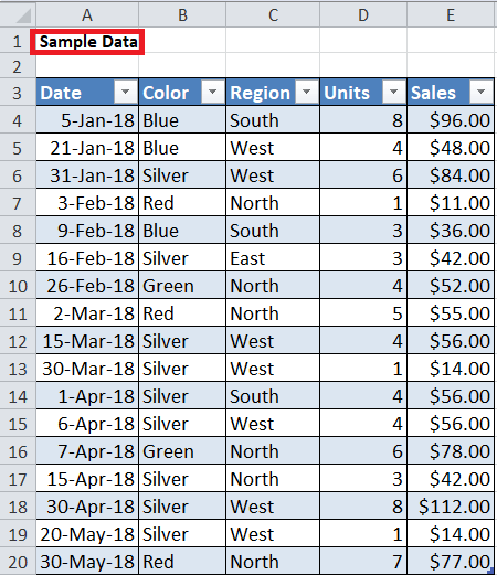
Moreover, our data is formatted as a proper Microsoft Excel table and named as 'Table1'. The tables in Excel are the more effective way that can be used for the purpose of creating a pivot table, and they automatically adjust whenever new data is inserted or deleted as well. We must need to perform the below steps in order to create a pivot table for our example data set effectively: Step 1: First of all, we must need to select any particular cell in the given table (data set) within our worksheet. After that, we are required to go to the Insert tab and then will click on the 'PivotTable' button. 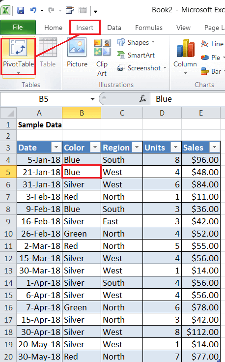
This will launch the 'Create PivotTable' window where our data range (table) will already be written. However, we can also select or change the input range accordingly. Step 1: In the 'Create PivotTable' window, the default location used for the purpose of creating a Pivot Table is set as 'New Worksheet'. It is better to create a pivot table in a new worksheet so that we can easily differentiate the source data as well as the pivot table. However, we can also create a pivot table on the right side or bottom of our source data in the same worksheet. We must change the default option to 'Existing Worksheet' and enter any desired cell in the 'Location' box to get start with the pivot table on the current worksheet as well. 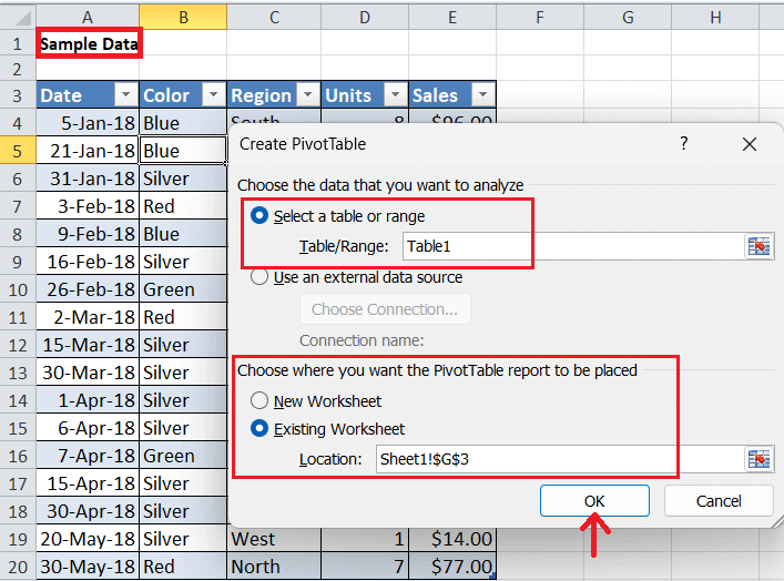
We all be then selecting out the cell G3 in the same worksheet (Sheet1) for the purpose of creating a Pivot Table for our sample data. Step 2: After selecting the source range as well as the destination location, we must need to click on the OK button, and an empty Pivot Table get appears in the selected worksheet. However, the Microsoft Excel will display all the corresponding fields of our example data in the side pane respectively. All the fields are listed but and are unused until we manually add or drag fields into the Columns, Rows, or Values area in accordance to our needs or choice as well. 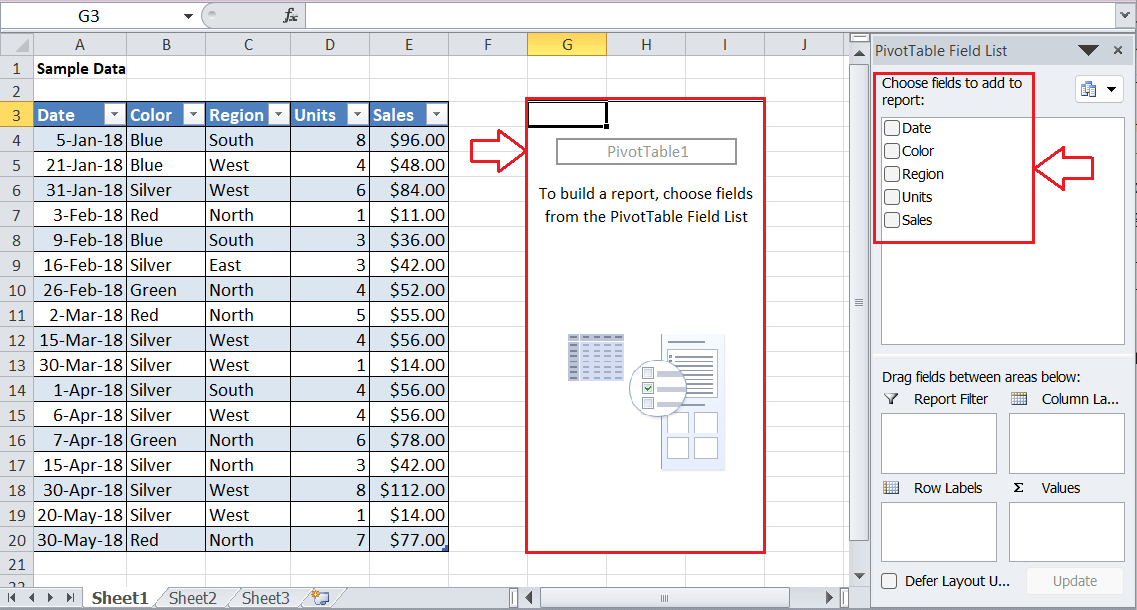
Adding/ Dragging Fields in Pivot Table Let us now understand how one can add the desired fields within the Pivot Table. Now for this we will be assuming that we want to know the sum of all the sales in our sample data set. So, we must need to drag out the Sales field in the right side of the pane to the Values box, and it will be then calculating out the total sales, that are other than: 929 respectively. 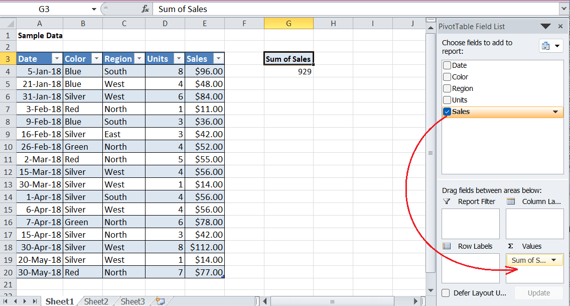
Alternatively, we can also click on the respective checkbox that are associated with the Sales in the side pane, and we can also add more than one field to our Pivot Table simultaneously. Now, let us assume that we want to break out the sales data that are based upon the colors. We can drag the Color field to the Rows area. When divided, it is easy to know which color has the highest as well as the lowest sales respectively. 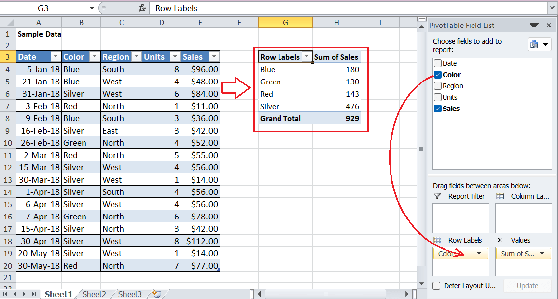
The above image shows that the total sales (Grand Total) remain the same as in the previous image. It makes sense as we have categorized the data for the full data set respectively. Number Formatting in Pivot Table Now with the help of the Pivot Table, we can also format the data as required, maintaining of the number formatting to the numeric fields as the source data. As we can see that the sales values have the currency sign ($) in the source area, and we can also include this sign in our Pivot Table values as per the requirement. Adjusting the number formatting in Pivot Tables can be a crucial step and it can also save our crucial time when data changes frequently as well. We can adjust the number formatting in our Pivot Table by just following the below steps very carefully: Step 1: First of all, we are required to press a right-click button on any sales cell and then we will be clicking on the 'Number Format' option present in the given list. 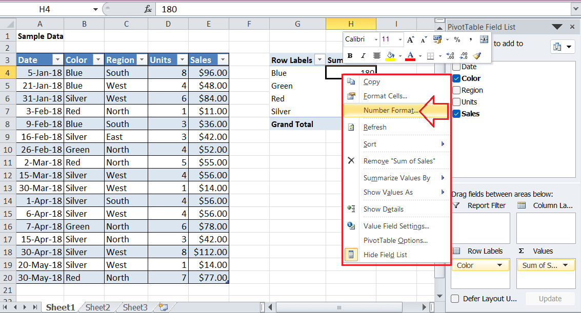
Step 2: Next, we must need to choose the desired format or create our own custom format as per the requirement. Since we want to include a currency sign, we will be then applying out the Currency formatting with zero decimal points and selecting a Dollar symbol respectively. 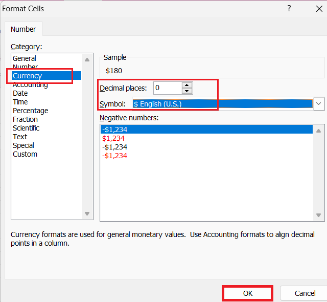
Step 3: Lastly, we must be clicking on the OK button and the dollar sign ($) will get appear in all cells with the sales data as well. 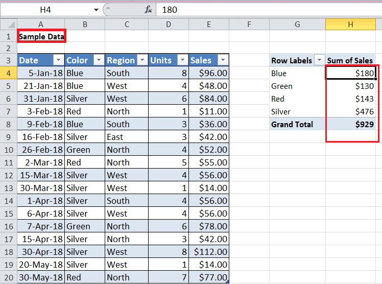
And once we have applied out the number of the formatting, it will then continue to serve, even after the Pivot Table is reconfigured or new data is inserted. Sorting by Value in Pivot Table As like the typical data sets in a Microsoft Excel worksheet, so we can also sort out the data from 'smallest to largest' or 'largest to smallest' in our respective Pivot Table. Now let us assume that, we want to put the highest sales at the top and the lowest sales at the bottom. So for this, we can easily right-click on any sales values to open the options menu. Nextly, we are required to go to the Sort > Sort Largest to Smallest. This will efficiently arrange the list and put the top-selling colors on the top as they have the highest (largest) sales as well. 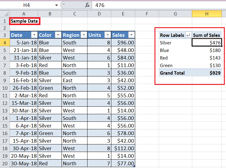
After that we have sorted the data in the Pivot Table, and the Microsoft Excel maintains this order even after we change the data or reconfigure the Pivot Table. Refreshing Data in Pivot Table The Pivot Table must be refreshed to update or it must reflect its data after changing the data in the source table or range. It is an essential task to bring new updates to our Pivot Table as well. Let us now suppose that we want to edit cell E4 in our source table and also want to change the value from $96.00 to $11.00. In that case, we do not see any changes in our Pivot Table. Therefore, we can easily refresh the data by just making use of the below-mentioned steps very carefully: Step 1: First of all, we all need to press on the right-click button anywhere within the Pivot Table area. Step 2: Nextly, we will be then clicking on the 'Refresh' button in the given list respectively. 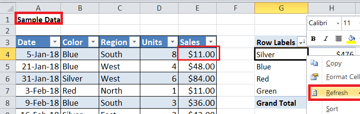
The new or refreshed data appears instantly after clicking on the 'Refresh' button as well. 
We can undo the changes by just pressing out the 'Ctrl + Z' shortcut from our keyboard in order to get our original source data and Pivot Table back. Percent of Total in Pivot Table Since the Pivot Table in Microsoft Excel helps us to view the data differently, we can also display values as a percent of the total.
Step 1: First of all, we need to insert or add the Sales field again inside the Values box. This will create another column in our Pivot Table for the sales respectively. 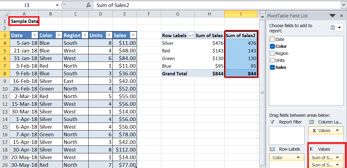
Step 2: Nextly, we must need to press out the right-click on the second or newly created sales column and will then go to Show Values As > % of Grand Total. 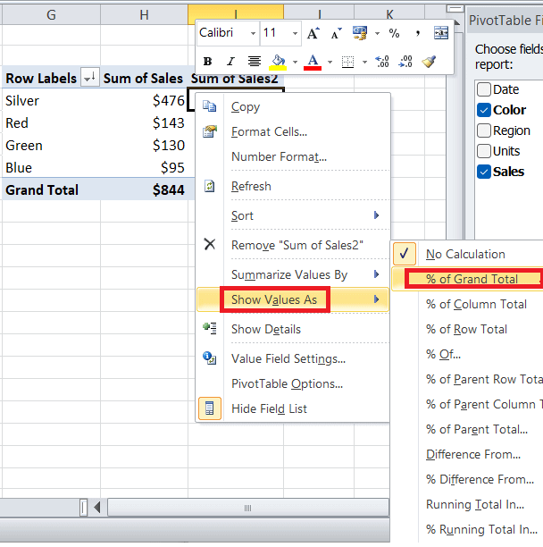
By completing the previous step, we can easily break down the sales as a percent of the total, as depicted below: 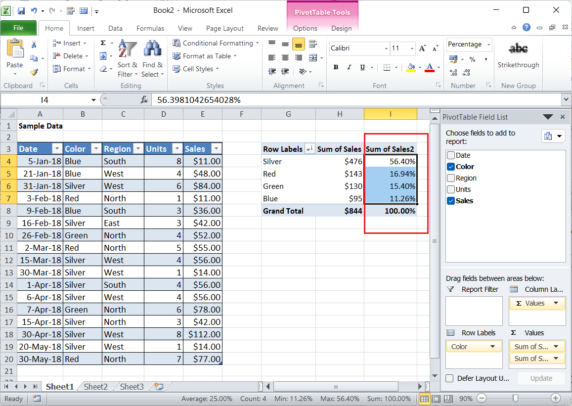
Grouping by Date in Pivot Table Microsoft Excel's pivot table has some awesome features, and grouping of the different data specifically into categories is one of them. It also allows us to group dates in our Pivot Table into various units like as months, quarters, or years. Also, we can customize the grouping in accordance to our choice or needs. Let us now delete the additional Sales column and perform the following steps to group dates in our Pivot Table respectively: Step 1: First of all, we all need to drag the Date field into the Column box, as this will list out the sales by their separate dates in our Pivot Table respectively. 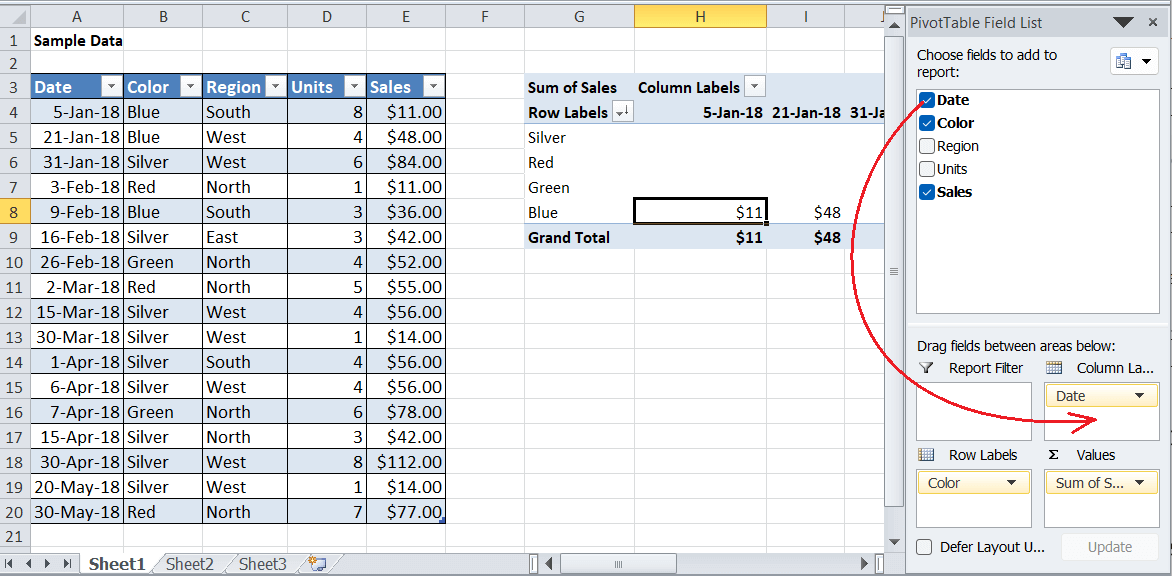
Step 2: Next, we must need to press on the right-click button on the header area in our respective Pivot Table and then we will be selecting out the 'Group' option present in the given list effectively. 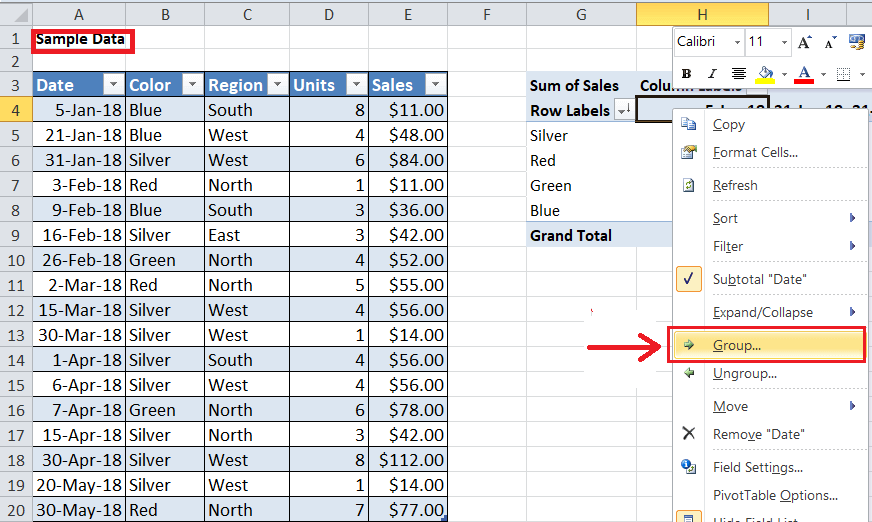
Step 3: And in the next window, we are then required to deselect the Months and Quarters but keep the Years option selected, as it was depicted below: 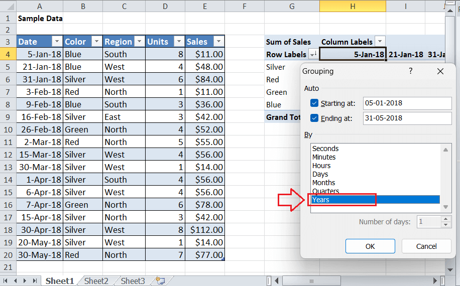
Step 4: Lastly, we must need to click on the OK button, and all the corresponding sales will be categorized based on the color and year as well. 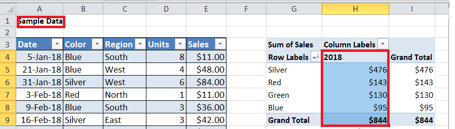
Since we have the sales data only for one year (i.e., 2018), we can usually see a single column in our Pivot Table: Method 2: By making use of the Keyboard ShortcutMicrosoft Excel is well-known spreadsheet software which primarily allows us to perform most of its tasks by just making use of the keyboard shortcut. It has a wide range of the predefined keyboard shortcuts. Moreover, we can also create our custom shortcut keys for any specific task by just making use of the Macros feature. So, we can also create a Pivot Table a bit faster by making use of the keyboard shortcut that is none other than 'Alt + D + P'. Let us now suppose that, we have the following data set showing how many sales are completed in year quarters for the different items. 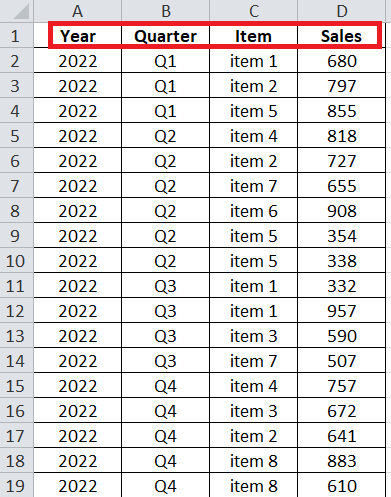
And we need to perform out the below steps to make use the keyboard shortcut and also to create a Pivot Table for our sample data in our given worksheet respectively: Step 1: First of all, we all need to select out the entire data in order to create a Pivot Table, and for this we can make use of the keyboard shortcut that is none other than 'Ctrl + A' for the purpose of selecting all the data of the current worksheet as well. 
Step 2: Next, we must make use of the 'Alt + D + P' keyboard shortcut, after that we must need to press each of the key one after the other in a given sequence as well and this will launch the 'PivotTable and PivotChart Wizard' window respectively. 
Step 2: Now in the very next window, we must need to select the 'Microsoft Excel list or database' option which are efficiently present just under the first section. It is because of the reason that, we have our source data already in an Excel worksheet. Also, we must need to select the 'PivotTable' option in the second section. After that, we must press the 'Next' button, and it will look like this: 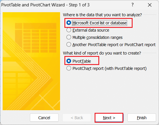
Step 3: And in the next screen, we have to enter the range of the input data. Since we have selected the data in the first step, the range will be prefilled. We must need to press the 'Next' button again. 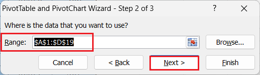
Step 4: And in the last window, we are required to select whether we want to create a Pivot Table in the same (existing) worksheet or a new worksheet respectively. Like the previous method, we also need to select the 'Existing worksheet' option and enter the cell (i.e., "Sheet2! $F$2" it is because of the reason that our sample data is present in the Sheet2) to start the Pivot Table in the same sheet. Lastly, we must need to click on the Finish button. 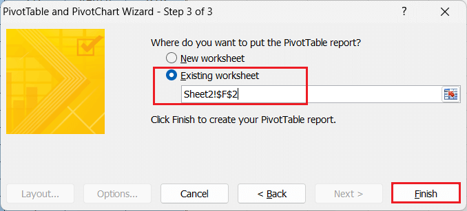
And this will be then immediately creating an empty Pivot Table that is starting from the entered or given cell references. 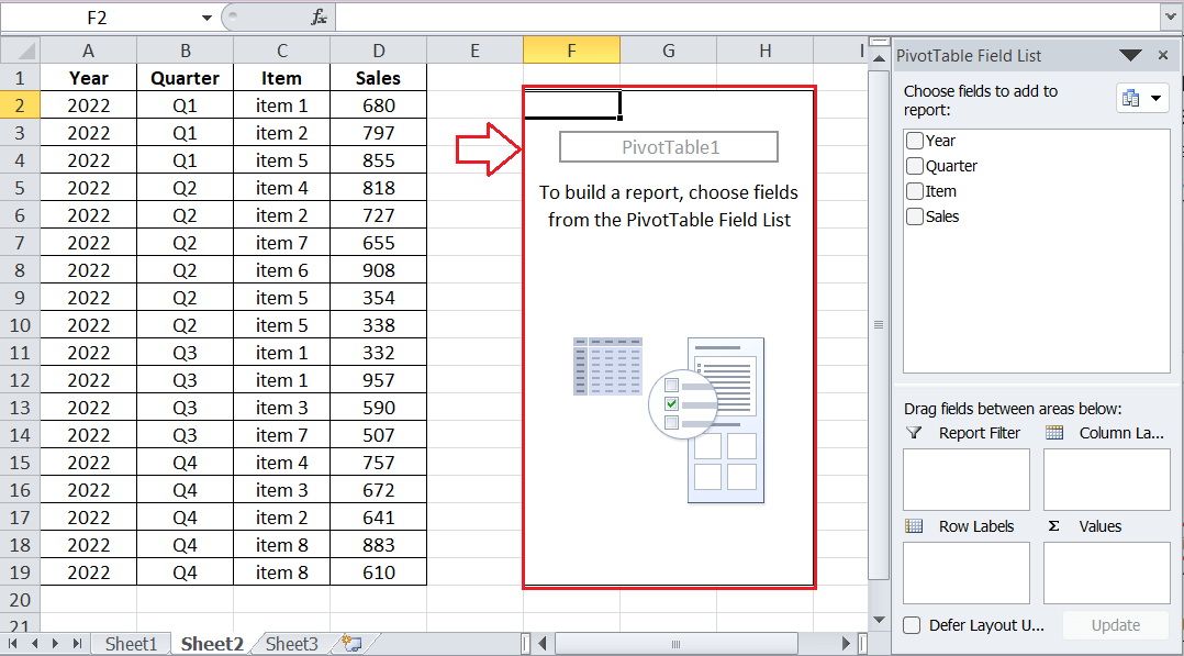
As like the previous method, we can also add the various fields, sort or filter out the data, by just adjusting out the number formatting, group data, and performing other desired tasks in our Pivot Table by making use of the side pane and other options respectively. Two-dimensional Pivot Table in Microsoft ExcelAn essential advantage of the Pivot Tables is none other than the two-dimensional or two-way arrangements referred to as two-dimensional Pivot Tables. In general, it usually represents the data in the various combined aspects after we drag the different fields into different areas or the boxes in accordance to the needs or the requirements. ? For example: Let us now assume that we want to break down the sales by color as well as the region for our sample data which are efficiently used in Method 1. And we can also create a two-way Pivot Table by just making use of the following arrangements as well:
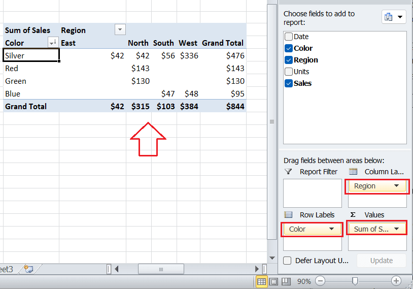
The above sheet basically shows a two-way Pivot Table that breaks down sales by color as well as the region respectively. Let us now assume that, when we swap out the boxes or the particular areas for the Color and Region fields, then in that case the respective Microsoft Excel will efficiently creates another two-dimensional Pivot Table. It is only the different view of the same data; thereby, the total sales remain the same as well. 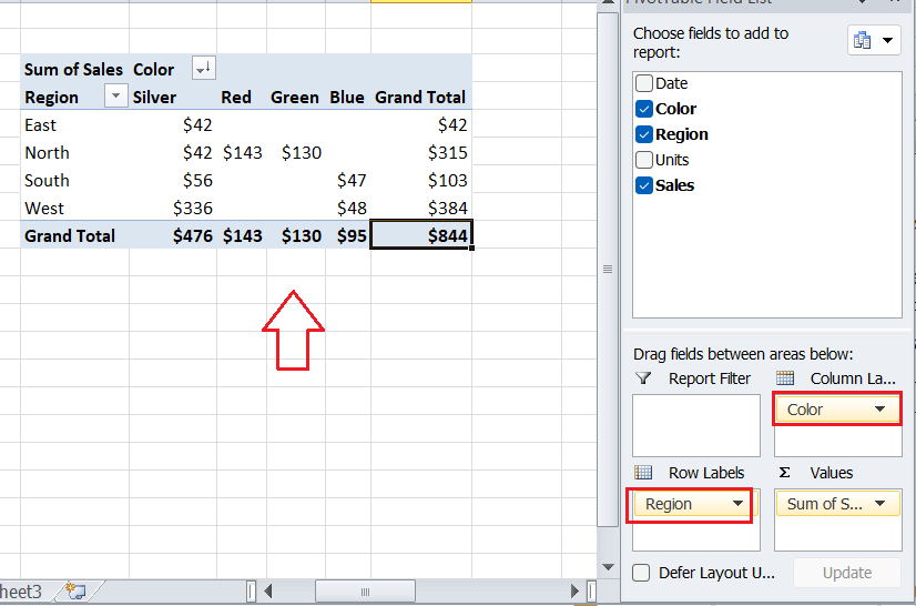
What are the crucial points that need to be remembered by an individual while working with the Pivot Tables in Microsoft Excel?The various crucial points which need to be remembered by an individual while working with the "Pivot Tables" in Microsoft Excel are as follows:
Next TopicExcel ISNA Function
|
 For Videos Join Our Youtube Channel: Join Now
Feedback
- Send your Feedback to [email protected]
Help Others, Please Share


