Pie ChartPie charts are one of the common elements that are used a lot in Excel worksheets to represent official data. They might seem easy, but there are a lot more things you should know about them to represent your data in a detailed and professional manner that can add value for the reader/clients/management. What are Pie Charts?A pie chart is defined as a circular chart with multiple divisions where each division shows the contribution of each value to the total value. The Pie (or the circle) represents the total value, i.e., 100 percent, and each slice of the pie chart adds some per cent to the total. 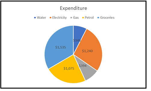
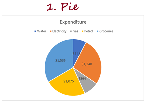
Pie charts usually represent the data where the values can be added together or with only one data series (all the data points are positive). For instance, in the above example, we have created a pie chart to represent the expenditure list of an xyz company. The company has 5 different attributes, and therefore the pie chart shows 5 divisions (also known as slices of a Pie). The larger the contribution of an attribute, the larger will be the size of the slice of the pie chart. A pie chart can be easily interpreted if data points are less (around 7). With more data points, you will have more slices, and some of them would be very small, making the graph difficult to read/interpret. Advantages of Pie Charts1. Easy to create: Though most Excel charts are easy to create, trust me, Pie charts are the easiest of them all. With Pie charts, you need not worry about customization and formatting of your chart as most of the time, the default settings are good enough. Note: There are various formatting options available as well if you want to format your chart.2. Easy to read: Pie charts are easy to see and therefore can be read easily if you only have a few data points. 3. Management is obsessed with Pie Charts: As per survey, it is reported that managers/clients love to have Pie charts in the official presentation. Disadvantages of Pie Charts
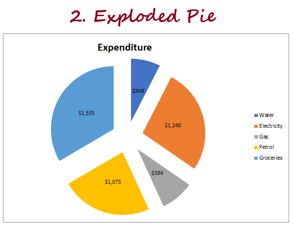
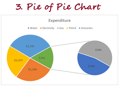
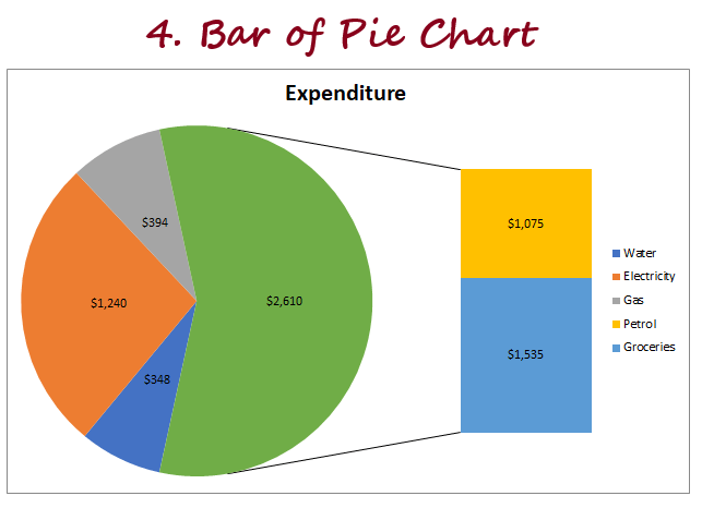
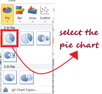
Types of Pie ChartsIn Excel, there are different types to represent your PIE charts. To access its various types go to the charts group and select Pie chart option and it will throw the drop-down. It will show all the various types of Pie charts available in Microsoft Excel. 1. 2D Chart2D or 2-Dimensional charts are further divided into 3 types which are as follows:
Eureka! We have successfully covered all the different types of 2D charts, and now we will move to 3D Pie charts. 2. 3D PIE ChartThere is not much of a difference between 2D and 3D pie charts. Both are almost the same with a visual difference. That's because 3D charts have depth as well in addition to length and breadth (where 2D charts only have length and breadth). 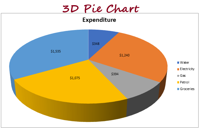
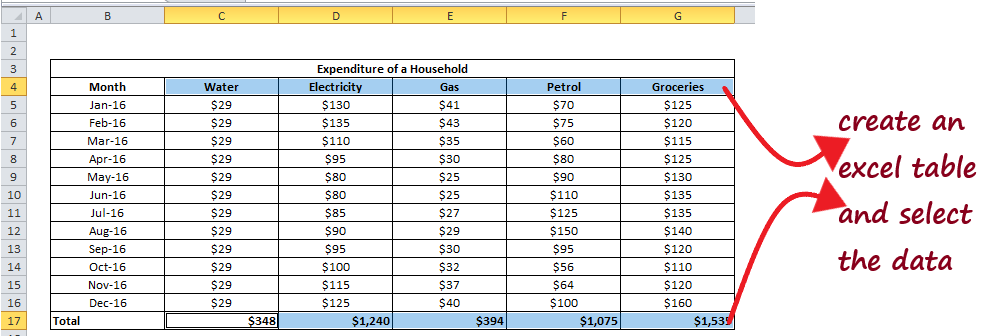
Steps to Create a Pie ChartFollow the below steps to quickly create a pie chart in Excel:
You can beautify and format it further by writing the correct chart title, axis titles, changing the colours of the slices, adding legends, changing axis and trying different ways to format the chart. Things to Remember
Next TopicDoughnut Chart Excel
|
 For Videos Join Our Youtube Channel: Join Now
Feedback
- Send your Feedback to [email protected]
Help Others, Please Share


