| |

Excel box plotWhen you do statistical analysis, you may require a standard box plot to show the distribution of a set of data. With the help of a box plot, you can see the distribution of numbers in data. You might not get the point of the box plot right now, but by following this chapter below, you will get it much better. Excel does not have box plot, but it has a chart called box and whisker chart that has two charts in one. Box represents to the middle value between the selected range and the whisker chart represents the minimum and maximum value of the selected range. 
Box and Whisker chart is also called box chart. This chapter will take you to each step of creating box and whisker chart and help you understand it. What is the box and whisker chart?Box and Whisker chart is also known as a box plot, and it is a way to represent the spread and center of a data set. This chart is divided into two parts: Whisker and Box plot. It means that - this chart is made up of whisker and box plot. Box plot represents the middle value or medium for the selected set of data. This box is drawn from the first quartile to the third quartile. Q1 represents the first quartile and Q3 to third quartile. A vertical line goes from min to max through this box in the chart that is called whisker. The line bar on the whisker represents the min and max value of the selected dataset. Elements of box and Whisker chartBasically, the box and whisker chart has five numbers summery as it contains five elements in this chart, i.e., Min, Max, Median, Q1, and Q3. 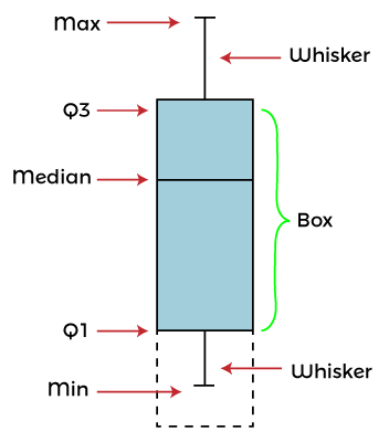
This box and whisker chart contains five elements whose detail is as follows -
Example 1: Insert a simple box and whisker chartWe will insert a box and whisker chart for Excel data that has an even number set of data. Excel will calculate the median and take it as middle number. We have this set of data containing some number values for this example - 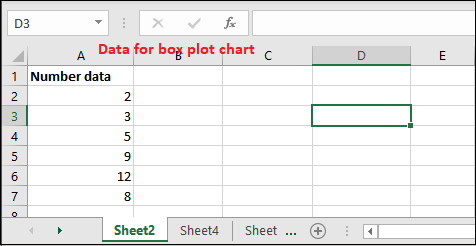
This data is not sorted. Either sort it or keep the same; Excel automatically does it for you while inserting the chart. Don't worry; it does not affect your chart structure. Steps to create a box and whisker chart Following are some steps to insert and create a box and whisker chart for even number of data - Step 1: Select the range of data (A2:A7). This sheet has six records here. 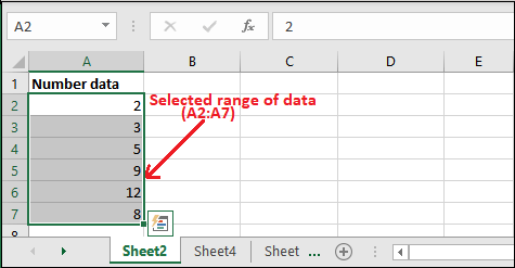
Step 2: Now, go to the Insert tab, where you will see the Statistics Chart option. 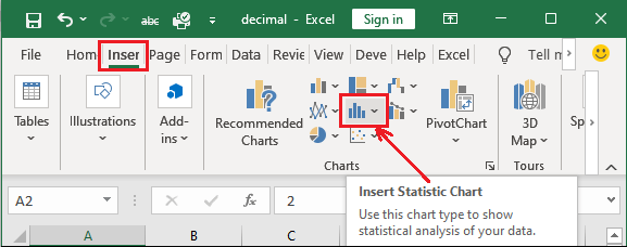
Step 3: Click on this Statistics Chart and select Box and Whisker chart from it. 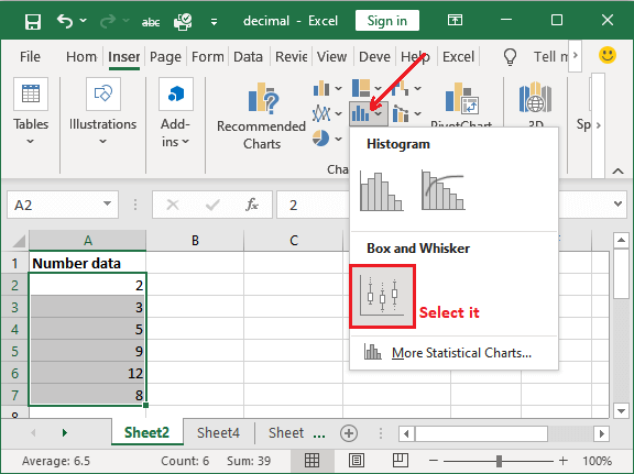
Step 4: A chart is inserted into your Excel sheet for your selected range of data. 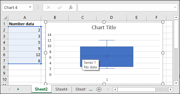
Here, Excel data set - {2, 3, 5, 9, 12, 8} If you sort it, the data will be like - Sorted data - {2, 3, 5, 8, 9, 12} (Excel automatically do this) Middle value - {2, 3, 5, 8, 9, 12} => {5, 8} (There is no middle value. So, taken 5 and 8) Median = (5+8)/2 => 13/2 = 6.5 Explanation Now, it's time to understand this chart for the given data. Following is the detailed explanation for it - In the selected range of data, 2 is the minimum value and 12 is the maximum value that is shown by the Whisker chart line bar. Box represent the middle value (median), i.e., 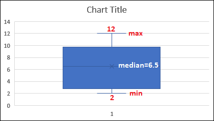
Step 5: Edit the chart title for the inserted chart and give the valuable heading to it. Click the chart title heading to edit it. 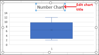
Your chart is complete now. For more styling, you can also change the chart theme. Example 2: Insert a box and whisker chartWe will insert a box and whisker chart for simple set of data through which you will learn this chart. We have this set of data containing some number values. It has an odd number of records, i.e., 7. 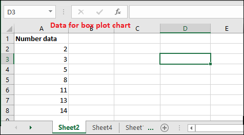
This sheet has seven records inserted here, which is already sorted in an order. Steps to create a box and whisker chart Following are some steps to insert and create a box and whisker chart for odd number of data - Step 1: Select the range of data (A2:A8). 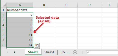
Step 2: Now, go to the Insert tab, where you will see the Statistics Chart option. 
Step 3: Click on this Statistics Chart and select Box and Whisker chart from it. 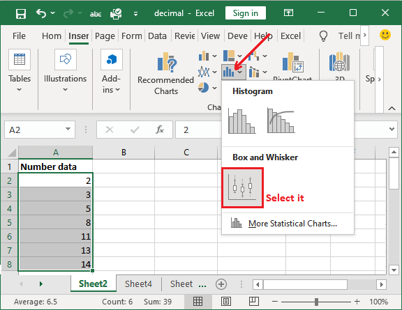
Step 4: A box and whisker chart is inserted into your Excel sheet for your selected range of data. 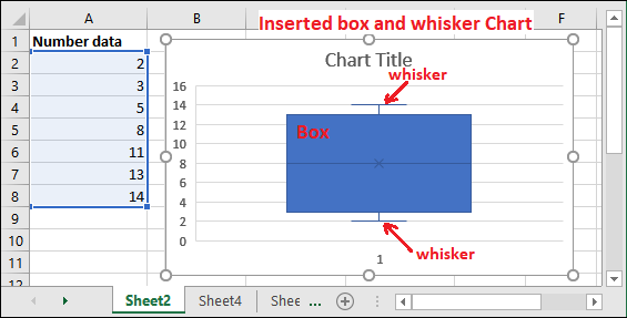
Excel data set - {2, 3, 5, 8, 11, 13, 14} Middle value - {2, 3, 5, 8, 11, 13, 14} This dataset has a middle number. So, it is the median itself. There is no need to calculate the median explicitly. Median = 8 Now, it's time to understand this chart for the given data. Following is the detailed explanation for it - Explanation In the selected range of data, the minimum value is 2 and the maximum value is 14. These values are represented by the line bars of the whisker chart. On the other side, box represents the middle value, i.e., 8. In this chart, middle value is 8 where {2, 3, 5} is above and {11, 13, 14} below of it. Hence, Min = 2, Max = 14, and Middle/Median = 8 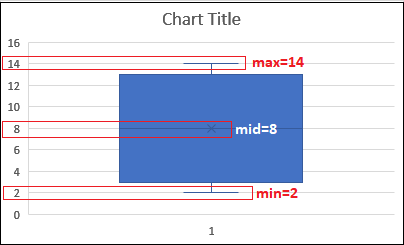
So, the box and whisker chart is a combination of two charts in MS Excel. Step 5: Edit the chart title for the inserted chart and give the valuable heading to it. Click the chart title heading to edit it. 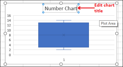
These were the box and whisker plot chart for simple data. Now, we will take one more example and create the chart for complex Excel data. Example 3We are taking an example, through which we will explain each value that how it calculates and plots in box and whisker chart. It helps you to learn the box and whisker chart in a better way. As we told you, that box and whisker chart has five numbers summery as it contains five elements in this chart, i.e., Min, Max, Median, Q1, and Q3. With the help of a step-by-step example, we will help you to learn each step better. Find the five-number summerySuppose the following are the ten numbers stored in an Excel sheet for which a box and whisker chart will be created. 9, 12, 14, 18, 19, 23, 29, 35, 42, 49 Calculate the box plot elements for this data 1. Our data is already sorted in increasing order. Sort the data if not sorted. 9, 12, 14, 18, 19, 23, 29, 35, 42, 49 2. Find the middle number in this dataset to calculate the median. For this data, we have found two middle numbers, i.e., 19 and 23. 9, 12, 14, 18, 19, 23, 29, 35, 42, 49 Middle Number - 19, 23 3. Now, calculate the median from these two middle numbers. Median is the mean of the two middle numbers in the selected data set. Here it will be - (19+23)/2 = 42/2 => 21 Median - 21. 4. Now, find out the quartiles. 9, 12, 14, 18, 19, 23, 29, 35, 42, 49 5. The first quartile (Q1) is the middle number/median of the data point from the left. So, here - 9, 12, 14, 18, 19 First Quartile (Q1) - 14 6. The third quartile (Q3) is the middle number/median of the data point from the right. So, here - 23, 29, 35, 42, 49 Third Quartile (Q3) - 35 7. Find the Min and Max for the entire data set. We have sorted the data in increasing order so that values for min and max will be easy to found. 9, 12, 14, 18, 19, 23, 29, 35, 42, 49 Min - 9 Max - 49 8. Complete summery for five number is - {Min, Max, Median, Q1, Q3} - {9, 49, 21, 14, 35,} Make the box plot for the calculated five number summery Five numbers summery is calculated. Now, let's create a box and whisker chart for the above five number value data.
Next TopicExcel Transpose Function
|
 For Videos Join Our Youtube Channel: Join Now
Feedback
- Send your Feedback to [email protected]
Help Others, Please Share


