| |

Organization Chart ExcelMS Excel or Microsoft Excel is one of the most powerful spreadsheet software tools and helps to organize or synthesize data using different diagramming capabilities. It has many inbuilt tools which can be beneficial in visualizing spreadsheet data, and excel also provides various charts to represent the data. Organization charts are among the most popular Excel charts that can improve a spreadsheet's visual appearance and overall effectiveness. 
This article discusses the brief introduction of an organization chart and the step-by-step tutorial to create an organization chart in Excel. With this article, we will learn to create the desired hierarchical organization chart for the given data. What is an Organization Chart in Excel?An organization chart visualizes the reporting relationships in any company, organization, or other entity. It helps represent the organization structure or hierarchy in Excel using the department's structure or employees' data. The organization chart makes it easier to visually define data for a large organizational structure in a familiar tree. The first modern organization chart was created by an engineer named Daniel McCallum and an artist named George Holt Henshaw. They built it to depict the company/organization structure of the New York and Erie Railroad by each location. The term gained popularity in the early 20th century, peaked in the 1960s, and is still used today. Apart from the obvious use as visualization of reporting structure, the organization chart is also used in many other situations. Some such essential situations include the following:
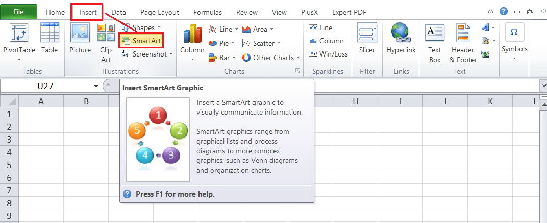
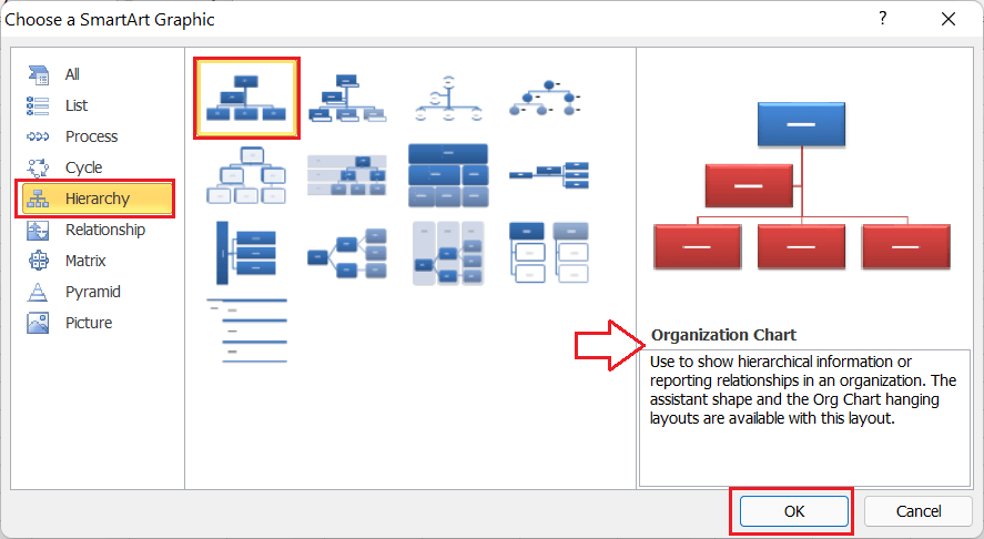
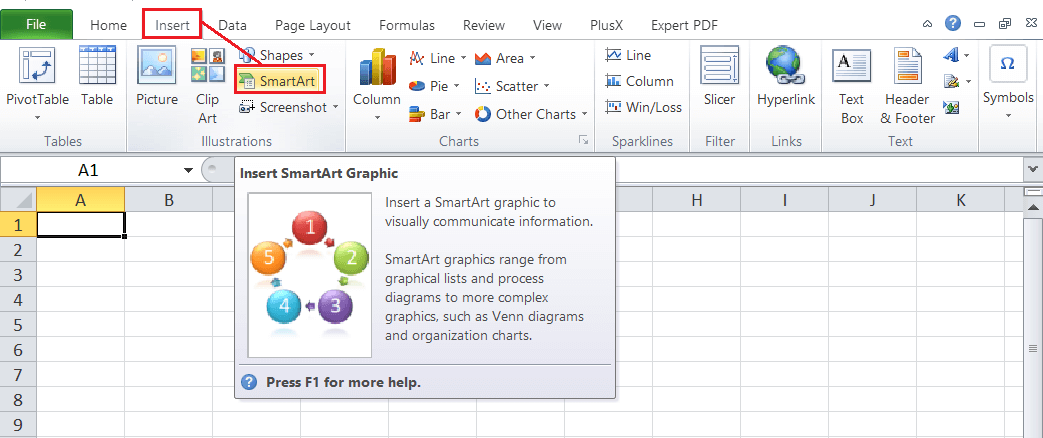
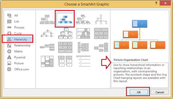
Note: The organization chart is also referred to as an organizational chart and org chart (shortened form).How to create an organization chart in Excel?Creating an organization chart is somehow different than creating other typical Excel charts. Unlike other popular Excel charts, the organization chart is not located under the Charts section. Instead, we need to create this chart type in Excel using pre-defined SmartArt Graphics. Steps to Insert an Organization Chart in ExcelTo use an organization chart within the Excel sheet, we must perform the following steps:
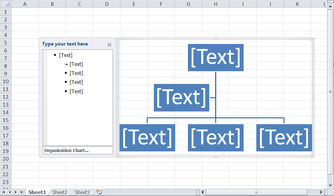
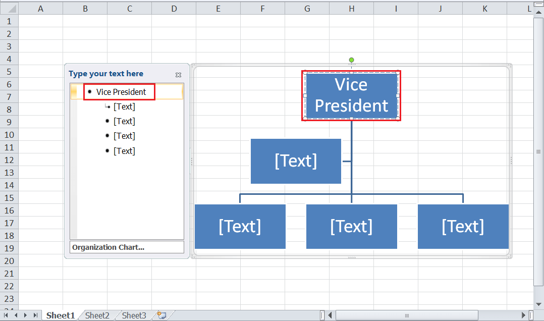
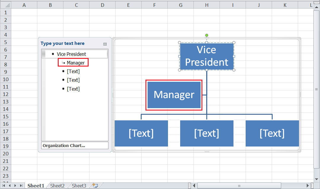
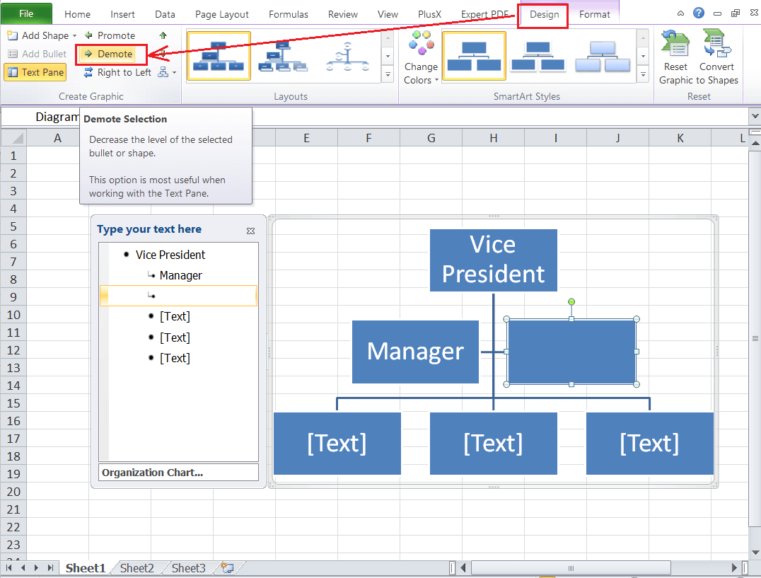
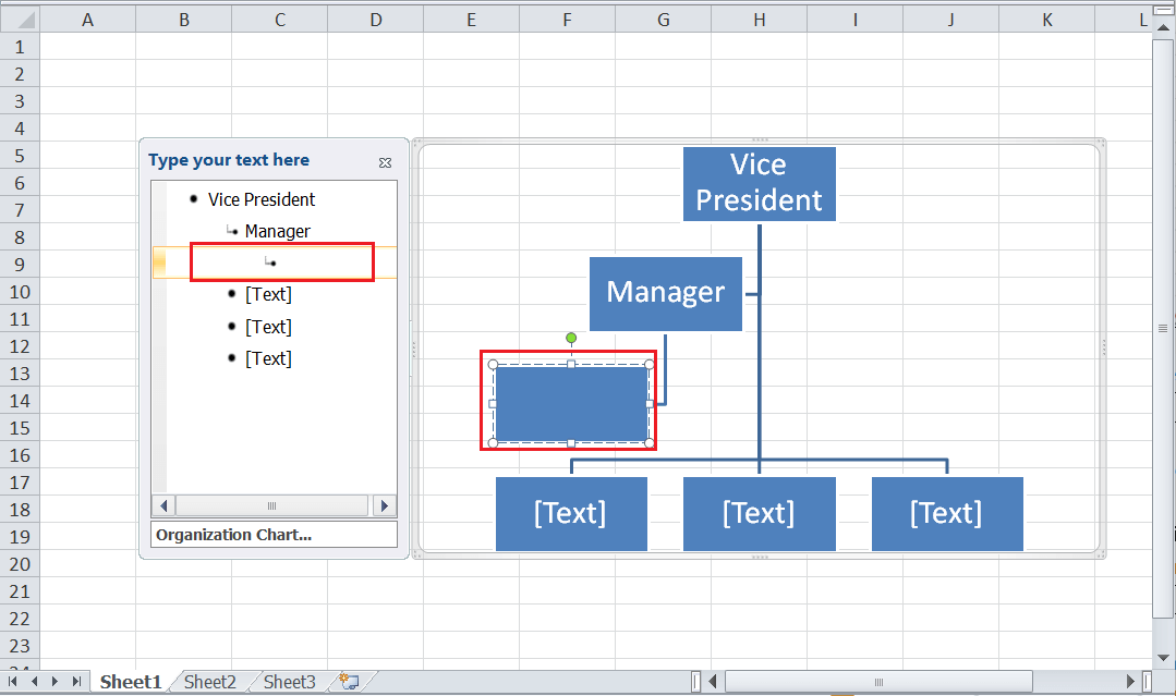
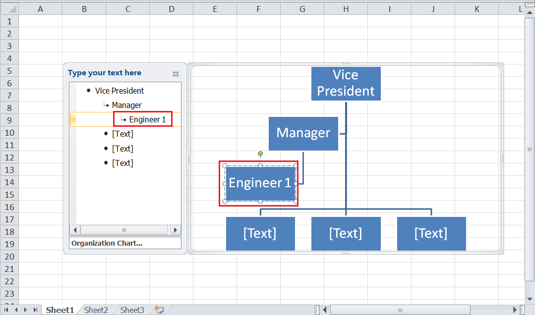
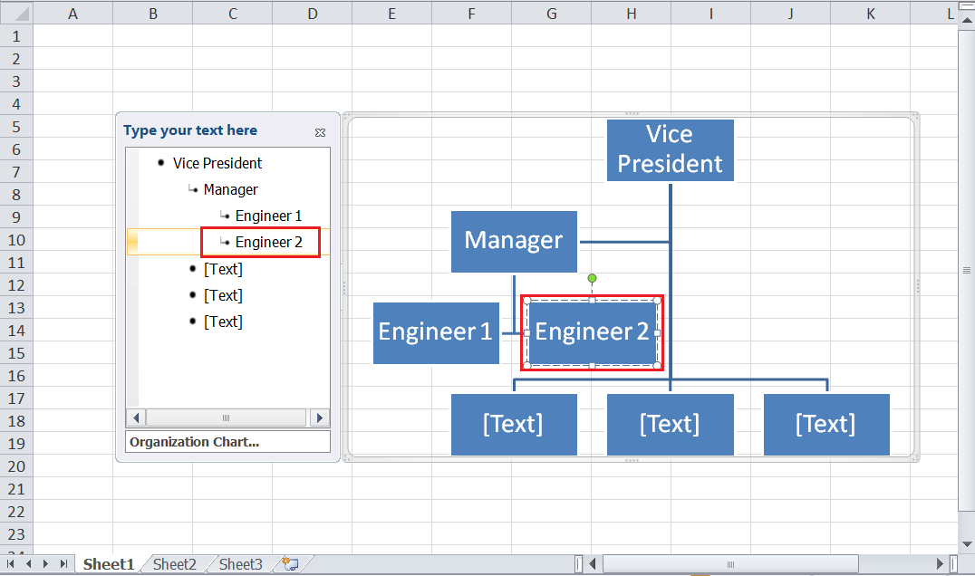
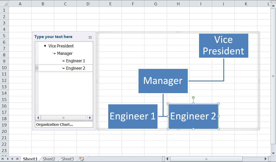
Example: Creating an Organization Chart for given HierarchyIt is essential to implement the above steps in an example to understand the process better. Suppose that we have given the following hierarchy to create an organization chart: Vice President > Manager > Engineer 1, Engineer 2 Let us now create an organization chart for the given hierarchy by following the steps below:
After the desired organization chart is inserted, it is good to customize the chart elements to make it look more attractive. However, it is not compulsory, and it only depends on the user's choice. Customizing the Organization Chart in ExcelCustomizing the organization chart in Excel is different than customizing other Excel charts. However, there are multiple formatting and styling options, and most of the customizations can be directly made from the Design and Format tabs. Let us know the most common customizations used in an organization chart: Adding images in an Organization ChartExcel allows us to insert relevant pictures in an organization chart to make it more informative. This can help display pictures of corresponding employees while presenting the company's structure in an organization chart.
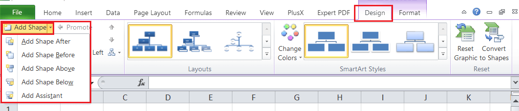
Likewise, we can insert other organization charts, such as 'Name and Title Organization Chart, Half Circle Organization Chart, Circle Organization Chart, Horizontal Organization Chart, etc. Note: Adding pictures in an organization chart is not available in Excel 2010 and lower versions.Adding/ deleting boxes in an Organization ChartDepending on the given hierarchy length, we may need to insert or remove boxes from the organization chart. Excel allows us to manage the number of desired boxes or shapes accordingly.
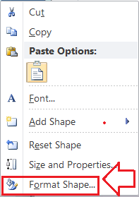
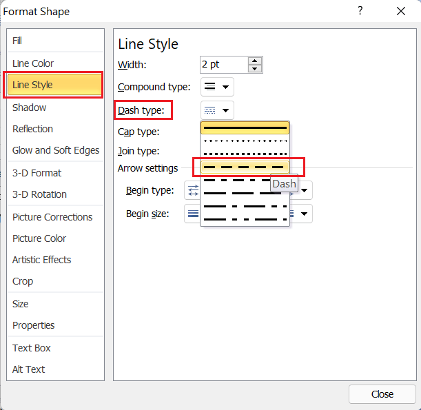
Changing a Solid Line to a Dotted Line in an Organization ChartTo include extra creativity or improve appearance, we can change the style of lines between the two boxes by using the following steps:
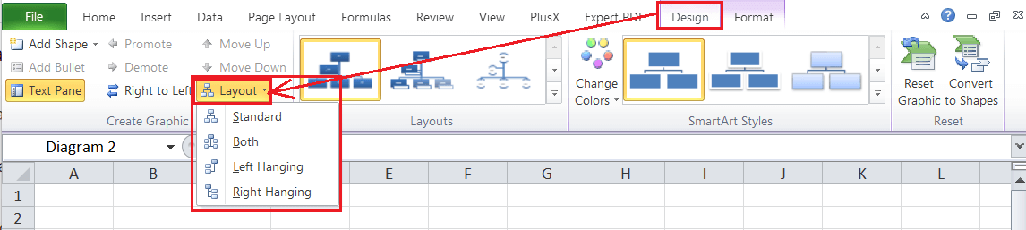
Changing a hanging layout in an Organization ChartChanging the hanging layout typically affects the position of all boxes below the selected box. However, we can use other hierarchy layouts to create an organizational chart with different layouts. Besides, the hanging layout option is only available for the organization chart layouts.
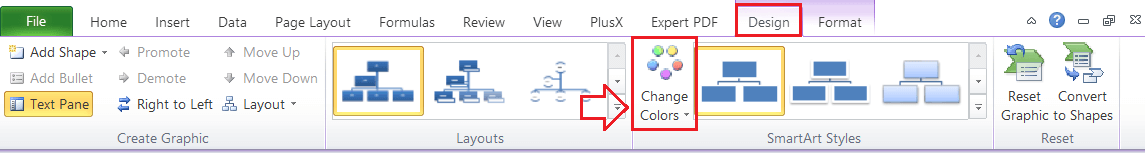
Changing colors in an Organization ChartExcel has some pre-defined color combinations for an organization chart. After the chart has been inserted, we can change the colors accordingly using the steps below:
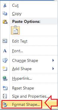
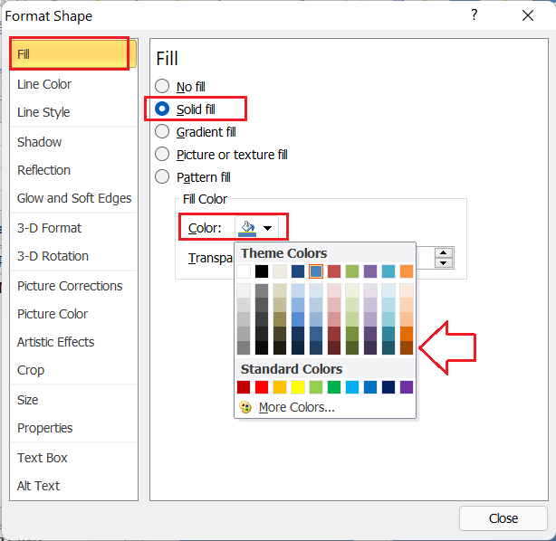
Changing colors of boxes in an Organization ChartIf the default color combinations are not good enough to suit our needs, we can also apply a specific color to each box in an organization box accordingly.
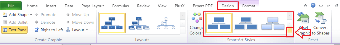
Adding SmartArt style effects in an Organization ChartExcel also offers some unique and attractive SmartArt style effects for an organization chart. We can select the desired styling, and it is applied automatically to an entire graphics.
Advantages of using the Organization ChartOrganization charts can be an advantage over other Excel charts in several ways. For example, new employees can easily know the structure of departments, managers can explain their functions & the actions of their employees within the company, or people can evaluate the functions of different positions before and after a department reorganization, etc. Additionally, these charts can be helpful in mapping departments and groups beyond large corporations, such as members of a PTA or a family tree. Disadvantages of using the Organization ChartThe organization chart is not always useful in Excel, and it is not considered effective while creating budgets, tracking informal communications, mapping out the complexity of daily tasks, etc. Besides, if the company often hires temporary or contract-based employees, keeping the organization chart up to date can be difficult. It is better to create an employee list to track employees or their data in such a case.
Next TopicExcel box plot
|


 For Videos Join Our Youtube Channel: Join Now
Feedback
- Send your Feedback to [email protected]
Help Others, Please Share


