Scatter Plot Excel
MS Excel or Microsoft Excel is popular spreadsheet software, and charts are the most popular elements of Excel when visualizing the spreadsheet data. When inserting charts, we must have basic knowledge of Excel charts. Because different charts are suitable for different data sets, we need to wisely choose the desired chart type.
The Scatter Plot is a special type of built-in Excel chart. However, this chart is not so popular. But it can be helpful in most cases. In this article, we discuss the brief introduction of the Excel scatter plot. Also, we elaborate on how to use a scatter plot in Excel to display a graphical representation of the data set.

What is Scatter Plot Chart in Excel?
Scatter Plot refers to a two-dimensional chart in an Excel sheet that visually represents supplied data in real-time. Generally, the scatter plot visualizes two sets of data on the X and Y axis that are co-related within the Excel sheet. This type of Excel chart displays many points on vertical and horizontal axes as per the supplied data sets, and it is mainly used to show relationships between two variables.
A scatter plot works by placing one variable on the vertical axis and a different variable on the horizontal axis. Each piece of data is then plotted as a discrete point on the chart. Both the X and Y axis display values in a scatter plot, which means that the scatter chart has no category axis. By convention, the X-axis represents arbitrary values that do not depend on another variable, called the independent variable. Besides, Y values are placed on the vertical axis and represent the dependent variable.
There are different types of scatter charts in Excel. They help in co-relation studies and regression studies of data. Additionally, the scatter plot can help retrieve insights to determine the degree of connection between the estimates of given values or quantities, called variables. These charts are also known by many other names, such as 'Scatter Graphs, Scatter Charts, Scattergrams, Scatter Diagrams, XY Graph, etc.'
Components of Scatter Plot Chart
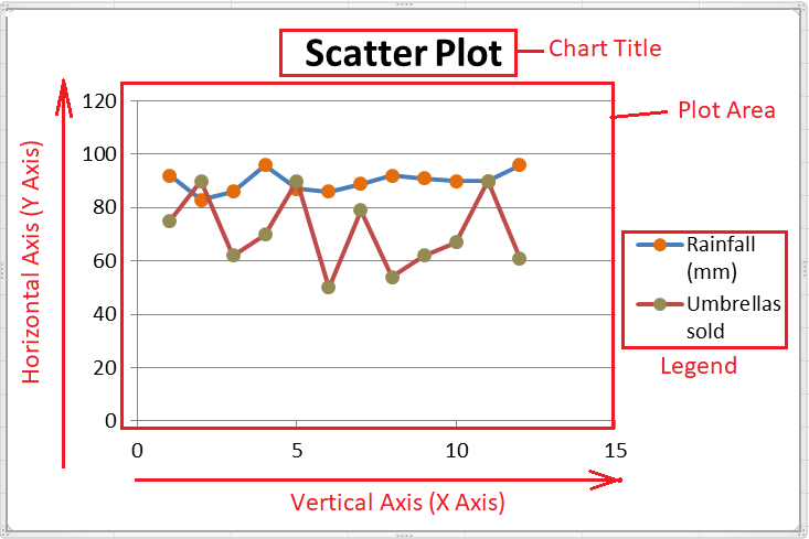
There are mainly five components in a Scatter Plot Chart, as listed below:
- Plot Area: A graphical form/area within the sheet where the data is drawn is called the Plot Area.
- Chart Title: A chart title represents the subject of the plotted chart that primarily helps determine the chart's topic or motive. The text in the chart title can be edited, and the position can be arranged accordingly.
- Vertical Axis: An axis that lies vertically in the chart window is called the vertical axis, and it is located on the bottom area of the plot area. Since the vertical axis typically represents the measurement values across X-axis, it is known as the X-axis.
- Horizontal Axis: An axis that lies horizontally in the chart window is called the horizontal axis, and it is located on the left side of the plot area. Since the horizontal axis represents the different data categories across Y-axis, it is also known as the Y-axis. We can group series data on the horizontal axis.
- Legend: The legend is another useful component of the chart that helps list and distinguish various data groups. We can move the legend or change the legend's position accordingly, and it can be placed on any side in the chart window.
Types of Scatter Plots in Excel
In current versions of Excel, we usually find the following types of Scatter Plots:
- Scatter with only Markers: Scatter with only markers are considered best when we have few data points to plot in an Excel sheet. This type of scatter plot can help visualize each variable separately within the Plot Area.
- Scatter with Smooth Lines and Markers: Scatter with smooth lines and markers are also good for fewer data points. This type of scatter plot visualizes each variable on smooth lines (also can curved lines) using the markers.
- Scatter with Smooth Lines: If we have multiple data points with many variables, Scatter with smooth lines is preferred over Scatter with smooth lines and markers. This mainly keeps the charts clean without using markers.
- Scatter with Straight Lines and Markers: Scatter with straight lines and markers are typically used to visualize the small set of variables and their data points. This type of scatter chart visualizes the data points by connecting the dots on a straight line. Also, it uses markers on the Plot Area.
- Scatter with Straight Lines: Scatter with straight lines is a scatter chart that helps visualize the data by connecting the dots on a straight line but without markers. This type of chart is considered best when we have at least two data sets to compare. However, there can be multiple data points.
- Bubble: A bubble chart is a special scatter chart type, and plotting is almost similar. However, we must supply three variables when using a bubble chart, and the third variable mainly affects the size of the bubble. The data/ values must be given in a preceding order for the bubble chart: x, y and z.
- 3-D Bubble: A 3-D bubble is nothing more than a 3-dimensional presentation of a bubble chart. It usually represents supplied variables in a sheet with a 3-D effect, giving a detailed view of a chart.

Advantages of using Scatter Plots in Excel
The following are the advantages of using the Scatter Plots in Excel:
- The scatter charts help determine the relationship between two or more variables, and they mainly showcase the relationship of one variable concerning another.
- The scatter plots can show correlations visually.
- The scatter charts are considered best when displaying non-linear patterns visually in Excel.
- It is easy to analyze the maximum and minimum values (high and low) in scatter charts on the data flow range.
- The scatter charts are used for various scientific analyses because plotting these charts is moderately easy, and perception and readings are accurate.
Disadvantages of using Scatter Plots in Excel
The following are the disadvantages of using the Scatter Plots in Excel:
- Although the scatter charts can show relationships between variables, they do not provide precise relationships.
- The scatter plots help determine estimated data or ideas of relationships.
- The scatter charts only work best where correlation is expected.
- The scatter plots cannot be used to show relationships between more than two variables.
- Understanding scatter plots can be difficult for readers as compared to other Excel charts.
How to create a Scatter Plot Chart in Excel?
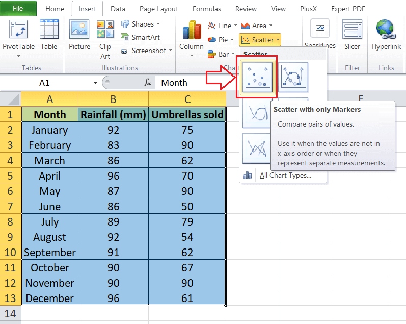
Since Scatter Plot requires two data segments, we consider the following Excel sheet as an example data set and create a scatter plot accordingly.
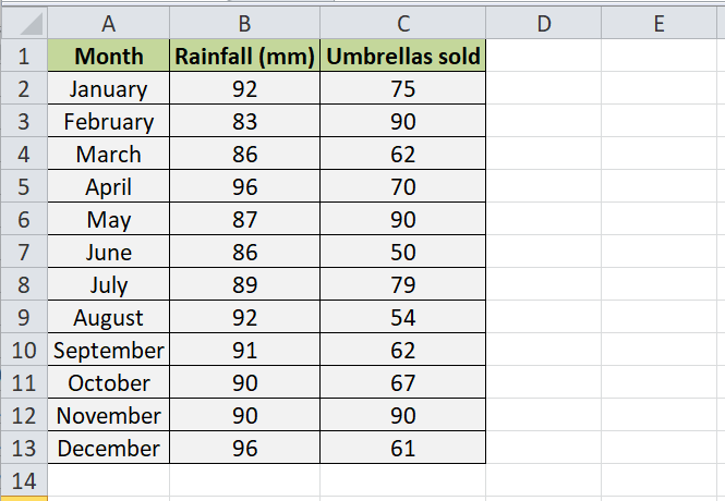
Creating and formatting of scatter plot is similar to inserting other typical charts in Excel. Specifically, we need to perform the steps mentioned below:
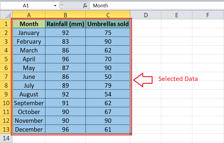
Step 1: First, we must enter the data in an Excel sheet and select specific data cells to create a scatter plot. Since we already have an example Excel sheet with two segments, we select the entire data, including the headers.
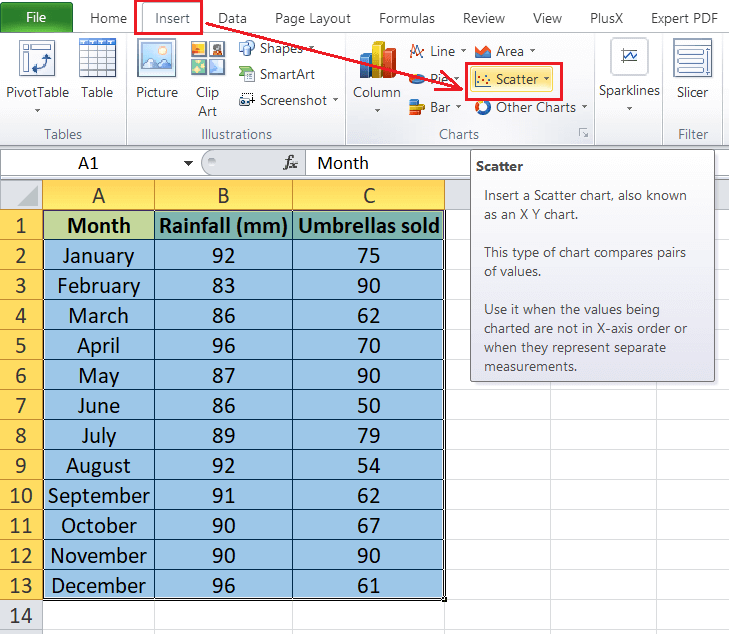
Step 2: After selecting the effective data set, we need to select the desired chart type from the Excel charts. For this, we need to go to the Insert tab and click the Scatter drop-down icon from the Charts section.
Step 3: Next, we need to select the desired scatter plot type from the drop-down menu. For example, we select the basic scatter plot from the menu by clicking the first tile, as shown below:
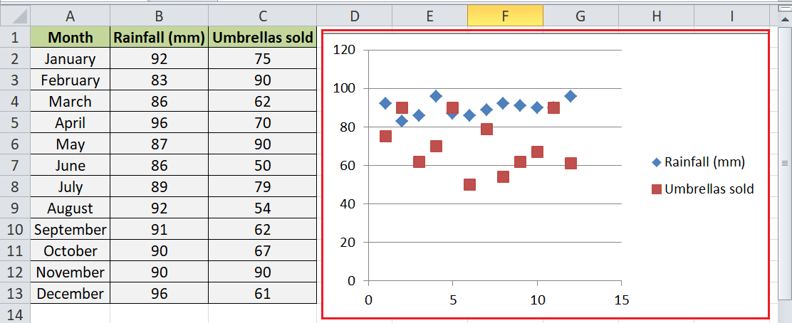
Step 4: After we click the desired chart, the same chart is instantly created within the same sheet on which we have data sets. The scatter chart for our example data looks like this:
Customizing Scatter Plot Excel
Customizing the Scatter Plots in Excel is almost identical to modifying other Excel charts, and we can modify the inserted chart as per our requirements. When it comes to customization or adjusting the formattings of scatter plots, we usually have the following ways:
- Double-Click: The easiest option to edit any element in an inserted chart is to double-click using the mouse. When we double-click on a particular chart element, Excel displays the relevant customization options to modify the preferences as we wish.
- Right-Click: Another easy way to access detailed customization preferences is to use a right-click on a particular chart element. As soon as we press right-click after selecting a chart element, Excel displays more options for that selected element. We can modify any element of the inserted chart in this way.
- Chart Shortcuts: Since the introduction of Excel 2013, we have the chart shortcuts as well. Chart shortcuts are located to the right of the inserted chart and are identified by a plus icon. Additionally, it includes formatting and filtering options. We can access chart shortcuts and enable/disable desired chart elements quickly.
- Ribbon: The most basic way is to use the ribbon and its options to edit, add, or remove specific chart elements, formatting, and styles. When we insert a chart in an Excel sheet, we also get additional tabs on the ribbon, especially related to charts, and it mainly includes design, layout and format. Using these tabs, we can easily customize the desired chart elements.
Changing Scatter Chart Type
Sometimes, we may need to change a scatter plot from one type to another. It is easy to change chart type in Excel, even after we have inserted any particular chart. For this, we need to go to the Design tab and select the 'Change Chart Type' option, as shown below:

After clicking the shortcut in the above image, we will get the new window with all the chart types. We can choose any of the desired scatter plots from the menu. Also, we can select any other chart type in Excel. After clicking the desired chart type, we will get the corresponding chart in a sheet immediately. Besides, the old chart will be replaced with a new one.
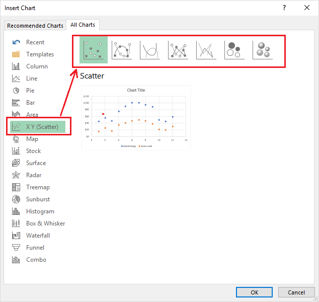
That is how we can switch from one scatter plot chart type to another or even choose an entirely new chart type.
Types of Relationship in Excel Scatter Plots
There can be the following three relationships in scatter plots in Excel:
- No Correlation: It represents a point when there is no intermediate connection between variables. For example, the number of computers in a company and the salaries that have been given to employees has no direct relation.
- Positive: It represents a point where two different factors follow the same direction or a connection, forming a direct relationship between each other. For example, an increase in the salary paid to employees after they are promoted. Salary and promotion are concerned here, and it is obvious that the employees used to get an increased salary due to promotion.
- Negative: It represents a point where different factors follow an inverse connection, forming a direct relationship. Specifically, when one variable is increased, the other variable decreases. For example, time taken while playing games and time spent on studying. This typically means if we play more, our time for the study will decrease accordingly.
Uses of Excel Scatter Plots
Some essential uses of Scatter Plots in Excel are listed below:
- To highlight or demonstrate a relationship between two variables, especially showing how one variable affects the other.
- To predict the one variable (dependent variable) behaviour concerning the other variable (independent variable).
- To plot the correlation between two different variables graphically regardless of time.
- To locate and/or create clusters within our data.
- To visualize and work with root cause analysis, especially to determine the potential for problems.
Important Things to Remember
- The variable must be supplied in the numeric term to be plotted in an Excel sheet.
- We must not format chart elements heavily so that the data remains visible effectively.
- Scatter charts should be used for knowledgeable readers of Excel charts as scatter plots may be difficult to understand for some viewers. However, we can use lines connecting the data points to make them easier to understand.
- We should select the effective data carefully because at least two segments are required for the scatter plot. Otherwise, it will not be possible to create a perfect scatter plot.
|


 For Videos Join Our Youtube Channel: Join Now


