Formatting ChartsAfter inserting your Chart, the next step is to format it according to your data specification to make it look visually appealing. In this tutorial, we will learn more about charts and their various formatting options. Chart ToolsOnce you insert the chart in your excel worksheet, you will notice you will get an extra tab named as Chart tools, which contains various different tabs such as: 1. Design Tab
This tab has ready-made formats for Chart Layouts and Chart Styles - you can see the different options and their impact on the chart by scrolling over the different options. You can also select different chart types or change the data for a graph. 2. Layout Tab
This tab is used to add/remove/edit chart titles, data labels, and Axis titles. We can also insert shapes, pictures in a chart. Another important use of this tab is 'Trendline'. 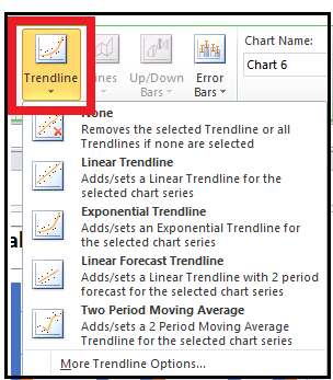
You can add a 'Linear Trendline', 'Exponential Trendline' to your graph. The linear (or exponential) trendline is based on a linear (or exponential) equation that is fit by excel to the data provided. You can also view the equation by right-clicking on the trendline and selecting 'Format Trendline', and then click on 'Display Equation on chart'. R2 (R square) shows the amount of variation in the dependent variable being explained by the model. The higher the value, the better the equation - it should lie between 0 and 1, but a good model will have its R2 around 0.7-0.8. 3. Format Tab
This tab is used to edit or beautify the chart. It gives you the option to select shape styles, WordArt styles, shape effect, shape fill option, etc., Format Chart AreaYou can format charts using Toolbar or right-clicking on the chart and selecting option 'Format Chart Area'. When you click on a chart a conceptual tab 'Design' also gets created which gives a lot of quick options to format the chart. 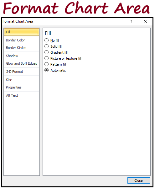
'Format Chart Area' - these options are used to 'beautify' your chart once it has been created -
Plot AreaWhen you do a right-click on the area where the chart has been plotted also known as the 'Plot Area', you get options which have the same functionality as 'Format Chart Area' options, just that the impact will now only be on the plot area and not the outside area which does not consist of the graph. 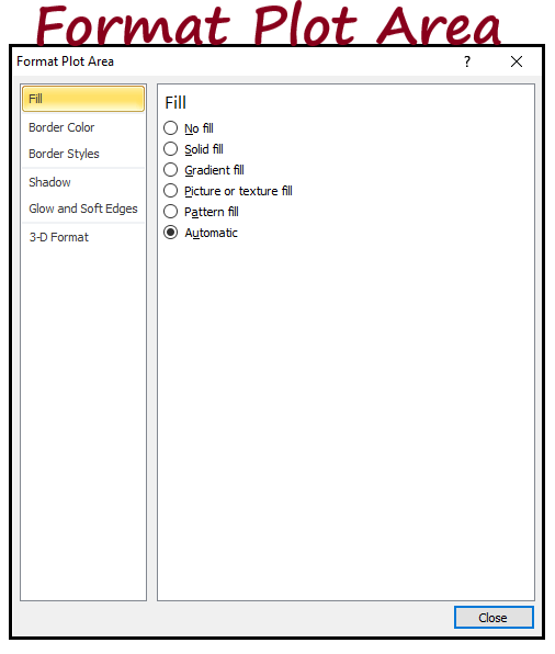
The last 6 have the same functionality as for a 'Chart Area'. Format LegendWhen you do a right-click on the legend - you get 'Format Legend' option in which you have the following options - 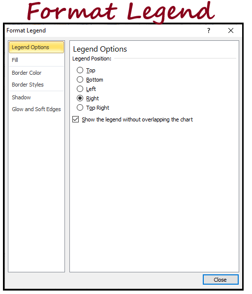
The last 5 have the same functionality as for a 'Chart Area' or a 'Plot Area'. Format Data Series for Column or Bar ChartWhen you do a right-click on the data-point which has been plotted for a Column or Bar chart, you get an option 'Format Data Series' - 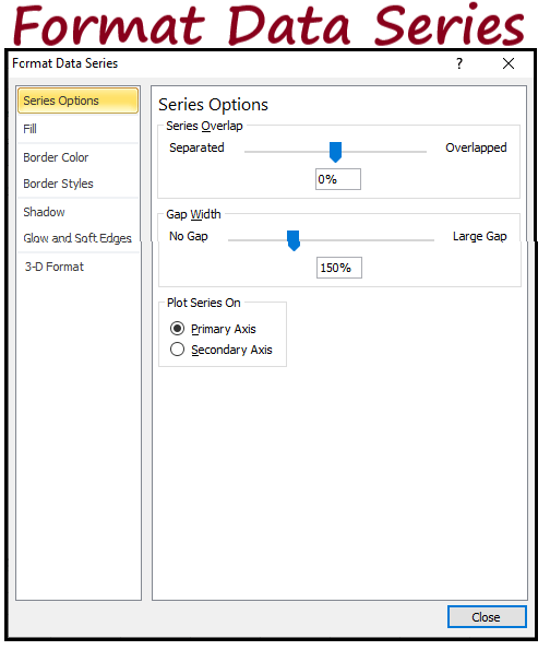
The last 6 have the same functionality as for a 'Chart Area' or a 'Plot Area. Format Data Series for Line ChartWhen you do a right-click on the data-point which has been plotted for a Line chart, you get an option 'Format Data Series' -
The last 3 have the same functionality as for a 'Chart Area' or a 'Plot Area'. Format Data LabelsWhen you do a right-click on the data-labels which have added to the plot are, you get an option 'Format Data Labels' - 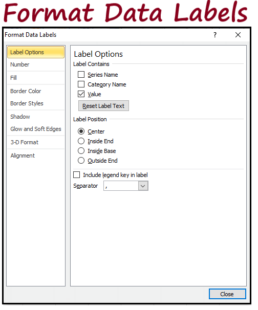
The last 6 have the same functionality as for a 'Chart Area' or a 'Plot Area'. Format AxisWhen you do a right-click on the vertical axis, you get an option 'Format Axis' (horizontal also has the same functionality) - 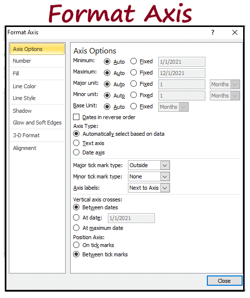
The last 8 have the same functionality as has been discussed earlier. Format Chart TitleWhen you do a right-click on the chart title & Axis title which have added to the plot are, you get an option 'Format Chart Title' - 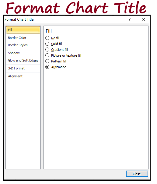
All these have the same functionality as has been discussed earlier. Using the 'Format' conceptual tab, you can achieve the same results as mentioned earlier. Copying a chartYou can simply copy a chart by clicking on it and copying it first (Ctrl + C) and then pasting it (Ctrl + V) somewhere else - you can then change the data-source as well but the format of the chart will remain the same. Sparkline ChartsSparkline charts are nothing but cell sized graphs. They are of 3 types in excel -
In the below picture, table one consists of expenditure of a household over 12 months and the table also consists of line and column Sparkline charts. 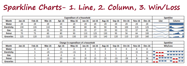
The second table showing the Win/Loss graph consists of changes in the expenditure as we move from one month to another over. Date Axis (Group - Axis)Usually when you plot time based data, it is assumed that the data-points are at equal intervals. But this may not always be the case and in order to avoid making a wrong conclusion, you can use the 'Date Axis' option. You will need to specify the cells consisting of the dates and then select OK - if data for some dates is missing, Sparkline will ensure that the data is spaced at equal intervals.
Next TopicPie Chart
|
 For Videos Join Our Youtube Channel: Join Now
Feedback
- Send your Feedback to [email protected]
Help Others, Please Share


