| |

How do you chart titles in ExcelThe usage of Microsoft Excel software is increasing in every field and organization. Data entered by the user varies from small size to large size. To retrieve a result and to go through the data, organizing the data is essential. Managing the data in the form of pictorial representation such as charts and graphs helps to study the data quickly and easily and get the solution easily. To identify and differentiate the chart, it is necessary to enter a title. If multiple charts are present in the data, entering the title chart helps get the result easier. What is a chart in Excel?"A chart in Excel is a graphical representation of data that provides a visual summary of the information. Charts help to present data in a way that is easy to understand, making it simple to identify trends, patterns, and relationships between different data sets." Excel allows you to create charts using data from the same worksheet or other worksheets and workbooks. You can also customize the appearance of charts by adding titles, labels, gridlines, colors, and other visual elements to make your diagrams more informative and engaging. Overall, charts in Excel are an excellent tool for analyzing and presenting data, and they are widely used in business, finance, science, and many other fields. Types of the chart in ExcelExcel offers a wide range of chart types, including,
Each chart type is designed to display data in a specific way, and you can customize your charts to suit your needs. Uses of a chart in ExcelCharts in Excel have many benefits, including:
Why title a chart?Titling a chart in Excel is essential because it helps to provide context and meaning to the chart. A chart title is a brief, descriptive label that summarizes the main point or purpose of the graph. Here are some reasons why it's essential to title a chart in Excel:
Titling a chart in Excel is essential because it helps ensure it is clear, understandable, and organized. It also helps to communicate the purpose and message of the chart to your audience. How to insert a title in the chart?To insert a title in a chart, the steps to be followed are, Method 1:Step 1: Create the chart for the given data as follows, 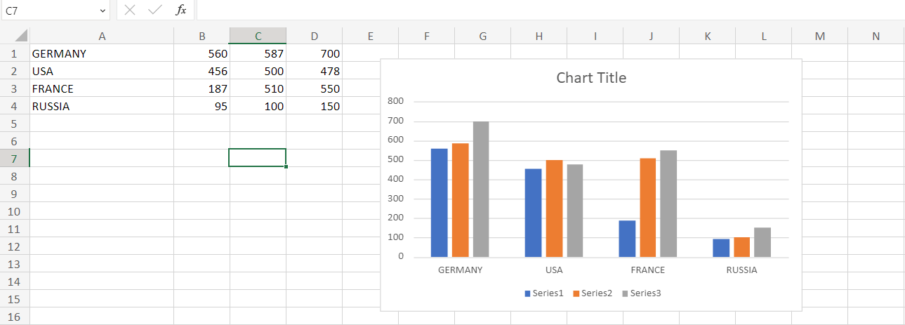
In the worksheet, the various material productions for the many countries are displayed here. Step 2: The chart displays the title name "Chart Title." Double-click the Chart title, and there shows the option as follows, 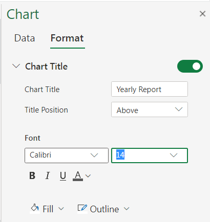
In the option, enter the chart title as "Yearly Report" and enter the title position based on the data. Here the tag is placed above the chart. The desired Font type and size are chosen. Step 3: Press Ok. The chart title will display in the chart. 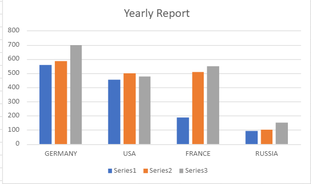
Step 4: You will notice, the desired title is present in your chart. Method 2: Using Chart Layout optionStep 1: Create a chart for the given data. Step 2: Select the chart in the worksheet, and choose the Layout option from the toolbar. Step 3: There are several options, and choose Chart Title. There display several options in the dropdown list. Step 4: Choose the desired option based on the data. Here the option chosen is Centered Overlay Title. 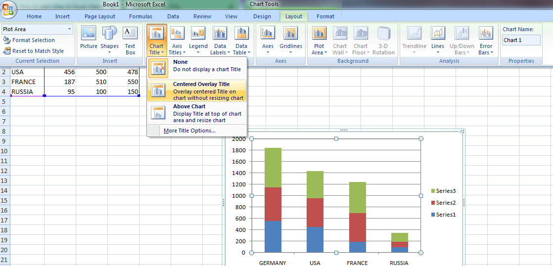
Step 5: A box will display on the chart. Enter the required title of the graph. 
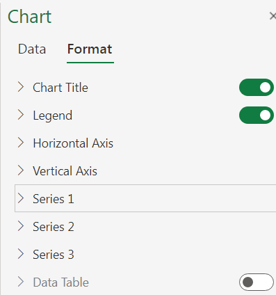
Formatting the chartFormatting the chart in Excel refers to customizing a chart's appearance to make it more visually appealing and easier to understand. This includes modifying the colors, fonts, sizes, and styles of various chart elements such as titles, axes, legends, data labels, and plot areas. Additionally, formatting can include adjusting the chart's layout, size, and position and applying various chart styles and themes to create a consistent look and feel with other charts or other elements in a report or presentation. The goal of formatting a chart is to present data in an accurate and engaging way for the audience. Why do we need to format the chart?There are several reasons why formatting the chart is essential:
Overall, formatting the chart is an essential aspect of data visualization, as it can help to make the data more understandable, engaging, and impactful. How to format the chart?To format the chart in Excel, you can follow these steps:
These steps may vary slightly depending on the version of Excel you are using, but the general process should be similar. Axis Title in ChartThe method for adding axis titles to a chart can vary depending on the software or tool you are using. However, here are the general steps for adding axis titles in most charting applications: Step 1: Select the chart you want to add axis titles to. 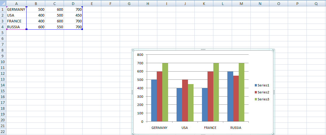
Step 2: Look for an option or button labeled "Chart Elements," "Chart Tools," or something similar. This is usually located in the ribbon or toolbar at the top of the screen. Step 3: Click on the "Chart Elements" button and look for an option to add axis titles. This may be labeled as "Axis Titles" or something similar. Step 4: Once you've found the option to add axis titles, select the type of axis you want to add a label to (e.g., X-axis, Y-axis). 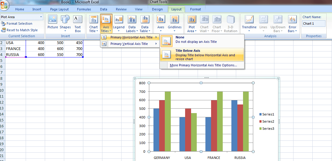
Step 5: Enter the text you want to use as the axis title. You can also customize the text's font, size, and color. 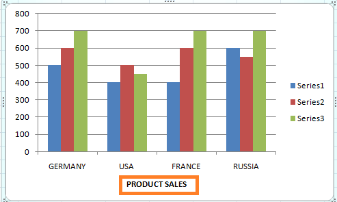
Step 6: Repeat the process for any additional axis titles you want to add. Step 7: Once you've added the axis titles, make sure to save your changes so that they are reflected in the final version of the chart. How to remove the chart title?In Microsoft Excel, you can remove the chart title by following these steps: Step 1: Select the chart whose title you want to remove. Step 2: Click on the "Chart Elements" button (it looks like a plus sign) that appears when you hover over the chart. Step 3: In the "Chart Elements" menu, select the checkbox next to "Chart Title" to deselect it. This will remove the chart title from the chart. 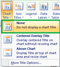
Alternatively, you can right-click on the chart title and select "Delete" from the context menu to remove it. 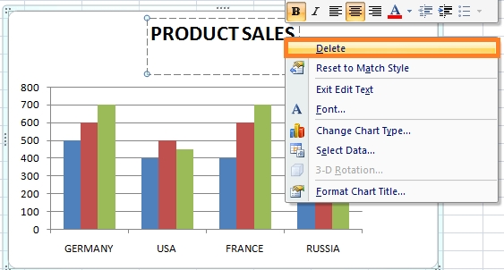
Once you have removed the chart title, be sure to save your changes so that they are reflected in the final version of the chart. 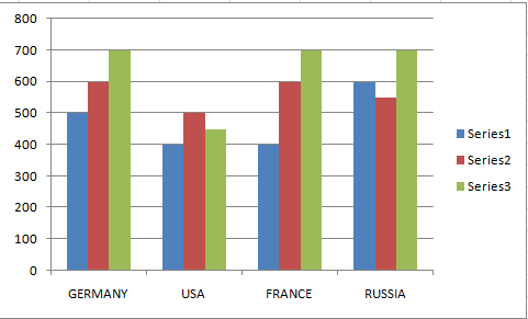
In the chart, the title is removed using the required options. SummaryIn conclusion, the chart title in Excel is a crucial element of any chart, as it communicates the main point of the data being presented, provides context, guides the reader's attention, improves readability, and enhances the professional look of the chart. To create a compelling chart title in Excel, it is essential to keep it concise, descriptive, and relevant to the intended audience. By following best practices, such as using the built-in Chart Title feature, using specific terms, and formatting the title to stand out from the rest of the chart, you can create a chart title that effectively communicates the insights and findings of the data being presented, and makes the chart more accessible and understandable to the reader. |
 For Videos Join Our Youtube Channel: Join Now
Feedback
- Send your Feedback to [email protected]
Help Others, Please Share


