| |

Chart Element in MS ExcelThe excel charts can have more descriptions with the use of the chart elements, which will also make data more interesting to look at. You will discover more about the chart components in this article. Consider the following data, which represents the sales of the listed item year-wise:
You can copy this data into your excel sheet to practice. The steps to adding chart elements to your graph are as follows:
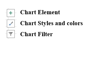
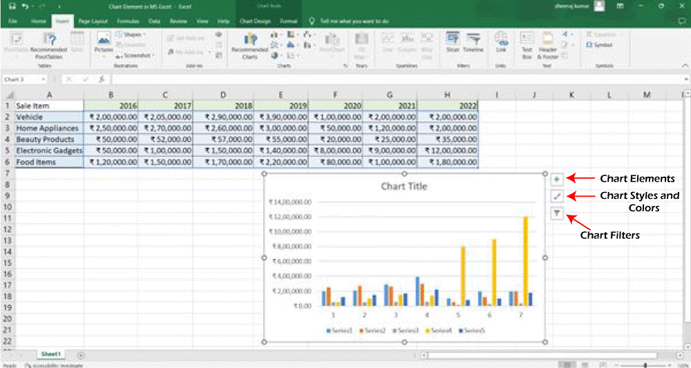
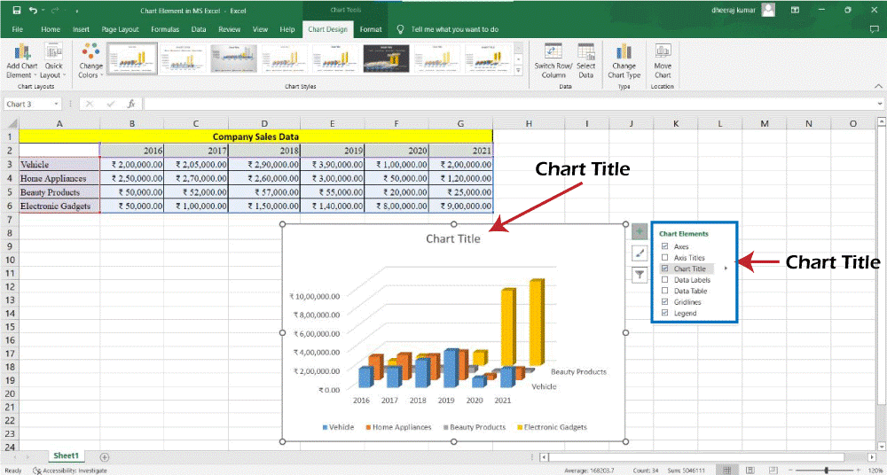
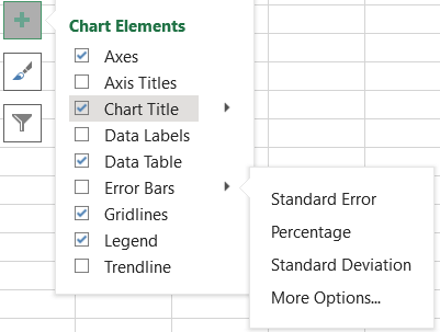
Chart Elements
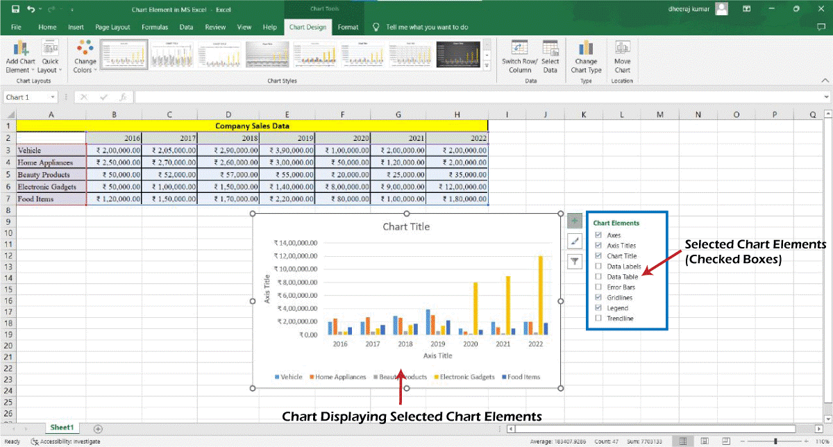
You can use any of these chart items as per your requirements.
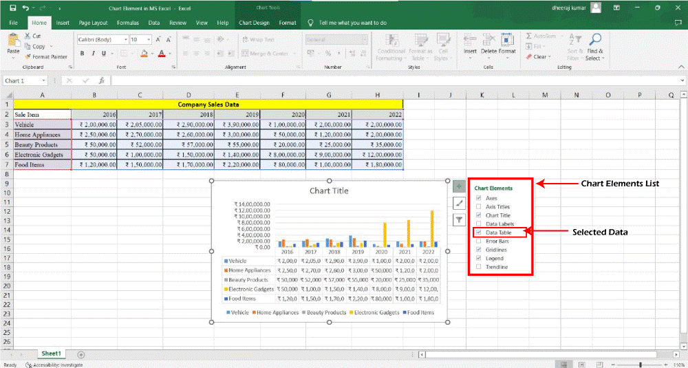
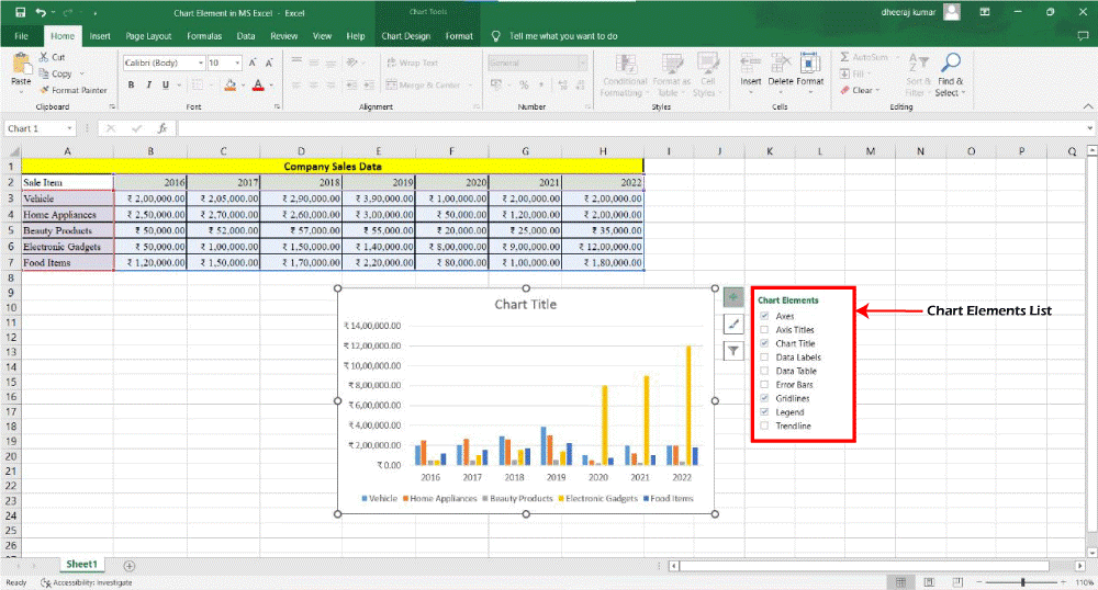
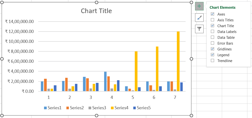
In the given figure, we have selected the Axes, Chart Title, Error Bars, Gridlines, and Legend elements. Whereas, Axis Titles, Data Labels, Data table, and Trendline are not selected. How to Use Chart Elements?Now let's understand how to use all chart elements. 1. AxesThe given chart is a 2d-chart, which is represented by two axes, horizontal and vertical. The horizontal axis is referred to as the x-axis or category axis. The vertical axis is referred to as the y-axis, the value axis, the data axis, or the range axis. 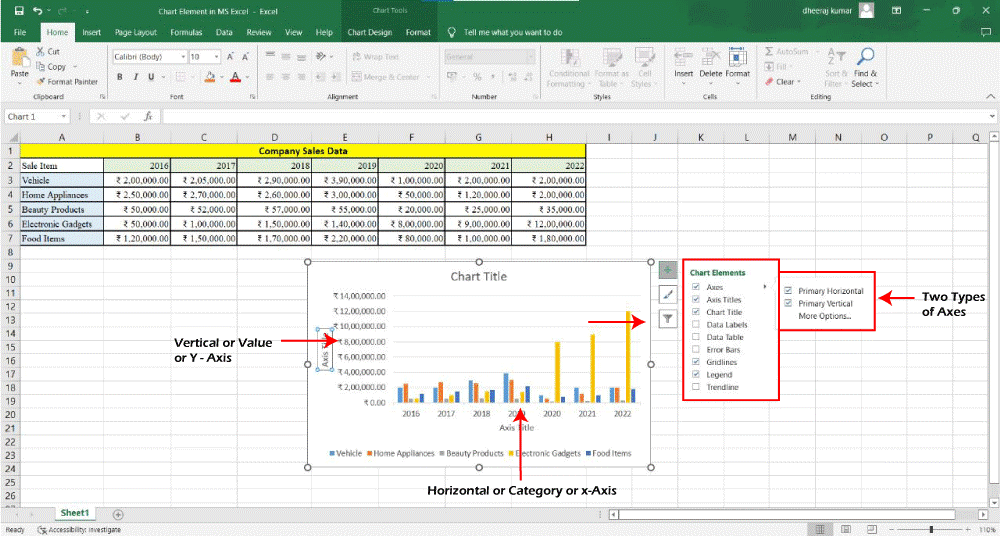
The Axis is checked by default. You can click to select or deselect the axis:
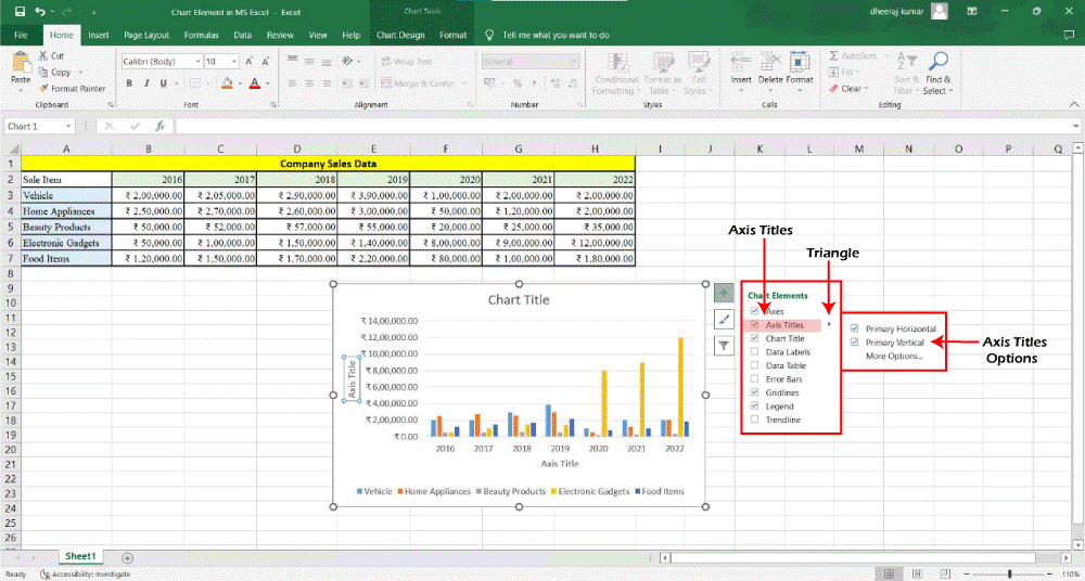
2. Axis Title -Axis titles are used to name the axis. It gives a better understanding of which data is kept on which axes.
Steps to Add Axis Title:
3. Chart Title -In the chart elements list, you get an option to add the chart title. The chart title appears at the top of the chart. Following are the steps to add a chart title to your chart:
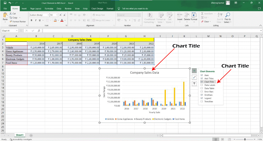
If you want to make chart title same as the heading of the data. You can link it to the cell containing the heading and whenever the worksheet is updated the chart title will get automatically updated. Following are the steps to link the axis title to a cell containing that text: Step 1 - Click on the chart title on the chart. Step 2 - In the formula bar, type = and select the cell containing the text/heading. Then press enter. The chart title will be updated. 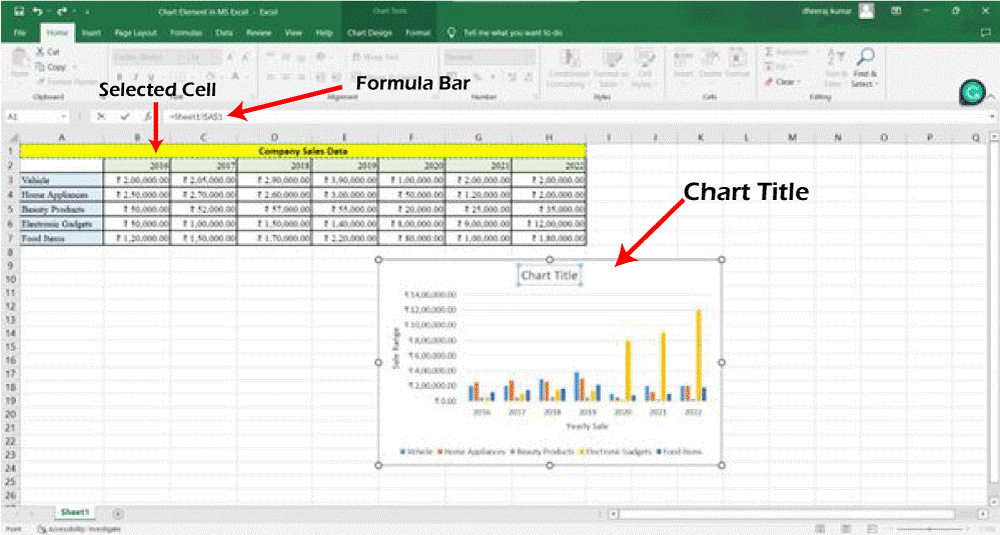
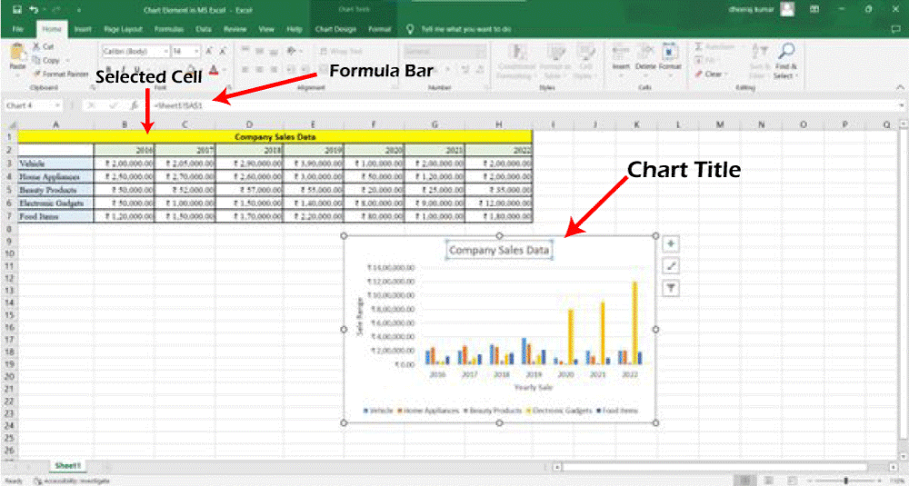
As mentioned, when the text in the link cell changes the chart title also gets changed. 4. Data Labels -Data table gives more clarity about the information plotted on the chart. It plots the data label for each individual series. The given pie chart is representing the sale of each item in the year 2016 but it is plotted without the data labels. 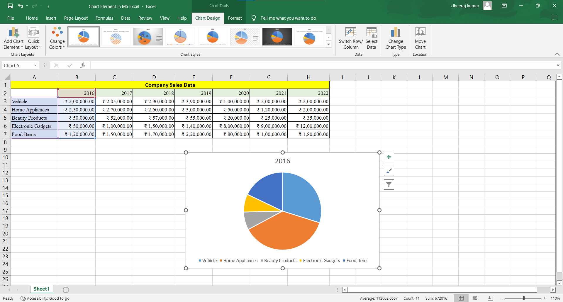
In the above chart, we have selected A4 to A8 and B4 to B8 cells. We can clearly observe from the above chart that the home appliances were sold more than the other items. But we cannot conclude how much it is greater than the other and what is the percentage share. Now, let us observe the chart after adding the data labels. Step 1 ? Click on the Chart. Step 2 ? Click the Step 3 - Click on the Data Label. The value of each item now appears on each pie slice. 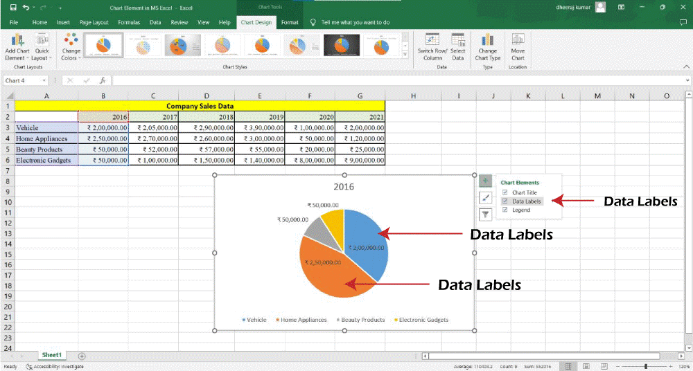
If we want to show the data labels in percentage, we can change it whenever we want. To show the data labels in percentage follow the following options.
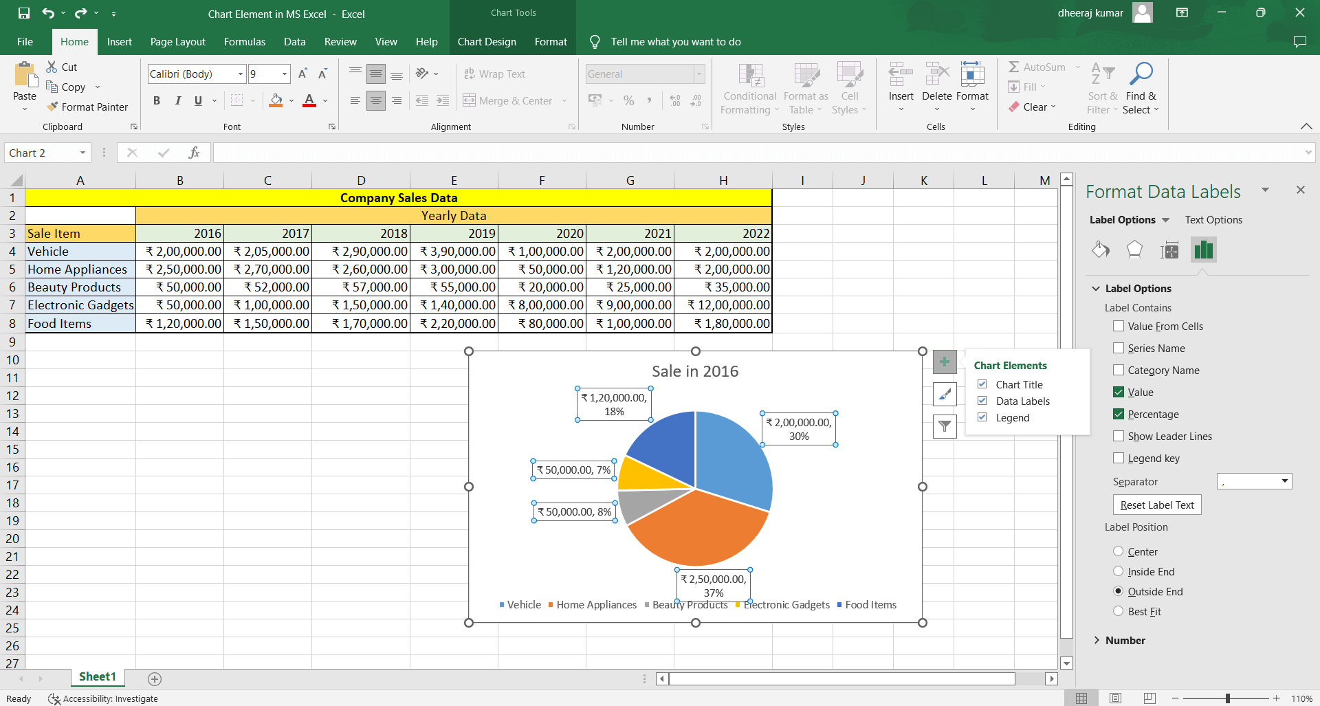
Now, we have more clarity on the sales of each item in 2016. And we can easily conclude how much each item was sold more or less from one another. Also, you place these data labels wherever you want. 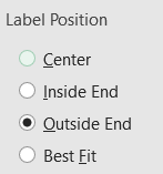
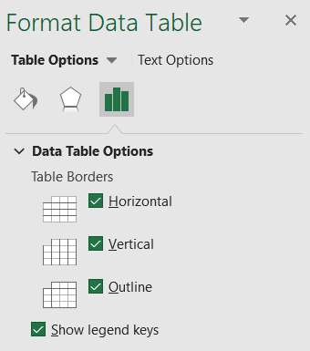
Select any of these options to place the data label or move it manually. 5. Data Table -We can place the data table in the Bar, Column, Line, and Area chart. The Data Table feature is used to display the data in the chart in the form of a table. Following are the steps to insert the data table in the chart. First Two steps are same:
The default view of data table is now displayed in the chart. In the default view, the data table appears at the bottom of the chart and the table heading is the horizontal axis. 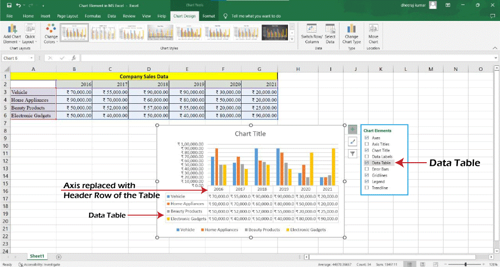
And in the case of bar charts, the header row of the data tables does not replace the horizontal axis. 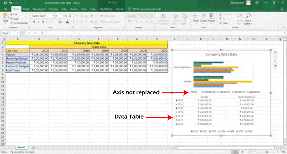
For more editing in the data table, follow these steps:
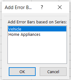
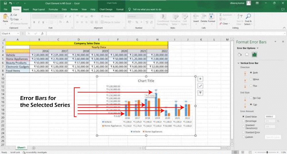
6. Error Bars -The potential error amounts in relation to each data point in a data series are represented graphically by error bars. As an illustration, the outcomes of a scientific investigation can be shown to contain 5% positive and negative possible error percentages. Two-dimensional area, bar, column, line, x-y (scatter), and bubble charts all support the addition of error bars to a data series. Following are the steps to add error bars in your chart:
The error bars are modified to reflect your changes if you alter the values on the worksheet corresponding to the series data points. You can show the error bars for the X values, the Y values, or both in X-Y Scatter and Bubble charts. 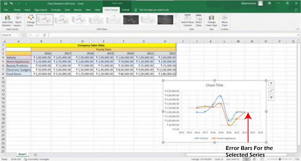
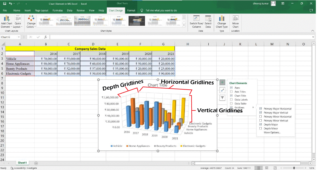
The error bars are represented for the selected series. 7. Gridlines -You can show the horizontal and vertical chart gridlines in a chart that shows the axes to make the data simpler to read.
Without Gridlines: 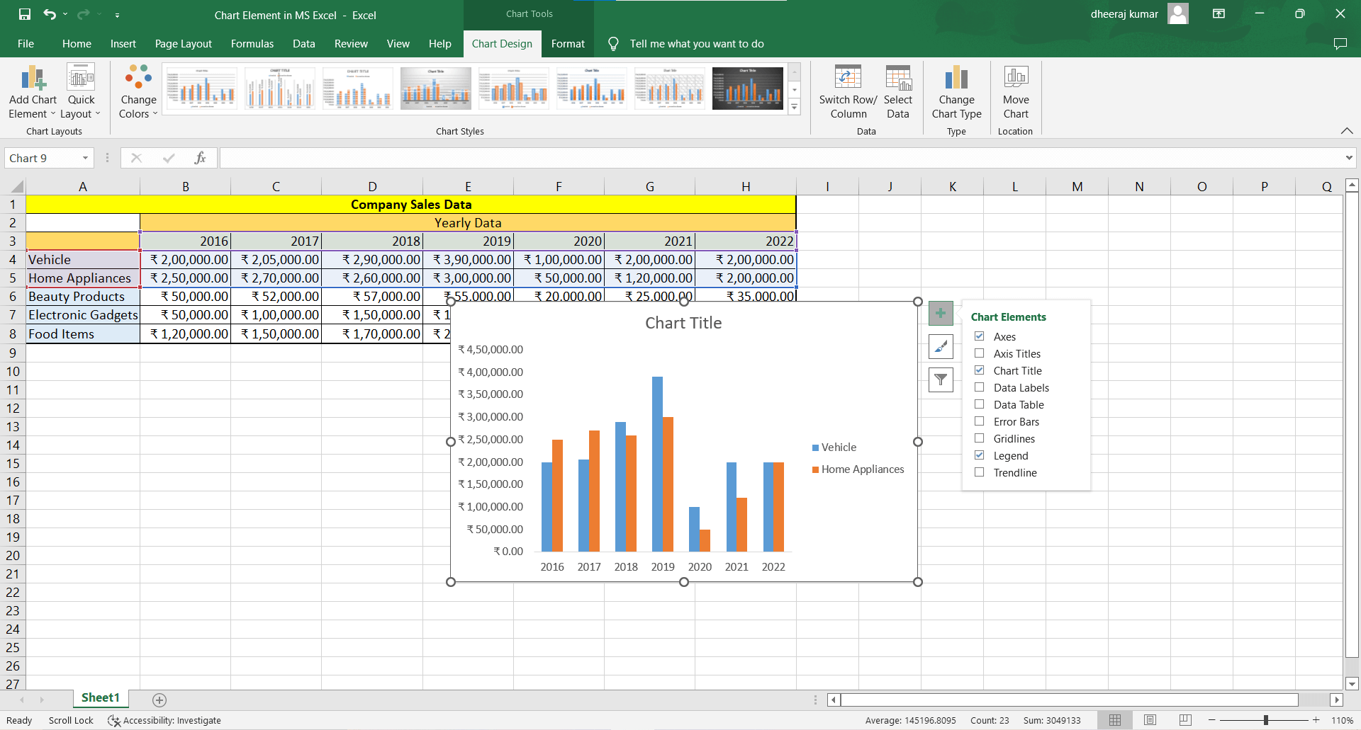
Following are the steps to add Gridlines in the chart: From the chart element list, select the Gridlines. The given chart is displayed with the gridlines. 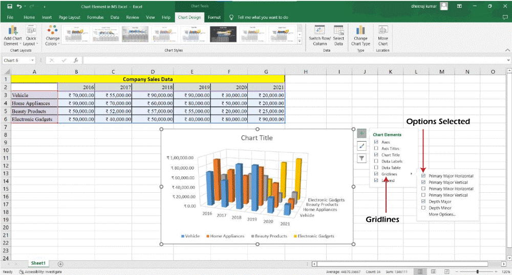
More On Gridlines
Pie charts and doughnut charts, which do not display axes, are examples of chart formats for which gridlines cannot be displayed. 8. Legend -The legend appears by default when you create chart. With Legend 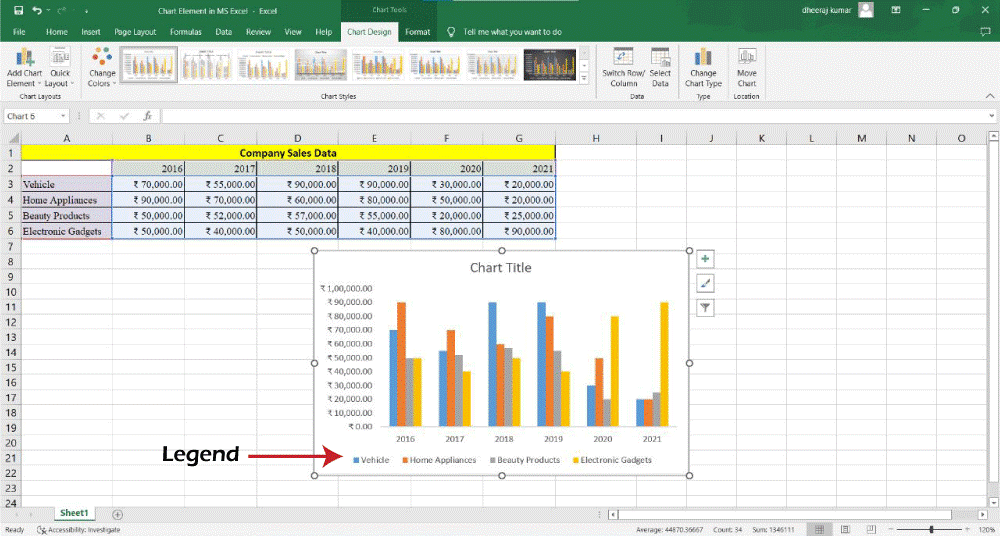
You can deselect the legend option if you want. Without Legend 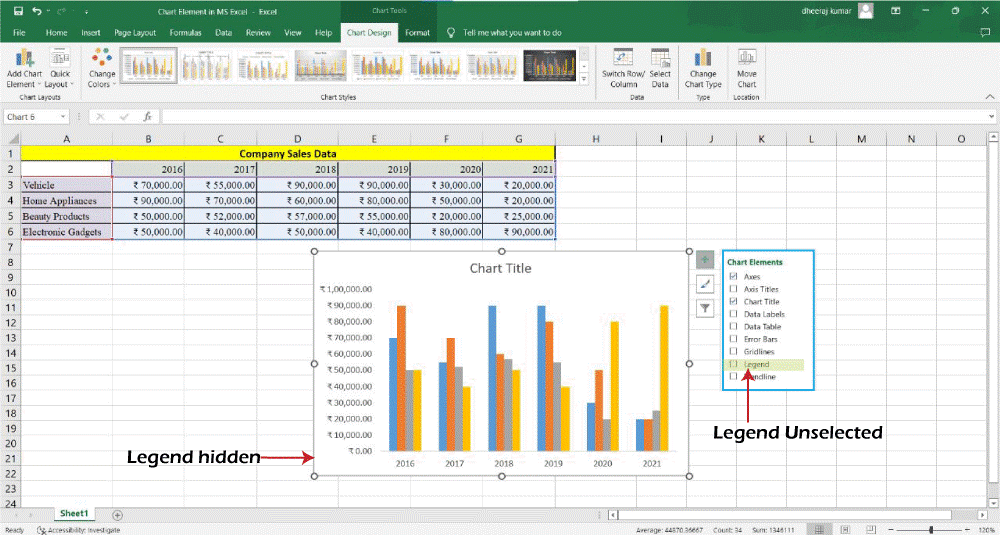
9. Trendline -Trendlines are used to examine prediction issues and graphically illustrate data trends. Regression analysis is another name for this type of study. 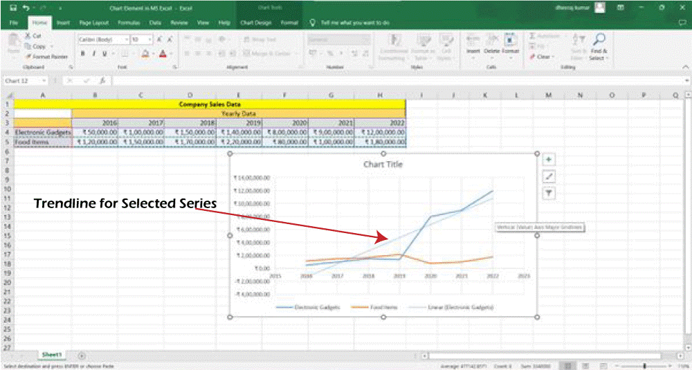
You can use regression analysis to forecast future values by extending a trendline in a chart beyond the existing data. In the case of multi, line chart when you click on the Trendline you get the options to add trendline for any series plotted on the chart. In the given chart, we have potted only two series and we get following options. We have selected Electronic Gadgets option. 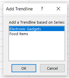
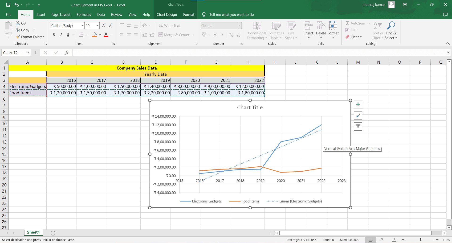
The Trendline for the Selected series (Electronic gadget) appears on the chart. We hope you have found these very helpful. We suggest you to explore all these options at least one time to get better understanding on them and when you get a chance to work on it, you can easily do that work.
Next TopicANOVA in the Microsoft Excel
|
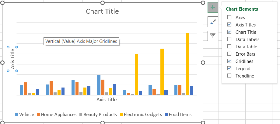
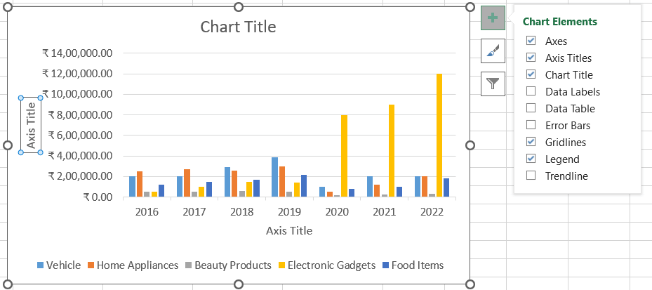
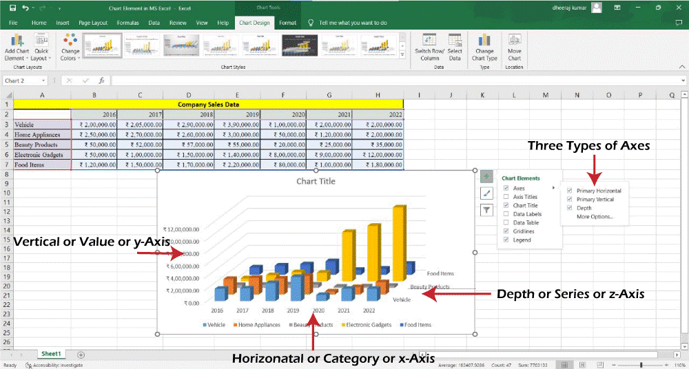
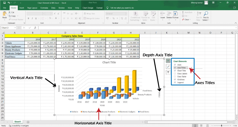
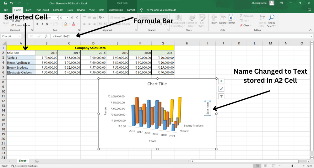
 Chart Elements icon.
 Chart Elements icon.
 icon. Click on this icon.
 the icon
 icon.
icon.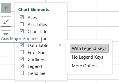
 icon.
icon.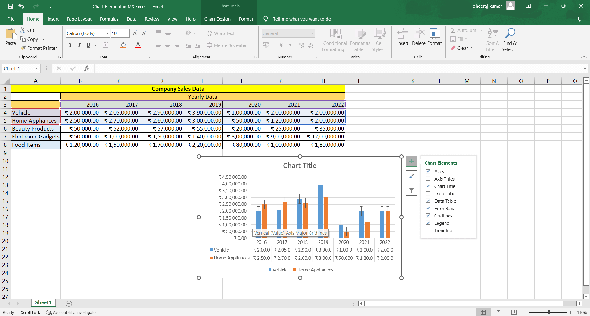
 icon. Click on this. You will get the following options.
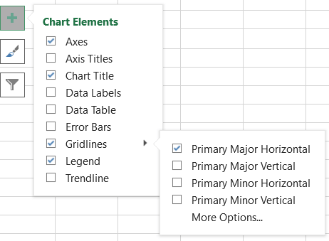
 For Videos Join Our Youtube Channel: Join Now
Feedback
- Send your Feedback to [email protected]
Help Others, Please Share


